The Paint Mistake An Expert Says Is Making Your Space Too Youthful
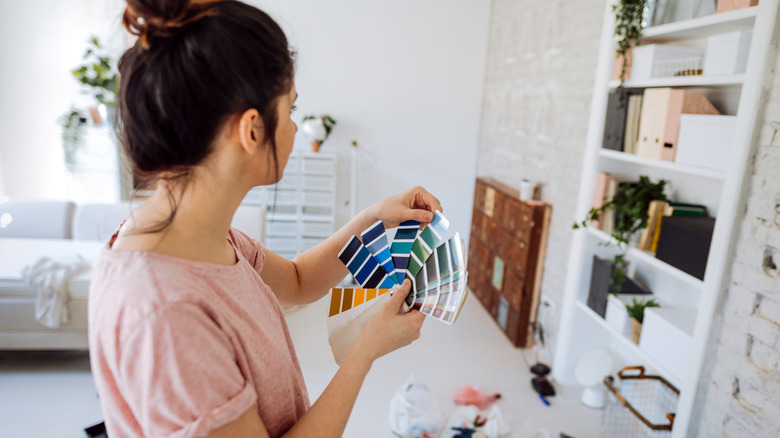
The paint colors you decide on for your home are ultimately based on your personal preferences and the ambiance you want to create. However, a lot can be learned from the professionals when it comes to considering the overall vibe that your chosen shades and colors create in a space. One painting mistake that they see often and advise against is the use of baby hues on your walls.
Alessandra Wood, who is an interior design expert and VP of style at Modsy, says "I cringe when I see baby blue walls. Light blues easily run into nursery territory, which makes the space feel childish," (via Apartment Therapy). Very soft hues like baby pink and baby blue are often chosen because they bring feelings of happiness into a space, but their playful nature mainly alludes to children's bedrooms, nurseries, and playrooms. Instead of these types of pastels, consider color shades that can evoke a more mature and balanced vibe.
Why these shades don't work
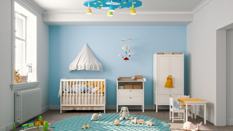
Pastels and baby hues were once very trendy because they represent youth and whimsy. They are great at creating a charming and playful atmosphere for adults and a nice paint color to keep things light in a room. However, these shades don't always work long-term because style preferences are always changing. Baby hues might be fun for a moment, but they are ultimately a paint mistake to avoid in your home because the quirkiness won't hold up over time.
In addition to making your space look too youthful, baby hue shades can make a space oversaturated with color. This will be a problem for a room that's small or lacks natural light because it won't have the illusion of openness and airiness that's typically created by light colors. Finally, baby hues can bring down your home's curb appeal because they aren't common colors, and therefore won't be appealing to everyone.
Alternatives
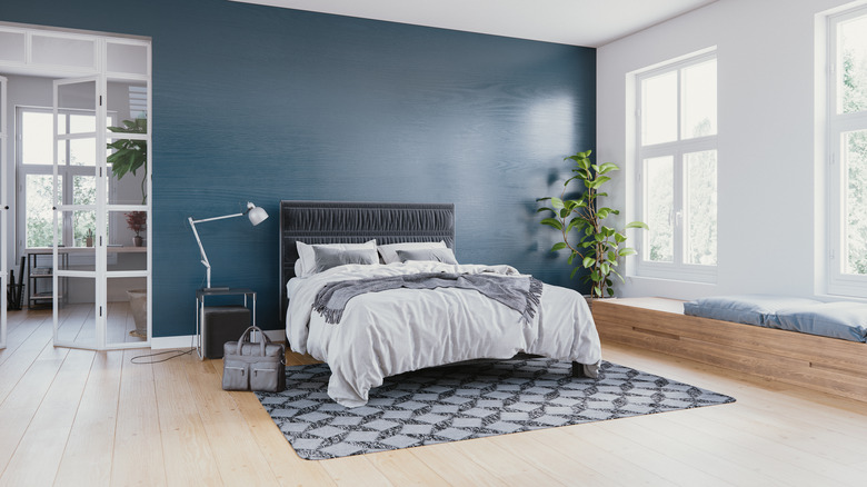
Consider using different shades of blue and pink for the walls. Instead of the really light shades, opt for something more solid and rich. A deep blue, for example, will communicate a lot more elegance and maturity while a more neutral blue can be an excellent background. Speaking of gray-like blue, designer Ryan Saghian says "It's a very soothing color, so I see it in either a bedroom or a breakfast room. Pair it with yellows and oranges to make the blue look even richer," (via House Beautiful).
If you still want to incorporate baby hues, consider using them as accents and in smaller, more easily changeable elements like throw pillows, bedding, rugs, or artwork. You can also use them for bigger staples like kitchen cabinets, furniture legs, or your work desk. This way, you can have the fresh, playful touches that you want in your home without having to commit to them as wall colors.