Take A Tour Inside HGTV Star Hilary Farr's Gorgeous Home
Designer and host of HGTV's "Love It or List It" and "Tough Love with...," Hilary Farr, is an internationally renowned interior and product designer. Born in Toronto and raised in London, England, Farr is celebrated for her ability to turn even the most distressed spaces into a brand new slice of heaven for overwhelmed clients. But in the premiere episode of Season 16, Farr surprised fans by turning the lens on herself when she featured her own home renovation on the long-running show. The exciting episode gave fans a glimpse into the process of upgrading the 71-year-old designer's home as real estate pro, and co-host, David Visentin tried to sway her to look at other houses in the area.
As one would expect, this isn't an easy process with the interior design maven having to essentially gut the home. However, what comes from this is a cohesive blend of modern and classic, which makes the cottage-inspired home flow without ever feeling monotonous or overwhelming. Fusing art into her decor through accents such as the lighting fixtures and creating multi-purpose rooms offers a masterclass in using space. The results? You'll see below, but suffice it to say even when it's as close to home as renovating your own space, Hilary Farr knows her stuff.
The Entrance
From the onset, Hilary Farr and her crew of contractors had much to do, starting with a termite-infested foundation that meant the house had to be taken down to the studs. However, in true Farr fashion, she saw an opportunity to create the home of her dreams – an English cottage with a modern twist. Smaller than what her co-host and friend, David Visentin, expected her to be interested in, Farr decided it was not about the size but what they do with the space. "I've always had big houses, and now I want to consider a different lifestyle. I like the idea of living in a smaller but fabulous space," she said (via HGTV).
What started as a bungalow with run-of-the-mill wood and asphalt shingle roofing turned into a gorgeous balancing act between traditional and modern aesthetics. The exposed-brick layout, coupled with the more modern arched doorway, is certainly an unexpected pairing but one that works. The door, which Farr describes in the episode as the "perfect go-between," was created by Clark Hall Doors and boasts Flemish glass – a textured glass with a distorted feature that provides interest, light, and privacy. Outlining the glass is a custom iron door that adds a layer of modernism to the overall look.
The Living Room
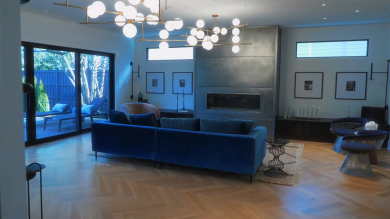
Two key things mattered to Farr: lots of light and lots of space. And that's what she got. Firstly the light herringbone flooring, done by Carolina in Home Flooring, lends itself to the light and airy nature of the home. In the living room, these light wooden tiles create a great foundation for Farr's design ideas. The first thing you notice, thanks to its pop of color, is the blue L-shaped sofa that breaks up the space and creates a demarcation between two areas.
A marble-top coffee table makes for an interesting centerpiece between the sofa and the pièce de résistance, the fireplace. Installed by European Homes, the fireplace's steel cladding gives it an industrial, modern look. This is a bold decision by Farr as it leans more industrial than cottagecore, but it works thanks to the minimalist feel of the space.
Farr's living room is designed in such a way that the eyes are always pulled upwards and the modular lighting fixture that looms largely above is a great example of that. Imposing though it might be in size, this brass angular art piece remains minimal. It's understated enough to avoid being overbearing but bold enough to draw your attention, a delicate balance but one that Farr pulls off quite nicely. Finally, the rug – Farr's own design in collaboration with Kaleen Rugs – is a cheeky infusion of counter-design. Blending with the light wooden flooring, it would be easy to miss the rug entirely were it not for the clever zig-zag lines in a darker tone used sparingly around it.
The dining room
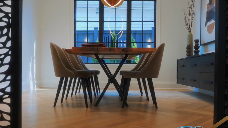
Art lives in exciting ways around Hilary Farr's North Carolina residence, from statement light fixtures to creative gallery-worthy door designs. The dining room has perhaps two of the most interesting installations in the designer's home. First up are the Swirling Leaves sliding doors, designed and installed by Artisan Panels. These doors separate the dining area from the kitchen. This gives the homeowner the option to let guests get a glimpse into where the food and drinks are made or cordon off the area if it's too messy. The cut-out leaves, however, are a clever way of ensuring the flow of the house is not completely interrupted when the pocket doors are shut.
Another eye-catching piece in the Farr dining room is the Bau lighting fixture from Visual Comfort. This natural brass light is coated in aluminum and works with LED lights, making it at once a gorgeous and sustainable addition to the home. Elevating the dining space even further is the gorgeous imperfect wood table. "The heartbeat of my home is the dining room. Friends and family enjoying fabulous food, great conversation and loads of laughter and love gathered around my beautiful table," Farr wrote in a heartfelt Instagram caption. Made of reclaimed wood, and constructed by Duvall & Co., this table seats eight and brings an earthy essence into the room. The large panel windows allow guests to have a clear view of nature and a generous dose of natural light while they dine.
The walk-in closet
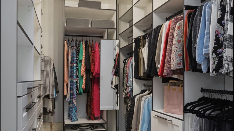
The key to a good closet of any size comes down to how the space is utilized. A walk-in that's littered with clothes and shoes but with no compartmentalization or order might as well be a sales rack at a TJ Maxx. However, if you're able to key into your inner Marie Kondo and really arrange your clothes, shoes, and accessories, you'll find that luxury is in the details. For Hilary Farr, this was the case when building her closet. The narrow space benefits from floor-to-ceiling compartments that allow for the entire space to be used. With her blazers, dress shirts, and trousers on one side, the opposite wardrobe consists of drawers and smaller compartments for accessories, bags, and more.
To liven up the space, Closet Factory – the design studio tasked with bringing this room to life – included a small statement chandelier that pulls the eyes upwards. A multi-colored graphic rug makes for an exciting burst of color below. The light wood herringbone flooring is also featured in the closet, continuing the central theme of Farr's home.
The powder room
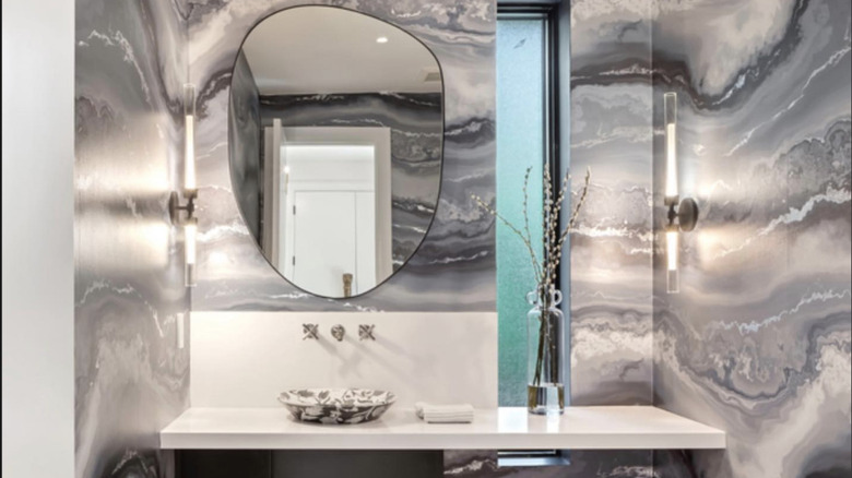
Now this room takes us in a different direction from the others we've seen in Hilary Farr's home. Starting with the aptly named "Moontide" wallpaper from York Wallcoverings, we are greeted by a bold choice that pays off. In the original home, there was one main bathroom and another tucked away in the basement. When it came time to rebuild and redesign, a powder room was included, in addition to a main and guest bathroom. The wallpaper, designed by textile designer, Avina Stanoff, is "like walking into a giant geode," as Farr put it on Instagram.
In reality, the design is inspired by crystalline agate and gold and retails at $120 per yard. The room features a minimalist floating vanity and a basin sink. The design is such that the movement of the wallpaper is never interrupted by any of the features. The slit window allows light in but doesn't overpower the artistic space. Then there's the asymmetrical mirror, which lends itself nicely to the fluidity that the space conveys. Keeping the wallpaper as the main focal point in the space, the wall sconces are slight so as not to disrupt. All in all, this space is a masterclass in executing maximalist ideas in minimalist ways. Not to mention, a great example of how to do loud luxury without crossing over into tacky.
The main bedroom
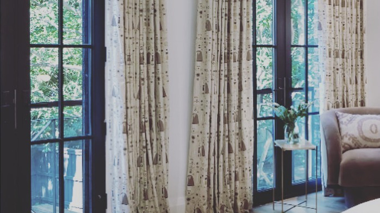
Along with most of the original rooms in the house, the main bedroom underwent more than a face lift in the renovation. In Farr's new bedroom, the windows were moved to a different wall and extended from wall to ceiling, bringing in more light into the space. In place of traditional windows, French doors were put in, which show off the greenery right outside. When opened up, there is no doubt Farr will enjoy a great amount of fresh air.
The prints on the neutral colors, as well as the graphics on the earth-toned rugs, add to the overall calmness of the bedroom. Decor is kept to a minimum here, allowing for the colors to really create serenity. A ceiling fan with an LED light illuminates the room, along with a floor lamp in the opposite corner to the bed. An armchair is perfectly situated by one of the French doors, allowing for Farr to sit closer to nature, should she wish to. Adeocrative railing is a clever alternative to a balcony. Since balconies tend to cost an arm and a leg, this is a gorgeous way to create an illusion without having to pay the cost.
The main bathroom
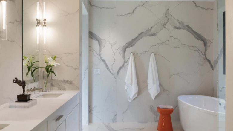
Creating and achieving tranquility in your home doesn't have to be a wallet-breaking experience. In fact, there are more clever ways to turn your home into a luxury spa dupe, and the Love It or List It co-host showcases one of them in her main bathroom. Enlisting the help of Ideal Tile, Farr selected marble-look porcelain tiles to wrap her bathroom walls. Known as the Statuario porcelain panels, these large tiles can transform your space into a luxurious and serene room. One thing we can expect from Farr's home is that if the wallpaper is meant to shine, the rest of the space will play supporting characters. A burnt orange ceramic stool provides a pop of color in the space.
The linear sconces bounce the light off the ceramic tiles, brightening the space. A pair of frameless mirrors adorn the vanity above two sinks with silver faucets. This airy layout also features a sleek standalone soaker tub, a walk-in shower, and plenty of space to relax. Nature is never too far off in Farr's home and the bathroom benefits from this as well. Thanks to the larger-than-usual paneled windows opposite the tub, natural light floods the space and the greenery from the plants and trees in the backyard add even more color to the space.
The stairs
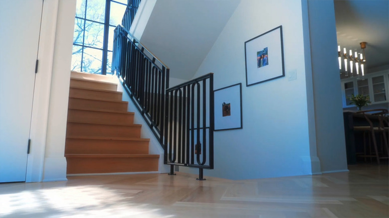
There's actually so much you can do with your stairs and landing and Hilary Farr showcases a few of them here, starting with the use of custom panels for the railing that upgrade it. Instead of the typical wooden railing, Farr and her design team, Room 62 – designers of the railings and window designs – opt for a curved design for the pickets using black iron and a polished brass handrail. In contrast, the steps remain light-toned wood.
However, perhaps the most inviting aspect of the stairway is the two floor-to-ceiling windows on the landing. Black metal window frames make an appearance here as well, but the off-white walls work to soften the effect. The view of the large tree in the backyard, juxtaposed against the oft-blue skies offers a calming effect that many can only dream of.
The backyard
Initially just a carpet of green on a generously-sized outdoor space, Hilary Farr had a vision for an outdoor living space and made it happen. With the transformation, there's so much more to love and so much more to do. Separated into three categories, this outdoor space takes entertaining to the next level. The folding glass doors lead you outside from the living room, creating a symbiosis between the inside and outside. Farr calls this her spa garden and she's right to. With the deck a prime spot for relaxing, the pool for floating, and the greenery for activities and picnics, the designer has every mood covered.
Once you're on the deck, you're greeted by two reclining deck chairs placed in front of another of the Swirling Leaf decor by Artisan Panels. Now once you get situated on the deck chairs and look up, you'll see the gorgeous exposed wood panels, which hold two ceiling fans, installed by Monte Carlo Fan Co. On the opposite side of the deck chairs is an outdoor sofa clad in white cushions and adjacent to another of the Swirling leaf designs. All the wood used in the making of Farr's deck, provided by Kebony North America, is said to be truly sustainable. There is a cohesiveness to Farr's backyard. All elements work together to encourage slow living and relaxation. With plenty of green still available to enjoy, nature remains at the center of this home.
The laundry room
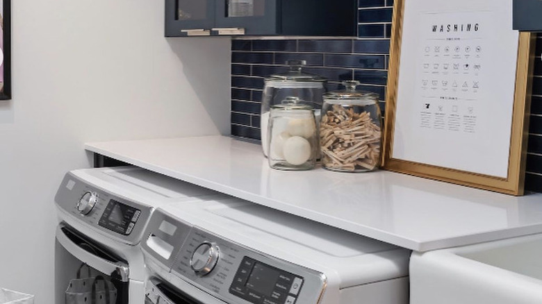
"I love to give small bathrooms and even not often thought of spaces, like the laundry room, BIG design impact!," admits Hilary Farr in an Instagram post. And that's exactly what she did with the oft-overlooked laundry room. Acting as a backdrop for the white goods, the dark blue horizontal subway tiles – a trend we're seeing a lot of this year – bring depth and interest to the space. The cabinets above the washer and dryer, showcasing in a slightly darker blue, are a genius way to counter textures without clashing.
The laundry room may not immediately be prone to sparking inspiration but Hilary Farr manages to bring a lot of visually interesting things to it. Hangers waiting to be used with clothes fresh out of the dryer hang above the white countertop, while large mason jars house the detergents, pegs, and other essentials in a minimalist yet uniform manner. A farmhouse-style deep sink is situated nearby, as well as some art to bring even more life into the space.
The basement
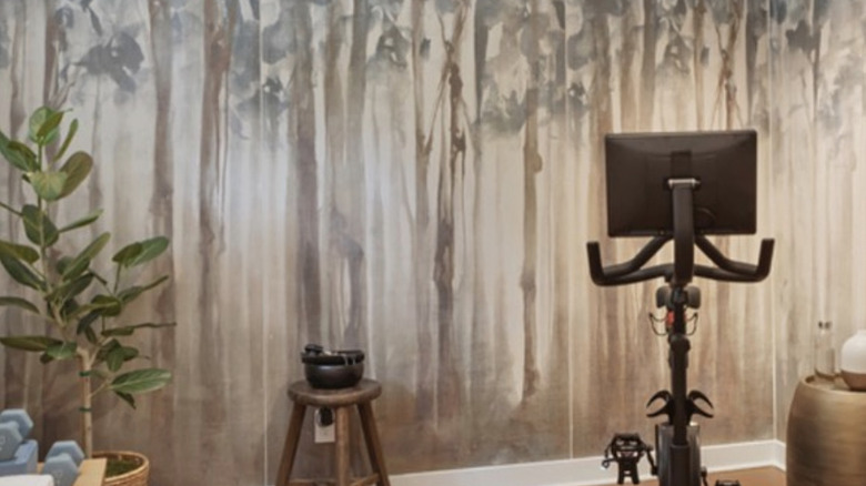
Of all the rooms in one's home, the basement is a room that often suffers from neglect. For Hilary Farr, this was an opportunity to create another useful room in her home. Thus, the gym was born. It's clear by now that Farr is in love with nature and wants to infuse it as much as possible into her decor. With her basement space, she enlisted the help of Philly-based company, Ideal Tiles, to create the perfect backdrop for her. That's right, this isn't wallpaper - it's large ceramic tiles. This takes up two of the four walls, with a neutral wall on the side of the slit window. A plant sits on the adjoining wall, adding texture and color to the space.
The tranquility is taken a step further thanks to the brass drum-shaped side table where a white and brass diffuser sits. Farr is careful not to overwhelm the space with stuff, so her gym accessories – yoga mats, dumbbells, towels, etc – are laid out along the neutral wall. A wooden bench allows for a place to sit. Another eye-catching detail about the space is the use of cork instead of wood for the flooring. Cork is a great substitute for wood and has many sustainable qualities. For one, it's fire resistant, and for another, it's hypoallergenic and great for insulating heat and sound.
The kitchen
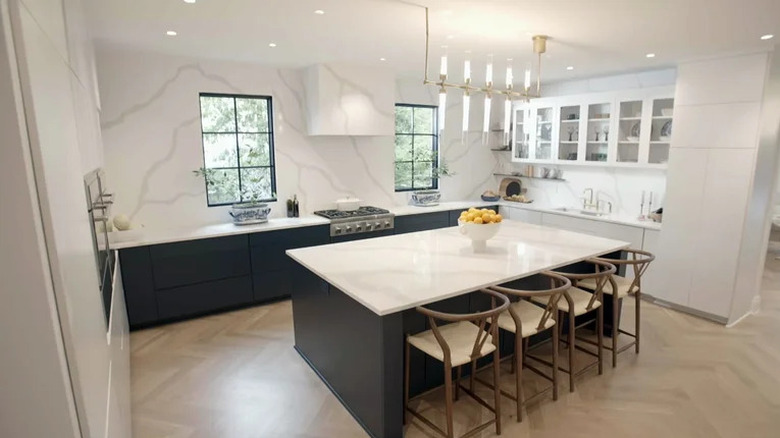
When you feast your eyes upon Farr's remodeled kitchen, it's impossible to imagine what it looked like before. With a much smaller square footage, the old kitchen was all-white and featured a standalone oven in one corner. With the renovation, Farr created yet another haven in her home. By breaking down another wall, Farr was able to achieve the spacious kitchen of her dreams. The uniformity of the veined tiles across the quartz countertops and backsplash creates a subtle texture. Farr noted that she wanted "elegance, durability and sustainability" (via Instagram). Installed by Silestone, the Statuario quartz is a great hack for more sustainable decor in the home, while keeping your home stylish. In fact, we love the look so much that we shared tips on how to steal the look.
Creating an effortless balancing act between light and dark, Farr chose to pair the bright surfaces with dark bases. Thus, the bottom of the island and one side of the low cabinets are painted black. Farr also accounted for the fact that people naturally gravitate towards the kitchen and ensured there was not only space to convene but ample seating as well. Four wooden high chairs line one side of the island, while the large slab allows for many to gather comfortably. In addition to the two large windows that let light in, the recessed lights offer even more brightness to the space. A minimalist chandelier with white lights offers the space even more illumination.

