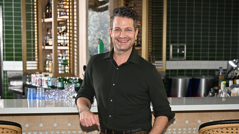
HGTV's Nate Berkus Shares His Favorite Neutral Paint Colors And They're Gorgeous
If you have ever wondered which colors Nate Berkus considers to be his favorites, wonder no more, as the HGTV star has revealed not one, not two, but eight different neutral shades that he loves the most. In a video posted to Instagram, Berkus shared, "I'm very flattered that a lot of you have been reaching out and asking me what are my go-to paint colors when I'm painting a neutral room. Are you guys ready? Because here they are, once and for all, I'm sharing the swatches that I use most often."
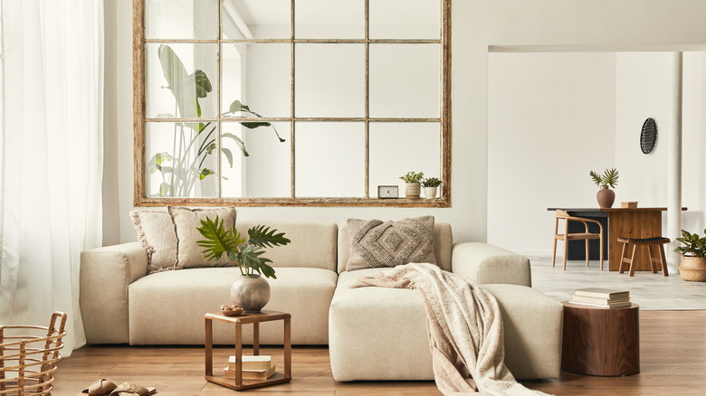
Long known for his love of neutrals along with his partner Jeremiah Brent, Berkus seemingly appreciates how neutrals are the base to creating a room you adore. "'What I love about neutrals is that they provide the perfect backdrop to then make the room what you want it to be," he previously shared with Homes & Gardens, and now you too can know exactly which neutrals Berkus uses to make that perfect backdrop. Get ready to rush to the paint store, as here are all the neutral paints Berkus reaches for when he's in the decorating mood.
Now you can get your hands on the interior designer's favorite neutral paint shades
The interior design pro started out by sharing his key Benjamin Moore paint picks. This brand is a favorite amongst interior designers like HGTV regulars the Property Brothers, who featured the brand in their favorite paint color picks. Nate Berkus' most reached-for Benjamin Moore shades are "Alabaster," a fresh white with pink undertones, "Swiss Coffee," a go-with-everything white shade that's infused with warmth, "Smokey Taupe," a versatile gray shade with warm undertones, and "Snowfall White," a precise bright white guaranteed to brighten up any room.
As well as his favorite Benjamin Moore paint shades, Berkus informed fans of his must-have shades from Portola Paints. His first pick was "Saint Sauvant," a neutral white color with hints of gray for an earthy touch. Next was "Lisbon," a sea-foam green-gray perfect for rooms you want to feel calm. Berkus called this shade "a beautiful color," adding that it was used in his children's bathroom. Finally, Berkus shared his favorite paint shades from Clare, highlighting "Fresh Kicks," a super bright, no-fuss white, and "Flatiron," a greige shade inspired by NYC architecture.
Nate Berkus and his partner have long loved neutral shades
You may have noticed that almost all of the paint colors chosen by Nate Berkus feature warm undertones (the exceptions are "Snowfall White" from Benjamin Moore, and "Fresh Kicks" from Clare). Unlike cold undertones, which can make a space feel businesslike, warm undertones help to create a cozy feeling in a home. The above colors are not the only time Berkus has shared his favorites paint shades, though. The designer teamed up with Behr Paint in 2023 alongside his partner Jeremiah Brent, and the pair revealed their three favorite paint shades from the brand.
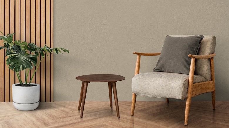
The design duo chose "Tranquil Gray," a soft taupe-gray that's on theme with the delicate warm neutrals Berkus has solidified as his picks, "Even Better Beige," a beige shade that will work just about anywhere, and "Blank Canvas," an unassuming white that's full of warmth. Warm neutrals will work in literally any room in your house. If you're worried about an all-neutral space looking visually dull, opt for a color like Portola Paint's "Lisbon," which still has a neutral vibe but is infused with extra color. Gray-green, i.e. the color of Reese Witherspoon's kitchen cabinets, is a huge hit with designers and carries a soothing vibe, so it makes sense that Berkus chose it for his children's bathroom.