Avoid These Paint Colors When Painting Your Patio
When painting a patio, the right color will need to work well outdoors on both an aesthetic and functional level. This is why home experts typically warn against colors that are too bold, too dark, or too complex. Dark blues and blacks don't work well for patios because they retain heat, making them uncomfortable to touch when it's hot and therefore impracticable in warmer weather. Super bright colors, busy patterns, and striking color combinations, on the other hand, overwhelm the space.
The paint color you choose for any part of the house should be in line with what you want to communicate about that space. Keeping this in mind, the patio should feel connected to the rest of your home to make everything feel cohesive, so you should avoid colors that make it feel too different. The wrong paint color affects the way you experience the patio and can even affect your home's resale potential.
Paint colors and types to avoid
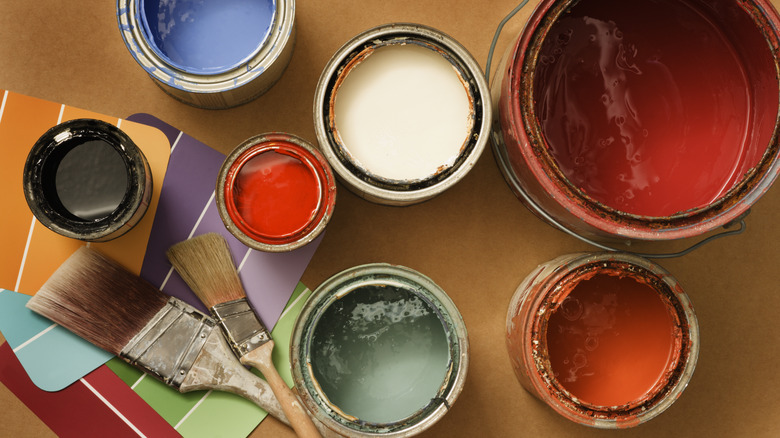
Bold, dark, or complex colors and styles should be avoided because they affect the appeal of the patio. Dark colors can suck the life out of the space, making it feel dull and spiritless, while bold designs and colors can drown out whatever else you have on the patio. Instead of harmonizing with the surroundings, they can clash with it. Overly vibrant colors can also fade more quickly when exposed to sunlight. Patterns like stripes or other trendy designs can quickly become outdated and need to be changed. These types and styles can also make the home less attractive to any possible buyers down the line since they are based on personal tastes and therefore less likely to be appealing to a wide range of people.
On the other hand, very light colors like pure white and pastels should also be avoided. While they are much calmer, they can be stained easily and will require frequent cleaning and maintenance to keep the patio looking good. Go for something more balanced and simple as it will be more versatile.
Colors to consider instead
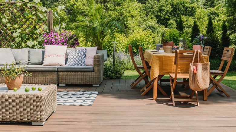
When painting your patio, you want to keep things simple while considering versatile colors. Neutral earth tones, as recommended by Behr, are excellent choices as they blend well with the outdoors and create a calming and inviting atmosphere. Light shades of blue and green also feel connected to nature and can evoke a sense of serenity. A neutral color like gray, which is on the cooler side, can lend a modern and contemporary look to your patio, creating a sophisticated and sleek outdoor space. Want something a bit brighter? Consider a muted shade of red, yellow, or brown. They will make the space feel lively without being overwhelmed.
Whichever color you land on, it should be a high-quality paint finish that can withstand elements and last for a long time. It needs to be easy to clean and slow to fade. When you've settled on your color, test your options with swatches to see how they look in different lighting conditions and at different times during the day — just as you would for choosing an interior paint color.