Ina Garten Makes A Great Case For Simple Paint Colors In The Kitchen
Ina Garten's design ethos when it comes to her kitchen is that things should be as simple and as streamlined as possible. "I think the kitchen is not a fancy place, it's a very simple, quiet place," she told House Beautiful. "Once somebody wrote about my kitchen, 'It's a kitchen with nothing to prove.' It's not impressive, it's just a great kitchen, it functionally works really well."
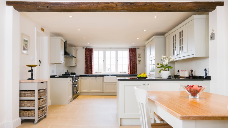
The Food Network legend has previously used a cool, neutral shade of gray for her kitchen walls because she believes in using simple colors in this space. For her, the wall color matters as much as the décor and the overall design. Neutral paint colors can easily complement various kitchen styles and highlight certain features. They can blend into the background and act as a backdrop for any elements you'd like to feature. In Garten's case, she wants her food and ingredients to be the main star. Another benefit of keeping the design simple is that it makes the room always appear orderly.
Why simple paint colors work in the kitchen
In addition to being a neutral canvas, using simple paint colors in the kitchen can be beneficial for their timelessness, airiness, and versatility. In Ina Garten's old kitchen, she kept most of the items white and stainless steel so they could all easily match. Now with her recent kitchen renovation, she has stayed committed to the simplicity of neutral colors. Her beige walls, white plates, and marble countertops, as seen on her Instagram, create a great backdrop for her food to shine.
Neutral colors tend to be less trendy and more classic, meaning they won't go out of style quickly. This is especially important in the kitchen, as it is a space where you want your design to remain appealing for many years. Additionally, if you do desire to switch up the décor, having a simple base color on the walls allows you to make those additions or modifications with ease. Light paint colors like beige can also make a small or dark kitchen feel more open, bright, and spacious. They reflect more light, creating the illusion of a larger and more inviting space.
Complementary features and accent walls
Simple colors on kitchen walls can be complemented by other features to add visual interest to the space. In her new kitchen, Ina Garten has a black and gold Lacanche stove, a gallery wall of framed photo prints of food, and a colorful cookbook collection on the counter. She also decorates her island with two vases filled with perfectly-arranged flowers (via Instagram). These bring in different textures and pops of colors that only work as well as they do because of the simple walls.
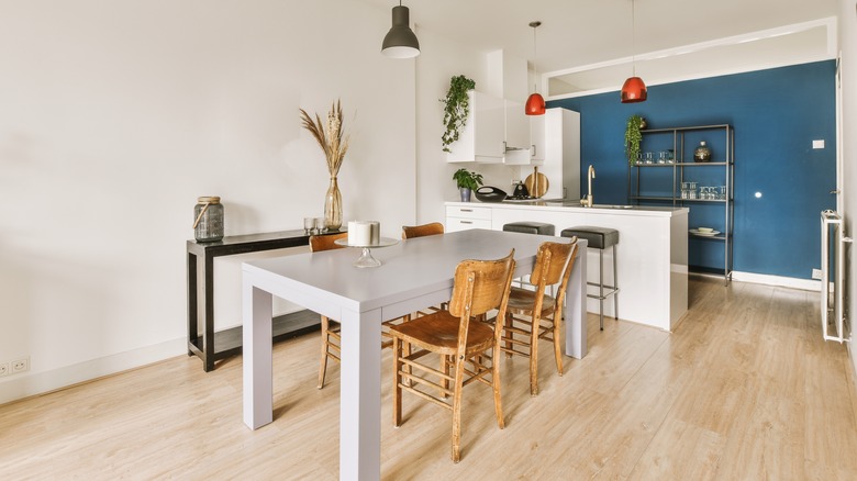
The wall behind her shelves, however, is painted a deep black shade. While this is still a simple color, it adds something interesting to the space without being too noticeable, as it sits behind the white shelving. Using more than one paint color by having an accent wall, even when it's in a neutral shade, is another way to make your kitchen design look more interesting.


