The Property Brothers Unveiled Their Favorite, Timeless Paint Colors
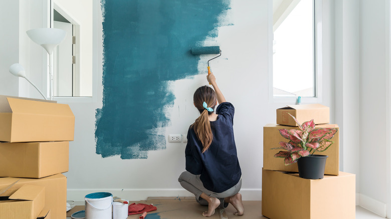
Drew and Jonathan Scott are paint experts due to their many years of renovations, and through the years they have perfected their taste in colors. Per Taste of Home, the Property Brothers believe that the following paint colors will never go out of style, so keep them in mind next time you're making over a space.
The first color Drew and Jonathan love to use is "Chelsea Gray." A sophisticated gray shade with brown and violet undertones, this chic color will add a refined atmosphere to a space. As it's a neutral shade, "Chelsea Gray" is the perfect choice for kitchens — Jonathan and Drew clearly think so too, as they used the paint color for custom kitchen cabinets during Season 7 of "Property Brothers: Buying and Selling."
Generally, neutrals are considered to be timeless because, unlike color trends, they don't come and go. Plus, you can use neutrals pretty much anywhere — in your bedroom as a grounding color, in your living room for a calming ambiance, or in your kitchen to balance out a brighter accent wall. Additionally, "Chelsea Gray" would look great in an upstairs hallway or along the stairs as a transitional paint color.
The Property Brothers recommend this staple shade

The second shade Drew and Jonathan Scott reach for time and time again is "Cloud White." Not quite a strong white also not quite in the realm of cream or even ecru, this paint color is a true classic neutral. The brothers think that "Cloud White" is a great shade for behind a fireplace wall. While bright whites can age badly (and give your home an unwelcoming, business-like aura), cream can look dated and old-fashioned.
A color like "Cloud White," which mixes these two shades, bypasses both of these issues to create a truly timeless look. It's also a solid accent color if you want to experiment with paint trends or an accent wall, as it won't clash with brighter colors or look too unassuming in a room.
Due to the creamy undertones of "Cloudy White," it's the perfect shade to pair with pastels like lemon yellow, particularly in a bedroom. For example, if you painted your bedroom walls "Cloudy White," opting for lemon bedding and accessorizing with a few light yellow plant pots would transform your bedroom into a sunny, welcoming space. Or, try using "Cloud White" in your bathroom and add in shades of blue for a vintage seaside-inspired look.
This luxe shade is a color not to be missed
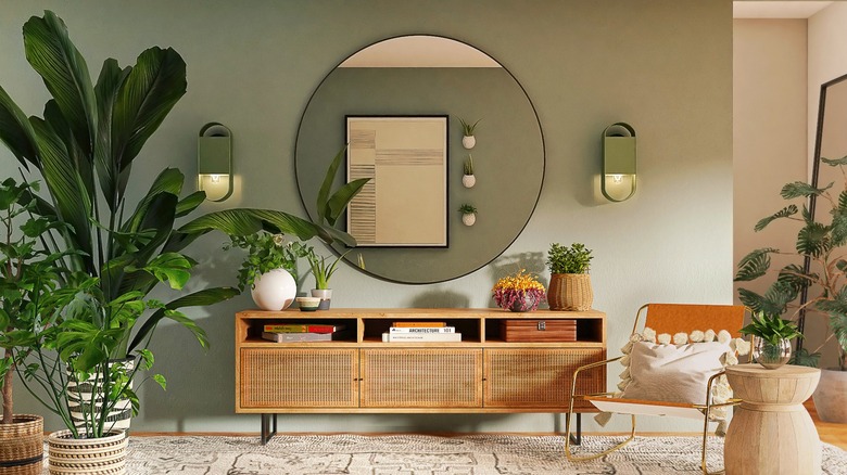
The Property Brothers' final timeless paint choice is "Grenada Villa." Technically another gray shade, "Grenada Villa" differs from other gray paints because of the strong green influences it contains. The brothers recommend using the unique gray-green color in your kitchen, and we think it would look gorgeous used for cabinets or a kitchen island. Alternatively, Drew and Jonathan Scott say that "Grenada Villa" is a good color choice for your front door, too. You could even continue the shade into your entrance space so you feel relaxed from the moment you step in the door. A shade like "Grenada Villa" would also infuse nature into your bedroom, creating a zen-like oasis for you to relax in.
In general, gray-green is a popular color choice among interior designers — Reese Witherspoon even chose it for her kitchen cabinets. However, the Property Brothers have long been partial to using green in their homes. In a video uploaded to his and Drew's YouTube channel, Jonathan showed off his kitchen, which features tons of different shades of green, including softer gray-green and brighter bottle-green hues. Meanwhile, in an episode of "Brother Vs Brother," Drew opted for dark green tiles in his bathroom.