Joanna Gaines' Top Tip For Embracing Bold Paint Colors
Joanna Gaines is known for a love of neutral-heavy designs, which have dominated her HGTV and Magnolia Network career and formed the backbone of what we know as the modern farmhouse aesthetic she's popularized. It may then be surprising to discover the designer has some sage advice when it comes to introducing new and bolder colors into interiors. In a recent interview with Elle Decor, Gaines' tip for homeowners drawn toward certain bolder shades and colors was to "just go for it."
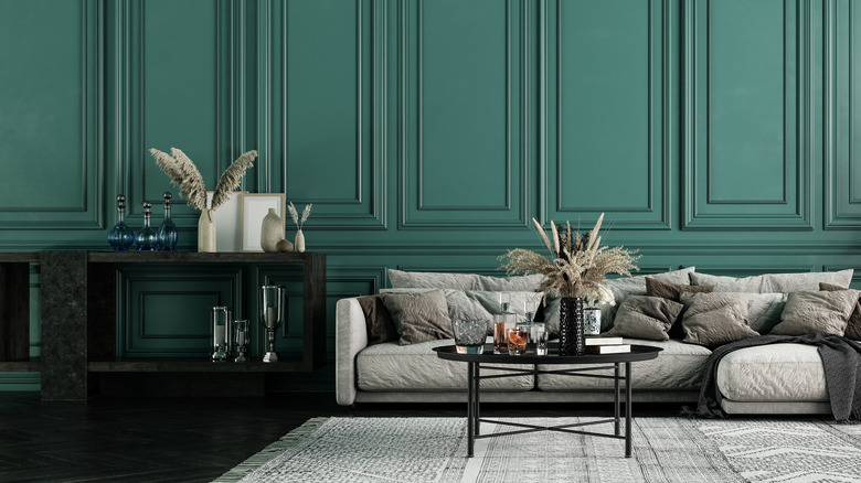
The proof is evident in Gaines' own designs, both for her home and the spaces she creates for others, including a relatively newfound love of deep greens. Gaines' design tastes, as a whole, have been moving toward a deeper array of colors. Many of these, like forest green, sage green, slate blue, and midnight blue, have been cropping up in homes on everything from walls and trim to painted furniture and cabinetry.
Shifting trends toward color
While the past decade has heavily favored minimalist, chic, neutral spaces incorporating shades like white, cream, taupe, and black, these new directions in color are an exciting time, which Joanna Gaines herself has felt an evolution toward. "Color is the biggest extension of our personality and style," she explained to Elle Decor, "and I've loved letting myself evolve in this area as a designer over the years." Gaines has demonstrated this change in a proliferation of rooms painted in shades other than white and cream, but also throug the introduction of more color in terms of textiles, accents, and wallpaper.
Gaines' evolving love of colors appears to be a trending wave among the design community, many of who have been calling certain colors the "new neutrals," a slate of adaptable shades like green, blue, and terracotta. These nature-inspired colors are often a gateway to more color in design schemes due to their amenability to other neutrals and accent colors in every family. Even alone, these new shades offer more depth and dimension than conventionally neutral spaces. It's a trend that's evident in design aesthetics like the grandmillennial, cottagecore, and other more maximalist styles that use color much more liberally overall.
Adding color to your space
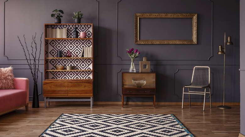
Joanna Gaines' advice to "go for it" when it comes to bolder tones and colors in your home, may set the heart of some homeowners aflutter with anxiety over somehow doing it all wrong, but according to the designer, you should embrace the shift. "If it seems a little scary, start small," she advised (via Elle Decor). Even minor doses of color can have a huge impact on creating depth and dimension in a room. If it's a color you love, it also makes the home more personal and distinctive.
Try using a favorite bold or dramatic color for a small space like a hallway, powder room, or entryway. You can also slowly introduce painted pieces like tables, dressers, and cabinets in richer colors into otherwise neutral spaces. Sticking to shades of the new nature-inspired neutrals may also be a perfect transition, since these colors, especially shades like soft green and pale blue, still have the calming allure of neutrals. Darker, more vivid colors often have the effect of toning each other down in proximity to each other. This is why combined jewel tones like deep purple, magenta, and plum are a stunning combination that adds drama but doesn't overwhelm the eye.