The Massive Paint Mistake Nate Berkus & Jeremiah Brent Warn To Avoid Making At All Costs
Married interior designers Jeremiah Brent and Nate Berkus are experts when it comes to all things decoration, and the design duo has some advice about picking paint for your home as well as the mistake you definitely want to avoid. Speaking to Homes & Gardens, Brent revealed that you could be making a huge mistake by not thinking about the lighting in a room and the impact it can have on a paint color.
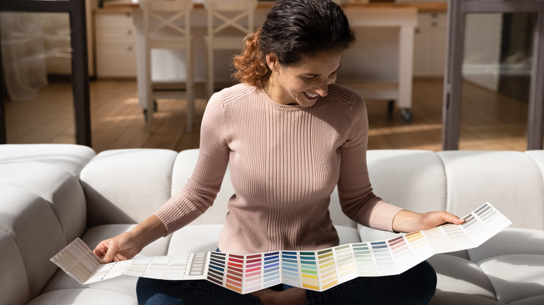
"People often choose their paint color without considering the lighting of their actual space," he shared. "What you see in a store with fluorescent lighting is very different from the natural light that will change with every hour in your home." For example, you may love how a paint shade looks in broad daylight, but the dimmer light your home receives in the evening may produce a less flattering color.
To avoid this mistake and see how a color can change due to light levels in the morning, afternoon, and evening, Brent said, "I recommend gathering swatches of paint, putting them on the wall in the actual room you'll be painting, and watching how their hue evolves throughout the day."
Think about how a color will look in various rooms and lighting levels
Nate Berkus additionally told Homes & Gardens that getting an idea of how a color will fit a room is key to finding the right shade. "Experiment with a couple of color options and live with them for a day or two," he recommended. A color that looks great in your kitchen full of natural lighting may be too dark in your windowless utility, and vice versa.
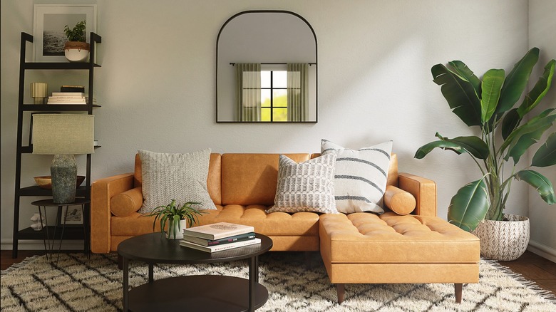
Feeling unsure about where to start with picking out colors? Color trends come and go, but neutrals are forever. Jeremiah Brent and his husband believe neutrals will always be fashionable, telling Domino they particularly like gray and beige. However, their chosen shades of gray and beige aren't the typical dull hues you may be thinking of. "I don't love a cool blue-gray. I don't think it ever reads as sophisticated," Berkus shared, adding that gray shades with brown have a more luxe feel.
As for beige, Brent called it "the most timeless thing in the world," revealing that he prefers beige shades that have a hint of khaki for versatility and avoids beige shades with yellow or green bases that are reminiscent of "Under the Tuscan Sun." No matter the paint color you're drawn to, use the above tips to see how it looks in different lighting before you commit.