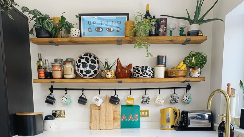
16 Shelfie Ideas To Display Your Favorite Accessories With Style
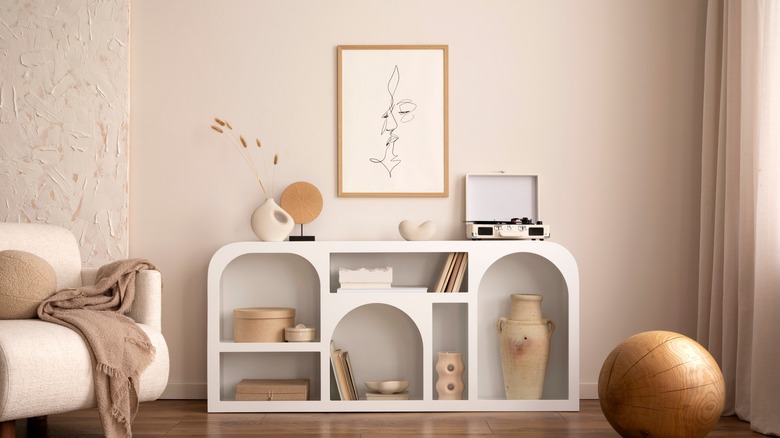
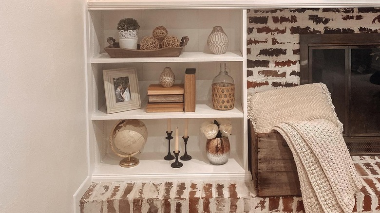
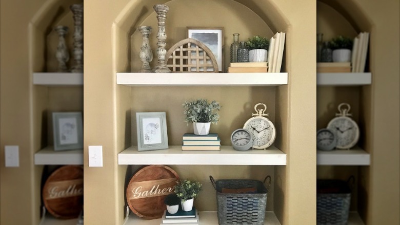
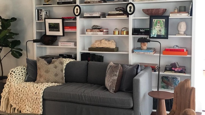
Have you ever been scrolling through Instagram and seen an image of a beautifully-styled shelf filled with items like books, artwork, knick-knacks, and other decorations? If so, what you were looking at was a shelfie. This term is used to describe a picture taken of a well-decorated shelf, which someone then posts to social media. Perhaps, when looking at these gorgeous spaces, you've wondered how they achieved such an Instagram-worthy look and if you can do the same.
If so, you can create a similar appearance by using the 16 ideas on how to make your shelves ready for social media below. These focus on different ways to arrange your decorations in order to create a satisfying look. Depending upon your preferred style and interests, your display will look different than the rest, since it will be personalized to your tastes. To get started on decorating your shelves, the best thing to do is empty off the surfaces, clean them thoroughly, and gather the decorative items you want to arrange.
1. Flip books around for a neutral look
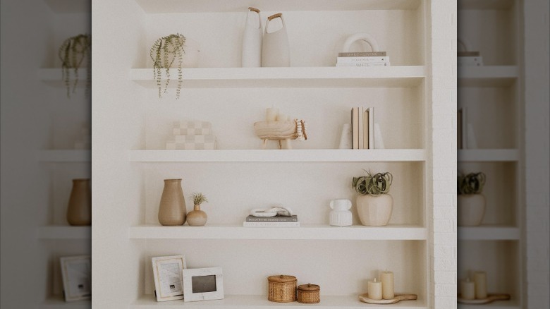
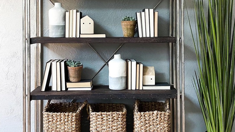
When styling your shelves, you may find that one category of items isn't Instagram-worthy: your colorful books. If you're going for a neutral or subtle look, you don't need to buy all new books. Instead, simply flip around the ones you have so that their neutral pages are facing outwards, which will hide their bold covers.
2. Layer items of various sizes
Instead of lining all your items up in perfect rows, try layering them in front of and behind each other. This will create a more interesting and textured appearance that takes your display up a notch. Typically, abstract pieces of art make great layering pieces, as they can easily be placed behind smaller items. You can also create a layered look by positioning small plants and vases on top of stacks of books.
3. Hang artwork on the shelves
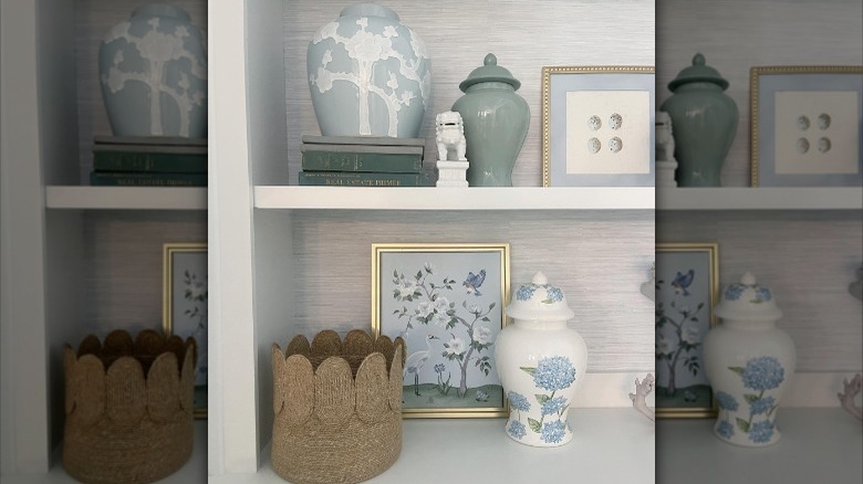
A trendy design hack, hanging framed artwork on the corners of your shelves will give it more life and dimension. The art will really stand out, since it's placed on the exterior part of the shelves, which will make your design really pop. Further, this can also help your bookcases look less cluttered, as the picture frames will take attention away from the items on your shelves.
4. Position similar items together
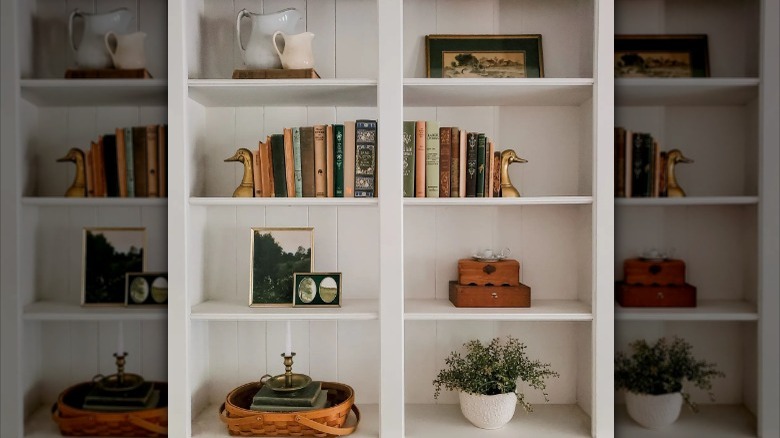
You may be tempted to place similar items on opposite ends of your shelving, as this would provide your design with a symmetrical look. However, to get an Instagram-worthy appearance, this isn't the best styling method. Instead, many group similar pieces together, which results in an asymmetrical and more dynamic display. It also prevents your shelves from looking too cluttered, as too many different items haphazardly placed could create a chaotic look.
5. Frame photographs with thick mats
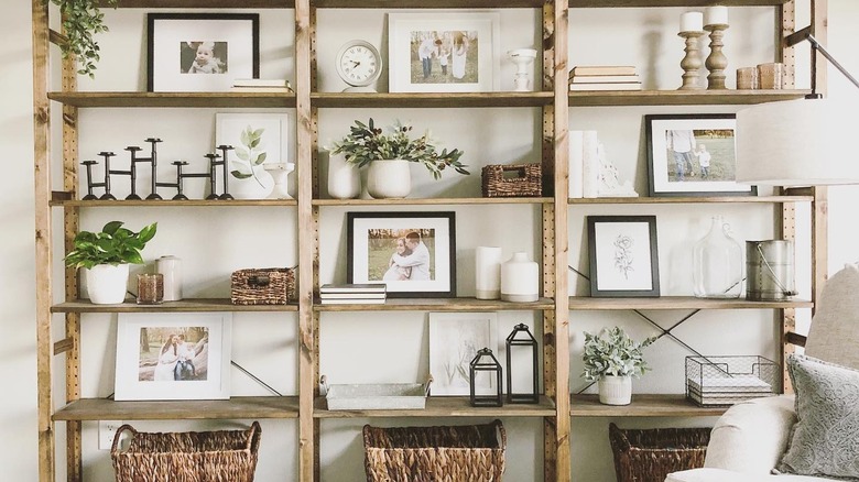
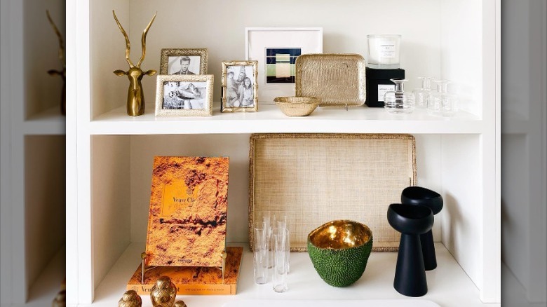
If you're going to decorate with photographs in large frames, it's best to use wide, white mats. This will give your shelving a clean and orderly appearance, since all the photos will look like they belong together. It will also draw more attention to the images, as they'll each have a pure white border surrounding them. If you want an extra uniform look, only use black and white photographs.
6. Embrace empty space
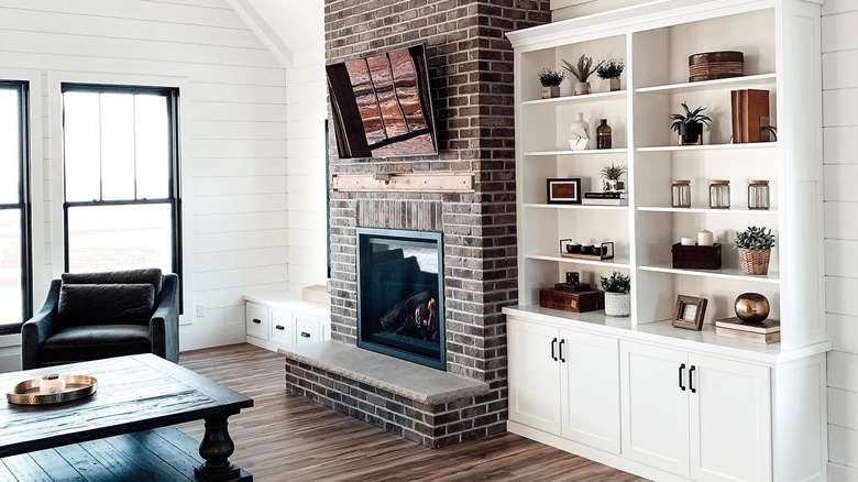
Another key ingredient to shelves that are ready to be photographed for social media is that they never appear disorderly or overwhelming. The best way to achieve this look is by using empty space to your advantage. You don't want all your shelves to be completely filled; Instead, include some breathing room, as this will allow each decorative item to really shine. If you stack books or place similar small pieces together, you can treat these groupings as one item.
7. Don't forget the plants
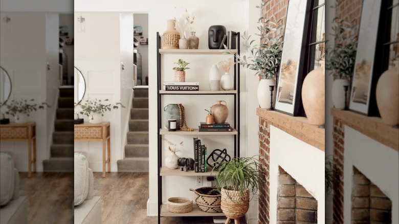
If you've spent any time looking at styled spaces on social media, you know that plants are a must-have. Greenery makes your design come alive and gives even the most neutral arrangement a small sprinkle of color. Those who have a green thumb can use living plants, but there are also plenty of faux types that can be made to look just like the real thing.
8. Contain clutter inside baskets
Perhaps you have possessions on your shelves that don't fit your aesthetic or that contribute to a cluttered appearance but you're not ready to part ways with them yet. If so, contain these items inside baskets, which could be made out of wicker, wire, fabric, or any other material. Or, if you want to completely hide away your pieces, use boxes with lids, which you could stack on a shelf and display as a decoration.
9. Only use items within a color palette
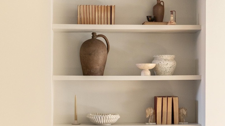
No matter what style you enjoy, limiting your items to a certain color palette could greatly benefit you. To choose the right shades, look to the rest of the room for inspiration: What two or three colors are mostly used in the space? Then, you can focus on these colors while also sprinkling in white, black, metal, and wooden materials.
10. Focus on odd numbers
In the world of interior design, it's a general fact that displaying items in odd numbers looks visually appealing. For example, in the image above, two of the shelves have three plants and clear vases placed in a line. Typically, most choose to use groups of three, since this guarantees that your space won't look too disorderly. However, if you have a large shelf you're trying to fill, groups of five or seven could also work.
11. Prioritize bigger items over smaller ones
While smaller knick-knacks may showcase your personality, they can also make your shelves look less appealing. This is because smaller items take up less space, so they could make your shelves appear too empty. Another problem you may face is that, if you use too many tiny pieces, you could produce a disorderly design. Instead, choose larger items like sculptures, vases, baskets, and books whenever possible.
12. Group small items together
However, perhaps you have small items that you want to display and you can't be persuaded to hide them away in a basket or box. If so, the key to styling with tiny pieces is grouping them together. For instance, if you have a few minuscule framed photographs, place them all in one area of the shelf. Small candles, glasses, and sculptures can also be placed near each other to make them look like one larger item.
13. Follow a specific grouping method
To make decorating shelves as simple as possible, some recommend following a specific grouping method. If you're working with a skinny shelving unit, placing everything in the middle of the shelves looks great. If the shelves are larger, you could place two groups with a space in the middle on each one. Or, you can even alternate between the middle and the edges as you move down the shelving unit. These options are perfect to showcase on social media, as they're guaranteed to make your items appear symmetrical and well-organized.
14. Mix textures and materials
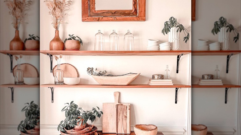
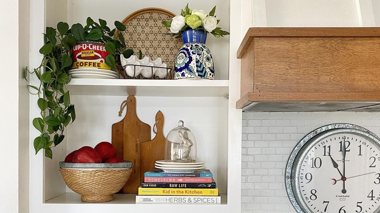
Instead of keeping everything the same material, try mixing in various textures. For instance, the wicker bowl, ceramic dishes, wooden cutting boards, trailing vine, and glass accent piece all make the above shelves appear dynamic. Another way to add a textured look is by including something with a pattern, like the blue floral vase on the upper shelf and the tray behind it.
15. Only use black and white
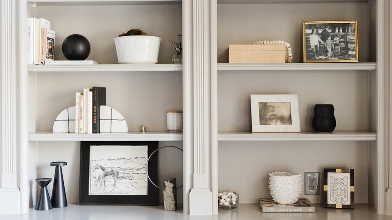
If you love a modern or minimalist look, you could focus on just adding black and white decorations. This means that not only will the vases, sculptures, bookends, and other items be one of these shades, but the photographs and artwork will be as well. To add more interest, mix in metals like gold or silver and plain neutrals like beige.
16. Make it personal
When styling shelves for Instagram, it may be tempting to choose the most trendy, neutral, and generally well-liked pieces. However, while this can look stunning, remember that it's most important to create a display that showcases your personal tastes. If you like bright colors, bold patterns, and funky artwork, then you should include those elements. Focusing on your interests will allow your personality to shine through the photograph and make your shelves look well-designed and beautiful.
