Foyer Design Mistakes To Avoid
Every square foot of your house's design matters, but there are some areas that need a little extra attention whether you're designing them for the first time or doing a re-design. While areas like the kitchen and living room are more obvious, there are some places in the home that need a lot of attention that may not ping your radar right away. Your home's foyer is certainly one of these areas. According to House Beautiful, it only takes 38 seconds for guests to judge your home once they enter, so it's imperative that the first area they see—your foyer—is up to the task of representing your house as a whole.
The foyer is also one of your house's highest-traffic areas, making it easy to incorrectly design if you do not consider several key factors. By avoiding classic foyer design mistakes and considering these updates to your foyer, you can be certain that the entryway to your home will bring the wow factor without sacrificing function.
Crowding
No one is going to be hanging around in the foyer, so it can be tempting to fill up all that empty room with different items. However, over-crowding the area is a surefire way to make your entryway feel crowded, messy, and small. Does that mean that you should keep the foyer as empty as possible? Certainly not. Finding the right balance is key to making your entryway feel more inviting.
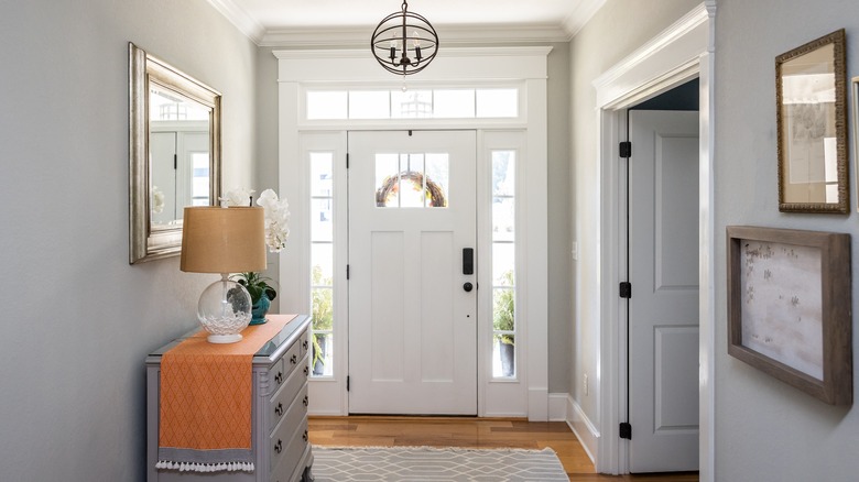
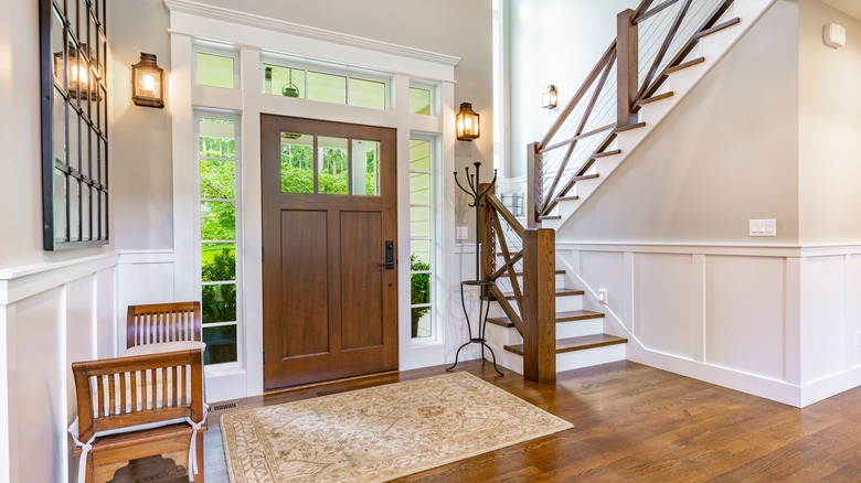
The first thing to look at is fixtures. Once you've put up your floating shelves, mirrors, key pegs, art, and extra lights, is there any blank wall left? Try to break up the décor so that it isn't all clumped together or too overwhelming. For fixtures hanging from the ceiling, make sure they don't hang low, and don't go overboard with the amount you install. The same can be said with furniture. Once again, it's certainly tempting to fill all that empty space with things like seating, storage, and decorative pieces, but the amount of furniture in the foyer should be rather sparse, giving those entering your home room to loiter for a moment and remove their shoes. Having empty space on the walls, floors, and ceiling will open the foyer up and keep it from feeling claustrophobic.
No seating
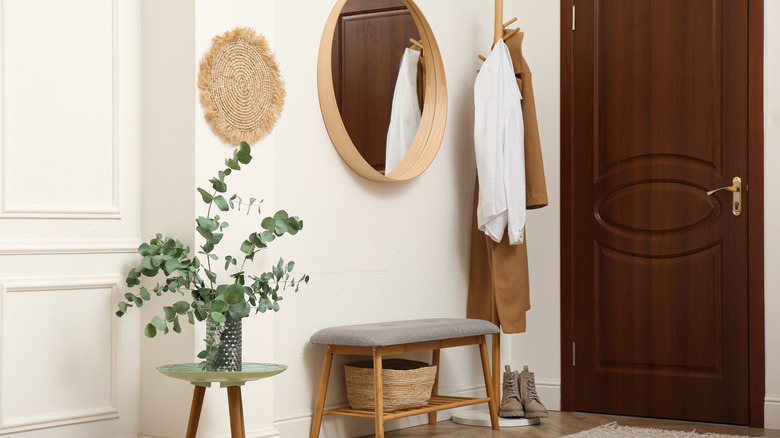
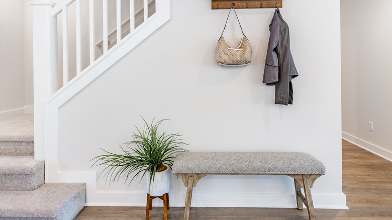
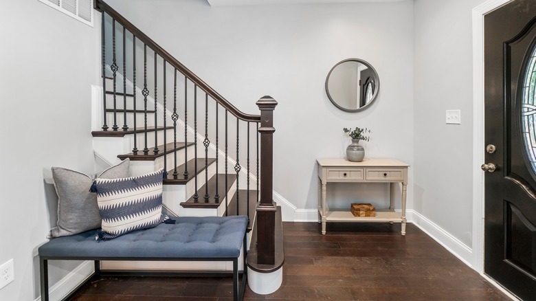
If you have kids, you're probably aware that getting shoes on and off can be an ordeal if they don't have anywhere to sit. The same goes for adults, even if not everyone voices it; complicated lacing, straps, and buttons can make removing shoes a nightmare while standing. Furthermore, not everyone is physically able to stand while removing their shoes. So, if you expect people to remove their shoes before entering your home, seating in the foyer is a must. And, if you choose a storage bench, your seating can do double duty as storage space.
Seating has other advantages, too. Waiting on your spouse to get their things together before you go out the door? Take a seat and check your phone for emails before you head out. If you're juggling groceries as you enter the home, having a place to set them down that isn't the dirty floor can really help with getting everything inside without a hassle. If you're throwing a party and run out of closet or hook space, having a place for guests to lay their coats that isn't your bedroom or the back of a couch is a huge plus. Without somewhere to sit, your foyer may as well be a breezeway.
No storage
When it's just you at home, leaving a pair of shoes by the door can actually be a cute look that makes your home feel lived in. But if there are multiple people in your home, or if you tend to cycle through which shoes you wear, you probably know how essential storage is.
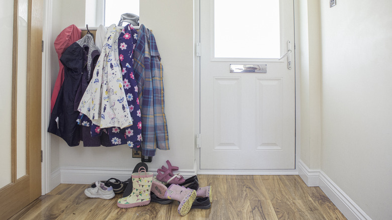
Many people think that having storage somewhere else in the house suffices. For example, having an area for your shoes and coats in your bedroom closet. That plan only works if you're that rare, super-powered kind of person who doesn't want to just drop everything the second they get in the door. Moreover, if you have no storage for your guests' outdoor clothes when they come over, you're likely to get an unsightly pile of shoes and jackets at your front door that neither you or your guests will appreciate.
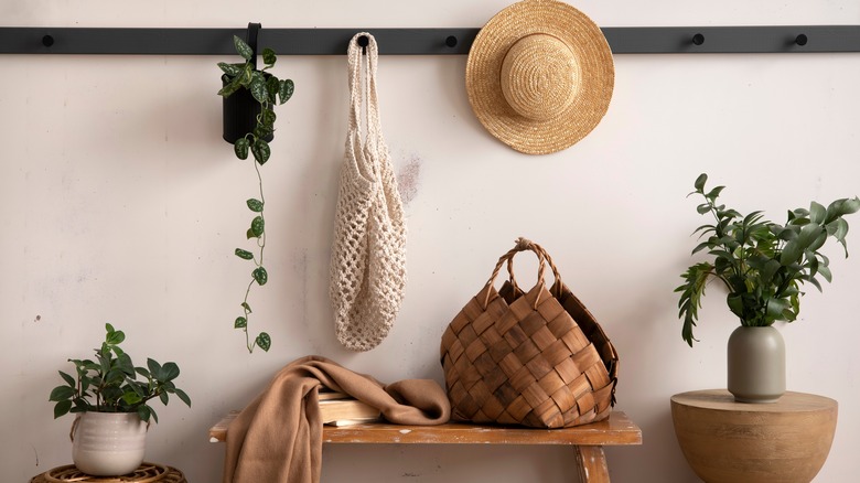
Having a place to store shoes, coats, umbrellas, reusable grocery bags, and other in-and-out-the-door items is essential for your foyer. Something as simple as a few baskets beneath your seating or a couple more rows of coat hooks can make a huge difference in the functionality and look of your foyer.
Dim or dark
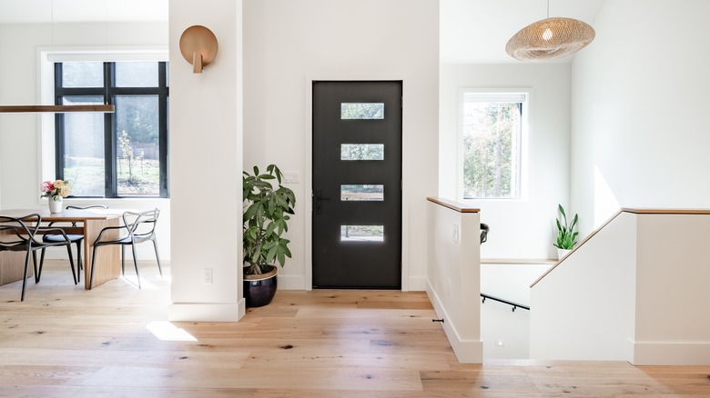
Nothing can make you feel more unwelcome in a home than walking into a dark entryway. It's at the start of every scary movie; the main character steps from the brightly lit sidewalk and into a dim foyer leading down an equally dark and creepy hallway, just before the bad guy pops out. You want your home to give off a warm and welcoming impression from the very first second anyone steps past the threshold. The key to this is a brightly lit area, preferably supplied by plenty of natural light, but at least illuminated by lighting fixtures if no natural light is available.
If you are worried about privacy concerning your foyer and have heavy curtains blocking out the natural light, consider privacy film to cover your glass with, as it will keep unwanted eyes from prying into your home, but will allow the light to filter in. Make sure you have plenty of overhead lighting for evenings and cloudy days; having plenty of light to navigate taking shoes off is important. Regardless of function, it is important to have a well-lit entryway for the overall look of your home, too. Many foyers are rather small when compared to other rooms in your home, and a lack of lighting will only make them feel smaller.
Not paying attention to scale
Finding the right furniture for your foyer can be difficult. A bench that looked adorable in the store may look awkward and clunky when you actually get it set up by the front door. The answer to this problem is the scale of the room. A full-sized ottoman makes a great seat, but might not fit in proportion to the room. In general, any furniture specifically made for the living room is likely to feel too large in your foyer, even if the furniture piece in question is relatively small. It's best to look for furnishings specifically created for the foyer or intended to be accent pieces, like in the case of entryway tables. A good general rule of thumb is that you can pick pieces with length, but keep the width skinny so that it doesn't take up a lot of walking space or block how far the door can open.
Pay attention to the scale of all the elements together. An oversize mirror may look great on the wall, but next to a short, skinny bench, it may look awkwardly huge. The same can be said of an exceedingly low table next to a taller bench, huge storage cubbies with small hooks, and other out-of-scale items that won't mesh well together.
No entryway mat
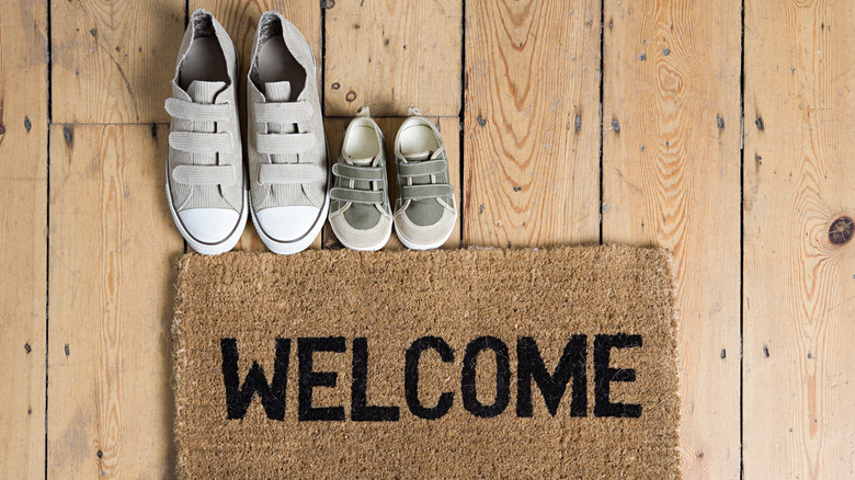
According to Hartford Healthcare, shoes can track in plenty of germs, some of which are resistant to household cleaners, bring in chemicals and toxins, and carry allergens into the home. While the easiest way to avoid bringing in these elements may be to simply remove shoes upon entering a home, you can't always expect your guests to. Some people are uncomfortable with removing their shoes; you may be one of those people yourself. There are also frequent instances where even those who regularly remove shoes before coming inside may be unable to do so, such as is the case when someone has full hands. A simple compromise is an entryway mat, where you and your guests can wipe your feet before coming inside.
After all, there are certainly plenty of other things we track inside that can be seen, and having an entryway mat isn't just a solution to this–it's also a good nonverbal reminder. People are far less likely to leave puddles of water, muddy footprints, or clods of dirt inside if a welcome mat is present. You can save any carpet and rugs in your home from being ruined, and cut back on the need for constant cleaning in the foyer.
Not taking sight lines into account
For a fully cohesive home that feels beautiful and functional, sight lines are everything. River Studio Design writes that sight lines naturally draw the eye through the home in a sense of flow and cohesion and that interrupting those lines is exactly how you throw the balance of your home off kilter. The big one for this is interrupting the ability to see from one area of the home into the next with obstacles. This could be a poorly placed bookshelf, a potted plant, or even a pendant light; anything that takes away from the natural flow from one area to the next by demanding attention.
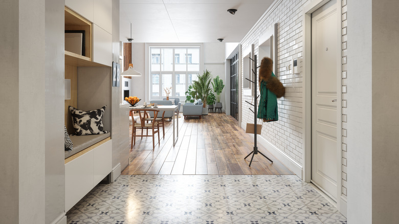
The foyer's need for sight lines is critical as the first room in the house. A view down the hallway, up a set of stairs, or into the next room should not be obstructed. Furthermore, there shouldn't be anything that makes that transition stop without an object, either. For example, a sudden color pallet change between the foyer and the rest of the house, or a design switch that doesn't mesh well, can completely obliterate the sight lines between your foyer and the rest of your home. Keeping the style of your home in relative cohesion will greatly help with this, and having transitions between one area and the next melt into each other instead of acting as hard stops will do the rest.
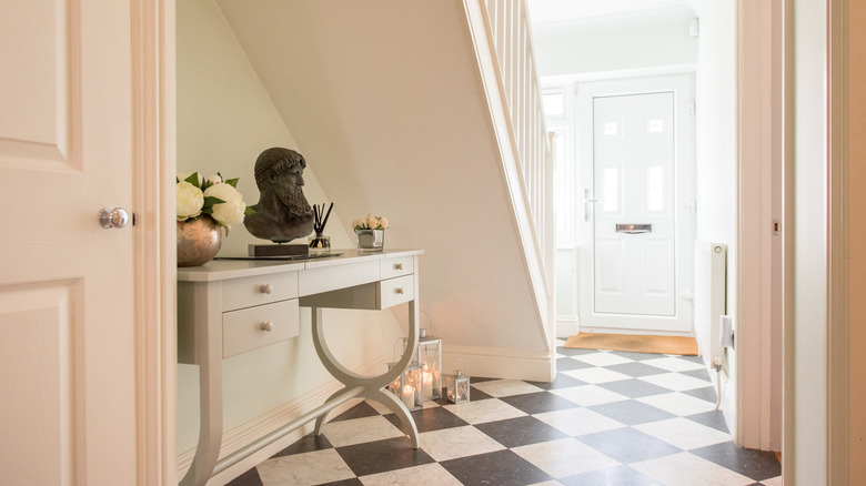
Porous tiles
As beautiful as things like slate, marble, and natural stone are, they can become a complete nightmare as flooring in high-traffic areas. Cleaning porous tile is a long, tedious process, and oftentimes these tiles stain permanently. While porous tile sealer does exist, it is certainly not infallible, and in areas that are likely to bear the brunt of tracked-in dirt and a lot of foot traffic, it can be nearly impossible to maintain. Even with sealant, your tile can still stain, just not as deeply. This is because porous tile and stone soak up water and then stain deep within the tile's pores, making it incredibly difficult to remove. For your foyer, you will want to find negligibly porous tile, such as porcelain, or at the very least low-porous tile, like granite.
No matter how well porous tile may go with the style of your home, try to find alternatives in your foyer. Something as simple as a pair of wet shoes left by the door, or melting snow dripping off a new coat, could escape your notice at first and penetrate your tile.
Matte paint
When it comes to showing wear, tear, grime, and gunk, there's no culprit as liable as matte paint. Your foyer will be exposed to the elements every time someone walks in or out of the front door. There will be plenty of dirt and dust brought in on shoes, coats, and hats. Almost everything that comes in and out of your home has to pass through the foyer, making it an area that will get dirty much faster than the rest of your home. With matte paint, this will show very quickly, and you may find yourself cleaning the walls more often than you would like; possibly to the point of scrubbing the paint off.
To prevent that from happening in the first place, a higher gloss paint should be used. High gloss paints can be tricky, as they do reflect a lot of light and can make large rooms feel too bright, but for the entryway, they're just right. These high-traffic areas need paint that isn't going to make the small space look darker while still being able to stand up to the mess that is sure to accumulate. So definitely nix the matte paint and try a gloss out.
All light colors
While it is true that a dark palette for a small space has the potential to make the room seem smaller, it doesn't actually mean that all light colors make the room feel larger. Without a balance of color, the foyer can feel flat, lifeless, and still, which all adds up to making the space feel — you guessed it — small. Light colors will also show dirt and grime faster, which isn't ideal for a high-traffic area.
Dark flooring, doors, and trim can help bring some dimension to your space without any effort on your part, but if you have light floors and the standard white trim and molding, you'll have to put a little work in. The best paint shades for a foyer are a healthy combination of light and dark colors can be as simple as adding in some wood tones or a few accent pieces in black or brown.
You can also utilize the colors of your lightbulbs to help the room feel less under-saturated. Bright white bulbs can make an all-light-colored room feel even more colorless and flat, so swapping it out for a warmer tone can help bring out some of the subtle colors in your foyer.
Poorly disguised damage
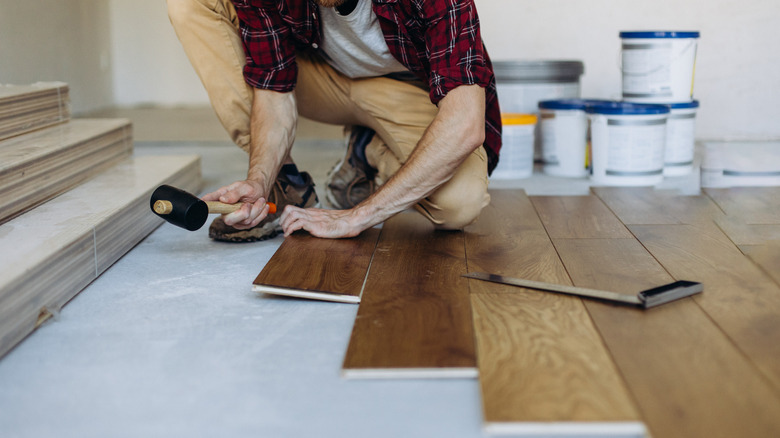
Of all the areas in your home, the foyer is one of the most susceptible to damage. Dings and nicks from bringing large items into the house or carelessly kicking off your shoes may appear. Water damage is also common, along with other weather-related issues. It's bound to happen, whether the issue be big or small, so it may occur to you to simply cover the damage up. This not only looks tacky most of the time but can only invite larger issues if the original problem is not addressed. For example, painting over water damage doesn't actually kill mold or mildew, and it can continue to spread within your walls underneath the fresh coat of paint. Paint also doesn't cover up damage to the walls and baseboards, and true damage to the floors can still be felt underfoot even when covered by a rug.
If at all possible, any damage to your foyer should be directly addressed, preferably by a professional. Even if you are worried that the same thing will happen at some point in the future, your foyer will look markedly better when you don't attempt a cover-up job and go the extra mile to fully repair any damage. If you think there may be any structural damage to your home, or mold left from water damage, consult a professional as the problem could be much worse than it initially appears.
