The Calm Living Room Paint Color Nate Berkus Absolutely Adores
It's well-known that color can impact our emotions and moods. It has to do with color psychology and how certain shades affect you. Blues, for example, can reset your circadian rhythm, while green can spark feelings of creativity. That's why color isn't only important in the aesthetic of the room but the overall feel of the space as well. Therefore, choosing the right hue can make all the difference.
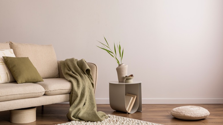
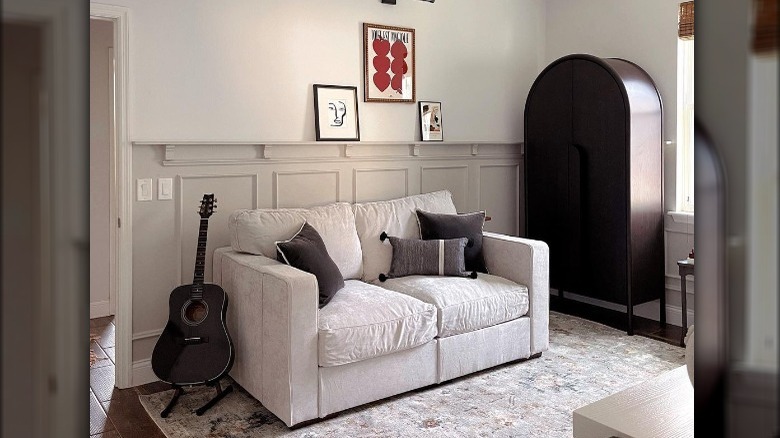
To evoke a sense of calm, Nate Berkus has a go-to shade. Tranquil Gray by Behr is "a delicate taupe/greige shade that makes the room feel calm," Berkus told House Beautiful. As the name suggests, the true neutral gray is a simple color that isn't too overwhelming, excellent for lying back and relaxing in your living room. The shade is elegant and could work well in a variety of calming spaces around the house. Greige hues are consistently popular due to their versatile and relaxing neutral. With the combination of gray and beige tones, greige can add warmth to the austere gray without veering too yellow like the standard beige. Along with being relaxing, Tranquil Gray also brightens the room, allowing it to feel more open and airy.
The ideal neutral
In January 2023, Behr featured Tranquil Gray as its Color of the Month. "Not too warm or cool, it is a delicate taupe-gray that whispers on walls, bringing a sense of balance and harmony to home interiors," the paint company wrote on its blog. Behr goes on to explain how the shade has a soothing quality that makes it ideal to use throughout the home.
The shade will highlight architectural features, like molding and trim, or design details, such as built-in bookcases, by standing out from the color on the walls. In kitchens, the color can look great on kitchen cabinets. And it works well on the walls of living rooms, as Nate Berkus has said, as well as in bedrooms and offices. Behr suggests using Tranquil Gray as the base color of a monochromatic color scheme because of its versatility. Neutral shades like Behr's Polar Bear, Mourning Dove, and Light Truffle are recommended colors for this neutral. But to add a pop of color, the company suggests Dignified Purple, Juniper Berries, Fantasia, Mauve It, Watery, and Chivalrous. These muted shades pair well with the neutral to create an overall cozy interior.
Never go wrong with neutrals
Tranquil Gray isn't the only neutral Nate Berkus adores from Behr's collection. Berkus, along with Jeremiah Brent, picked three colors that they recommended for every space. They also love Even Better Beige and Blank Canvas, per HGTV. The three colors are featured in Behr's Designer collection, which has 30 shades of whites, neutrals, and accents that professionals and experts have recommended.
Even Better Beige was Behr's Color of the Month in November 2022. According to Behr, this color is "a versatile neutral that brings a warmly distinctive feeling to any space." The neutral shade of beige can be both modern and traditional, all with a feeling of elegance. For a monochromatic palette, Behr suggests warm neutrals like Silky Bamboo and Swiss Coffee. Bright, soft colors like Ocean Boulevard, Ballet Rose, and Whitewater Bay will also coordinate well. Blank Canvas was selected as the Behr Color of the Year for 2023. This warm shade of white feels welcoming and comforting, which makes it a beautiful choice to slather throughout the home. Shades from Behr's Designer Collection that complement this comforting white include Vine Leaf, a deep green, and a misty blue aptly named Mightnight Blue. Neutrals like Vintage Pewter, Gratifying Gray, and Cracked Pepper will also work well with this light shade.

