Furniture Mistakes You Could Be Making, According To Queer Eye's Bobby Berk
For those who have spent the last few years falling in love with the Fab Five of Netflix's "Queer Eye" reboot, resident designer Bobby Berk is no stranger. However, for the uninitiated, here's a quick breakdown of the designer's background. Before he set out on his own, Berk spent years gaining experience in retail stores, including Bed, Bath and Beyond, Restoration Hardware, and Portico Home + Spa. However, it wasn't until 2015 that Berk founded his very own interior design company, Bobby Berk Interiors + Design. Things began to shift gears from there. Only two years later, Berk, alongside Antoni Parowski, Jonathan Van Ness, Karamo Brown, and Tan France, became the new faces of the reimagined Queer Eye series for Netflix. Five seasons, multiple award wins, and nominations later, Berk and the rest of the crew are household names. So when it comes to design advice, he's definitely one to listen to.
One of the key things Berk suggests when it comes to selecting furniture is functionality. In an interview with Austin Home Magazine, the designer said, "The most important part is that it actually functions for the person. It makes their life flow easier and work easier, and it eliminates frustration and helps with mental health." Berk went on to admit that the actual aesthetics of the space is secondary for him. Meanwhile, when it comes to common mistakes many make with furniture, Berk says the biggest faux pas is worrying about trends. "It's about what makes you happy in your home." He told Austin Home. Here are a few other mistakes you could be making and how to fix them.
Not investing in a good mattress
"Your home is like your phone charger: If you don't get a full charge every night, you're not going to make it through the day." Bobby Berk told Austin Home, and truer words have not been spoken. One of the key mistakes that Berk highlights is not investing in a good mattress and bedding. In the present, picking a good quality mattress for you helps you recharge and get your energy back for the next day's hustle – whatever that may be. Furthermore, in the future, the right mattress, which could last you up to 10 years, will help prevent many physical ailments, including chronic back aches.
Don't be fooled, though; a higher price tag doesn't always equate to a good quality mattress. When selecting the right mattress for you, focus on the firmness of the bed. That's right; experts at the Sleep Foundation suggest you get a mattress that's not too soft. Despite the saying, "sinking into bed," you actually want to get a mattress that supports the alignment of your back and spine. So with that in mind, opt for a bed that has a bit more firmness than you'd expect.
2023 has introduced some exciting new inventions in the mattress world. This means you're going to have a field day picking out the right mattress for your needs. According to Forbes Home, the best mattress of 2023 is the Nectar Premier Copper, which offers medium firm support and comes in both memory foam and hybrid versions. Another top mattress this year is, The DreamCloud, whose firmness is considered the best overall in the publication's lineup.
Not buying the right rug for your space
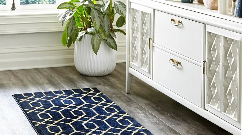
When The Dude proclaimed in the 90s classic, "The Big Lebowski," that the rug "really tied the room together," he was right. And designer guru, Bobby Berk, agrees. Consider your rug one of the key establishing points in your room, and then ask yourself,"What would I want that element to reflect?" One of the biggest mistakes that many make when it comes to rug selections, is picking the wrong size for your space. According to Berk, there's a simple question to ask when figuring out if your rug is the right scale: is it touching all the major furniture? "To find the right size," the Queer Eye star says, "I always advise making sure that all your furniture is at least touching the rug and you still have at least 15 inches of space between the rug and any perimeter walls." (via Phoenix Home + Garden).
Another thing to consider is if you've picked out the right material for your space. Too light, then you risk wear and tear if the rug is placed in a room with lots of activity. If it's too thick, and placed near a doorway, it may interfere with the opening and closing of that door. So what makes a rug worthy of your selection? Durability. According to Berk, it's vital that you consider how much the rug will endure in the room that it's placed. Let this guide how your process of elimination. A fluffy cream rug may seem like a lovely luxury find, but in a home with active toddlers, and/or pets, this may be a very short-lived purchase. The interior designer suggests looking into vintage rugs for a durable, one-of-a-kind option.
Using color on big furniture instead of small accessories
Color statements can be a huge commitment in the home. Especially when used on big furniture pieces like sofas or all over your walls. These can be expensive to switch up, should you suddenly fall out of love with the color or design. "People sometimes go overboard with color on walls or big pieces of furniture, and it can be a bit overwhelming..." Bobby Berk told Stylist. "...So unless you want to spend a ton of money, use color with curtains, pillows, throws and rugs, because those are not expensive pieces."
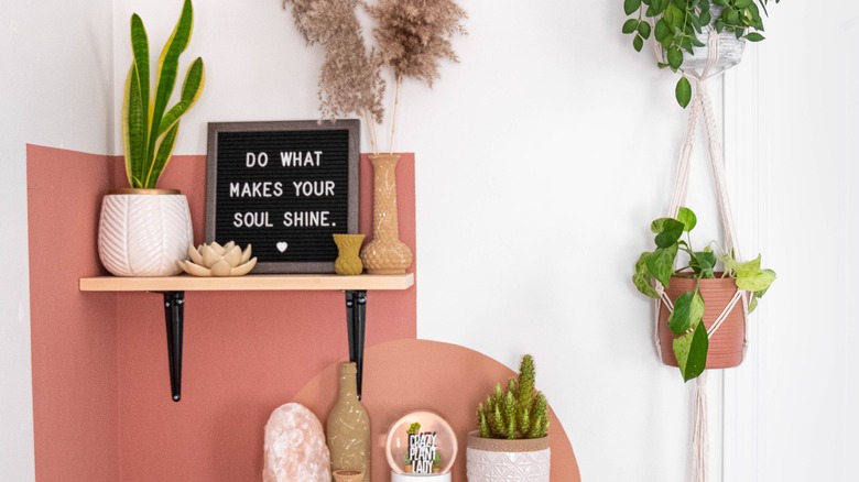
Consider your smaller furniture and accent pieces your canvas and explore all the color options available to you. In a neutral home, cushions, rugs and even your gallery wall are a great way to infuse bold colors into the space. If you're looking to go slightly bigger, then Berk suggests opting for using smaller furniture pieces such as a small shelf to create a two-tone effect. You can achieve this by placing a colored shelf against a wall with a neutral tone or a different but complementary color. This doesn't mean you can't use your walls at all. In fact, Berk suggests painting horizontal stripes – one or many – along the space to break up the monotony of your neutral wall. Alternatively, you could select a section of your wall and paint an arch. This gives you a small but still significant area to experiment with.
Making your TV the star of the room
The 1950s marked the first time television was considered a viable purchase for average American families. This meant more families were able to sit in their living rooms together and watch their favorite shows. In the decades since, many homes continue to center the television in their interior designs, ensuring that all sofas and chairs face the primary source of entertainment. While eras like the 60s and 70s rebelled against the idea by introducing such phenomena as conversation pits, the TV, as the primary focal point, won in the end.
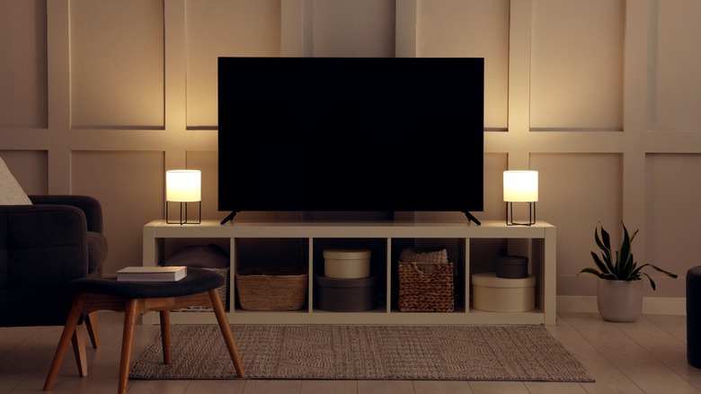
However, in more post-modern times, there are multiple options upon which to view content. As a result, designers have begun to opt out of this layout. Bobby Berk is one of them. "A lot of people will center their living room around a TV. I personally think that's the wrong decision...," Berk tells Fast Company. "...I like to set up your room as a bit more conversational. That's a way to be a little bit happier in your space. Engage in conversation more." With this in mind, try turning your sofas and armchairs inwards, so they face each other instead of the TV. This is a simple way to achieve the more conversational element that Berk suggests. Another option is to create a different focal point – a fireplace, a big piece of art, or even your primary source of light.
Not investing in textured or patterned furniture
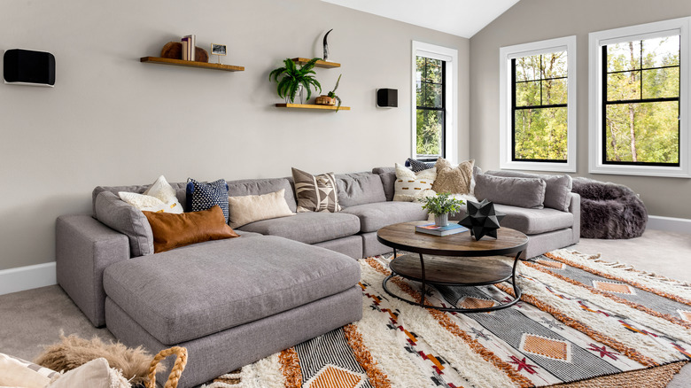
For Bobby Berk, texture isn't just about the aesthetic boost it brings to a space, although that's a big plus. It's about how these textures and patterns feel to the touch, and how that can boost your energy and mood. Adding textured accents including throws, rugs, cushions and even bedding can elevate your space's comfort levels. Smoother textures such as satin and silk reflect light and have the potential to brighten up your space. Finding the right balance of texture and pattern can take a flat space and turn it into something more three-dimensional. Don't take this too literally though. Even if the patterns are 2D – wallpaper, for example – the depth they introduce to a space is anything but.
Berk's tip for how to add texture and pattern is to vary the size. You don't want to go into sensory overload in an attempt to make a space more interesting. Beyond the accents and wallpaper options, there are other interesting ways to inject texture and patterns into any space. House plants, for example, are a great way to bring the outside in. Coming in such an array of colors, shapes, and sizes, any combination of nature's best decor would instantly elevate your space.
Not making your furniture proportional to the space
It's easy to look at an empty space and mentally begin to fill it up with your Pinterest board of ideas. It's an entirely different thing to do that same exercise in reality. When furnishing the various rooms in your home, scale, and proportion are key. The former refers to how the item fits in the space. The latter is defined by how the items fit together. As mentioned above, the scale of your sofa will determine the size of the rug you place underneath it. Additionally, a large sofa in a small living room will take up much more real estate than necessary. This limits what else can fit in and even interrupts the flow of the room. Bobby Berk suggests leaving the larger furniture for the larger rooms. Smaller spaces will benefit from more compact options.
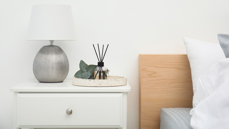
Another key element when considering the scale and proportion of your furniture is space to move. Ensure that you have enough space to get around conveniently. Do not fill your space to the brim in the name of comfort. "People think that big, cushy furniture can make a small room more comfortable, but in reality, it weighs down the space and takes up an unnecessary amount of room." He told Elle Decor. Even the table lamps in your bedroom could be off-scale. How can one tell? In some cases, the disparity is obvious. A lamp that's too small in proportion to your nightstand will be instantly noticeable, as will one that's too large. In other cases, it may just feel like something's off. According to Berk, the rule is that a bedside lamp – including the shade – should be about two inches taller than your nightstand and a third of the width.
Not considering double duty furniture
If you've got a small space and you're wondering how best to utilize it, this is especially for you. Everything in a compact space should be justified; you don't want to deal with cluster when living in smaller living quarters. One thing that's important to note, according to the Emmy-winning designer, is storage. Any furniture that can provide double the use is best for a small space. An ottoman that opens up to reveal extra storage; a sofa that you can pull into bed. A stacked coffee table that provides extra seating for guests. Double-duty furniture is the best way to design your space without drowning it in stuff.
We see a lot of storage trends come and go, and most of them require numerous glass, rattan, or plastic tubes to through your items in. That's not to say that these extra storage units don't work, they're very useful. However, they might be taking up valuable space in your home. Double-duty furniture helps you organize your home better, without taking up more space than necessary. Berk is no stranger to double-duty furniture, having lived in a small apartment in New York himself. For him, this is advice based on personal experience. And that advice is simple – utilize all of your space. "Make sure you're maximizing that space because there are so many spaces in our homes that can really do double duty – that can really make our homes more organized," he explained in an interview with Homes & Gardens, "But we're only using them the way they are built instead of thinking about the way they could really be used."
Aiming low instead of high
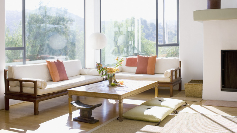
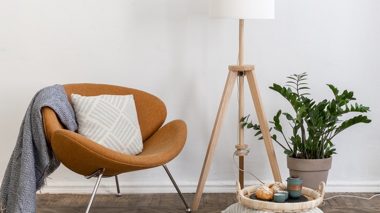
One of the design star's biggest observations when it comes to furniture mistakes is how often items are kept close to the ground. "Just like stilettos can change the visual shape of the person that is wearing them, the same can occur for furniture," Berk said in an interview with Sunset. "Rather than buying boxy furniture that goes all the way to the floor, opt for pieces that have 'feet' or legs to them to allow a visual line under them. It helps make a room feel larger and less weighed down."
Creating space between your furniture and the floor allows the flow of the room to continue uninterrupted. Adding extra shelves above your furniture also provides extra storage space while pulling the eyes upwards. According to Berk, anything that can be stored above ground level is great for opening up the space. Floating shelves and hooks are great examples of this. "In a small space, try to keep the floor plan as open as possible by installing floor-to-ceiling bookshelves with bins and baskets for storage as well as hooks to hang anything you need to keep handy." The designer told PopSugar. "I also love to go big with wall art and play with the scale in the room."


