The Property Brothers Warn Homeowners To Avoid This Crucial Bathroom Layout Mistake
It's no secret that renovating your home takes a ton of time and effort, and it all starts with planning the layout. It's crucial you have a solid plan that not only matches your vision but is practical too. The flow of the home should come first and foremost, especially when it comes to the placement of the bathroom. Should you decide to list your home on the market, you will have a greater chance of selling if its layout makes sense. Potential buyers really focus on the flow of the home, and if yours is poorly planned, you might be missing out on a sale.
In the Bright Future Ahead episode of "Property Brothers: Forever Home," hosts Jonathan and Drew Scott come across a crucial bathroom layout mistake: the bathroom door opens directly into the dining room. After discovering this major design flaw, The Property Brothers spring into action. The question is, why is this layout such a big deal?
It causes a distraction
Jonathan and Drew Scott warn homeowners to avoid placing a bathroom off the dining room because the toilet can cause a major distraction. "So you're dining, you're eating, you're entertaining, FLUSH!" jokes Jonathan. To say it takes away from the ambiance is an understatement. Using the bathroom should be a private matter, not something on display for everyone else to hear. No one wants to be eating when they know exactly what's happening on the other side of the door.
After you or someone uses the bathroom, certain smells may be emitted, which is enough to make anyone not want to continue their meal. Specifically, it's been proven that poop particles are released into the air after flushing, and if you aren't closing the lid afterward, it's highly likely those particles will travel out of the bathroom, per CBS17. Gross. Do you really want those floating around where you eat? Probably not.
The do's and don'ts of bathroom remodels
If you're renovating your bathroom and need advice, you're in luck. The Property Brothers have an entire list of do's and don'ts for taking on this project. When deciding on a paint color, Jonathan and Drew Scott highly recommend staying away from yellow and red and painting your walls a soft gray, white, or blue-green, as per their website. For tile, they suggest something matte black and opulent. If that isn't your style, you might consider an accent color from your bedroom to pull the look together. Don't be afraid to go outside your comfort zone.
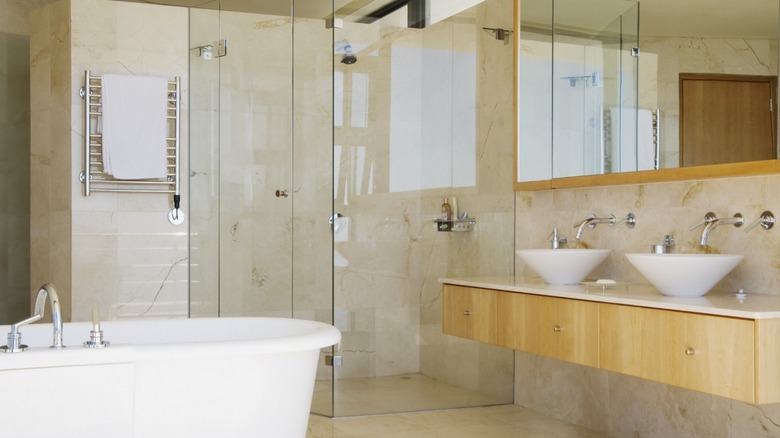
What about the sink? It's a vital part of the bathroom after all. According to the brothers, if you have the space, installing two sinks is worth the splurge (via Realtor). It's a total game-changer, especially if you have a big family. Pedestal sinks don't allow more than one person to get ready at a time. Plus, they provide no room for additional storage. If you plan on installing a steam shower, Jonathan says porcelain tile is the way to go, so ditch the natural stone.


