If You Want Your Home To Look Like A Wes Anderson Film, Here's How To Decorate
Wes Anderson's films are quirky, entertaining, and gorgeous to look at. The director is known for his unusual set designs, dreamy aesthetics, and vivid color palettes. In cinema, color can be symbolic of a character's journey, and Anderson's films often embody this principle. He has a knack for creating unusual, stunning, somewhat surreal interior and exterior scenery — and there are a few common visual elements seen in the interiors that can be replicated in your own home.
Anderson is perhaps best known for his bold and complicated use of color in sets, costumes, and lighting. His interiors are often brightly hued, like the lemon-yellow walls of "The French Dispatch," or the red elevators of "The Grand Budapest Hotel." There is also a clean, fastidious look to most of the interiors, with each object in place, almost as if they were crafted in miniature-like rooms in a dollhouse. In fact, some sets were built as miniature models, which were then seamlessly melded with full-size sets.
Anderson's sets also include plenty of period details that lend them authenticity, balancing the slight feeling of artificiality created by the unusual colors. He creates a very specific world for viewers to enter: We know we have gone someplace that's unlike anywhere we've been before. Of course, emulating the look of Wes Anderson's films in your home will first mean becoming familiar with the look of his films, so now's the time to rewatch your favorites and become inspired.
Meaningful color palettes
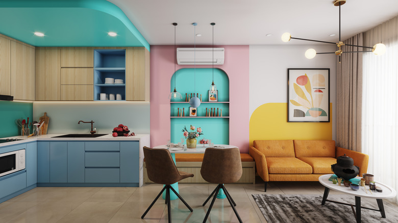
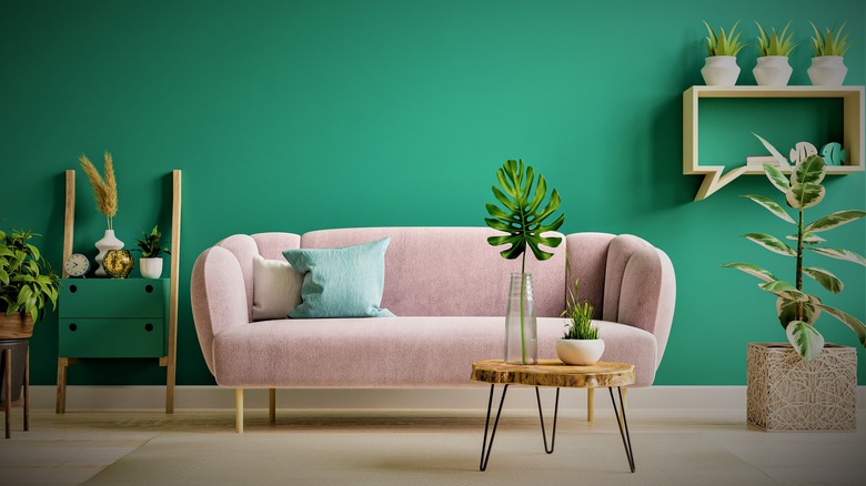
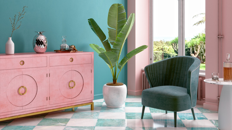
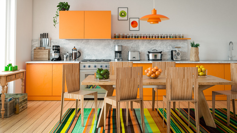
One of Wes Anderson's most notable trademarks is a bold use of color. His color palettes are eye-catching and often symbolic, making a statement about a character's emotional state, or foreshadowing a significant plot twist. Characters are associated with specific colors too: like Suzy wearing pink (associated with youth and romance) in "Moonrise Kingdom." Or Chas Tenenbaum in his trademark bright red tracksuit (a color associated with strong emotions and a desire for attention) in "The Royal Tenenbaums." Elsewhere, the turquoise and green train cars in "The Darjeeling Limited" create a sense of peace and healing, which the three brothers find in their journey across India.
To emulate the use of color palettes in these films, don't be afraid to use vivid hues and bold color combinations. "Asteroid City" — set in a space-age tourist attraction in a southwest desert — has an abundance of bright aqua paired with vermilion (a very 1950s palette), and the ubiquitous presence of a soft sandy yellow: a muted tertiary color palette. "The Grand Budapest Hotel" often combines deep red and purple together and uses pastel pink in multiple scenes. Meanwhile, "Moonrise Kingdom" feels like a sea of beige and gold plaid — until you notice all the rosy pinks and bright spots of turquoise.
Try creating palettes with complementary and tertiary colors: pinks with greens, blues and teals with oranges, purples and violets with yellows. Also, you don't have to repaint walls unless you want to — you can create many exciting color statements with furnishings and decor.
Period details: history with a twist
Whether it's post-war France ("The French Dispatch"), a dreamy summer in 1965 ("Moonrise Kingdom"), a midcentury desert ("Asteroid City"), or an urban 1970s vibe ("The Royal Tenenbaums"), there is always a very focused and specific time period commanding the design of a Wes Anderson film.
The period details give these spaces a lived-in appearance (like the cluttered news offices and rustic bistros in "The French Dispatch"), creating a look that is both stylized and recognizable. Having some sense of history in the furnishings and decor is key to creating a Wes Anderson look. With a certain period style in mind, you can choose colors and furnishings to mix together. Sometimes just a few small elements can communicate volumes: a small collection of vintage glass whiskey decanters, a gilt-framed mirror, a pair of mod chairs, or a low-rise suede couch.
To meld different design elements together requires some time and effort, and a keen eye helps. But stick with what you like, and keep in mind that less is often more. Add pieces and elements slowly and see what works together. Remember that colors and shapes play very key roles in creating the desired look. Studying interior design magazines or films of the period will also give you insights, in addition to being inspired by Anderson's use of vintage elements.
Humor and whimsy
In addition to the humor contained in dialogue and action, Wes Anderson's films also contain humor in the visual set elements. The color, shape, or placement of objects draw the eye, possibly offering commentary on the scene taking place, or just adding an extra layer of silliness or strangeness. You can employ this same whimsical approach to decor in your home with well-chosen pieces and even small collections.
What about some unusual framed art in the bathroom (old magazine covers or advertisements)? Or a collection of vintage soap dishes? Maybe the kitchen can contain images or miniatures of your favorite food (framed prints of Wayne Thiebaud's pies and cakes?), or have appliances and cabinets in the same bright, unexpected color. A living room or library could hold some interesting antiques or displays of collected objects that are both fascinating to look at and important to you. Maybe you want to display work by a certain author or artist, vintage stereo equipment, collections of glassware or statuary, etc. Your patio could have a collection of old lanterns or wind chimes.
Keep in mind that you have to live with these objects. The bedroom may not be the best place to have "loud" colors or unusual things that might keep you awake or startle you in the dark — like old marionette puppets with glass eyes.
Patterns and color blocking
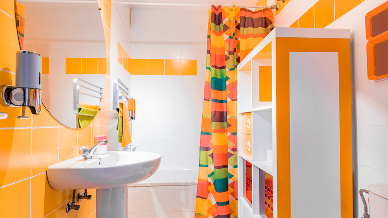
One intriguing element of the interiors in films like "The Royal Tenenbaums," "The French Dispatch," and "Moonrise Kingdom" is the proliferation of unusual patterns and graphic use of color. "Moonrise Kingdom," for example, has a lot of plaid. A sort of New England/Northeast vibe, but in unexpected shades of gold and yellow — a far cry from the reds, blues, and greens of the tartans one sees in Maine and Vermont (courtesy of L.L. Bean). "The French Dispatch" has rooms full of art vying with dingy prison walls and plenty of patterned wallpapers, like the dark plum-toned "cubist floral" seen in one bathroom.
Patterns can be tricky to implement into your design scheme, as people generally love them or hate them. With an unusual wallpaper, try it in a small area first (a closet, an accent wall, a guest bathroom) to see how it feels after a time. Patterns in window treatments and linens are easy enough to try out. Maybe upcycle an old couch or chair with new upholstery, guided by your taste and budget.
Color blocking — a term with slightly different contexts in decorating, art, and advertising — is a way of using large spots of color (furniture, curtains, cushions, rugs, or wall coverings) to draw the eye. It can be done with one color family, one palette (like cool-colored pastels), or even with color-themed patterns (mixed plaids or florals). This is a flexible way to try out different looks and see what works.
A room with a mood
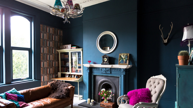
Another aspect of Wes Anderson's cinematic design is that it creates a strong sense of mood. Whether dark and sad, or bright and uplifting, intricate and ethereal, or earthy and human, there is a wide range of emotions and ideas swirling around in the filmmaker's collected works. This portrayal of mood is a signpost of Anderson's signature style — one that is never just about telling a story but immersing the viewer into an entire world and all the moments and feelings that world conjures.
Sometimes there's a touch of the surreal or the unexpected: Set in 1932 at the dawn of World War II, "The Grand Budapest Hotel" cleverly uses an abundance of pale pink for logos that almost look like the swastikas used by the Third Reich, softening and inverting the harsh visual vibe audiences might expect. Then as we continue to see plenty of pink in the hotel and the bakery, we realize there's a purposeful color structure happening. This is an example of creating mood with a complex array of visual elements.
Creating mood can be done with a variety of elements: lighting, color, fabrics, collections, artwork, and period furnishings are just a few things to experiment with. Mood is also highly personal: dark blue might make you feel melancholy, while others might find it comforting. When trying to create a Wes Anderson look in your home, go with your instincts and preferences. Go for the unexpected. The whimsical. The colorful.