21 Of The Best Kitchen Makeovers On Fixer Upper
Joanna Gaines has remodeled plenty of kitchens with the help of her husband, Chip Gaines, over the course of HGTV's "Fixer Upper." Joanna notably usually includes design elements that vary from her usual farmhouse chic style, depending on her client's preferences. With her expertise and experience, the guru creates kitchens that marry both form and function, creating warm and welcoming cooking and dining spaces.
The Gaines usually try to salvage anything they can from the original house, sometimes using wood pieces as kitchen installments, or uncovering original floors and shiplap walls that only need a little TLC in order to shine in a new design. Time and time again, Joanna has taken a run-of-the-mill kitchen, or a cooking space that had seen better days, and created a beautiful kitchen well-suited to the homeowners' needs. Despite how quickly design trends change, the kitchens from this show stand the test of time and still look beautiful even today. Here are their most impressive flips.
1. From a drab '80s kitchen to a modern dream
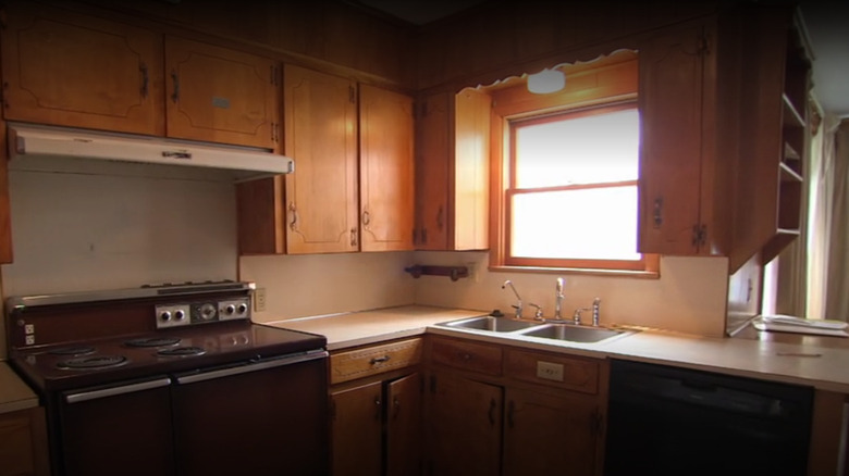
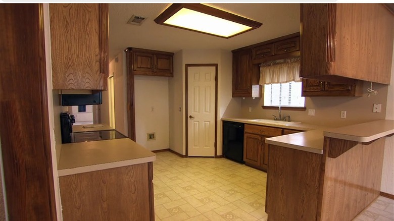
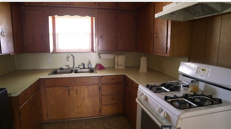
The biggest transformations always occur in neglected houses, and in Season 3, Episode 1, Chip and Joana outdid themselves. They took a house that was sitting vacant for two years and transformed it into a welcoming family home. The house had great bones, but since it was built in the 1920s, it had an outdated floor plan that wasn't conducive for buyers in the 21st century. Old homes usually have small kitchens since they were purely for work rather than gathering. Because of that, Chip and Joanna had to change the floor plan completely. The kitchen was moved to the back of the house, where the den used to be. In addition to that, the aesthetic was stuck in the 1980s. The small kitchen had rickety orange pine cabinets, outdated appliances, and a small U-shaped footprint.
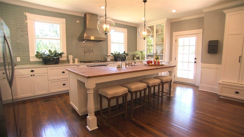
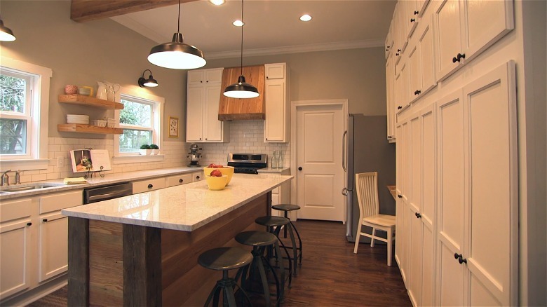
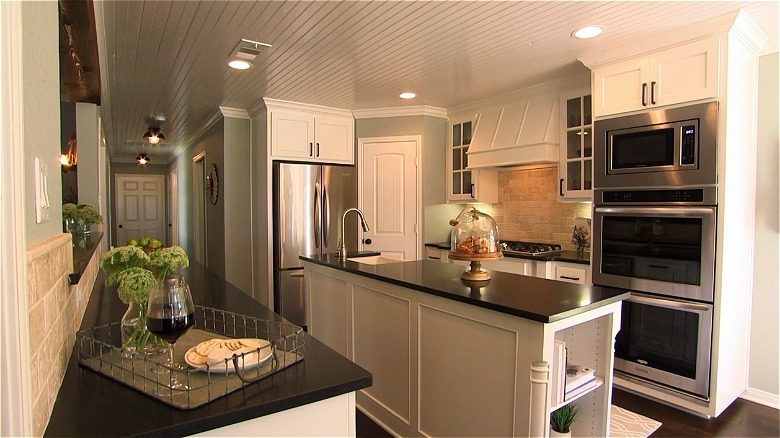
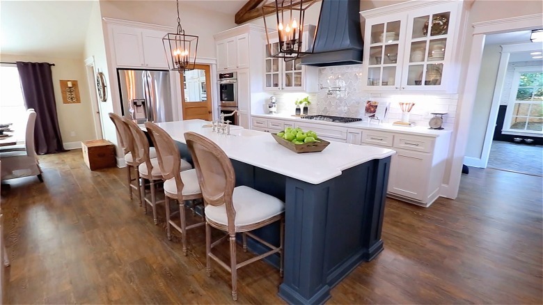
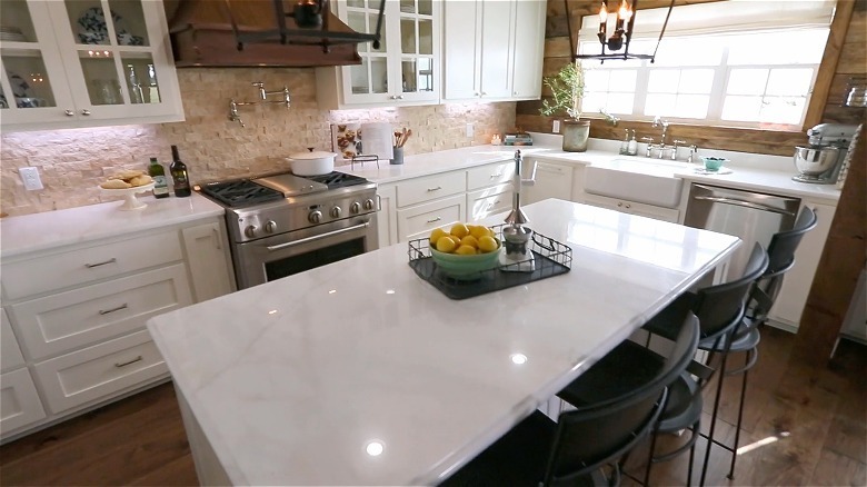
The updated kitchen was unrecognizable. The carpeting in the den was removed, and in its place was dark wood flooring. The U-shaped footprint was expanded into an open floorplan kitchen, which bled into the living room. The orange wood cabinets were updated for white shaker models, and Joanna only added them to the bottom row to make the space feel airier. But the episode's real star was the custom-built farmhouse island in the middle of the room. One side is for cooking, while the other acts as a kitchen table, allowing the rest of the room to stay open.
2. From a shack to an industrial kitchen
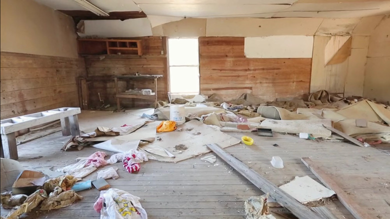
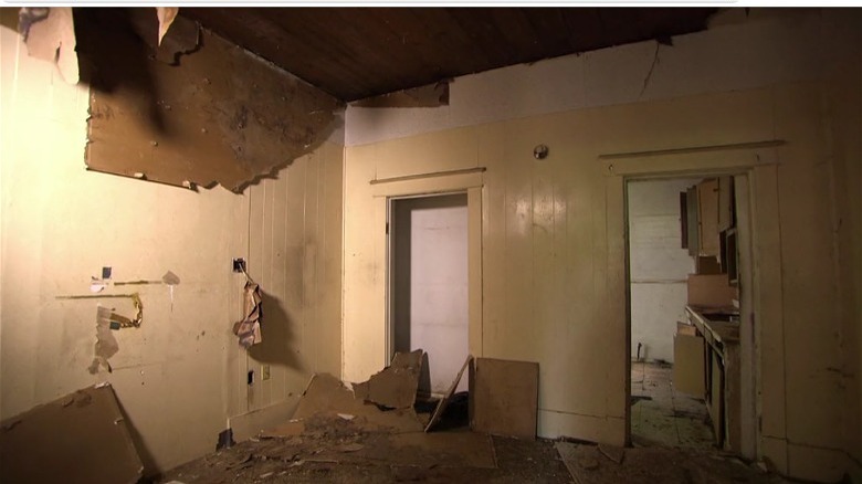
If you were to look at a before and after picture of this kitchen, you might be surprised to find that the room originally wasn't a kitchen at all. This "Fixer Upper" home, dubbed the Little Shack on the Prairie, was hardly more than a dilapidated room. Seen in Season 4, Episode 17, it was the season's finale. The house was nothing more than a sagging shack on stilts, and the inside was even worse. The "kitchen" was essentially a demo site, complete with bare concrete floors, unfinished walls, and a ceiling caving in.
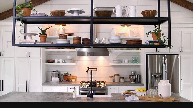
The "after" was a beautiful, modern kitchen with industrial accents. It kept the "open floor plan" of the original shack, but nothing else. The island had a unique concrete waterfall countertop, which was the first one Chip had ever built. And above the island, Joanna created black iron open shelving, separating the island and the dining room.
3. From peeling wallpaper to sparkling subway tiles
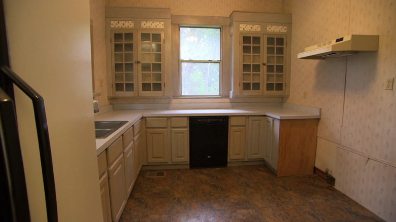
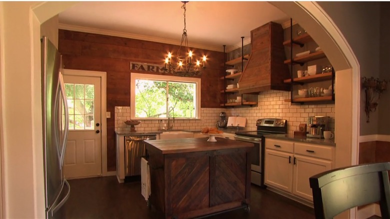
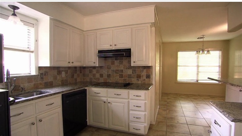
One major concern with this Season 2 kitchen was space. The homeowners wanted an island and storage space, but there wasn't much room to work with. It was a typical '90s kitchen, complete with white-washed cabinets, a dingy linoleum countertop, and peeling floral wallpaper. It's hard to imagine how you could carve out more storage space here, but Joanna had some tricks up her sleeve.
Somehow Chip and Joanna were able to deliver a perfectly compact kitchen that wasn't crowded or lacking in anything the homeowners asked for — they were even able to put in a back door! The original hardwood floors, hidden underneath the old, unsightly linoleum, were completely restored, making it feel more elevated. The kitchen island was also on wheels, making it movable, which was perfect for this small space. Finally, the entryway was opened up into a giant arch, making it feel bigger than it was.
4. A dark brown kitchen got an airy upgrade
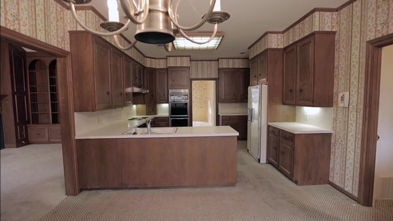
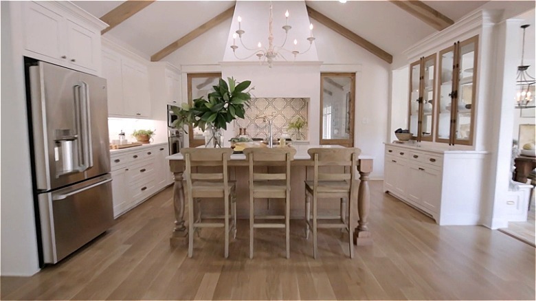
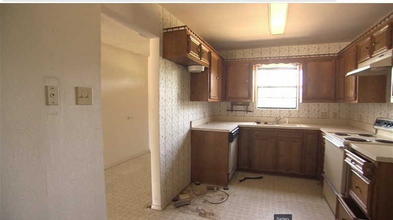
In Season 5, Episode 11, Chip and Joanna tackled a big house with a lot of good bones. But the kitchen was the room that needed the most work. It was a farmhouse kitchen — but an '80s farmhouse. It had heavy dark wood cabinetry, white linoleum countertops, and ditsy pink floral wallpaper. As you might imagine, wallpaper does not mix well with grease and steam. But do you know what is even more out of place in a kitchen? Carpeting! And this space had lots of it.
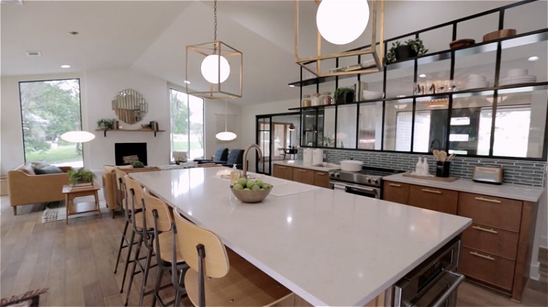
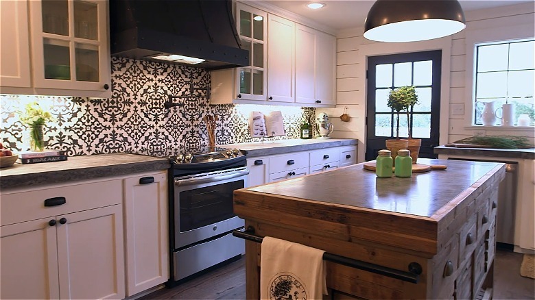
However, Chip and Joanna transformed this McMansion into a French country-meets-traditional style retreat, and the kitchen reflected that vision. The couple tore down the wall separating the kitchen from the vaulted-ceiling living room, creating one giant, impressive space. To make it stand out even more, they raised the ceiling in the kitchen to match the pitch in the adjacent room, creating 20-foot heights. The carpet was also torn out, and white oak floors were put in its place, giving it a dose of quiet luxury. You would never guess you were standing in the same kitchen.
5. A postage stamp sized kitchen doubled in size
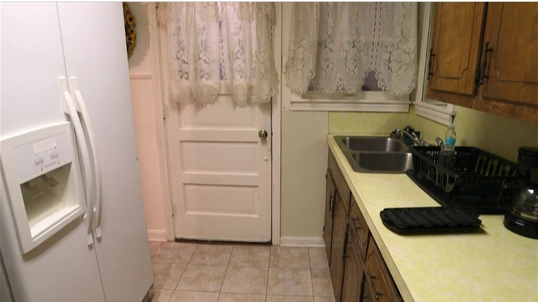
You will think Joanna Gaines has access to black magic with this makeover. Seen in Season 4, Episode 6, the "Fixer Upper" couple came to remodel a military vet's house, but they had a lot of work cut out for them. The bungalow was seemingly too small and cramped to be functional. They had only 800 square feet to work with, so the original kitchen was extra small. It was hardly bigger than a small hallway, with one row of cabinets on one side and an unanchored fridge on the other.
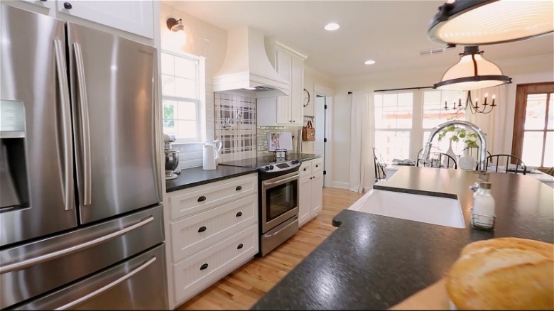
When Joanna first saw the kitchen in her walk-through, she immediately shared that they would want to tear down the wall that separated the living room. This would not only make it feel less cramped, but would help make the entire bungalow feel airier and more connected. That's exactly what they did, and the end result was unrecognizable. The dingy linoleum was replaced with hardwood floors, the visually heavy cabinets were swapped for white shaker substitutes, and the windows were replaced with bigger ones, allowing the light to flood in. With more room, light, and ease of movement in this kitchen, it became a place for the family to make both meals and memories for years to come.
6. From a rubble site to a kitchen with tons of storage
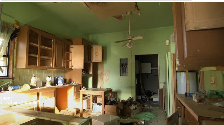
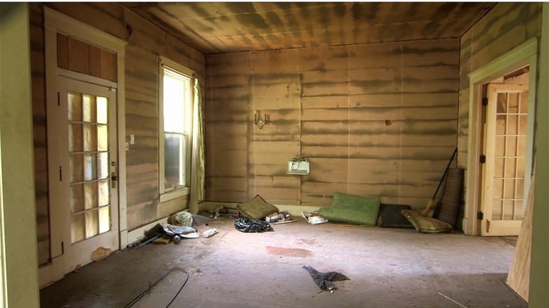
The Gaines' had their work cut out for them in the kitchen in Season 1, Episode 6. They were tasked with flipping an abandoned 1915 house into something modern and beautiful. Which was a tall order when you walked into the original space. Initially, this room was almost completely destroyed. The ceiling, walls, and floors were all falling apart and molded, the cabinets were in disrepair, and the area was littered with trash. It was hard to imagine what the end result would look like.
A lot of work went into restoring this room, such as hauling out all the debris and fixing the hole in the ceiling. Not only did they remove the destroyed cabinets, but they also took down the precariously dangling ceiling fan and replaced it with pendent and recess lighting. A second window was also placed in the corner of the kitchen to bring more light in. Luxury touches were also added, such as timeless Carrara marble countertops, new wood floors, and a custom island built by the new homeowner of the house, who happened to be a furniture designer!
7. From a cheap, wood-paneled kitchen to an industrial upgrade
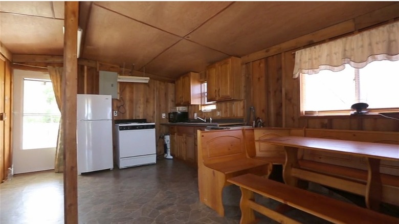
Fans of "Fixer Upper" will undoubtedly remember Season 4, Episode 10's houseboat, also called the Double Decker. It had a lot of potential, but it was in rough shape, aesthetically speaking. The kitchen felt like a grandparent's basement, complete with wood-paneled walls, an orange pine breakfast nook, and yellowed lace curtains. What was even more offensive was the faux-stone linoleum flooring. The space looked like it belonged in a Midwestern cabin rather than a Southern houseboat!
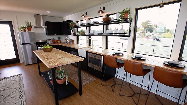
Chip and Joanna gave the place the face-lift of a lifetime. This new, modern kitchen played with black, stainless steel, light wood, and browns to make the perfect color pallet for the open and airy space. One of the coolest features of this kitchen was how the wooden countertop extended seamlessly into the bar, which was the house's only eating area. It was a classy look that fixed the problem of not having a lot of space to work with, and it was perfect for a meal with a view. The island offered up even more prep space for the kitchen, and it was movable, which was perfect for a small area. Finally, the floating shelves offered storage space without blocking valuable window space, which was a genius move by Joanna.
8. A cheap, linoleum kitchen transformed into a sleek bachelor kitchen
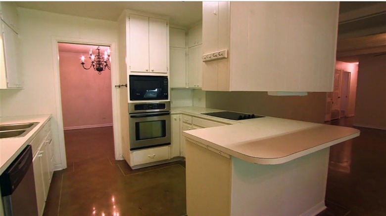
As one of the stars of "Fixer Upper" Season 3, the infamous Peach House was going to be the perfect bachelor pad and entertainment space. The buyer wanted a huge kitchen where he could cook meals for his large family, and plenty of living space he could entertain in. But the kitchen couldn't offer that in its "before" stage. Instead, it was shaped into a tight U and entirely enclosed by its cabinets. It had a dingy brown linoleum floor, and the old white cabinets needed some major TLC. But Jo had ideas on how to make the space feel airer.
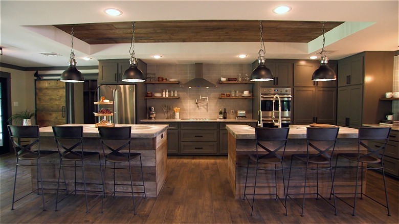
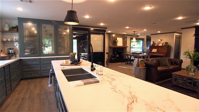
And that was to completely open it up to the dining and living room. The crew removed two walls to expand its footprints, extending it into what used to be the living room and den. It was also very unique in that it had two islands as opposed to the usual one, but it nicely broke up the space and created enough room for entertaining. The end result also felt more masculine. It used a lot of reclaimed wood, especially in the recessed ceiling, and the darker color pallet gave it an intimate, mature look with just the right amount of edge.
9. A basic white kitchen that got a vintage makeover
Dubbed "The School House," this cute house from Seasons 3, Episode 9, had a standard suburban '90s kitchen. It wasn't built for entertaining, so the quarters were tight. Cabinets covered the entire space, so you felt like you were stepping into a tight box. It was visually heavy. The area also had a few decidedly unluxurious features, such as brown linoleum floors and a cobblestone backsplash. But all that would soon change.
Chip and Joanna knocked down two walls to create an open-layout kitchen, doubling its size. The cramped white cabinets were replaced by stately blue versions, complete with a vintage-inspired china cabinet. Since the last kitchen felt so visually heavy, Joanna wanted to keep this one light by forgoing top cabinets and instead using open shelving. The china cabinet was also fronted by mercury glass, which looked like an antique mirror and helped open the space. A giant island also took up the length of the space, topped by white marble countertops.
10. A distressed kitchen that became a mid-century modern showpiece
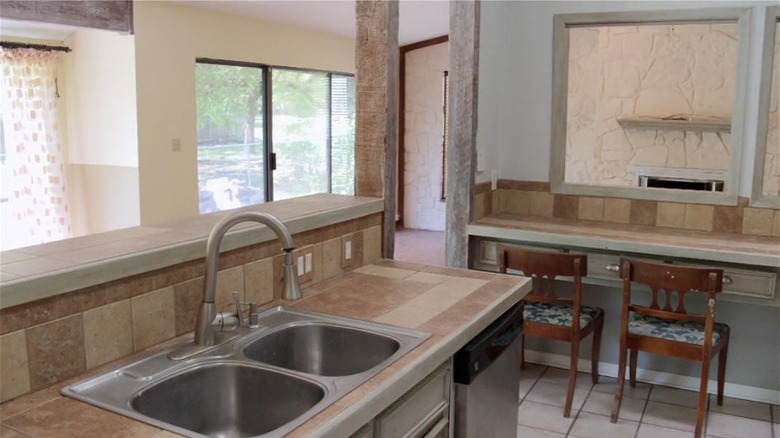
A "Fixer Upper" fan favorite, this episode of Season 5 saw Joanna fixing up their newest flip for her sister. But she first had to get her sister on board with her vision — especially considering the kitchen's state. It was an eclectic '70s kitchen, complete with tons of texture. It was closed off in its own room, yet had a series of windows opening it to the living room and dining room. It also had white distressed wood cabinets and cobbled stone countertops, giving it a messy, ramshackle appearance.
The "after" was spectacular, especially with the amount of personality on display. The walls were torn down to open it to the living and dining room area, doubling its size. Since it is located essentially in the middle of the open-concept house, Joanna left a single wall up to anchor it, but created a half-window partition to keep it visually airy. It's one of the most unique kitchens she's ever made.
11. A bland white kitchen got a punch of color
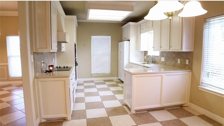
Seasons 4 of "Fixer Upper" put out a lot of favorites, and the "Rustic Italian Dream Home" in Episode 15 is certainly one of them with its unique style. But before it became a Tuscan dream, it was first a drab house. The original kitchen had white shaker cabinets, a clay tile backsplash, and brown and white checker flooring. The buyers admitted they didn't like all-white kitchens, so they didn't feel inspired by the space. Joanna agreed, saying, "It's very safe." It was about to get a significant shake-up.
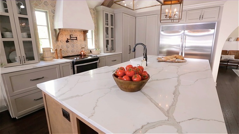
The buyers envisioned something bigger for their kitchen, so Chip and Jo pushed the length of it toward the stairs, doubling its size. And since most of the renovation money went into creating the kitchen, the result was phenomenal. Listening to the buyer's preferences, Jo skipped white cabinets and instead chose a matte dove-gray color for the counters and cupboards, paired with a classic white marble for the countertops. The backsplash here really pays homage to the rustic Italian look with its pattern and coloring, which matches well with the light wood island. But probably the most striking transformation was the flooring! The checkers were swapped out for elegant dark hardwood.
12. A scary florescent kitchen got a farmhouse upgrade
If you could use one word to describe this Season 2, Episode 4 house, it would be "drab." It was terribly outdated, and it took a lot of imagination to see what could be done with it. The cabinets were made from cheap particleboard, there was yellow linoleum flooring, and a fluorescent light acted as the room's centerpiece. But the team was up for the challenge.
The dark and heavy cupboards were gutted, and in their place were white shaker replacements. To create a sense of flow to the eating nook on its left, the original breakfast bar was removed, opening the space. To create extra prep room, a thin island was added to the middle. The linoleum was replaced by elegant dark wood flooring, and the ugly fluorescent light was replaced with a traditional shiplap ceiling. But the biggest transformation was the fact that Joanna removed a window. The team usually adds windows to open up the space and bring in light, but since the best spot for the stove was where the original sink used to be, the window had to be replaced with a backsplash.
13. From a demolition site to a lofted kitchen
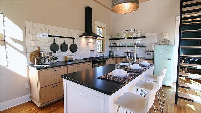
One of the most renowned "Fixer Upper" houses is the Shotgun House, a tiny home that Chip and Joanna Gaines transformed into a one-of-a-kind home. It was one of the remaining two shotgun houses in Waco, so it was important to preserve it. But with only 700 square feet to work with, the couple had to get creative with the kitchen. Since it's a shotgun house, it's built like a rectangle with no hallways, meaning each room leads to the next. Its original floor plan had the living room in the front, which led to the bedroom. But you had to go through the bedroom to get to the kitchen, so to make that less awkward, the team relocated the kitchen. But that wasn't their biggest project. Instead, it was that the room was basically a demolition site.
The end result was an amazing transformation. The kitchen was modern and spacious, even though the house was miniature. The couple tore down the wall between the living room and kitchen, creating an open floor plan to make the space feel less cramped. They also vaulted the ceilings to 20 feet and installed an entire wall of floor-to-ceiling windows across the island, making it feel bigger than it actually was. Joanna also kept the kitchen design relatively simple so the mint Smeg fridge could stand out, which the buyers owned beforehand.
14. A dingy barn loft transformed into an entertainment kitchen
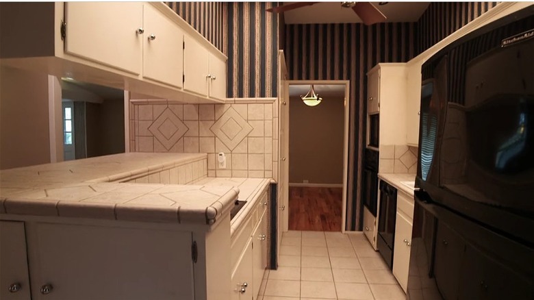
In Season 3, Episode 7, fans got to see Chip and Joanna transform one of their most famous properties: the Barndominium. Rather than tackling a ranch house or a Tudor home, the couple got to try something a little more non-traditional. They converted a barn with horse stalls, hay storage, and a 1,000-square-foot loft into a sprawling 2,7000-square-foot home. The main living quarters were in the loft upstairs, but the existing kitchen was rough. It had '80s country cabinets, old-fashioned striped wallpaper, and popcorn ceilings.
The flip turned it into a completely new layout. Chip and Joanna tore down the kitchen walls, opening it up to the living room and doubling its size. They also added more windows and an outside door, completely changing the structure of the original blueprint. But what's most interesting is that the team decided to keep the kitchen upstairs. The buyers love entertaining and have a large family, so Joanna kept the first floor an entertainment space, complete with a 16-person dining table and guest bedrooms. The upstairs was earmarked for the family's living quarters, which is why the new kitchen stayed on the second floor.
15. A condemned house got a vintage-inspired kitchen
The before and after photos of this Season 1, Episode 2 "Fixer Upper" are like night and day. In this episode, the buyers embraced revitalization, choosing a historic home they wanted to lovingly restore. However, historic homes usually sit on the market for a reason. There is usually quite a bit of work involved. When the couple first saw it when they drove up, they asked Chip and Joanna if they had brought them to a haunted house. Built in 1927, it was nicknamed "The Catastrophe House," and with good reason. The kitchen was nothing more than exposed shiplap, leftover debris, and dead mice carcasses. But the buyers saw its potential.
The finished result was a huge undertaking. "We've fixed up a lot of condemned-looking houses, but this was one of the worst because it had been in such bad shape for so long," Joanna said. The crew removed two walls and doubled the size of the kitchen, expanding it into where the sunroom and dining room used to be. They completely remodeled the space, adding plumbing, wiring, sheetrock walls, wooden flooring, and white shaker cabinets. It took them six long weeks to restore the house, and the end result reflected that. But the most charming detail was the custom-built island and kitchen table. Their furniture maker used the shiplap boards from the gutted walls, repurposing them back into the space.
16. A state-owned house got a complete overhaul
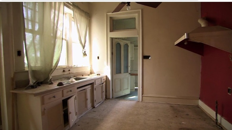
This kitchen in Season 1, Episode 13 was a complete leap of faith in its "before" stage. The 1910 house was condemned, and since it was filled with debris, Chip nicknamed it "The Trash House." That didn't instill much confidence in the Baby Boomer couple that went to view it, but Joanna helped them see the kitchen's potential. Let's just say the buyers had to squint. There was no flooring, but there was a row of rickety cabinets and a blood-red wall with nothing but a dusty hood attached to it. "This space is the hardest one for me to imagine, so it has to really come together," the buyer told Joanna. Jo was up to the task.
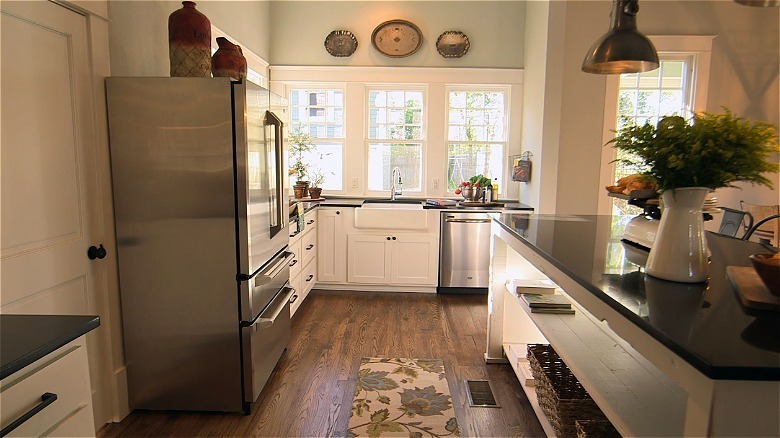
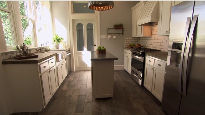
The transformation was amazing, where the team created a bright white, timeless kitchen. Its elegant shaker cabinets, farmhouse faucet, and dark wood planks still paid homage to the vintage character of the house, but felt modern and clean. Even better, Jo kept some original details, restoring rather than gutting them. For example, the arched glass door and windows were still the same.
17. An office-like kitchen got a mid-century face lift
Originally, this Funky Fixer kitchen was a tiny, closed-off room jammed between an equally awkward dining room and living room. Seen in Season 2, Episode 9, it was one of the most interesting transformations in the series because it forced Joanna to experiment with something other than modern farmhouse designs. The mid-century ranch was something of a time capsule, and she wanted to preserve its aesthetic. Well, preserve everything but the kitchen. It was a tight galley space that looked like it had office cabinets rather than kitchen ones. The ceiling also had flickering florescent lights, which threw terrible yellow light over the room
The "after" kitchen was unrecognizable from the original space. The walls were torn down to quadruple the room's size, creating an open floor plan that bled into the living and dining room. "I like that this is now the heart of the home," Joanna said in the episode, highlighting how the space went from cramped and closed off to the home's centerpiece. Joanna went in a completely different direction with the cabinets, switching from white to black. She also carved the space from the adjoining living room with the help of tall glass shelves, which acted like a transparent wall. Overall, it was one of her most creative designs.
18. A bleach-white kitchen got infused with texture
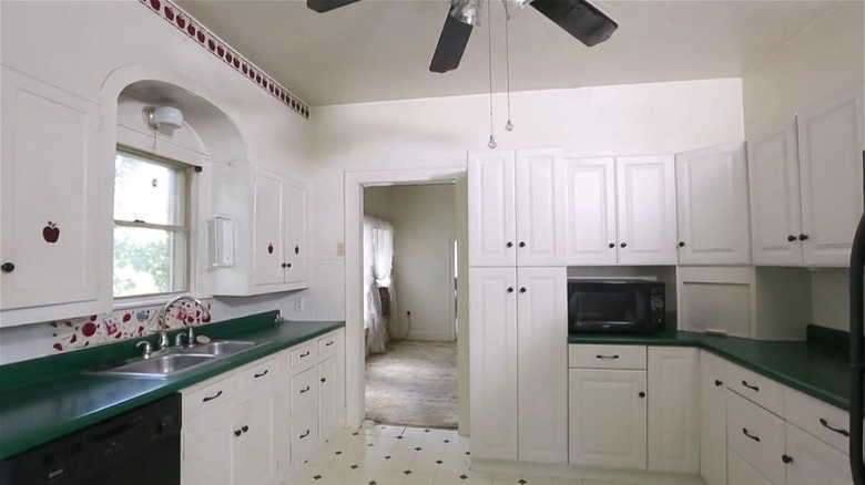
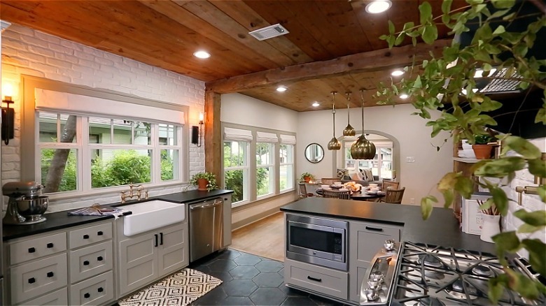
In Season 4, Episode 16, Chip and Joanna returned to their flipping roots and bought a house they could rejuvenate and resell. They purchased a 1,800 square foot house from the 1930s that seemed stuck in the 1990s. It had textured walls, old linoleum floors, and brown carpeting as far as the eye could see. And the kitchen was no better. It felt outdated with its black appliances, apple decals, and fruit-print backsplash.
Chip and Joana completely reconfigured the new kitchen, tearing down walls to make it bigger and airier. While the white cabinets with black hardware paid homage to the original design, the white brick walls, slate hexagon floor tiles, and exposed shiplap ceiling made you feel like you were in a completely new house. They also had to switch the appliances around — swapping the fridge with the stove — so that required a new gas line. But the flow was much better, making it worth the effort.
19. A bland galley kitchen got a moody makeover
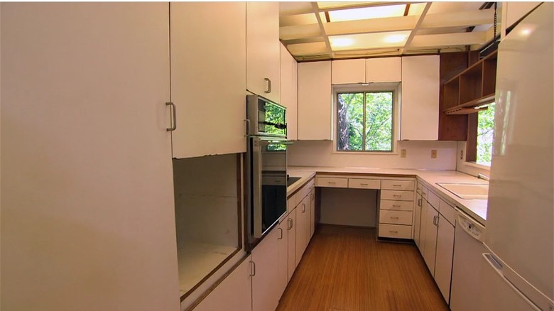
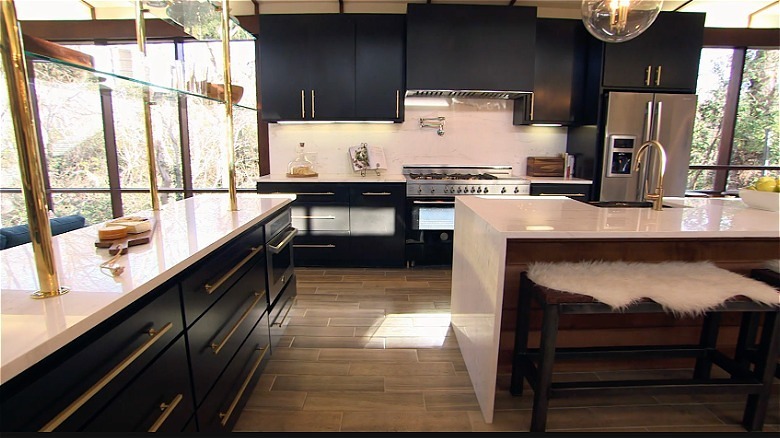
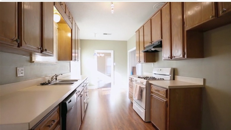
In Season 5, Episode 1, Chip and Joanna restored the charm of an old house for a young Austin couple, choosing to keep its vintage accents rather than completely remodeling them. But when they first saw the house, it was outdated. It had a galley kitchen, which the buyer admitted wasn't their idea of a dream kitchen. However, it was wider than most, which was a perk, but that's where the positives ended. It had old country cabinets, white linoleum countertops, and outdated appliances.
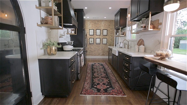
This is one of the most impressive kitchen flips in the series because it shows how different you can make a kitchen while still keeping its blueprint. Chip didn't take down any walls to create this new space. Instead, Joanna used design to make it feel completely different. They installed wooden floors, chose dramatic black cabinets, and added gold open shelving to make it airier and more glamorous.
20. A cave-like kitchen completely changed shape
A '50s ranch home was the star of the show in Season 4, Episode 1, but it needed some major TLC beforehand. The kitchen was a dark, cramped space that didn't inspire the imagination. "It feels like you're staring out into a little cave back here," the buyer joked. He had good reason to feel that way. It was a busy galley kitchen with black appliances, dark green striped wallpaper, and a white stone backsplash. It wasn't something anyone would want to cook in.
Joanna doubled the kitchen space by tearing down its walls and combining it with the living and dining room, creating a free-flowing floor plan. But even more impressively, they increased the pitch of the roofline, creating soaring vaulted ceilings with wooden beams. This not only made it feel even more open, but made it the center of the home. It wasn't tucked into a dark corner but became the main gathering space.
21. A country kitchen became a rustic retreat
In Season 4, Episode 5, Chip and Joanna had one of their biggest challenges in redefining rooms. Dubbed "The Big Country Farmhouse," it was one of their most dramatic transformations of the season. And that's because everything had to be reconfigured. "Every space in this house has been reconfigured. What was once the living room is now the master bedroom. What was once the kitchen is now a guest bedroom...What was once the master bathroom is now the kitchen. What was once the kitchen is now the bunk room," she told HGTV. That's because the original house had four separate additions added to it over the years, creating a disjointed blueprint. The kitchen itself was also in rough shape, featuring outdated orange cabinets and a small footprint. When the buyers first saw it, they let out an audible "oof" and joked, "Can we all fit in?!"
The new kitchen, which is in the space the master bath and closet used to be, is much more suitable for a modern house. It features updated white cabinets and a marble island. The travertine backsplash is rather unique and unexpected, but it creates a visual tie-in with the stone fireplace in the living room, which sits directly across from it. It's no longer an outdated country kitchen, but part of a rustic retreat.
