The Feng Shui Decor Rule Nate Berkus Loves To Break
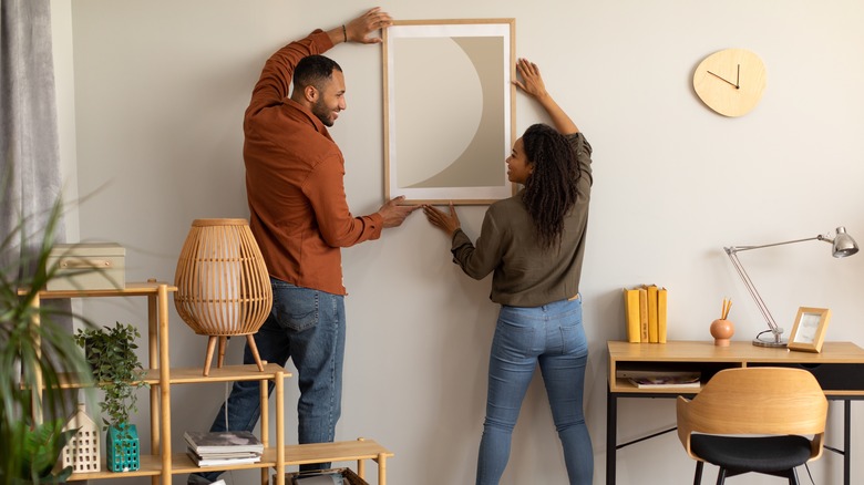
Choosing and hanging art in your home can be one of the best ways to add visual interest to your walls and reflect your unique personal style. How you hang the art, however, can sometimes be the difference between a harmonious and engaging space and one which seems overly cluttered, out of scale, or visually unappealing in some way. While many may look to the principles of feng shui to create harmony via symmetry while hanging artwork, design expert Nate Berkus says breaking this guideline may achieve better results.
"People think that everything has to be symmetrical," Berkus told MyDomaine. "They are obsessed with the idea that everything has to be balanced — which is not always the case." This applies not only to the placement of the art on the walls but also to the art itself, how you mount it, and the frames used. By playing with asymmetrical presentation and layout, you can often achieve a greater sense of visual flow than actual symmetry provides.
The joy of asymmetry
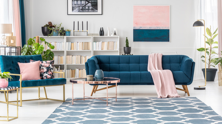
Berkus is often a fan of asymmetry in design, often choosing pieces, layouts, and principles that skew away from pure symmetry, including the choice of furniture and other décor elements that may echo each other and carry similar visual weight but don't necessarily match. This can often be a better approach to avoid seeming matchy-matchy or boring and predictable. "However, symmetry doesn't always mean pairs of things," He explained to The Washington Post. "For example, you could have the bookcase on one side of the window, but you balance it on the other side with a tall potted tree. The similar heights of the two items can create that craved symmetry for you. "
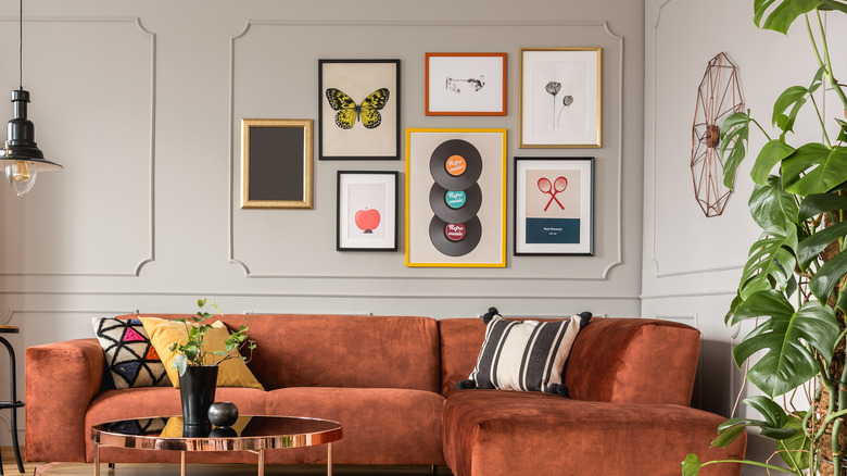
Berkus suggests frame choices work in a similar way. While you may be tempted to deck out an entire room with the same kind of frame, mismatched frames that complement each other in a variety of shapes, textures, and materials can often be a better approach.
Feng shui and art
While feng shui loves symmetry, keep in mind the rule of three, which can also be an important guideline when choosing décor. In feng shui, odd numbers represent greater flow than even numbers and are usually more desirable. This may mean that a grouping of three pieces of art will make more sense than four. Or that two matching pieces may seem less visually dynamic than three that complement and echo each other through medium, shape, and colors.
Other important considerations often come into play when hanging art according to feng shui that weigh a bit heavier than symmetry, including the ideal height to hang pieces and the scale of art in relation to the space it occupies. White space is also important around each piece and group of art, allowing the eyes to rest and for energy to flow well throughout the room. Crowded, cluttered, or overwhelming configurations can actually impede the free flow of feng shui more than a lack of symmetry can.


