Bobby Berk's Favorite Color Palette To Open Up Small Spaces
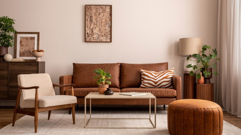
Small spaces can be a challenge to decorate, but they can also be a great opportunity to create an attractive, cohesive design. According to Bobby Berk from "Queer Eye," the key is color (via Homes & Gardens). By carefully choosing an integrated color palette, you can create an elevated, intentional room, whatever the square footage. Berk suggests limiting the colors in a small room to under four. While you can choose from a wide range of shades, the ideal approach is a monochromatic or tonal look. He says, "That doesn't mean that it can't be colorful, but that does mean to stick to a tonal palette, whether that be cool tones like blues and greens, or warmer tones like terracotta, beige, and rusts. By keeping things within the same tonal palette, the space will feel larger and more cohesive, which will allow it to feel less disjointed."
While small rooms, by their nature, can often seem cluttered even with not all that much inside them, color can go a long way toward creating a more open and orderly feeling. The repetition and contrast of a cohesive palette will draw the eye and create desired focal points without being overwhelming. A careful eye on the effect that colors and patterns have on the experience of a room can work wonders. Keeping a few key principles in mind can result in a room that is small in space but big in style.
Limit your palette
While your first inclination when dealing with a small space may be to deck the entire room in white to expand the sense of openness, Berk suggests that stark white may make the room seem lifeless and cold. Berk suggests you "Opt for a tone with a little bit of warmth in it and employ a warm, neutral palette throughout the space. I like to keep the foundational elements in neutral colors and then bring in interest through a layering of textiles in the same tonal palette" (via Bobby Berk).
Many designers adhere carefully to the 60-30-10 rule, suggesting that the major percentage of a room be dedicated to a single main color, with a 30% secondary color and a 10% accent shade. This is especially essential in smaller spaces where, unlike larger rooms, the eye takes in the view entirely at once instead of in segments.
Using color in small spaces
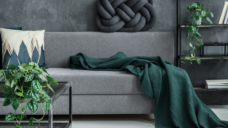
While light neutrals are an option that will always make a space feel more open, you can also trend toward dark, richer colors. Especially on the walls, these deeper shades have a way of making the room seem cozy and pulled together. They also provide a contrasting background for lighter or colored furniture. Many dark shades like forest green, indigo, or black are cropping up in spaces like entryways, hallways, and powder rooms.
A great way to add depth to your small space is to add swathes of colors in unexpected spaces, like the interior of a closet or bookshelf, which immediately draws the eye and makes a room seem larger. You can also use a focal wall in a bold color surrounded by white ones., which immediately has an elongation effect. For tiny rooms with a high ceiling, you can also implement elements like wallpapered ceilings, vertical stripes, and color above a picture rail to draw the eyes up off the floor and make the space seem more open.