The Color Rule Joanna Gaines Swears By To Make Small Kitchens Feel Big
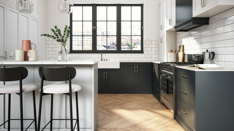
When designing a small kitchen, Joanna Gaines tells HGTV, "I love to play with color, because it's all about an illusion." This means choosing the right backsplash tiles, cabinet colors, and wall paint to make the space feel expansive, even if it's really tiny. When doing this, Gaines has a certain rule she always follows. "One of the things I tell people is anything from the countertop up, keep light in a space that's this small."
There are a few benefits to following this rule besides making the room feel bigger. First, it "really gives the feel of a light and airy space," explains Gaines. Further, light upper cabinets will make the area feel clean. And, no matter what interior design style you're going for, this rule could easily work since light colors are so versatile. If you're not sure where to buy your cabinet paint, Magnolia Home by Joanna Gaines with KILZ has many white, cream, and light gray shades to choose from.
How Gaines adds darker colors in a small kitchen
While Joanna Gaines recommends using light colors for the elements above the countertop, those below can actually be quite dark. For instance, in a 150-square-foot kitchen with white upper cabinets, Gaines adds dark green lower cabinets and a deep wood floor. This is a common color combination for Gaines, as she often pairs white with a darker tone like green, blue, or gray.
If your kitchen is too small for an island, Gaines also recommends isolating a darker tone above your countertops. "I tell people an island is really an anchor for their kitchen, but in a space this small we couldn't do an island, so we gotta find another thing that creates that same amount of interest," Gaines says via HGTV. "For me, this vent hood, I love this thing. I mean it's distressed wood, it's all about character, you've got these amazing, white clean cabinets, let's break that up, let's create a focal point." The dark wood on the vent hood adds a layer of interest that keeps the space from looking too one-dimensional.

