Living Room Furniture Pieces Shea McGee Avoids At All Costs
Interior designer and star of Netflix's "Dream Home Makeover" Shea McGee knows that how a home feels is just as important as the way it looks. Living rooms with matching, box set furniture tends to feel very formal, which can make the space feel impersonal and unwelcoming. Living rooms with formal energy tend not to get used very often, which defeats their intended purpose of being a place to relax and unwind or gather with loved ones. For this reason, McGee says she tends to avoid using overly-matching furniture sets in her designs and opts for mismatched pieces instead.
In a recent season three episode of "Dream Home Makeover" titled "The Dream in Dream Home," Shea McGee and her husband Syd are called upon by Neil and Liz, who need help turning their huge, open-concept mansion into a cozy space where every member of their family of five will enjoy spending time. Knowing that a warm, welcoming living room is especially important for Neil and Liz, who want their home to exude intimacy and personality, McGee doubles down on her avoidance of matching furniture sets and brings in pieces that help the space feel far more inviting.
A place to gather
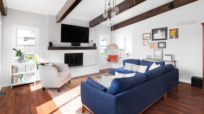
"Like Liz and Neil, I believe family comes first," McGee says (via Realtor). "And a family home is a place that you want to spend time, because it's comfortable and also beautiful." In her quest to create a comfortable and beautiful home for the couple and their family, McGee seeks to create a living room that is not only expertly designed and styled but guaranteed to get used. Through the use of mismatched, multicolored fabrics on the living room furniture, Shea helps create a beautiful living space that is also functional. "Every piece of seating has a different piece of fabric on it. Nothing actually matches," she says of Neil and Liz's new living room. "That's what helps keep things more interesting and not too fancy."
In addition to mismatched neutrals, color can also be incorporated into a living room's design scheme to liven it up and prevent it from feeling sterile or generic. "We added some hints of color in the textiles and in this dark blue sofa," McGee explains. "It creates a room that feels warm enough that it makes you want to spend time in that space."
How to style a mismatched living room
Designing your personal space around a collection curated by a furniture company is a big missed opportunity, as your home is the one domain that you have complete control over. Your living space should be an extension of yourself, and filling it with matching furniture from a singular collection leaves it feeling like a showroom. "There's something about furniture sets that don't bring that thoughtful feeling that mixed furniture does," says Kelsie Lindley, Lead Designer at Shea and Syd's design studio, Studio McGee.
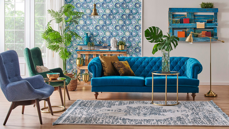
Though filling your living room with matching pieces from the same Pottery Barn collection is certainly one way to guarantee your space will match, curating your space is about more than things simply matching. And while your furniture pieces don't have to match, they do need to be curated in a way that is cohesive to a single living space. "Start by using your sofa color as a jumping-off point, and create a higher-end look by allowing colors to gently flow into each other," says McGee (via People). While introducing pops of color into your living room using the furniture itself is a fun and bold way to make the space feel inviting, McGee notes that she also loves to invest in more neutral furniture pieces such as sofas and then "weave in color and heavy textures through the pillows and throws. I find that about five colors is the sweet spot for a great textile palette in a room."


