What Is A Triadic Color Scheme And How Can You Use It In Your Space?
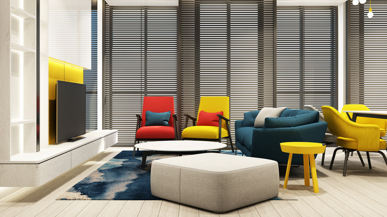
Interior designers have long relied upon color schemes to bring clients' living spaces to life. The triadic color scheme is just one example that turns heads and impresses if done correctly. A triadic color scheme is a trio of colors that are equally spaced apart on the standard 12-part color wheel, often consisting of one primary color, one secondary color, and one tertiary color. While other color schemes also rely on color wheel positioning to give rooms a distinct look, the triadic color scheme has the ability to integrate three conventionally opposing tones to form one vivid and complementary space, making it a worthy tool of use when designing a child's bedroom, kitchen, or any other room in need of a bright and refreshing reset.
Though the formula has been utilized for centuries, the triadic color scheme is popular in modern interior design due to its visual appeal, promoting an air of harmony and balance while also incorporating pops of color into an otherwise mellow or dull living space. Not only is it suitable for home décor practices, but world-renowned brands also implement the scheme into their advertising campaigns, like hamburger giant Burger King and soda manufacturer Fanta. The scheme is also used in set and costume design for movies and is frequently used by artists spanning a variety of creative mediums. Let's delve more into how the triadic color scheme can be used around the house specifically to create stimulating yet aesthetically-pleasing spaces.
How to use the triatic color scheme correctly
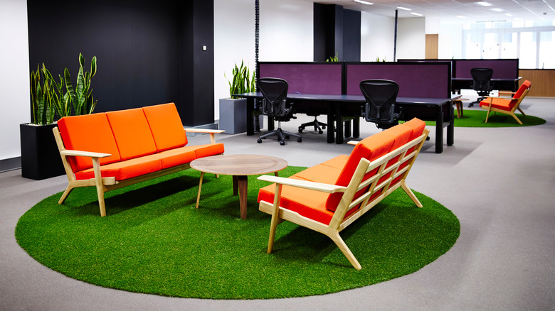
The triadic color scheme can be implemented by simply grouping the three primary colors, red, yellow, and blue, together, as they're spaced exactly 120 degrees apart on the color wheel. The same rule applies to the three secondary colors: Orange, green, and purple. However, you can make your trio of colors as warm, cool, vibrant, or toned down as you'd like. If you want to experiment with possible color combinations, try toying around with a digital color scheme generator online before debating potential paint swatches and furniture pieces with your housemates.
A crucial element in bringing a triadic color scheme to life is incorporating each of the three colors into a space equally. In other words, you should aim to add just as much of each color into the room you're renovating in order to best exemplify the balance that the color scheme offers. It's also important to consider light flow when opting to use a triadic color scheme since the way natural and artificial light bounces off certain hues can substantially affect how rooms appear to the home's residents and guests.
Where triadic color schemes fit best
Kids, on average, are more attracted to color than adults, so triadic color schemes fare especially well in rooms of the house predominantly used by children, including bedrooms, playrooms, and similar areas. Incorporating bright colors into kids' spaces can create a playful vibe that both stimulates their minds and sparks their creativity. Warm colors, like vibrant shades of red, yellow, and orange, are scientifically proven to incite creativity among youth, so consider palettes involving these hues when designing spaces for your little ones. Since triadic color schemes depend on layering to create a proper balance between the used shades, choosing one color as the base, to be used along walls or other larger elements, and leveling out the rest of the room with décor elements in the other colors, can help add dimension to an otherwise flat space.
Triadic color schemes are also beneficial inside rooms of the house that require the most focus or are used the most when entertaining, like living and family rooms, kitchens, dining rooms, and home offices. A room's color can greatly impact an individual's mood and behavior, so choosing a scheme that will match the necessary tone of a specific space is crucial in crafting a stylish and functional home.


