The One House Feature Nate Berkus And Jeremiah Brent Can't Agree On
Interior designers and television couple Nate Berkus and Jeremiah Brent are known for their unique aesthetic and ability to transform the ordinary into beautiful and functional living spaces — and that translates to their own home. In a tour with Architectural Digest, the duo reveal the updates they made to their New York City house. The renovations are all about the contrast between modern and traditional, high style and durability — it's probably why they can't agree on how it comes across to others.
In an interview with HGTV, Nate describes the home as "storied... and strangely causal." To which Jeremiah laughingly replies, "I don't think most people would describe our style as casual." He elaborates, "I think some people would consider it to have some formality. But we don't. We don't find anything to be precious, and we never want people to feel like they can't, you know, put their glass down somewhere." Ultimately, they both want their space to feel casual and welcoming to anyone that visits.
Their joint style
As the first project they took on together, it was extra special to be able to return to this location. "It represented a building block for us, a very important one in all the ways of being seen and being heard and being known," Nate said (via Architectural Digest).
According to their Architectural Digest tour, one of the main goals for the new home was to be able to host people and allow everyone in the home to feel comfortable. Nate and Jeremiah's children were one of the driving forces behind this, as their floor incorporates a lot of colors and feels warm and playful. The design couple wanted to create a casual, inviting home where many of the belongings are on display because they are cherished and actively used, not just decoration.
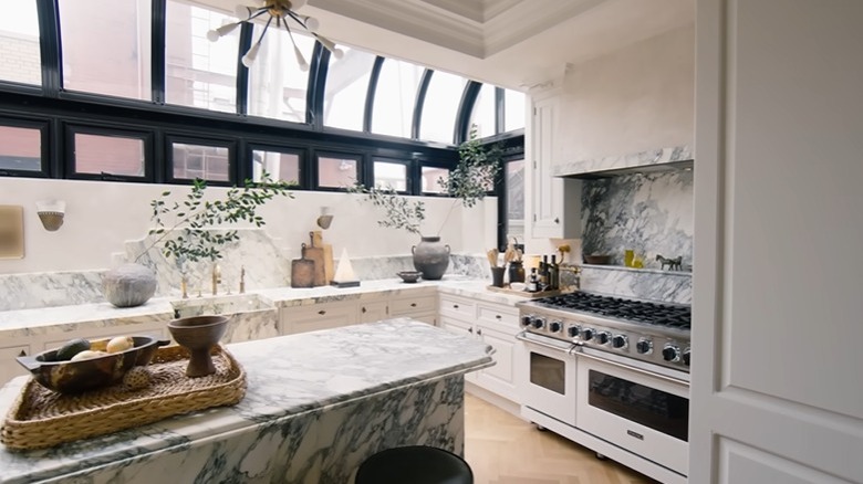
The living room and dining room are some of the spaces that allow them to do that. They have friends over for drinks, hang out with the kids, and have their quality time in these two rooms. The kitchen is another. "People always ask why we accessorize the kitchen the way we do, and it's because we live here. We like lamps, we like art hung. This space always makes me happy," Jeremiah says about their bright, chalky kitchen. This home tour definitely shows a significant revolution in their design tastes and motivations since the last time they showed it.
Renovation motivations
Now a family of four, the couple has changed a lot since that first home tour, and their two personal styles have found a balance together. "It's a blend of his modernity and rule breaking, with my sort of traditionalism and crazy auction-house encyclopedic furniture history that lives in my brain," according to Nate on Architectural Digest. Their style is inspired by '30s to '50s decor and features many neutrals and textures.
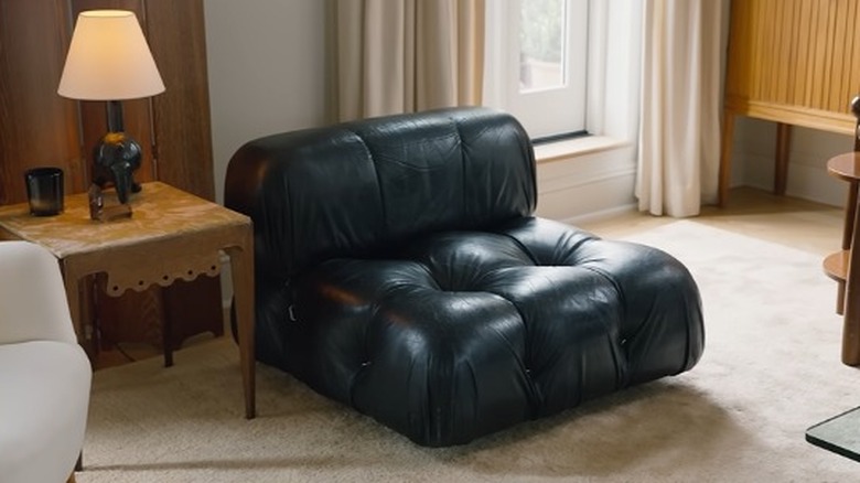
The family room features a bookshelf that was there from the first time they lived there, and they painted it a light color to keep the space bright. The large white shelf is contrasted with the sofa and side table, however, which are dark brown in line with Jeremiah's modern style. The room that shows their joint style the best is probably their bedroom. From traditional lighting to modern fixtures and furniture, the bedroom shows how much they've pushed themselves to do some different and the potential their home's style has to stand the test of time.


