A Comprehensive Guide To Midcentury Modern Architecture
Midcentury modern architecture is a style popular in the mid-20th century, roughly between the 1930s and the 1960s. It fell out of fashion by the 1970s, but has recently been experiencing a revival in both the home and office spaces. You might have seen midcentury modern architecture popping up recently and want to know more about it. A focus on function and simplicity and an embrace of new materials and construction techniques characterizes this design movement. Midcentury modern architects sought to create buildings that were not only efficient and utilitarian, but also aesthetically pleasing and in harmony with their surroundings.
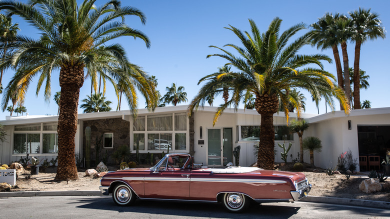
The most iconic midcentury modern buildings are known for their clean lines, geometric shapes, and use of materials like wood, glass, and concrete. These buildings often feature large expanses of glass, which blur the boundary between indoor and outdoor spaces and allow for abundant natural light. Midcentury modern architects also extensively used innovative construction techniques like precast concrete and modular construction. Their buildings can be characterized by a sense of lightness and a feeling of openness and spaciousness, making them highly sought after by homeowners and commercial clients. In modern times, midcentury modern architecture is seen as a classic, desirable design aesthetic and is popular in new homes and remodels.
Where does the name midcentury modern come from?
Midcentury modern was first used to define an era by author and historian Cara Greenburg in her 1995 book "Mid-Century Modern: Furniture of the 1950s." Although the term was used in passing before Greenburg's time, she was the first to tie everything together. The name comes from the point in the 20th century the design first appeared (right in middle) and how it was viewed at the time (very modern). In the book, Greenburg recounts interviews with American designers Ray Eames and George Nelson — both were instrumental in modern design in America. Having first-hand interviews with them gives readers deeper insight into the thinking behind the movement.
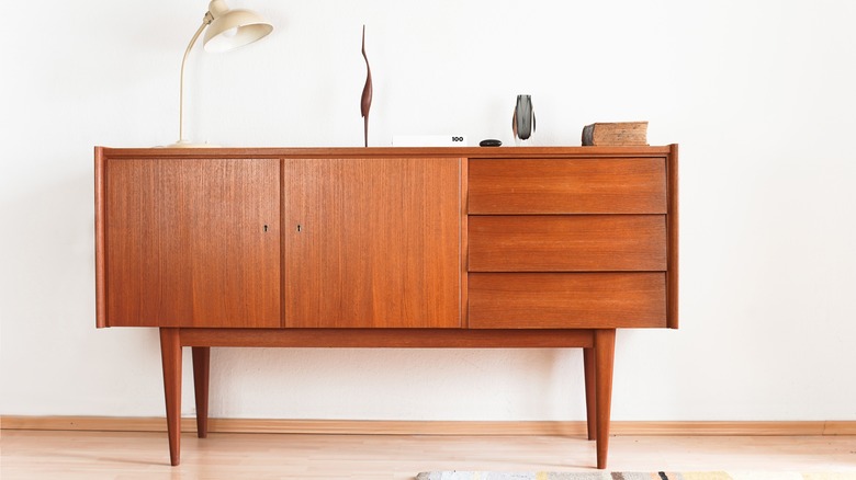
Although the book mainly focuses on furniture in the period, the design features it covers easily translate to buildings, as well. The trademarks of clean lines and geometric shapes pop up in all versions of the design movement.
When was midcentury modern architecture popular?
Midcentury modern architecture was a style that emerged in the mid-20th century, roughly between the 1930s and the 1960s. The movement reached its peak when World War II ended in 1945. The postwar period was a time of significant cultural and social change. The United States had a booming post-war economy due to increased manufacturing and disposable income. This boom created the rise of the middle class. The newfound prosperity led to a growing demand for affordable, stylish homes for returning soldiers and their families. Suddenly, there weren't enough houses to go around and everyone was scrambling for a mortgage. The Federal Housing Administration (FHA) started handing out loans to civilians, while soldiers secured financing through the GI Bill.
Midcentury modern architecture emerged as a response to this need. Most communities in suburban America were built distinctly in the style. Its focus on simplicity, functionality, and the use of modern materials made it easy for builders to create a lot of sturdy houses quickly. A few examples of this housing boom are the Arapahoe Acres neighborhood just outside of Denver and the Glenbrook Valley neighborhood in Houston. Both communities popped up in the 1950s and the homes are almost exclusively in the midcentury modern style.
What are the key features of midcentury modern architecture?
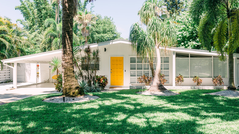
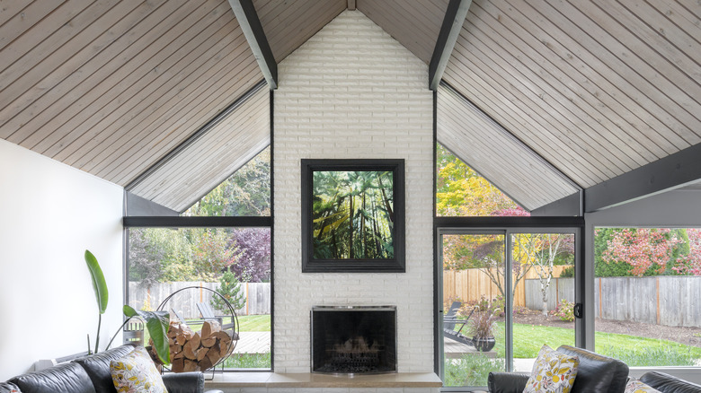
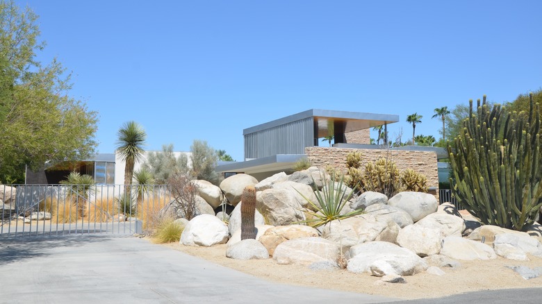
It's easy to spot a midcentury modern building if you know what to look for. Most of the structures had features like flat or low-pitched roofs, open floor plans, and little to no decoration in the design. Plus, designers in this era were interested in blurring the boundaries between indoors and outdoors. They often used large windows and sliding doors to bring in natural light and connect interior spaces with the surrounding environment.
"Midcentury modern was about stripping away unnecessary ornament and really getting to the essence of a design gesture," designer Jonathan Adler told Architectural Digest. "That clarity of vision is innately communicative and people love design that speaks to them. By stripping away the frills, the designer can communicate directly with the viewer, and communication is ultimately what good design is about."
This means that midcentury modern buildings have a big emphasis on function instead of fashion. Designers created structures with practicality in mind, rather than just aesthetics. However, midcentury modern design also often features bold, bright colors like turquoise, mustard yellow, and deep red. They used these colors to add pops of excitement and energy to otherwise neutral spaces.
What materials were popular in midcentury modern architecture?
The development of new materials and technologies influenced midcentury modern architecture. Designers liked to blend cutting-edge equipment like steel and concrete with older, tried-and-true options, like wood and stone.
For example, many homes during the midcentury modern era featured lots of concrete in the walls, floors, and even support beams. Concrete is versatile because it can be molded into nearly any shape without compromising its strength. However, too much concrete in one space can make it feel cold and sterile. So while the floors and fireplace might be concrete, the home's walls might be covered in wooden panels to create more warmth and livability in the space.
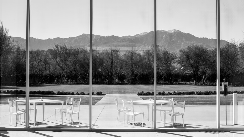
In addition, midcentury modern architects liked to use a lot of glass in their buildings. You will notice homes and offices from the era tend to have walls of windows. This was to let the sunlight into the main living and working spaces. It also allowed those inside to enjoy the amazing views of the outdoor world without actually going outside. Outside and inside were perfectly blended whether the building was set over a river in the forest of Illinois, hanging onto a cliff in southern California, or even in the heart of midtown Manhattan.
Midcentury modern architecture rejected decoration
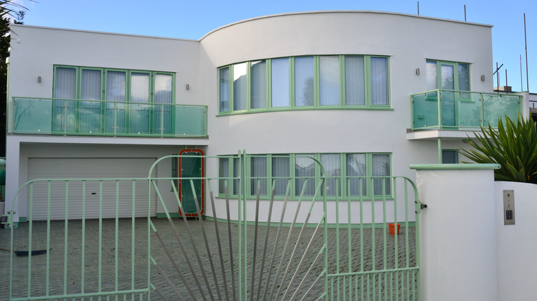
International Style also influenced midcentury modern architecture. The style was characterized by functional design, the use of modern materials, and a rejection of ornamentation. It first became popular in the 1920s and 1930s. This style was the opposite of Art Deco, which developed at the same time and was the main style in homes before midcentury modern became popular. Art Deco embraced decoration as a fundamental design principle, with its use of intricate geometric patterns, elaborate ornamentation, and the incorporation of exotic materials like precious metals and rare woods. Art Deco buildings were designed to be visually striking and glamorous, with a sense of luxury and opulence. midcentury modern was about as far away from this as you could get.
While a focus on modernity and technological progress characterizes both styles, they differed significantly in their approach to design. Midcentury modern architecture was marked by its simplicity, functionality, and lack of ornamentation, while Art Deco was known for its bold use of decoration, luxurious materials, and glamorous aesthetic.
Midcentury modern architecture tried to harmonize inside and outside
No one likes feeling cooped up inside their own homes. Midcentury modern architecture was the perfect solution to this. A focus on indoor-outdoor living with features that blurred the boundaries between inside and outside characterized the movement. Architects like Frank Lloyd Wright, Richard Neutra, and Ludwig Mies van der Rohe believed that people should be able to experience nature from inside their homes or workplaces.
They used a few clever tricks to make this possible. One of the most common was to use lots of glass. Instead of hiding behind walls, midcentury modern buildings often had huge windows and sliding doors that let in natural light and provided views of the surrounding landscape. This made the inside of the building feel like it was part of the outside world.
Homes were also often designed with outdoor spaces in mind. Whether it was a patio, a balcony, or a rooftop terrace, these spaces were treated as extensions of the interior, with furniture, plants, and other elements that made them feel like cozy, welcoming outdoor rooms.
Midcentury modern is thought to be an evolution of the German Bauhaus style
Some argue that defining features of midcentury modern architecture are an evolution of the Bauhaus style, which emerged in Germany in the early 20th century. The Bauhaus was a school of art, design, and architecture that emphasized simplicity, functionality, and industrial production. It was founded in 1919 by Walter Gropius, who believed that art and design should be integrated with industry and technology.
The Bauhaus style was characterized by clean lines, geometric shapes, and a minimal color palette, just like midcentury modern. The style also emphasized functionality and the use of industrial materials like steel, glass, and concrete. This approach to design was revolutionary at the time and had a profound influence on the development of modern architecture and industrial design.
In the 1930s, many Bauhaus designers fled Germany due to the rise of the Nazi regime. They brought their ideas with them to the United States. They continued to develop their designs in their new country, incorporating new materials and technologies into their work. When the war was over, the style took off stateside. However, American midcentury modern designers also brought their own unique ideas to the table, including a greater emphasis on nature and the use of new materials like plastic and fiberglass. They also focused more on creating comfortable, livable spaces for people, rather than just functional objects.
The Lovell Health House in Los Angeles is one of the first domestic examples
One of the earliest examples of midcentury modern architecture in the United States is the Lovell Health House in Los Angeles. Richard Neutra designed the home in 1927. At the time, the home seemed straight out of the future. At the very beginning of the midcentury modern movement, this home set the tone for a design style that's all about simplicity, functionality, and being eco-friendly.
The Lovell Health House is made of steel and glass, which was a new and exciting way to build a house in the 1920s. Yet as chic as it was, Neutra's choice wasn't just about looking cool. The glass walls let in lots of natural light, which meant its residents didn't have to use as much electricity for lighting. Plus, the steel frame meant that the house could be built quickly and efficiently, with less waste of materials.
But that's not all: The Lovell Health House was designed to be healthy for the people who lived in it. It had a ventilation system that kept the air fresh and clean. It was also built on a hillside to take advantage of the cool breezes from the Pacific Ocean. The house even had a rooftop garden, where residents could grow fruits and veggies. Without even knowing it, Neutra set the scene for the midcentury modern movement.
Frank Lloyd Wright influenced the style in the United States
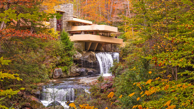
Frank Lloyd Wright's work is some of the most easily recognizable in the United States and is the perfect example of the midcentury modern style. His work used all the hallmarks of the movement, like building homes with straight, clean lines and natural materials. He also believed in the integration of the built environment with nature, a concept that was central to the movement. Fans of Wright's work will recognize these examples in Fallingwater, a private residence Wright designed in Mill Run, Pennsylvania.
The home perfectly pairs the stream flowing past, as the part of the home even hovers over a small waterfall, becoming one with it. The home also features innovative use of reinforced concrete and cantilevered construction, which was a breakthrough in architectural engineering at the time. A cantilevered structure is only supported on one end. The rest of the object, typically a balcony, roof, or beam, juts out straight from the attachment point with no further support.
Wright's daring organic architecture inspired many other midcentury modern architects, like Richard Neutra and Eero Saarinen, who incorporated his ideas into their designs. Without Wright's influence, it is unclear whether the design would have ever become as popular in the United States as it did. What is clear is that his style changed the direction of the style's features in the country.
Midcentury modern architecture even made its way to movies and TV
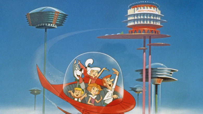
At its peak, midcentury modern architecture even made its way into pop culture. The artistic style of "The Jetsons" is an excellent example of the style, as is much of the architecture at Disneyland in California. "The Jetsons" is an animated television series from the 1960s. Meant to take place in the 2060s, the Jetsons were a family who lived in the space age. They inhabited an optimistic vision of the future, highlighted by a midcentury modern style. The Jetsons' home, located in the futuristic city of Orbit City, features a streamlined aesthetic that reflected the influence of modernist design. It has glass walls and an open floor plan, emphasizing the importance of natural light. Plus, the house was on stilts, a popular design feature that allowed homes to rest on difficult terrain.
Contemporaries of midcentury modern architecture were convinced it was the way of the future, which is why the same style appears in "Tomorrowland" and Disneyland. The neighborhood in the park is supposed to represent a perfect future, much like "The Jetsons." The land opened in 1955 and underwent several redesigns in subsequent years, reflecting the evolution of this period's architecture. Tomorrowland's architecture features the clean lines, geometric shapes, and bold colors that are hallmarks of the design movement. Tomorrowland also has a lot of aluminum, fiberglass, and plastic included in its building materials. This reflects midcentury modern's focus on technological progress and innovation.
The Farnsworth House in Illinois is another masterpiece
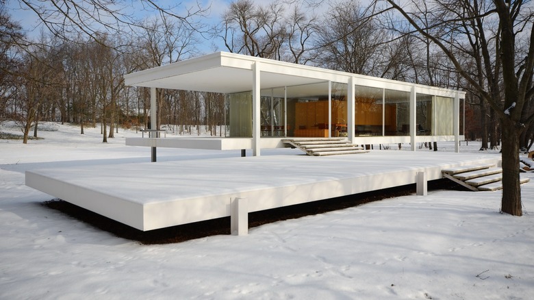
Another notable example in the United States is the Farnsworth House. Ludwig Mies van der Rohe designed the house in 1951. It is considered a masterpiece of the style. The house is in Plano, Illinois, about an hour west of Chicago, and was built to interact with the nearby Fox River. The home sits on an elevated platform that sticks out over the river. This clever design trick makes the home appear to effortlessly float over the water. This marriage of man-made and natural elements is common in midcentury modern architecture, as the Farnsworth House and Falling Water have many similarities.
In addition, the home's interior is a single open room with floor-to-ceiling glass walls that provide unobstructed views of the surrounding landscape. Architect van der Rohe did this on purpose when he built the house primarily of steel and glass, with minimal use of materials and a focus on simple geometric form. By doing this, its first resident, Chicago nephrologist Dr. Edith Farnsworth, could have uninterrupted access to the nature surrounding her home. In recent years, the home is no longer a private residence, but a museum open to the public to explore and enjoy the style.
Midcentury modern was used in both domestic and commercial spaces
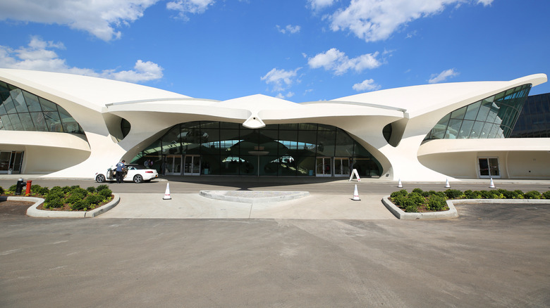
The style also appears in commercial architecture, like TWA Flight Center at JFK Airport in New York. The center, now a hotel, was designed by architect Eero Saarinen. Its appearance relies heavily on modernist design principles, like simple forms without unnecessary ornamentation. The center is somehow chic and plain, all at the same time. This effortless combination is the epitome of midcentury modern. The building's sweeping curves and aerodynamic shape are a nod to the sleek and functional design of airplanes, a symbol of progress and technological advancement during the mid-20th century.
In addition to this, TWA Flight Center's materials and construction techniques reflect the style's focus on innovation and new technologies. The building visually showcases the era's excitement about the possibilities of the future. For example, the building's concrete shell was created using thin-shell construction, which allowed for large, curvilinear forms to be built without the need for supporting columns or beams.
Its interior spaces are designed to maximize natural light and create a sense of openness and fluidity. The building's main terminal features a vast, column-free interior space with a soaring, 115-foot-high ceiling that mimics a grand cathedral in Europe. The building's expansive windows allow for ample daylight to flood the space, creating a bright and airy atmosphere. It's the perfect embodiment of the style's obsession with bringing the outside, inside.
Midcentury modern is making a comeback
The style fell out of favor in the 1970s, but has experienced a resurgence in popularity in recent years. "More than anything I'm drawn to the vibe of optimism and the spirit of postwar possibility," designer Jonathan Adler told Architectural Digest on the style's continued popularity. "Optimism never goes out of style."
In the 2020s and beyond, there is an increasing focus on sustainable and eco-friendly design. This interest is perfect for a midcentury modern renaissance, as the style is known for its effortless sustainability. For example, most buildings in the style have a passive solar design. This means the building uses natural energy from the sun to heat and cool the space, reducing the need for artificial heating and cooling systems that consume lots of energy. Midcentury modern buildings also often feature large windows that allow for plenty of natural light to capture as much sun as possible during the winter months, while also providing shading during the summer months.
Midcentury modern homes also often incorporate natural materials, such as wood and stone, that are renewable and have a smaller environmental impact than many synthetic materials. Architects who design in this style tend to emphasize the connection between indoor and outdoor spaces, which can help reduce the need for artificial lighting and ventilation. These days, many architects and designers incorporate midcentury modern elements into their work in homes and businesses, like Zaha Hadid and John Pawson, further proof that midcentury modern is still very much in style.
