House Digest Staff Reveals Its Favorite Design Trends Of 2023
The design world has been shifting and changing since the new year, and some interesting trends have emerged to meet the new zeitgeist. The last couple of years has been fueled by the pandemic, a resurgence of the noughties, and a slowed-down way of living. Thanks to the pandemic, amateur and professional home designers alike have been looking for ways to make the home feel comfortable and safe. But now that we see the light at the end of the tunnel, the design world is rejecting sterile white rooms inspired by cleanliness and embracing bright hues and wonderfully messy maximalism as a sign of hope. The pandemic has also slowed our way of life, leading to less-curated and Instagram-perfect spaces. Another massive influence on micro-trends is Gen Z and their love for all things 2000s, which has brought about new furniture shapes and brightly colored accents.
There are a lot of new trends to choose from, and we have asked our editors which ones are the most exciting. From earthy kitchens to brightly colored tiles, there's a new pendulum swing toward color, texture, and fun. Here's what to keep your eyes out for.
Jennifer Anum - Rounded edges
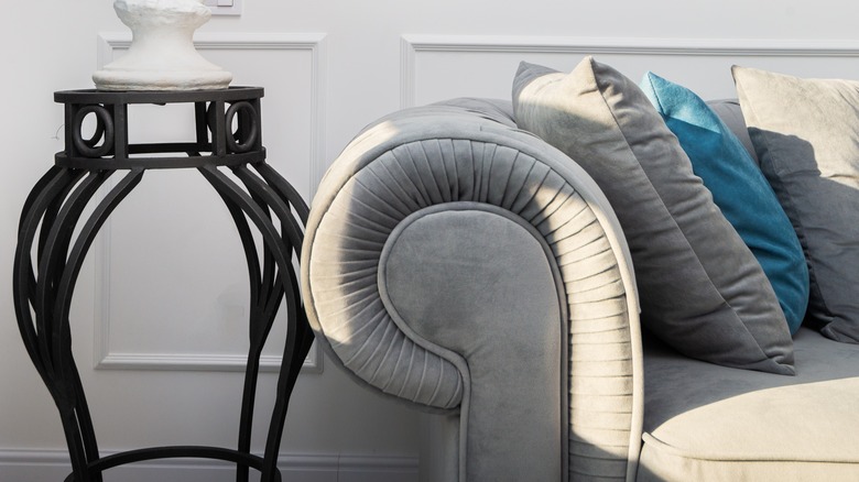
Antoni Gaudí, the most ingenious pioneer of Catalan modernism, might have seemed mad when he declared buildings should not comprise sharp edges since nothing in nature is straight. Sure, it must have been difficult for 20th-century architects to swallow, but the eccentric was proven right with the emergence of the biophilic design. Observing how buildings began to reflect the softness and curves of the natural environment, designers in the '70s dashed into the home to do the same with furniture. Enter rounded edges.
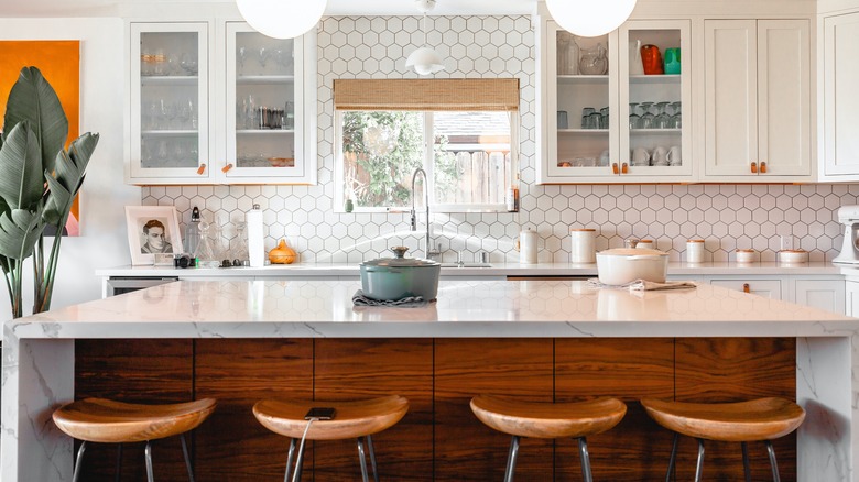
For 2023, the resurrecting power of the curved furniture trend has me in a chokehold. I am a fan of all its formats, whether depicted with wood, glass, stone, or natural fibers. I would rather the exciting curves of a kitchen island and the soft appeal of a chaise lounge grace my interiors than straight lines and shapes. After all, rounded edges introduce an organic look to traditional and contemporary settings, creating a familiar flow that enhances visual and social aspects. Curved-edged furniture designs emphasize sculpting, creativity, and sophistication, proving to designers that consumers still yearn for bold expressions.
Sydney Fogel - 1970s inspired
In 2023, we're seeing a revival of home decor and design from the 1970s, but with a modern twist. With trends moving away from appearing super staged and more lived-in, the '70s fits this look. The decade was defined by earth tones, lots of textures and prints, natural wood furniture, and so much more. With modern trends blending together with a '70s aesthetic, I think it makes for an ideal balance in the home.
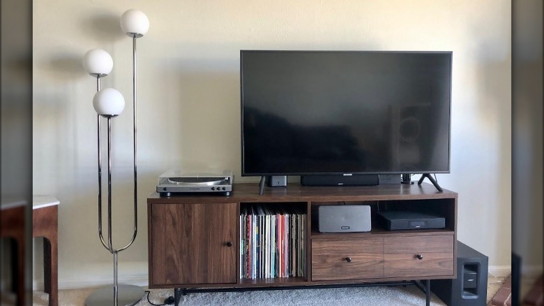
My husband and I just moved into a new home, so we took it as the perfect opportunity to give our decor a little '70s-inspired upgrade. We ditched our previous black media table and picked a new brown mid-century model that lets us put our records on display. We also got this funky globe light floor lamp. We played up the warmth of the bricks around the fireplace by displaying a Native American textile my husband picked up while in New Mexico. Though perhaps not a permanent fixture, we topped the mantle with disco ball lights that tie into the glam of the floor lamp. On our liquor cabinet, we created another little vibe, complete with my original lava lamp from my pre-teen years. We still have a long way to go with decorating, and I can't wait to see how we continue to transform the space to make it even more homey and inviting.
Chris Gillespie - Light wood flooring
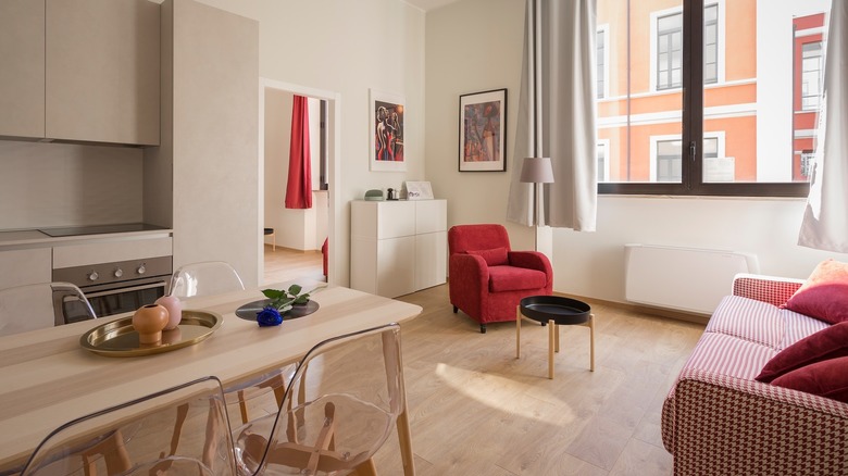
Mention hardwood floors, and most people will think of solid dark woods with rich coloring and beautiful graining, such as oak, walnut, or American hickory. These floors are typically found in older homes with traditional styling, period furniture, or rustic farmhouse elements. However, one trend that emerged at the end of last year, and is continuing into 2023, is light wood flooring.
If you are trying to create a minimalist aesthetic in your home, light-colored wood is definitely the way to go – especially thin boards rather than wide planks. The minimalist trend is characterized by a less-is-more mentality and focuses on creating a calm, cohesive, clutter-free space. When choosing colors to complement a minimalist decor, light, airy, and neutral pallets work best. For flooring, this equates to pale species, such as maple, ash, white oak, or even bamboo.
Light colors help brighten up a room and can create a contemporary, modern vibe. They also help to create the illusion of space and can make the most of a room that lacks natural light. If you are thinking of installing a hardwood floor in your kitchen, white oak is an excellent choice as it's highly durable and naturally water resistant. Alternatively, for a sunroom or an enclosed porch, opt for something with a more natural feel like bamboo, which can help tie the outdoor and indoor elements together, and looks striking when paired with some tropical potted plants and simple rattan furniture.
Abby Kolonsky - Colorful zellige bathroom tile
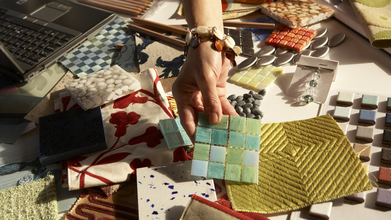
Interior design in 2023 is all about embracing color, and I'll be the first to say that nothing is cheerier than scrolling through a Pinterest feed of colorful and aesthetically-pleasing homes! Trends are moving away from neutrals and towards bright and vivid spaces, especially in bathroom design. Gone are the days of white tile with white marble and white walls — no more cold and bland rooms filled with countless shades of gray and beige. Instead, people are designing rooms full of color, pattern, organic texture, and, most importantly, personality. One of my favorite trends that encapsulates these themes is using colorful zellige tiles in bathroom designs.
These Moroccan clay tiles are handmade with tons of natural variation in texture and color, bringing an organic feel to an otherwise sterile room. They are available in an array of shapes, from diamonds and hexagons to standard squares, and can be glazed in every color imaginable. We're seeing entire bathrooms covered with zellige tiles in moody colors to create a cozy vibe. Long rectangular-shaped tiles in contrasting colors can create a striped design on the bathroom walls, while squares in different shades can form a checkerboard pattern on the floor. Or traditional Moroccan designs with intricately chiseled tiles in multiple colors add lively visual interest. The options are endless, making zellige tiles the perfect tool to express creativity in design!
Marlen Komar - Wallpaper ceilings
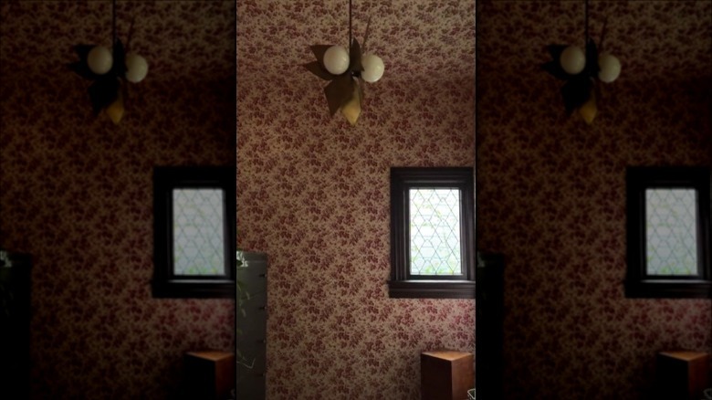
Wallpaper ceilings have been dominating in 2023, riding on the coattails of the maximalist resurgence. As more and more people are moving away from minimalism and making their homes cozier, they have taken to adding print and color to their ceilings. This helps bring the ceiling down visually, making you feel enveloped in the room. It originally evolved from statement walls, where you would have one focal point in the room. But this has been around for years, and people have been itching for something novel. Extending the print to the ceiling was the answer.
I love this trend because it helps add visual interest to the room. A white ceiling often feels stark when the walls are painted a bold color, and adding wallpaper adds an unexpected element. I'm a maximalist at heart, so I'll grab any chance to add more texture or pattern to a room. If you want to get really wild, you can take this trend one step further and wallpaper the ceiling with the same print as the walls. This looks especially welcoming on a gabled or slanted ceiling, as it draws your eye upward, making the space feel bigger. It also makes choppy, awkward rooms feel cozier and more intentional since it smoothes their sharp lines.
Zachary McCarthy - Bold, dramatic kitchens
I was fortunate to chat with several high-profile designers in 2022, and not a single one mentioned the sanitized (and formerly ubiquitous) farmhouse aesthetic when discussing the dream kitchens their clients clamored for. To me, this is a sign of the times.
A kitchen is where the glint of steel blades, open flames, and chunks of meat collide with the base imperatives of American life — pleasure and survival. As such, it's always been a space that welcomes brash creativity and a celebration of the pungent ingredients that make life bearable. For me, these are fiery, fragrant, and doused in red, like fatty chunks of pork belly slathered in gochujang, simmering on scalding cast iron.
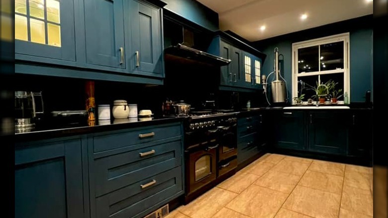
But burgundy floral wallpaper, black concrete countertops, and polished white kitchen counters for contrast are not to everyone's taste. Designer and DIY wunderkind Jenni Yolo proves a dash of drama can be achieved with a rustic flair. In a recent project, she modernized a traditional kitchen setup by painting the existing counters an eye-catching royal blue. Juxtaposed with adventurous medallion-print wallpaper, Jacobean butcher block counters, and a reclaimed wood ceiling beam, the result speaks for itself. Homeowners are beginning to realize that a kitchen's surfaces are meant to be sanitized – its design should tantalize and inspire.
Ashley Palmer - Geometric wall tiles
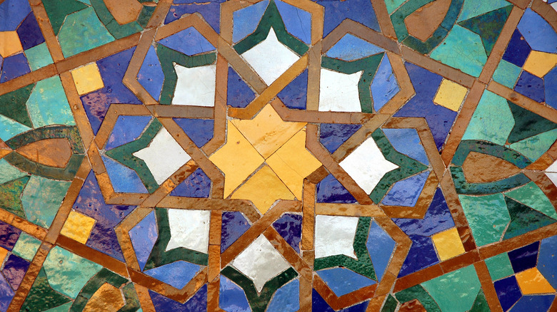
Geometric wall tile installations are a dynamic combination of historical heritage and modern ingenuity. Inventories feature stunning options inspired by rich cultural havens from the shores of Greece to the Mexican deserts. There are innovative three-dimensional tile shapes that create amazing texture and visual interest. Or, those looking to buck typical rectangular tiles can opt for trending octagonal or hexagonal shapes. These attention-grabbing tile installations have been widely used to bring a custom zest to the atmosphere in trendy eateries and bars. In 2023, they're popping up as an interior trend everywhere from quaint Victorians to vibey lofts.
These are perfect for those looking to make a stunning statement no matter their decor comfort level. Those who want to play it safe can add subtle details with a delicate gray and white monochromatic pattern or on-trend tile shape in a solid matte. However, those ready to dive into bold design choices can opt for stand-out designs like vivid florals or vibrantly-hued stripes.
What I love most about geometric wall tiles is their innate ability to add character to spaces with any decor style. Traditional kitchens can instantly gain a curated feel with an Aztec-inspired backsplash. You can boost a contemporarily-styled wet bar with a three-dimensional octagon design. And boldly-colored wall tiles make themselves right at home in ethnically- or boho-inspired bathrooms. Personally, I jumped on the farmhouse movement's stark, white subway tile trend in my own spaces. Swapping them for brass-infused graphic tiles is on my home-modernization to-do list.
Olivia Royle - Moving away from curated homes
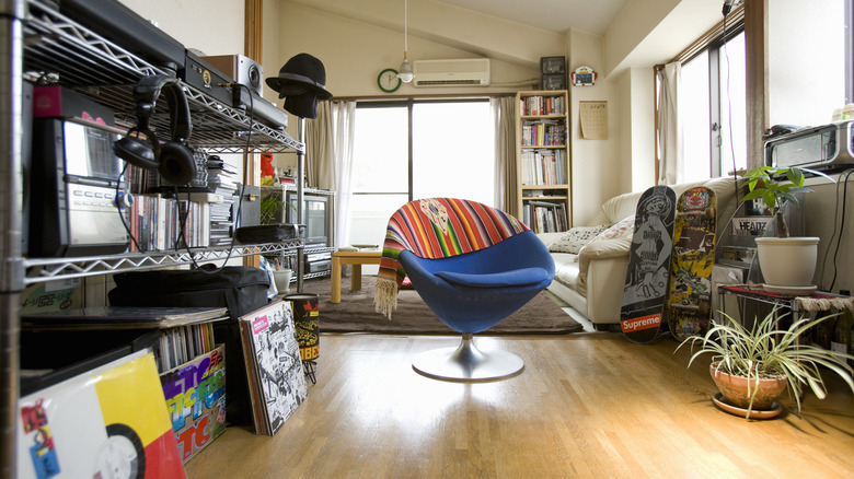
Lived-in homes are trending in 2023 — and professional and amateur interior designers alike are moving away from perfectly curated everything. The trend is a manifestation of the movement to "make Instagram casual," where users have ditched the perfect images and opted for photo dumps instead. It has seen tons of people — especially the younger generation — forgoing the HomeGoods display-esque look. Basically, not everything needs to match, and not everything needs to be aesthetically pleasing for all palates. Books on the table, trinkets on the shelves, and an improperly placed throw blanket are all allowed here.
My favorite example of this is Julia Fox's viral TikTok apartment tour. She walked millions of viewers through her NYC home, showing family photos hung on the mirrors, an unmade bed, and shoeboxes in the kitchen. Of course, not everyone needs to stack boxes in their kitchen — tidying up is perfectly acceptable. But the point is that a home shouldn't look like it was staged by a real estate agent. If your décor appeals to everyone, then it probably doesn't really appeal to anyone.
I love this trend because it's all about putting functionality and love into a space instead of treating it like a showroom — picking things you're drawn to even if they don't fit into a particular aesthetic.
Nancy Sheppard - Moody maximalism
I will openly admit that I'm a subscriber to the notion of "more is less" in my design aesthetic. I have collections galore scattered throughout my home — tin toy robots, MCM-inspired owl figurines, clocks, antiques, and a ton of magnets from places I've been, which adorn my metal fireplace. What one person may see as "clutter" I see as a treasure trove of memories and personality.
Maximalism happily and figuratively hit me where I live. I am not a fan of negative space, and my artistic eye is drawn to texture, patterns, and color. When my husband deployed many years ago, he left our house with a lot of blank spaces and came home to gallery walls for days. Since then, he has subscribed to (or maybe "indulged me in" is the more accurate statement) my aesthetic and never gives me a second look when the various sundries I acquire for my home's look are proudly displayed.
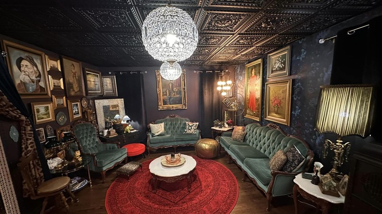
As I've matured in my own design choices, I've found inspiration in what is called Moody Maximalism. This organization of bold patterns wrapped in deep jewel tones, dark shades, and a multitude of unexpected decor choices carefully curated together creates a calming atmosphere in my home while still having something interesting to look at, no matter which direction you're gazing. The way I look at it, it is as if you took "Pee Wee's Playhouse" and gave it a sort of "adult Goth" vibe. Every item, color, and fabric is a conversation-starting opportunity and is loaded with a unique personality.
Colleen Vanderlinden - Biophilic design
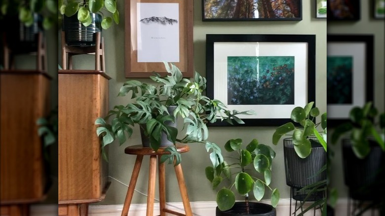
As someone utterly obsessed with plants, I'm drawn to any trend that puts plants and greenery at center stage, and biophilic design does that like nothing else. I first noticed the trend on Instagram. Apparently, the 'gram's algorithm noted that I like plants, and said, "Here are ALL the plants." I soon became consumed with homes that highlight plants, natural elements, and earth tones. I especially loved shades of green, tying into what biologist E.O. Wilson (who came up with the term "biophilic design" in 1984) noted as "an innate and genetically determined affinity of human beings with the natural world."
It's a bit of a trick to integrate this trend into my own home. I have a small jungle of houseplants, but I also have two cats, one who is horrifyingly curious about tasting and chewing on plants. At this point, my plant collection is mostly a hanging garden in front of my living room and dining room windows, as well as a couple of bookcase shelves outfitted with plant lights.
I've also integrated plenty of earth tones and natural elements. Browns, greens, soft grays, and blues make my home feel soothing and cohesive. Plants abound, and natural materials such as wood, stone, shells (gathered from nearby Grand Traverse Bay), and dried flowers give my home the cozy, natural feel that biophilic design is famous for. At its core, biophilic design is about marrying our innate love for natural spaces with a desire to live more naturally and sustainably, and it's a trend that I hope lasts for a long time.
