HGTV Fans Can't Stand One Detail In Joanna Gaines Bedroom Makeover
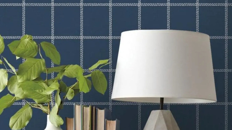
Joanna Gaines, known for her uniquely-styled interiors that both set the tone and reflect popular modern farmhouse trends on her hit show HGTV's "Fixer Upper," recently embarked on a "MiniReni" of a smaller, cozy home that has the Internet buzzing. In question? The ardent approval or disapproval of one of her more unique choices in one of the home's bedrooms. The bedroom, which combines Gaines' signature neutrals and rustic yet modern touches, also features a bold graphic wallpaper in a rich navy shade, topped by a black chair rail. While trends are surging for both wallpaper and architectural elements like chair rail molding to add dimension to a room, it's perhaps the choice of a very modern windowpane plaid wallpaper that has followers up in arms.
While Gaines is often associated with interiors awash in neutrals and pale swathes of color, rounded out by rustic accents and a mix of both modern and vintage in equal measure, the bedroom's look may seem like a departure from her usual designs and what fans expect from "Fixer Upper" and the Magnolia Design empire. One key element has engendered a split reaction, with many HGTV fans and followers expressing their disapproval openly, while many fellow designers are applauding Gaines' rather unconventional choice.
The no's
Gaines' choice of wallpaper has commenters leveling many criticisms, including the resemblance of the tile pattern to 1980s/1990s bathroom tile or a hospital interior. Others have hated the paperless, but they agree it seems out of line with the bedroom style. While they suggest the graphic pattern is interesting and modern, its severity might be better used elsewhere in the home than in a bedroom, which is supposed to be a soft, relaxing space.
The paper, which is a midnight navy shade gridded by white, is definitely a more modern style element that contrasts with the rustic feel of the rest of the room. The incongruity seems to have commenters divided, citing either its brilliance or its terribleness. While many have been willing to embrace the idea of bolder wallpaper as an excellent way to manipulate the eye and transform rooms in a relatively cheap and easy way, some hate the trend. Others would like to see a pattern more in line with the room's aesthetics, like a floral, textured, or softer plaid paper that echoes Gaines' prevailing modern farmhouse aesthetic.
The yeses
While fans are split, fellow designers applaud the bold and unusual choice. Genevieve Chambliss from Viève Interiors told Homes & Gardens, "It works particularly well because the geometric print mimics the geometric look of paneling while adding a fun masculine menswear look." San Francisco-based designer Daniel Ian Smith from Village West Design agrees in the article, citing Gaines' successful creation of a "datum," a term for a horizontal line usually in the middle of the room that alters how we see the space. Through the paper and chair rail, Gaines has changed the sense of height and focal point of the room. While homeowners who choose chair rail and wallpaper combos usually install the wallpaper on the upper section, here, Gaines has reversed it for a surprising twist, which opens up the room vs. closing it in. The effect is airy but also cozy.
In addition, many believe the choice is perfect for a master or guest room, which ideally mixes both feminine and masculine in a stylish way. Navy works almost as another neutral in this context, with the more modern style of the wallpaper fitting well with the stainless lamps and clean lines of the black furniture but still retaining a rustic modern farmhouse feel with the bedding and the textured rug on the floor. In addition, close-up, the wallpaper is a bit softer than the severe lines suggest from afar.

