Gallery Walls: Are They Still Trendy Or Out Of Style?
Gallery walls have been a trendy way to add art to a room for years. But as time passes, features either become classic and timeless or begin looking outdated. And the fate of those details lies in the hands of both designers and consumers, two groups that may or may not agree. Some homeowners are over the gallery wall trend, considering the collection of photos or art to be overrated and out of style.
However, these are not the feelings of the majority. There are many who see a gallery wall as a great way to display things in your home, including many interior designers. For them, gallery walls have transcended into the realm of timeless and aren't going anywhere. But, like other timeless features, that doesn't mean it's not immune to some updates. The gallery wall may not be a feature so easily rid from homes, but the layout, composition, and art included can help make the detail feel more current.
Less planning, more natural
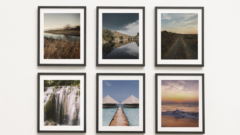
One of the overall trends in home décor is giving up the vibe of the perfect showcase house and instead creating spaces that look more cozy and lived-in rather than planned out. Comparing gallery walls from a few years ago to ones being created now, there are differences in the composition and details. The older style of gallery walls had similar art in matching frames in a well-spaced layout, similar to what you might see in an actual art gallery. But with modern gallery walls, the final product looks like it came together naturally.
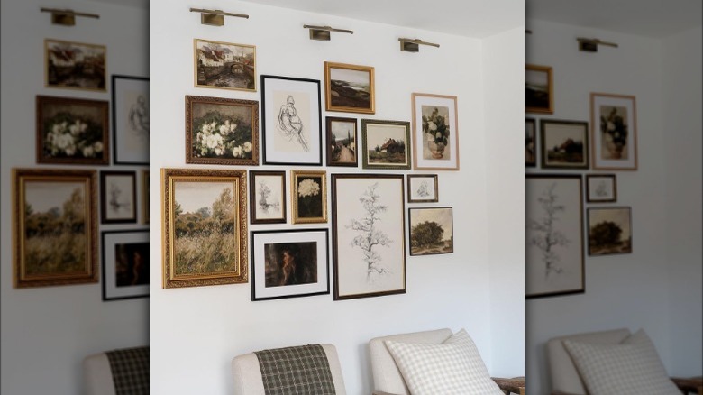
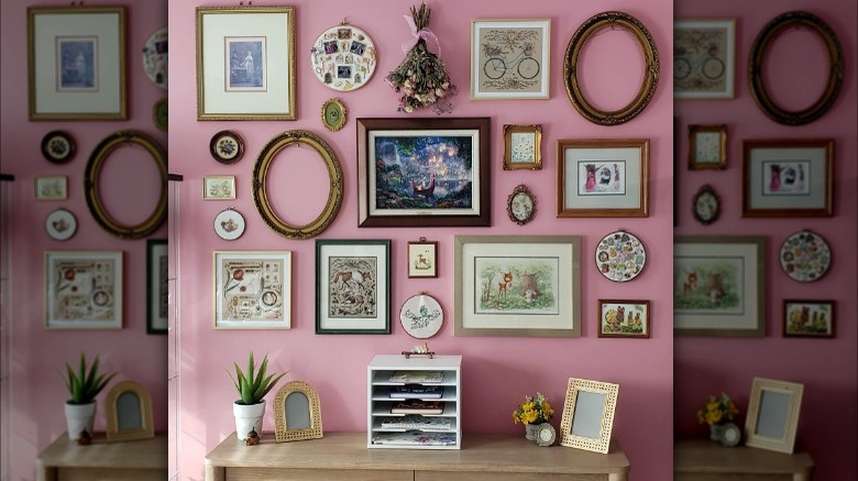
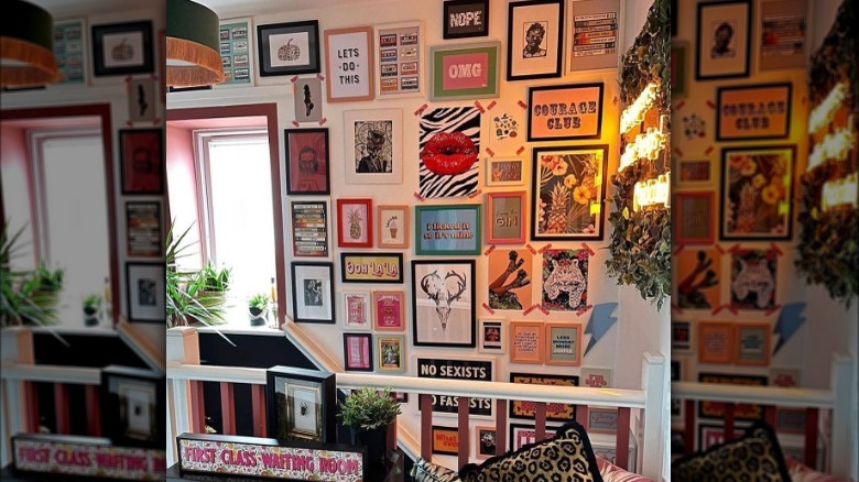
Modern gallery walls use art of various sizes, from extra large to extra small, in shapes ranging from squares and rectangles to ovals and circles. The frames are different colors, materials, thicknesses, or frameless altogether. And the layout is more like a puzzle pieced together than an evenly-spaced grid of images. If there are awkward spaces left on the wall, that's an opportunity to add unique objects like shelves, wall hangings, or baskets, which can add a bit of visual interest. Also, don't be afraid to carry a gallery wall all the way up the ceiling. It's a great way to add height to a room.
Eclectic but cohesive
Along with making a gallery wall feel more natural and lived-in is a collected feeling to the art. Great gallery walls showcase prints, paintings, and photographs collected over time rather than bought and hung up in a weekend. That's not to say your gallery wall has to be years in the making, although it certainly can be. But the other extreme of buying a bunch of art and installing it can make the gallery wall feel boring and standard. Sourcing pieces from different places, on travels, or from loved ones creates a much more interesting feature that tells a story.
It's best to start with one or two pieces that you already love. Use the mood, colors, and aesthetic of those original pieces to guide you when selecting your future art. While you may be hunting for art, it's also important to let pieces come to you. Allow yourself to stumble upon something, as those are often the most unique and interesting in a gallery wall. Consider galleries, antique stores, flea markets, and small businesses, either local or when traveling, to create a curated collection. Plus, when the art comes from different sources, they'll all have unique memories connected to them that add life to your gallery wall.
Choose personal pieces
Another problem with some of the gallery walls is that they look impersonal. That's often a symptom of buying mass-produced art or pieces from big box stores, especially when all the pieces are purchased from the same store. These often make for a gallery wall that lacks personality. Instead, you want to choose pieces or a theme that is unique to you. And that doesn't mean you always have to select photographs or something that means a lot to you.
Sometimes, you can choose a theme or aesthetic you like, such as travel, vintage photos, maps, botanical diagrams, or typography. Feature those things as accents or on most of the gallery wall to make it feel less cookie-cutter. This is also a good philosophy for all the other details, such as arrangement, color, and frames. When the feature is chosen from a personal place, everything will come together as something you love.


