Steer Clear Of This Bedroom Painting Mistake When Selling Your Home
Showings are an integral part of the selling process, which is why special attention is needed in the way a potential buyer perceives and experiences a house. Some of the main steps to prepare your home include properly decluttering, carrying out any necessary repairs, and keeping it clean. However, another essential part of the preparation process that shouldn't be glossed over is depersonalizing your home.
A showing is an opportunity for potential buyers to visualize themselves in the home. Instead of being surrounded by the seller's beloved possessions and personal tastes, the house should feel neutral and spacious enough for them to mentally add themselves to the picture. This can be done by removing family photos and memorabilia and making the space fool open and inviting. Updating the furniture and rethinking the decor is another way to depersonalize your home, says Opendoor. Here's how to avoid alienating potential buyers by making this common painting mistake, specifically in the bedroom.
Avoid bold, gendered colors
When selling your home, you want it to appeal to as many people as possible. With this in mind, you should avoid painting the walls in strong, gendered colors. While you may want your bedrooms to feature themes of hot pink or black, these kinds of colors might be off-putting to potential buyers. According to HomeLight, prominent colors are very likely to stay imprinted in the buyer's minds, which isn't good for you if it's something they are averse to.
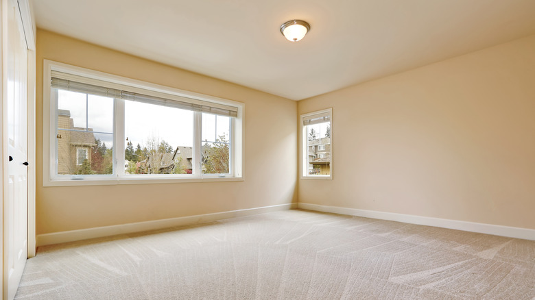
Neutral colors that go with most things are the way to go, according to Opendoor, because they make it easier for the buyer to picture their personal belongings or furniture in the room. Strong colors can also negatively impact how large a room feels, regardless of its actual proportions, which is why a dark bedroom can feel like it lacks space while bold colors can feel unwelcoming, explains Homes & Gardens.
Alternative color options
To avoid this bedroom mistake, it is recommended to paint the walls in light, neutral colors so the room feels open and airy. Beige, tan, and white are great options to keep things simple. HomeLight suggests keeping the rooms the same color as the common spaces. This creates a more seamless, calm flow for the buyers as they move throughout the house and really makes it feel like a blank canvas.
With the right design and the correct furniture, it is possible to use strongly gendered colors in a way that keeps the room feeling neutral, notes Homes & Gardens, so you don't have to avoid them completely. Some ways to do this include using the colors as light accents in small doses or including them in patterns that feel balanced and neutral. Instead of wall patterns like florals, try stripes or more abstract designs. Mixing in different shapes and forms also makes a difference. Rounded curves and straight lines together can strike a balance that contributes to making the room feel inviting to all.


