25 Home And Apartment Design Mistakes You'll Have To See To Believe
Your home's design is not just about aesthetics; it involves finding that sweet spot between form and function that is often elusive. The Great American Home Store points out that having a space customized for your personal needs will ensure efficiency and comfort. When it comes to curating a home, you would imagine leaving the task to the professionals will yield nothing short of stellar results.
Unfortunately, this is not always the case, especially since some of these experts throw the design rulebook out the window. While you might think your home design isn't pleasing enough, it is by far nowhere as horrendous as some examples you will see later. While the designs can make a good laugh, especially if it's not your home, they show that common sense is not quite as common after all. Take a look at some of the most absurd home designs you must see to believe.
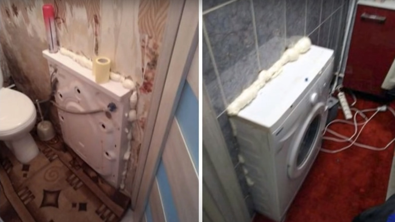
1. Washer through the wall
While the idea might be to save on the precious real estate in the room, fitting an appliance through a wall is never a good idea. This is especially true for washers that shake, and the noise would be unbearable.
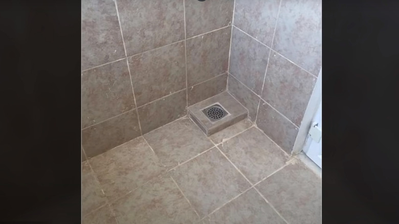
2. No drainage
Talk about an absurd design mistake. This particular drainage is raised a few inches above the bathroom's ground level and might only work when there is a flood.
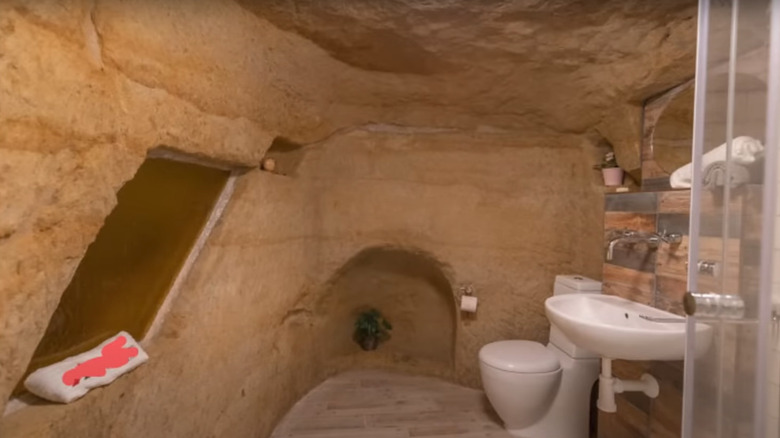
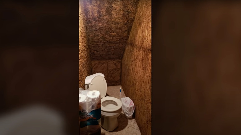
3. Man cave
It is hard to tell whether this bathroom is built inside a rock or the finish makes it appear like so. Nonetheless, even if the idea was to create a man cave, it doesn't need to get this literal.
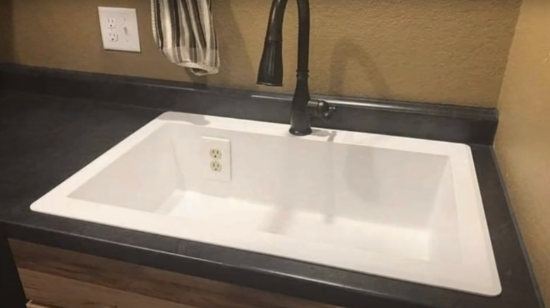
4. Shocking idea
Common sense dictates that water and electricity are a deadly combo. However, as it stands, it seems common sense is not quite as common, at least for the one who installed this plumbing fixture.
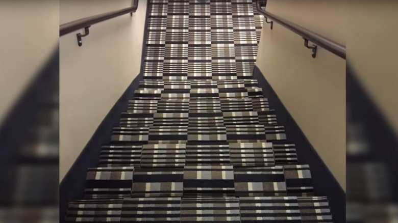
5. Camouflage staircase
Walking down the stairs doesn't need to cause a headache, and this particular staircase is a disaster in waiting. The checkered tile pattern makes the steps disappear from view.
6. Underground toilet
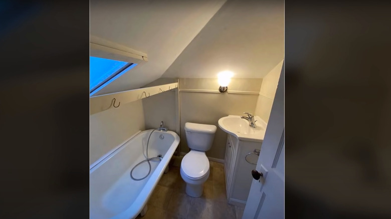
This particular design is wrong on multiple fronts. First, the toilet is installed diagonally, perhaps to create a little legroom. Also, what was the idea behind carpeting the entire walls and floor? I guess we'll never know.
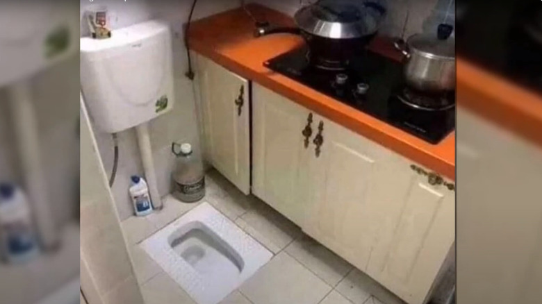
7. The ultimate space saver
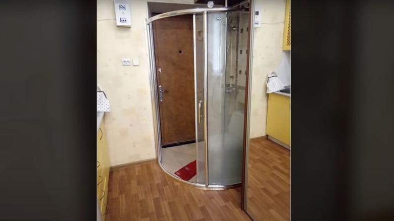
Is this a toilet in the kitchen or a kitchen in the bathroom? Regardless of your answer, a kitchen and a toilet in the same space is never a good idea despite how small your apartment is. Think of all you will have to put up with, especially if you are not living alone.
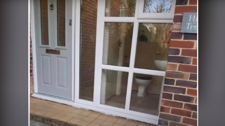
8. See-through toilet
The bathroom is an intimate room that gives you all the necessary privacy. Apparently, for this design, privacy is down the priority list, as anyone walking outside can see you sitting on the toilet.
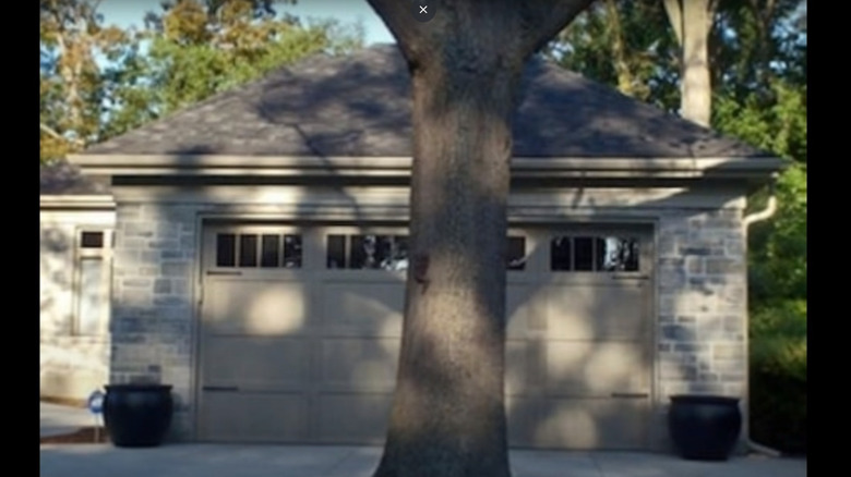
9. Ultimate inconvenience
Planting a tree right in front of the garage driveway is something you wouldn't see quite often. In this case, it seems the homeowner loves nature more than the convenience of driving straight in and out of the garage.
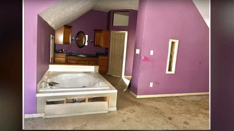
10. Carpeted bathroom
Wall-to-wall carpets certainly have their place, and it is not in the bathroom. Water spills in the bathroom, particularly around the bathtub or the sink, are inevitable, and having to dry the carpet every time is not a task many are up for.
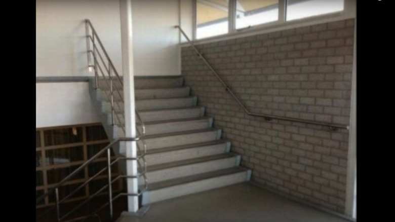
11. No way through
Ever imagined using a flight of stairs that leads nowhere? It is hard to picture a trained professional deliberately creating such a flawed design. This easily fits the bill of one of those design fails you need to see to believe.
12. Disastrous garage design
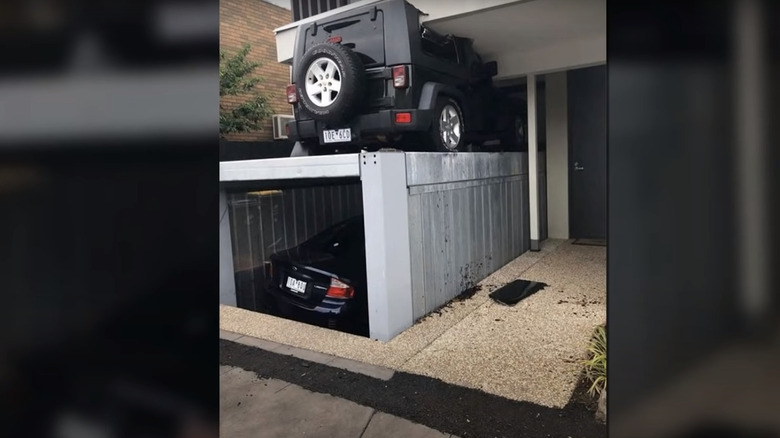
This is a rather expensive design failure. While the overall idea is quite creative, the design failed to consider enough clearance for the upper deck when the underground garage needs to lift.
13. Walk-in bathroom
Another serious design flaw that failed to put into consideration practicality and privacy is this one. Although the design might save on space, think about someone walking in on you while taking a shower and the door hitting you while in the process.
14. Not enough space
While the idea was to maximize the space available, this area is just too small to accommodate all the kitchen essentials. There is no space to stand and use the sink, no way to open the cabinets, and insufficient clearance to facilitate showering while standing up.
15. Poor workmanship
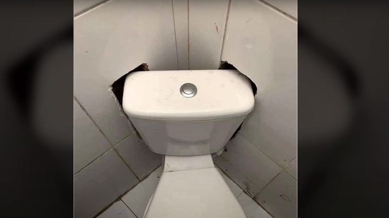
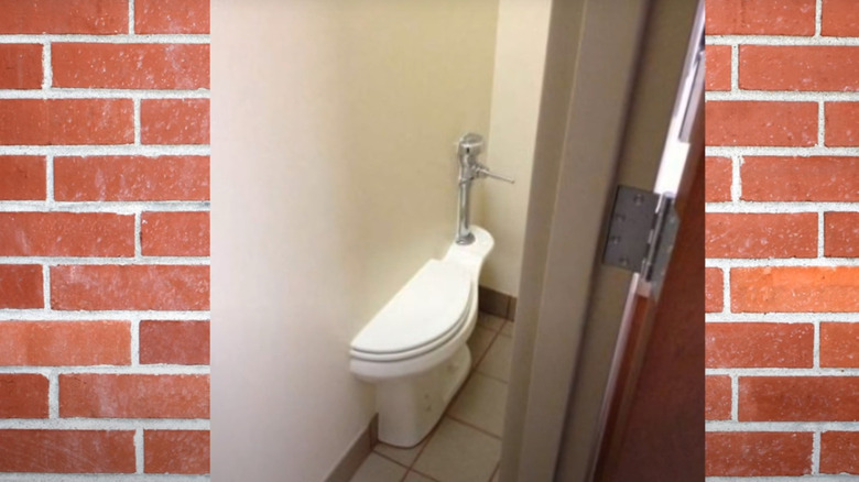
The most practical solution to this design flow would be to rotate the seat. However, the plumber thought it wise to make holes in the wall to force the toilet to fit right in the corner.
16. Cabinet on the ceiling with no access
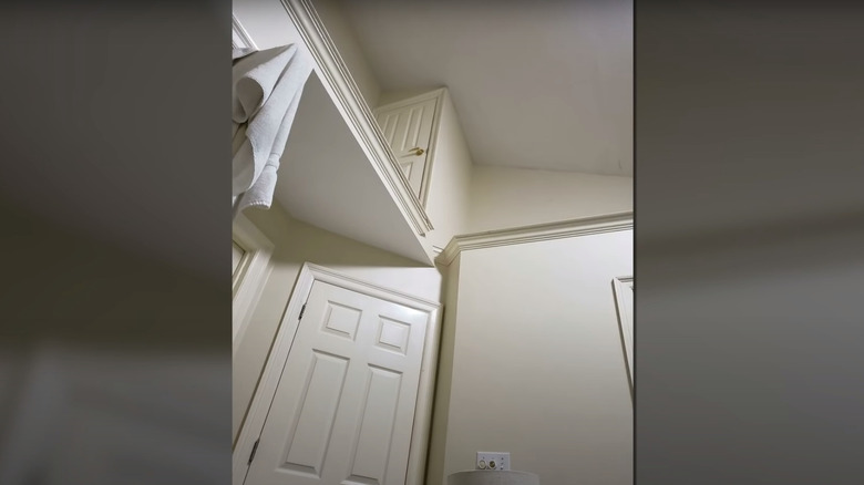
While it is good to leverage the space on the wall for extra storage, what is the point of building cabinets that you cannot access? This design features a cabinet perched over six feet high with no ladder or alternative mechanism to get to it.
17. Open-plan toilet and bedroom design
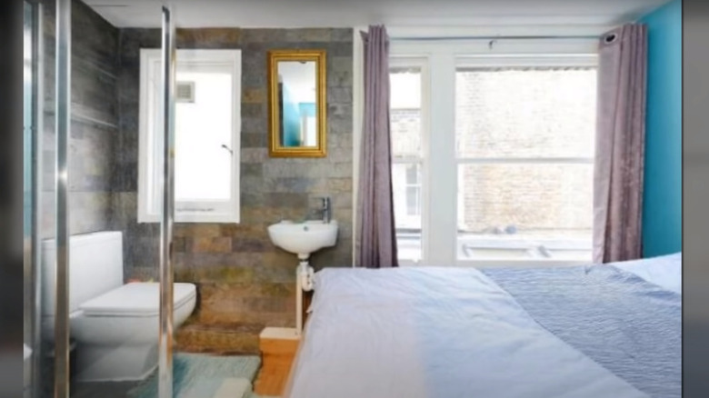
Do you really need a toilet installed right in front of your bed? Well, this is a fair question that the interior planner should have thought of before coming up with such a terrible idea.
18. Long walk to the toilet
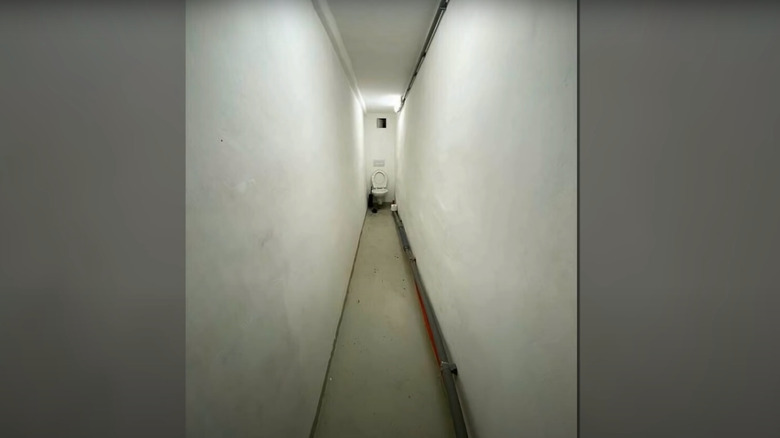
Going to the bathroom doesn't need to feel like going for a long walk. However, if you install a toilet right at the end of a long hallway with a dead end, the long back-and-forth trips will feel like going out for a walk every day.
19. Half bath
Although a half-bath refers to a bathroom with a washbasin and a toilet, the designers of this particular one took the name too literally. The wall divides the toilet bowl right into the middle.
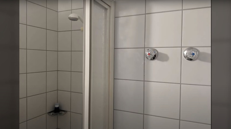
20. Knobs outside the shower
Typically, you want the shower knobs inside the shower preferably within arm's reach for convenience. Unfortunately, this plumber thought it wise to install the controls away from the shower for whatever reason.
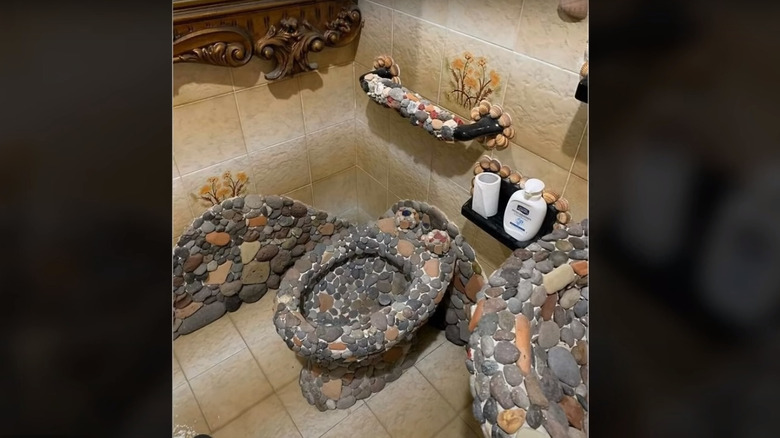
21. Cleaning nightmare
Cleaning a ceramic toilet is a hard enough task, to say the least. Now imagine having to scrape or clean this unusual toilet decorated with pebble stone. It must be a nightmare!
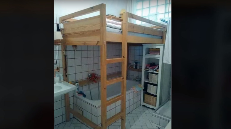
22. Bed and bath
Having a bed in the bathroom is among the few design failures you have to see with your own eyes. Think about dealing with all the moisture and terrible smell of all the different kinds of detergents.
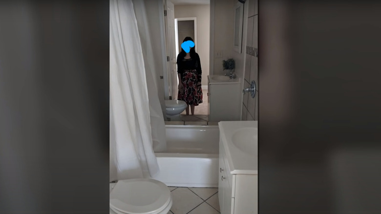
23. Perfect symmetry
At first glance, you would be forgiven for thinking there is a mirror on the wall. This perfectly symmetrical bathroom has two toilets separated by a bathtub to facilitate two people using it simultaneously. Who thought this was a good idea?
24. Unnecessary lighting
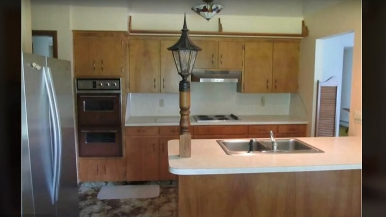
While there is no doubt that lighting is important in every room, including the kitchen, this particular stand-alone lamp post style is not meant for the kitchen. It looks out of place and only takes away the precious real estate from the island.
25. One door, two rooms
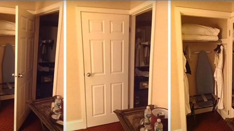
When you have to choose between closing the bathroom or the closet, which one do you go for? Apparently, this is the dilemma the homeowners have to deal with because of an epic failure during the designing phase.
