Stunning Shower Makeovers You Can Tackle Yourself
When renovating the bathroom, one of the largest areas to upgrade is your shower or combination shower bath. There are three basic ways to update this fixture. The first option is to completely demo the existing unit and install a new one, which will require the most money, time, and energy. The second choice is to work with what you already have but still provide some upgrades that make an impact. For instance, you could replace the hardware and upgrade the tiles. The last way will be the least expensive, and it won't require much work: all you'll do is clean and make some visual upgrades to your shower, like a new curtain or storage solution.
We've gathered 10 before- and after-shower remodel images to give you some makeover inspiration. The first five are the most labor-intensive, the following three are in the middle, and the last two are purely cosmetic. Further, because all of these projects were DIYs, you could try to complete them yourself.
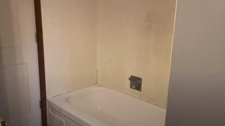
1. Before: out of style
Before renovations began, this shower bath looked quite dirty. The yellow tiles don't match the white tub; overall, they looked outdated.
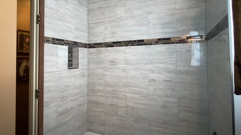
2. After: fully upgraded
While this owner kept the bathtub as is, the rest of the shower underwent a complete makeover. To achieve this look, they had to complete demolition, upgrade the plumbing, install cement boards, tile the walls, and replace the fixtures. The result? A gorgeous shower with unique detail work and a useful niche.
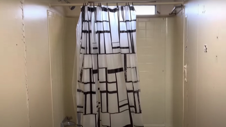
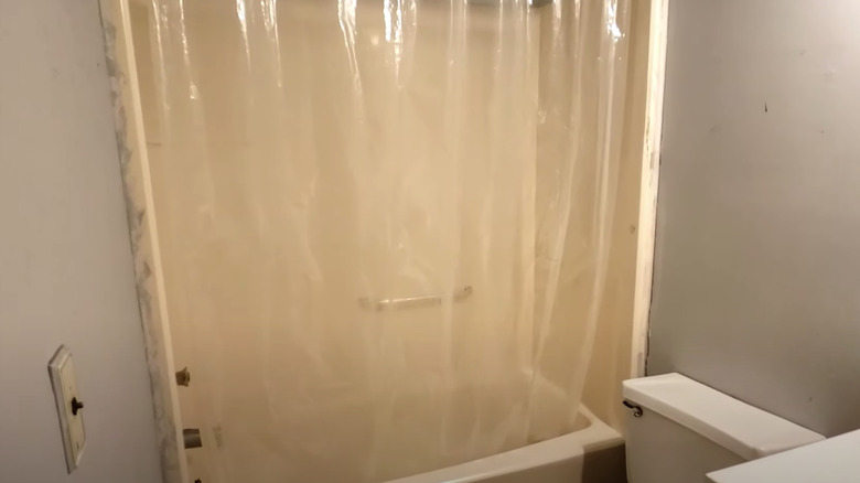
3. Before: simple curtain
In this small mobile home, the shower lacked some pizzazz, as everything was beige and bare. Further, replacing the shower curtain with something more substantial will make a giant impact.
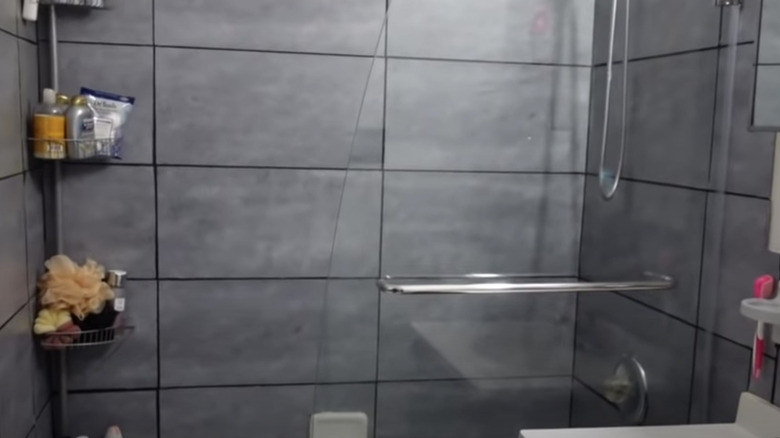
4. After: black-grid wall
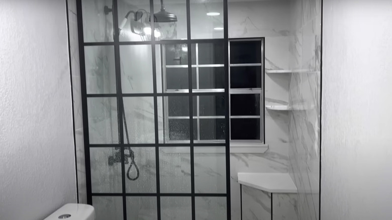
From dull and warm-toned to fabulous and cool-toned, just like that! This shower now has new tiles, a large window, built-in shelving, a stool, and — the cherry on top — a beautiful black grid wall.
5. Before: old school
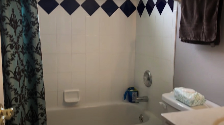
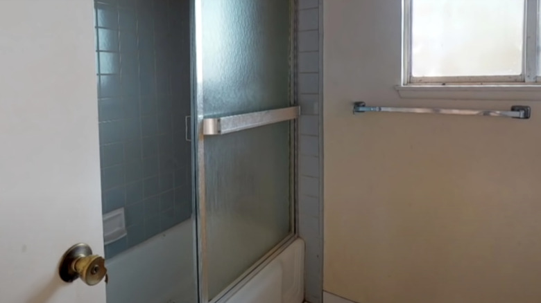
This shower is clearly outdated, from the basic tiles to the diamond details — even the curtain looks a bit drab. Further, they wanted their shower bath converted into just a shower.
6. After: modern marble
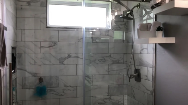
Not only is this combination now just a shower, but it's also unrecognizable. Instead of the old-fashioned yellow and blue tiles, this area is now lined with stunning white and gray marble ones that give it a much cleaner look.
7. Before: beige tiles
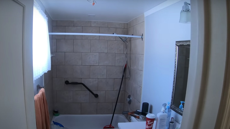
Here's another shower bath that needed to be upgraded into just a shower. Further, while there's nothing wrong with the tiles, replacing the warm tones with cool ones will give the space a more modern appearance.
8. After: black accents
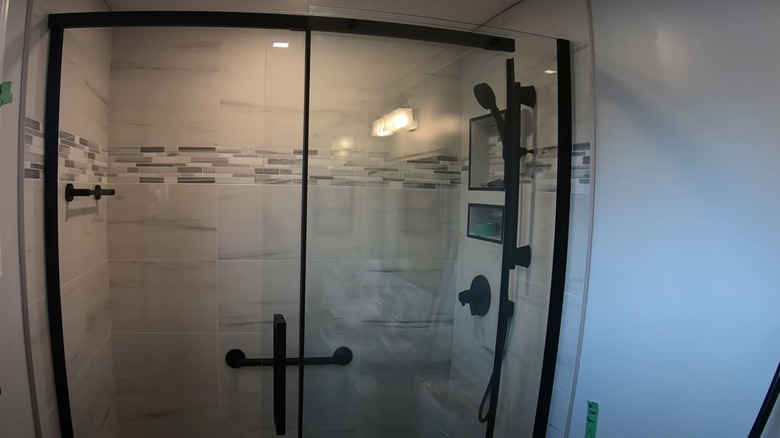
An easy way to make a space appear more in style is by adding black accents. This shower now has white and gray marble tiles with some interesting detail work, added niches, and black fixtures.
9. Before: closed off
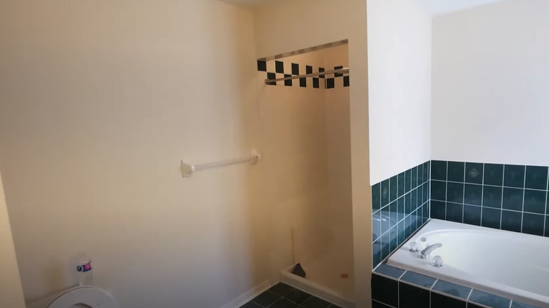
In this large bathroom, the shower looks like a small closet, and it's separated from the rest of the room by solid walls, which makes it look much more cramped than it is.
10. After: open and bright
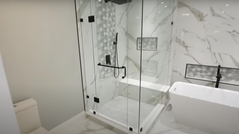
Surrounding the shower in glass and replacing the tub with a freestanding model makes it appear much more open. There are also quite a few upgrades, including tiles, niche, fixtures, and bench.
11. Before: blue tiles
Let's move on to easier-to-complete DIYs that still pack a visual punch. Starting, this shower bath is extra dirty and would benefit from a lighter and more airy tile tone.
12. After: clean white
While this may look like it was completely remodeled, it's the same blue tiles, just reglazed. If you want to create a similar look, follow these steps: replace the glass door with a curtain, polish the tub, remove the old caulking, reglaze the shower, and install the fixtures — no demolition is required.
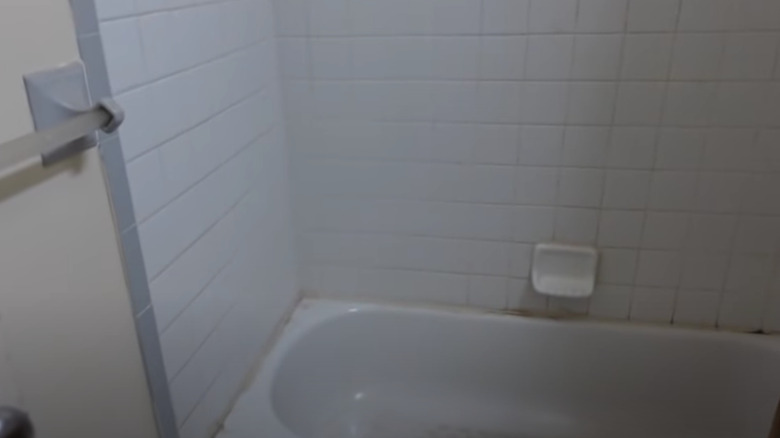
13. Before: grimy rental
This apartment shower bath is looking quite grimy. Not only is the caulk extra dirty, but the tiles are outdated. Let's check out what this renter did to improve the appearance.
14. After: peel-and-stick tiles
Because they're renting the space, the owner couldn't do any demos or make significant changes. Instead, they used gray peel-and-stick tiles to upgrade the walls and to add more storage space; they included a tension rod in the corner.
15. Before: yellow bathtub
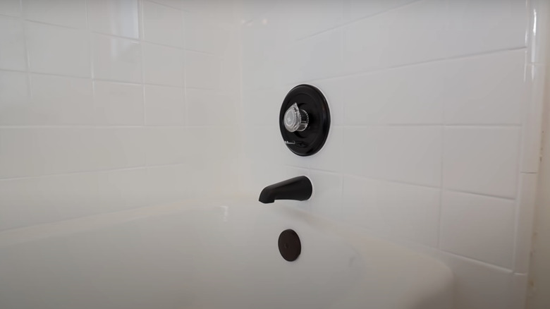
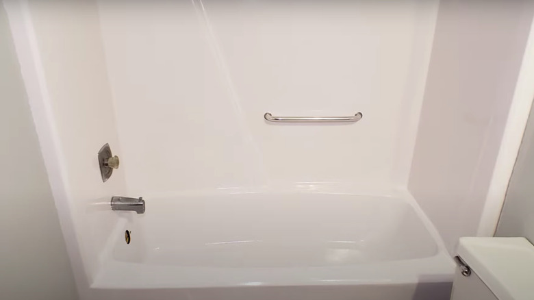
While there's nothing wrong with this shower bath, the beige tone wouldn't match a modern aesthetic. For less than $20, this owner completely changed the look by applying Rust-Oleum Marine Coatings Topside Paint.
16. After: painted white
After just two coats of the Rust-Oleum paint, this tub looks fresh and new. If you try out this DIY, make sure you use sandpaper to roughen up the surface so the paint can adhere, clean the tub well, and have a ventilation plan since this product can be pretty intense.
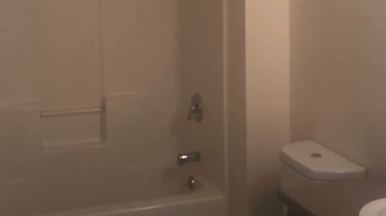
17. Before: basic and boring
To kick off the last two examples of minor updates that can make a huge impact, let's look at this bathroom. Like many other "before" images, this shower and tub combo is boring with no interesting features.
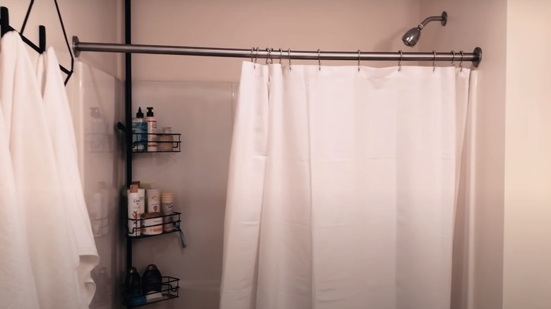
18. After: small upgrades
After installing a new white curtain and adding a black tension rod holder to the corner, this basic shower has a bit more interest. Just these little changes can make a massive difference.
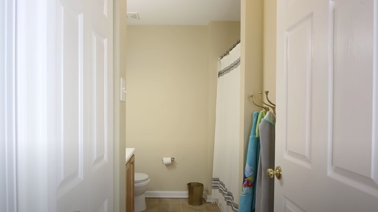
19. Before: yellow walls
This warm-toned room was begging for a cosmetic upgrade. While all the fixtures are in good shape, painting the walls and replacing the curtain will completely transform the bathroom.
20. After: fresh tiles
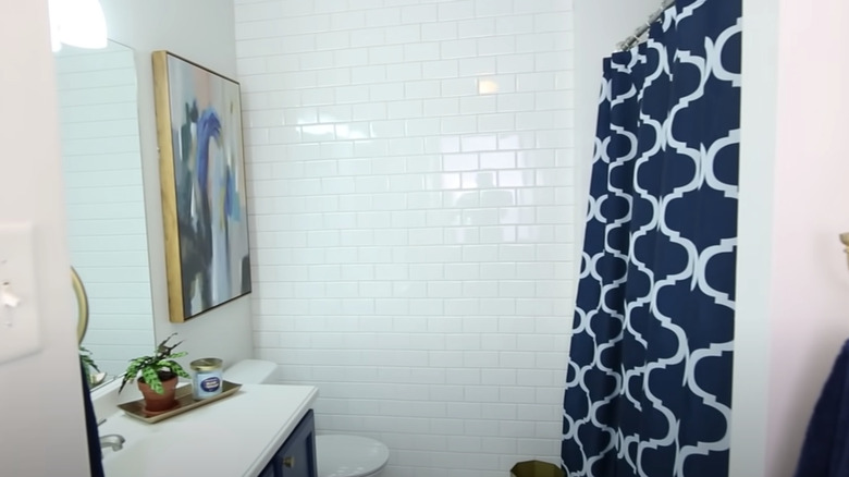
After a white coat of paint and a floor-to-ceiling tiled wall, this bathroom has been completely transformed. This demonstrates how making minor upgrades, like painting around your shower and swapping out a plain curtain for one with a bold color, can make all the difference.
