15 Garage Remodel Ideas To Boost Your Home Curb Appeal
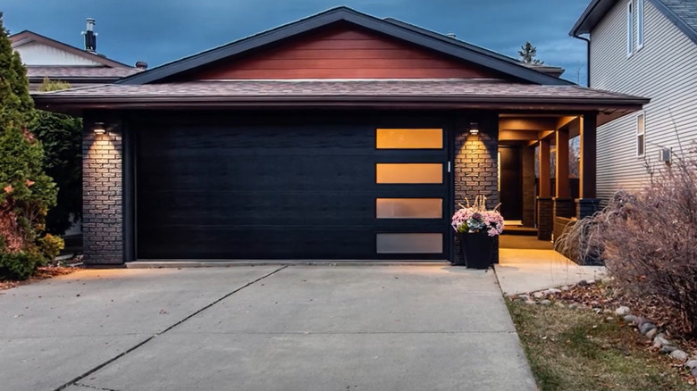
Ramping up your home's curb appeal not only adds to the wow factor of the property's front view but also increases its value and the possibility of gaining attention if you're listing it for rent or sale. And what better way can you enhance your property's aesthetic than by updating your garage? You have many options to choose from when redoing your garage. You can work from the inside out by organizing your storage and work space, or you upgrade your garage door. The latter offers many choices that range from adding decorative accessories to replacing your door for a more modern look, per D and D Garage Doors.
Additionally, you might be able to complete a garage-related project on your own in one afternoon or one weekend, or you may need to hire a professional garage door installer, depending on the complexity of the task and the result you're looking for. Regardless, the possibilities are practically endless. So here are a few ideas that we have compiled for you.
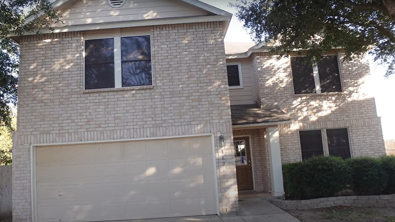
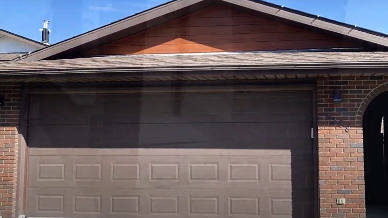
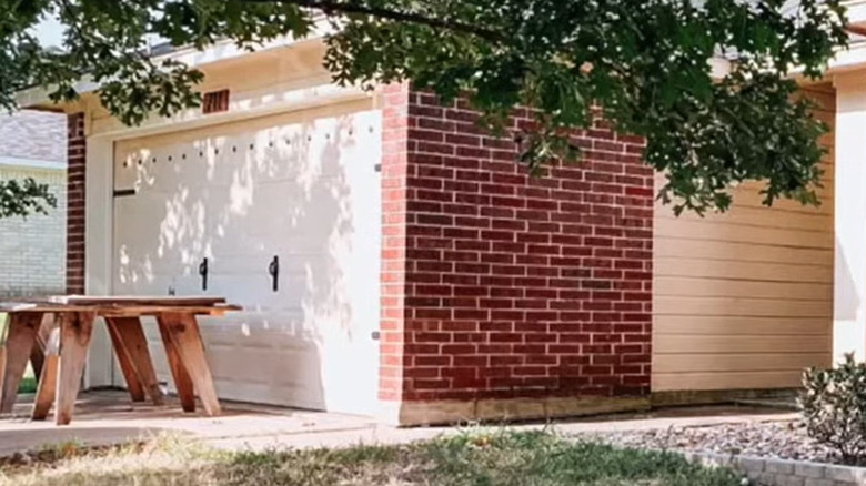
1. Before: uneventfully neutral tone
This style was quite popular 20 to 30 years ago, which might explain why you see many garages with this type of door. Hence, they don't stand out.
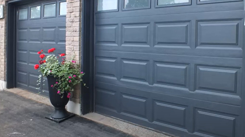
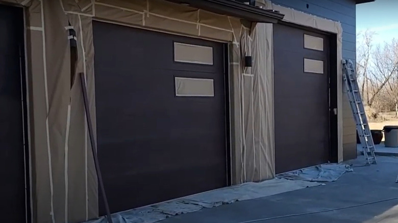
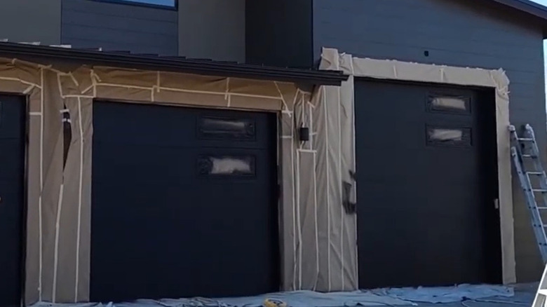
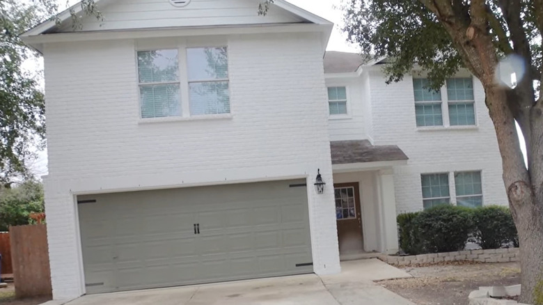
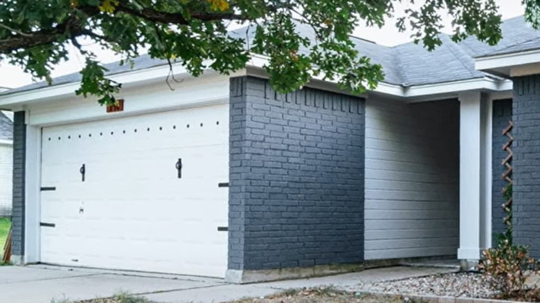
2. After: modern and sophisticated slate
On the other hand, a dark color brings out the subtle darker tone within each brick. Overall, the dramatic change bears a stark contrast to the rest of the façade, which makes it more conspicuous.
3. Before: ageing paint covered in dust
This example proves how difficult it is to keep beige clean. A power wash might spruce the garage door up, but how many times a month do you have to repeat the process?
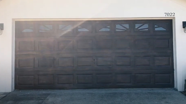
4. After: faux wood gel finish
On the other hand, a faux wood gel finish totally transforms this door while making it easier to maintain.
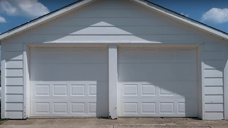
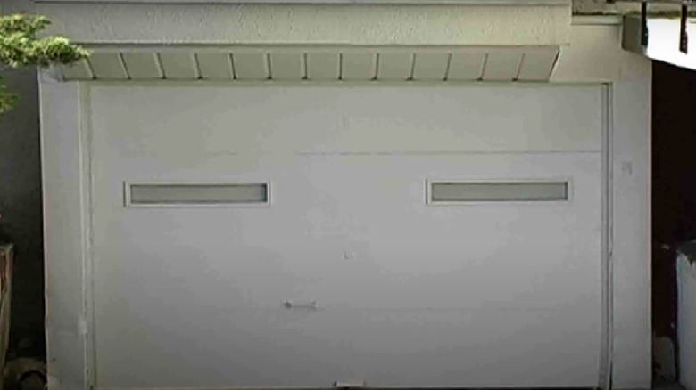
5. Before: absence of color
A monochrome scheme intended to yield clean, straight lines could achieve the opposite effect. Take a look at the bottom of the frame, where the wear and tear stick out.
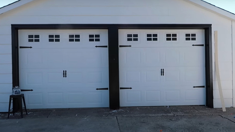
6. After: refresher with paint and accents
However, just a few fixes bring about a profound change. Repairing the holes on the frame and painting it black breaks up the monotony, while the black on the panels gives the illusion of windows. Metal accents add to the sophisticated, minimalist look.
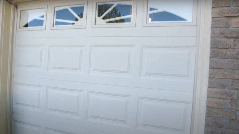
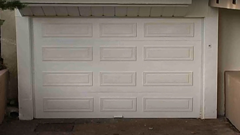
7. Before: straight shot of beige
Again, you can see how easily light, neutral tones show their age and wear — not to mention all the dust.
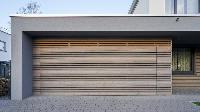
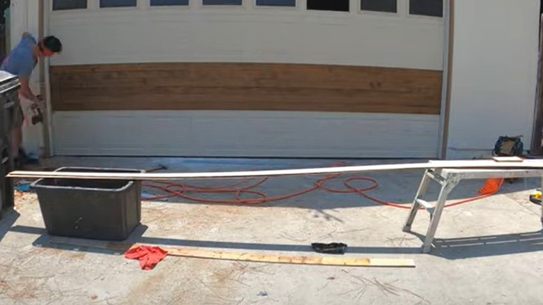
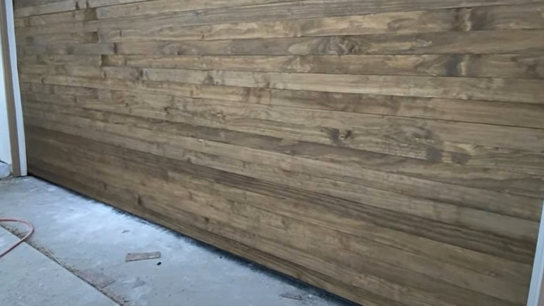
8. After: modern yet rustic twist
By installing thin wood panels, the door takes on a modern rustic look ready for metal accents. Or you can leave it as is; the texture and pattern profoundly affect the rest of the façade.
9. Before: faux wood finish
Even the faux wood in a matte finish needs an update to enhance this home's aesthetic.
10. After: clean and even finish
Opting for a slightly darker shade, the overall finish looks more even, thus providing straight blocks across the front that catch the eye. And keeping the matte finish is not taking attention away from the siding.
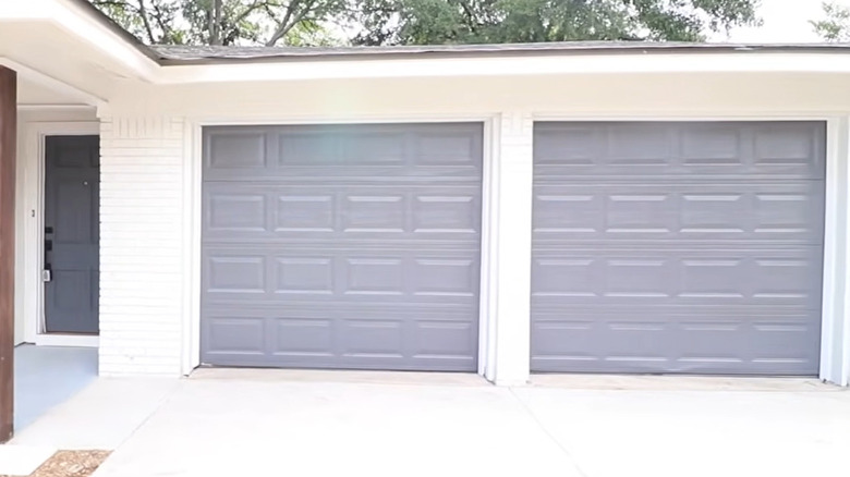
11. Before: no variety in colors
While this design is not exactly monochromatic, the blend of light brown, off-white, and beige does little to make this house stand out.
12. After: transformation after painting and accessorizing
After changing the color from beige to gray, you add more of a focal point. The accents also serve well to draw attention to the garage.
13. Before: dire case for repainting
Again, you have a style that's not only outdated but also one that shows every aspect of wear and tear.
14. After: panels make a difference
Can you believe that it's the same door? Painting the door and adding thin wood panels make for a simple but profound transformation. The panels, consequently, hide any imperfections.
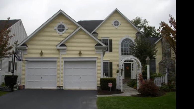
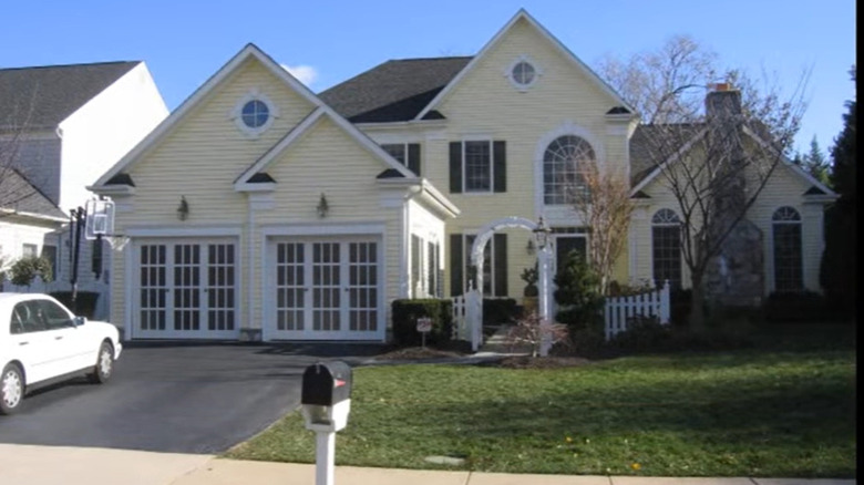
15. Before: coordinating with the trim
While on the surface, nothing seems wrong with this double garage. The white doors coordinate well with the building's trim — just like every other house on the block.
16. After: pop of natural light
Conversely, French doors are the way to go if you want to add more natural light to your garage work space and transform your home's exterior.
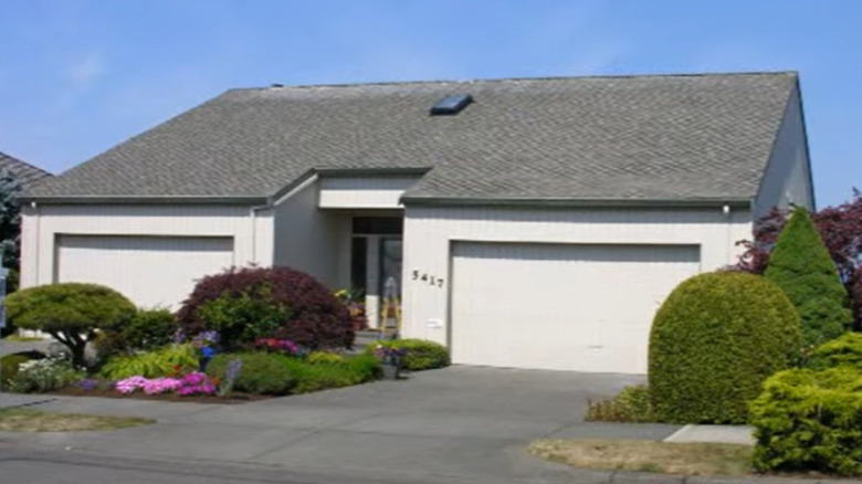
17. Before: slightly too monochrome
Likewise, this modern, monochrome façade makes an excellent backdrop for the shrubbery in the front yard, but it most likely wouldn't catch the attention of passersby.
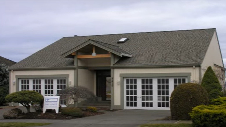
18. After: garage doors with a view
But when you add a garage door with windows and French doors, anyone driving will not help but notice this up-and-coming trend. And again, you're adding more natural light, which is a draw.
19. Before: yesteryear's trend
While dark paint doesn't require much cleaning and tends to hide surface imperfections, it also fades over time, leaving the tone looking rather dull. Plus, this door and the surrounding masonry and arch appear outdated.
20. After: update with vertically placed windows
So, you get rid of the outdated features and add windows to provide much-coveted natural light to the space. The vertical layout of the windows and the darker shade give a modern vibe without appearing too trendy.
21. Before: nothing paint can't fix
Not every garage door needs replacing. As you can see, this one is still in good shape, but what happens when you want to change the surrounding color scheme?
22. After: change the surrounding color
Naturally, you can go with another neutral color that pairs well with the rest of the home's refinishing. Another perk about this garage door's repainting is that the accents stand out more.
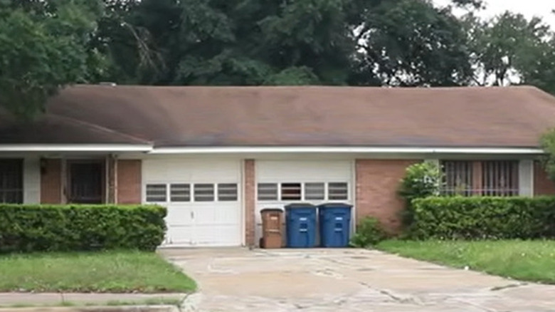
23. Before: a decade's old look
The ranch style from the 1950s has been a mainstay for the exterior style of many homes. However, the windows on these garage doors might need to be replaced or removed altogether.
24. After: all-new gray update
In that case, you might consider replacing the doors altogether. As you can see in this example, the gray adds some variety to the color scheme, and the doors' patterns are more up-to-date compared to their predecessors.
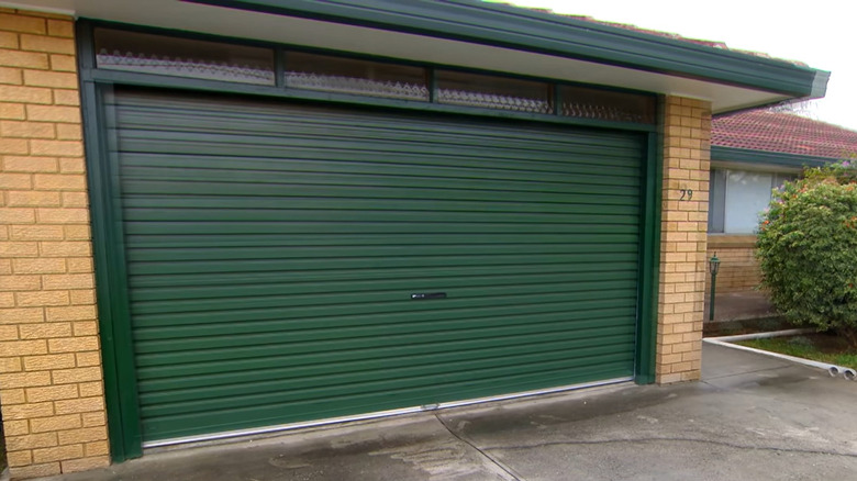
25. Before: dated forest green
Aside from the outdated forest green, one might wonder about the ergonomic logic behind placing the handle in the middle, and the bottom seal stands out way too much. Plus, this door has to be manually opened and closed.
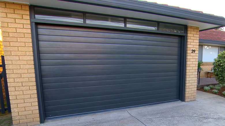
26. After: charcoal finish
The black finish and wider slats on this new door update the exterior while coordinating well with the newly painted fascia. Plus, the bubble-patterned windows have been replaced with sleek modern panes to allow for more light. And goodbye, manual garage door.
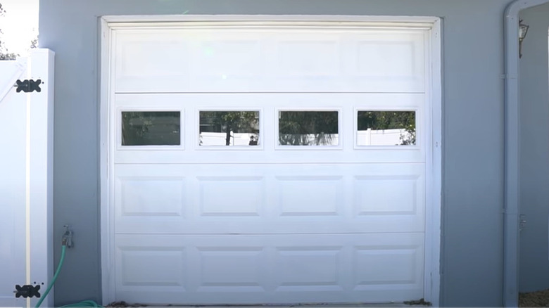
27. Before: clean lines but something is missing
This door presents another example where small changes can make a big difference. For instance, if you look closely at the bottom, dust and debris can find their way underneath, and the door could use a minor facelift.
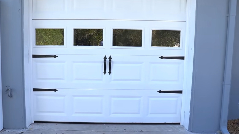
28. After: improved with accents and seal
The homeowner added magnetic accent pieces and a seal. The contrast of black and white gives a visual pop to the door, and it pairs well with the fence next to it. Most importantly, the seal keeps the dirt from coming in.
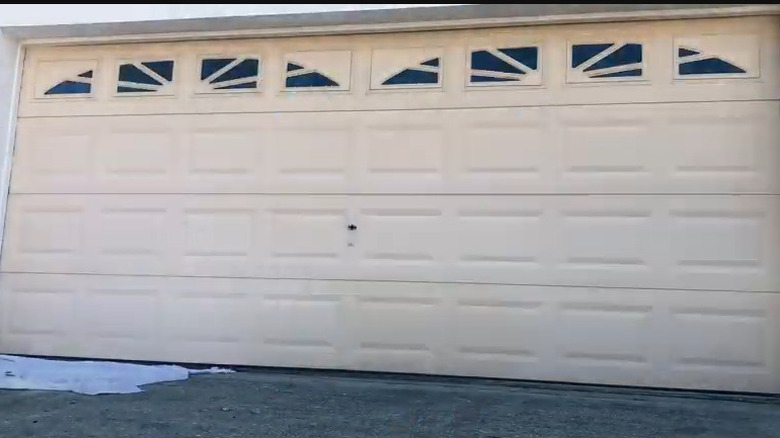
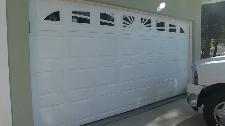
29. Before: the typical door
Once again, you have an outdated door with windows that have a metal design that doesn't allow for much light to shine through anyway, and the frame is showing some wear.
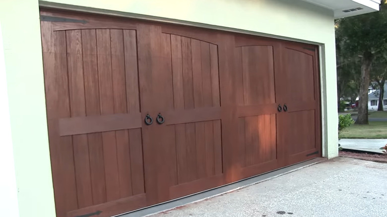
30. After: brand-new barn doors
As you can see, this replacement makes a statement. The faux barn doors, with their reddish tone, add more color to the exterior without being overstated. This style is not only attractive; it's also durable, with less chance of dents compared to metal panels.
