Everything We Did To Give Our Bedroom A Budget-Friendly, No-Reno Makeover
When we moved into our home every wall had been freshly painted. The seller who painstakingly flipped our 1880s-built farmhouse chose a neutral ivory to latte palette. They relied on a designer trick: picking their paints from a swatch card with tints and shades of the same color. It's an easy way to introduce dimensionality and create a pleasant flow between spaces, especially those that are simultaneously visible. The downside to this method, however, is that no one room is the jewel box — they all feel equally important.
Our primary bedroom was larger than our last one, and it had abundant natural light reflecting off the plain parchment walls. There was nothing pressing to do there other than be thankful and settle in (and add privacy window treatments), while we attended to some projects we weren't previously aware of, and others that would make the house function better for our lifestyle. Specifically, that meant waterproofing the stone basement and adding hanging systems to the few empty closets. Deep cleaning, child-proofing, and switching the locks are other actions Rocket Mortgage says new homeowners should immediately take care of. The cosmetic and superfluous items might have to wait.
Adding the accent wall
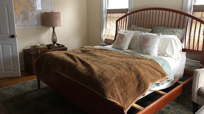
Not too long after moving in, we learned we were having our second child; so for a while, a comfortable place to catch up on sleep and lounge leisurely together as a family was the lovely priority for our bedroom. But as time went on, we had the energy and focus to start considering a change for the space. The nondescript neutral walls were looking dingy, the bedding was tired, and the floor plan and furniture didn't work for us anymore. We were using an ottoman and a chair for nightstands (which is embarrassing to share). Plus, the bedside lamps seemed minuscule. And finally, the gravest transgression: The room just didn't feel cozy. It needed differentiation from the rest of the house and some elements we could vaguely name: luxury, softness, and calm.
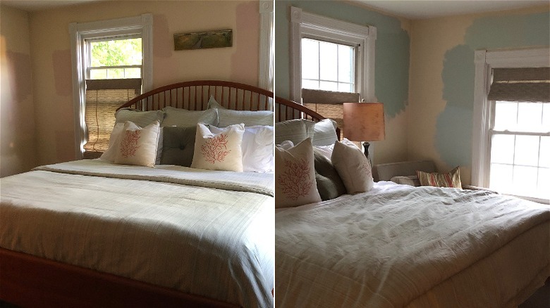
We started with paint, a shade of blue-green that matched our duvet cover — but it was a lot of strong color after living with cream. We stopped painting after one wall was finished, justifying our cowardice and indecision with the knowledge that accent walls were gaining popularity. The wall added the energy we were searching for without overwhelming the room, but unfortunately, instead of creating a soothing atmosphere, it was jarring and disjointed. And it made the existing off-white paint look dirtier; but for some reason, we weren't ready to let that neutral go.
Bringing in new decor
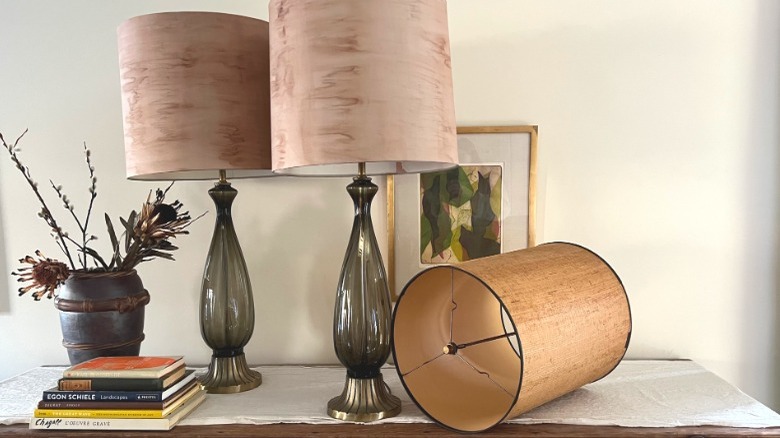
We nabbed a much larger and more unique pair of mid-century modern glass lamps at a tag sale. The tall woven shades needed repair (and looked dated), so we switched the harps to a shorter length and purchased new lampshades. We painted them with water-based ink to look like silk moire or birch bark. Pro-tip: One of the best parts of buying secondhand is the freedom to play and change an item to make it your own. As long as it doesn't have a provenance you'd be stripping away, you're reviving it and getting a personal statement in the bargain.
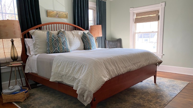
After finding a new area rug for our living room, we were able to use the previous one in the bedroom, replacing the undersized and dark option. A rug should occupy ½ to ⅔ the length of the bed so that you're able to step onto the cozy surface instead of a bare floor when getting out of it. Yet there should be enough rug visible to make an impact on the design of the space; at least 24 inches on each side and at the foot is ideal. The larger rug made sense in a different orientation (better filling the dimensions of the room and leaving a walkway to the closet), which required moving the bed to another wall. As a result, it felt as if the space was calling for a bigger bed, and we now had room for one.
Upgrading to a bigger bed
We had wanted a king-sized bed for some time, imagining it as the best spot for the whole family to watch movies together, especially during cold and drawn-out New York winters. We soon came across a king bed frame we loved. A new area rug and bed would have been a drag on our budget, but we purchased them both at estate sales. The solid cherry bed was crafted by a local artisan and was an unbelievable steal. The money saved went toward the expense of a new mattress and bedding — that's an important consideration if you're sizing up.
The challenge with the bigger bed was that it encroached on the windows; the roman shades hid the frame from outside and would do for a while. Because we had offered our queen bed frame to someone, we slept on our queen mattress and king bed while waiting for our ordered king mattress to arrive — and were fortunate no one broke a leg. (We don't recommend it!) We supposed we had it better than the poor souls whose kitchen renovations require bathtub dishwashing.
Testing out new paint
Fixing the jarring paint treatment now seemed unavoidable. So we swatched. And swatched. We were after something restful with subtle ties to nature; the ocean and its complements were an inspiration: the water and sky, dried dune grasses, washed boulders. There was a particular image in mind of a pearlescent shell and smooth beach glass. Ideally, we wanted the space to comfort, but to also feel grown-up (which we equated to pulled-together) and a little luxe — not glam, but the way that nature can be unexpectedly luxurious sometimes.
We sampled peachy blush paint, spreading the swatches around the room to catch the light from different sources and examining them under artificial light at night. While we loved the colors alone, the results weren't matching our concept. This is tricky — although it's hard not to, one should avoid judging a paint color (or a project for that matter) in the middle of the process. Yet, the pink story didn't feel quite right. Paint should be one of the last elements settled on during a makeover since it's one of the most affordable and easiest to change. In the end, we shifted tact to a tint paler than our accent wall. It's a hue that has always felt like home.
Changing the window treatments
Lastly, we needed to address the window situation. We were equally as concerned about how the bed appeared inside the room as from the exterior of the house. Fortunately, curtains would not only help to conceal the too-big bed frame but also be sound- and light-dampening while adding a sense of lushness. Additionally, they would help regulate the temperature in our room and minimize drafts from our builder's grade windows — especially important since our heads would be in such close proximity to them. We considered springing for custom drapes; we had invested in them before and they were beautiful and wonderfully made — worth every penny. However, after taking our time and budget constraints into account, we opted for something ready-made.
Many online and brick-and-mortar searches later, we found two sets of drapes — one each for summer and winter. In an earlier House Digest article, we explained why this is a good idea and how to shop for curtains. They were discovered during a visit to a larger city, planned with this particular hunt in mind. If décor options feel limited where you live, a trip to a more populated area can make a difference in what you'll find. Plus, looking for something specific gives you a fun mission, while the place and memory of any purchase create a fond attachment that becomes another layer in making your space personal.
The finishing touches
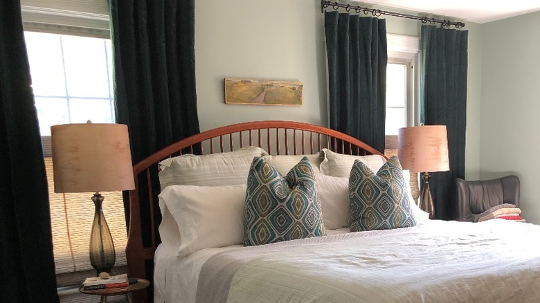
In late fall, we hung deep blue-green velvet drapes that disguised the window problem, yet also provided the bed with the backdrop it demanded to act as a focal point in the room. The existing roman blinds continued to hide the lamps and any nightstand messes from outside. With the addition of a small brass table and a more appropriately-sized lamp on each side of the headboard, a comforting sense of symmetry and grounding was created that the space never had before.
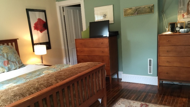
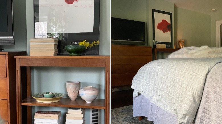
Across from the bed, two matching chests flanked a walnut shelving unit which was moved from our living room. We professionally reframed a favorite poster and centered it here — the graphic black border helped the dark TV to blend in and the placement of such a strong piece finally made sense. The whole wall balanced the weight of the headboard and dark curtains. We also decluttered and replaced or removed some furniture: Our comfy velvet club chair — too wide to fit next to the bed — was removed and swapped for a thinner silhouette, and a blanket chest was relocated to another bedroom.
The modified layout felt logical and cozy and created a good flow through the space; strangely, although the bed is bigger, the room seems much larger. It's now the restful, pulled-together, and nurturing bedroom we had hoped for and needed. And we've gratefully settled in.
