Designer Emily Henderson's Tips For Starting Your Gallery Wall
Interior designers always stress the importance of making your home reflect you and your personality. As such, create an interior that stands out and looks like only you can live there. One of the best ways to achieve this is with art. Since the beginning of time, it's been a way for people to express themselves through creating or collecting various pieces. Buying art is also a great way to support local businesses and artisans, according to Stephie Cooks, who recommends small or handmade items for people just beginning their collection.
But once you have these room displays, what should you do with them? On her blog, designer Emily Henderson shares ways to dress up your interiors with a gallery wall, which typically features a collection of multiple pieces similar to a museum. This decorative feature can go anywhere in your home, including the living room, kitchen, and bedrooms. While a bit more complex than throwing a bunch of things on the wall, it's not difficult to put together. Once you know these designer-approved secrets, you'll be able to assemble everything in no time.
Decide how and what to hang
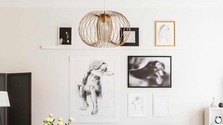
Before picking out any art, it's a good idea to first decide how you plan to display and orient it. In one home Henderson designed, she uses shelving to display a collection in a living room. The celebrity designer shows how she styled the two horizontal ledges on Style by Emily Henderson to create a loose grid. The largest pieces are in the center, with smaller pieces flanking either side. Henderson was also careful not to choose anything too tall, which would cause the mantles to be further apart and increase white space between individual items.
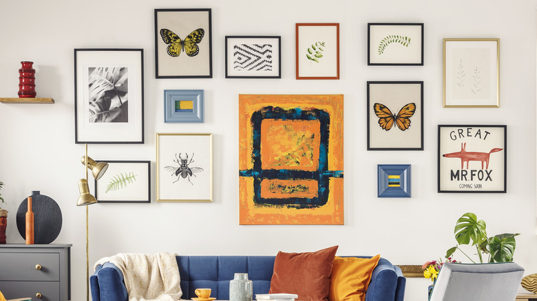
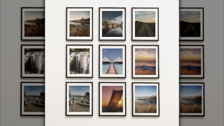
Picture ledges are a great option for gallery walls because they make it easy to swap out different pieces, according to Dear Designer. They're also advantageous for renters, who may be hesitant to display wall art that often requires putting holes in the wall. Additionally, these berms are also beneficial for mixing in vases, sculptures, and plants. But if you enjoy the look of hanging artwork directly on the wall, still consider the layout beforehand. Mix different sizes and shapes in a seemingly random pattern for an eclectic look, suggests Little Gold Pixel, or opt for a cleaner aesthetic by using a straight grid. Any creative option in between can create a customized gallery wall.
Choose the right art
The right artwork makes all the difference, but this is where novice collectors tend to get overwhelmed. With tons of styles and even more professionals creating their own styles, it can
be difficult to find the right prints or paintings. Luckily, while possible, it's often time-consuming. More often than not, it requires some self-reflection to figure out what you're most drawn to, according to Artwork Archive. As such, consider what mediums and subjects you gravitate toward. Now, this may require looking through a good amount of artwork from different movements and time periods. For instance, you may like oil paintings over watercolors or nature scenes more so than figure studies.
After finding the styles you like, start building your gallery wall; however, that doesn't mean buying all the same type of art. Mixing media and styles is what makes them interesting to look at in the first place. Emily Henderson features a gallery wall that uses watercolors, oil paintings, and mixed media. Don't just stop at traditional art; instead, infuse a personal touch to your gallery wall (via Style by Emily Henderson). Polaroids, family photos, or mementos like concert tickets will make it feel more like a home rather than an actual art gallery.
Mix and match
Though they may all be different images, the pieces on a gallery wall should still be cohesive. Have a common thread running through the art by choosing a similar color palette, suggests Style by Emily Henderson. In addition to a large anchor piece, any smaller art displays should feature the same colors to prevent a manufactured matching mess.
Float mount some or all of the art on your gallery wall. Case in point: A floating frame can instantly make a piece look more elevated (via Style by Emily Henderson). That's because they don't have back-mounting and the image doesn't touch the frame's edges, which provides an interesting depth and three-dimensional viewing space for wall artwork, according to Baboo Digital. A floating frame can be a focal point or accent for a few pieces or how you display everything.
You can also mix and match the frames and orientations. Consider frames of different colors, materials, and thicknesses. Thin frames tend to look more modern, while thicker casings err toward being more traditional. Not opting for symmetry? Then be sure to choose frames of different shapes and display both vertical and horizontal images.


