How To Steal Ellen Pompeo's Open And Naturalistic Home Style
Ellen Pompeo is most commonly known for her role as Meredith Grey in the long-running ABC show "Grey's Anatomy." However, some may not know that before the show picked up the pace, Pompeo, alongside her husband Chris Ivery, was considering purchasing a pad in Malibu, California, as per Architectural Digest. Stating that she couldn't afford it at the time, once the show became a commercial success and the estate came back on the market, the actress decided it was time to make the purchase. The home was built in the late 1970s and was later remodeled to span around 3,000 square feet.
Having a natural allure to interior home design, the star has taken on many home projects, including her main residence in Los Angeles as well as her other home located in Sag Harbor. However, when it came down to updating and revamping this pad, Pompeo enlisted designer Martyn Lawrence Bullard to accompany her during the process. Together, the two collaborated on three home renovation projects before the Malibu beach house. While the flow of the rooms remained untouched, the duo decided to add many subtle touches here and there. Fortunately, when the property located on the backside of the home recently came up for sale, Pompeo and her husband quickly grabbed it up to expand their current estate. From many marble designs to neutral tones and settings, here is how to steal Ellen Pompeo's open and naturalistic home style.
Add marble everywhere
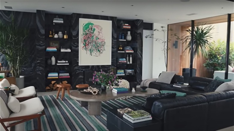
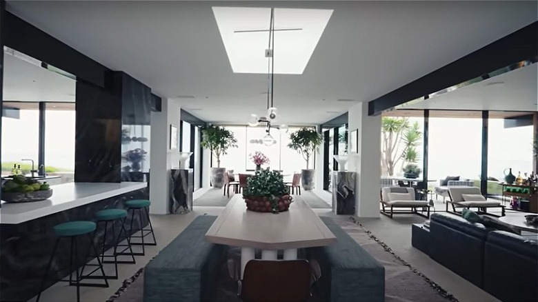
One of the first aspects of Pompeo's home that one will notice is the marble installed in many locations, via YouTube. Upon entry, most of the walls of the living room are black marble. This spans into other areas of the home, including the dining room walls, as well as a few pillars in this area. While the kitchen walls are a solid white tone, the countertops are the same black marble design as the living room and dining room walls. Over into the main bedroom, the walls are a mixture of white, black, and blue marble formed in a triangular design. Across from this is a fireplace with white marble that also matches the bathroom's design.
To steal this style and add it to your home, we recommend starting with basic areas and building your way up. Begin with areas where marble is common, such as the kitchen or bathroom. When choosing between black marble or white, Surrey Marble & Granite states that a white design can produce a sleek look and open up any room. In comparison, black marble can make a room look dim; however, this can be avoided if paired with the right contrasting colors. Once these areas are complete, add more marble to other areas, such as an adjacent wall in the living room or bedroom. Build up gradually until you're satisfied with the final result.
Embrace wooden tones
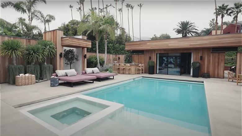
Aside from all of the marble designs, another aspect of Pompeo's home is a lot of natural wooden tones, as per YouTube. Most visible on the home's exterior, this residence showcases wooden siding and awning as its main feature. This then spans to other outdoor areas such as the bar, the entrance gate, and even the guest house. Additionally, the actress decided to incorporate more wooden tones within the furniture pieces, such as the outdoor coffee table and bar stools. Inside, you can see a wooden bar cart, small stools, and bookshelves in the main bedroom.
Usually, there are some wood tones naturally incorporated into a home. Maybe it's the exterior like Pompeo's home, or perhaps it's the baseboards or trim. Either way, if you have these features, leave them as they are. Don't paint them or try to replace them for an upgraded look. However, if you, unfortunately, don't have these features, consider installing some or adding in décor of wooden shades. You can install some wooden flooring or even paint the wall trims a shade of brown. If you want to go above and beyond, you can even replace your vinyl siding or brick home with wooden boards. On the other hand, you can keep it very subtle by adding wooden stools, a table or two, and some matching chairs. Fortunately, this is a customizable design with a lot of choices to choose from.
Open and spacious
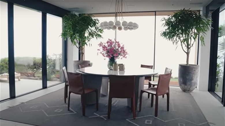
For the most part, this home is very open, with tons of space and light, via YouTube. This can mostly be seen within the formal dining room. Surrounding a round table on three sides are floor-to-ceiling glass windows that overlook the estate. These windows don't feature any blinds or curtains, allowing natural light to flow through with ease. Similarly, many of the other rooms within the home, such as the living room, the bedrooms, and even the main bathroom, all house large floor-to-ceiling sliding doors. Within the main bedroom, aside from standard pieces such as the bed and nightstands, the room only has a couple of extra décor items, such as a plant. Thus, allowing the room to feel open while giving space for one to move around.
To steal this design, it's more about what you don't do to your home than what you do. For example, refrain from installing curtains or blinds on large windows — or any windows at all, for that matter. This lets the light shine in and allows your room to feel much larger than what it actually is. If you have a large room, consider keeping it like an open floor concept. Don't place furniture too close together and instead place them with plenty of space around each item. If this doesn't work, consider removing a piece or two from the area. Remember, the more space within a room, the better.
Keep the main features in a neutral setting
Upon entry, similar to the marble, you'll notice a lot of neutral tones, such as black, white, and brown, via YouTube. Within the dining entrance, the table that Pompeo refers to as "the kid's table" is a simple cream tone with dark-toned chairs. Nearby, the "adult's table" is white with black trim and features similar dark-colored chairs as well as a chandelier of a white tone. The living room contains an L-shaped black leather sofa paired with two wooden chairs with white cushions. In the middle of this sitting area is a large gray coffee table. One of the guest rooms features solid white walls, a bed with a gray headboard and black and white designs, and black and white photos of important moments in Black History.
To keep a room feeling neutral, take a look around you and acknowledge the big pieces within a room. Look at the focal points and identify which items are the center of attention. Got it? Good. Take the pieces and exchange them with items of a simple tone, such as tans, whites, or blacks. If it's an expensive item, such as a sofa, consider investing in a sofa cover in one of these shades. This way, you get the natural tone without breaking the bank. Style by Emily Henderson also recommends adding pieces of texture as well. You can do so by adding in a rug, fluffy pillows, or a chunky blanket.
But add color to more personal areas
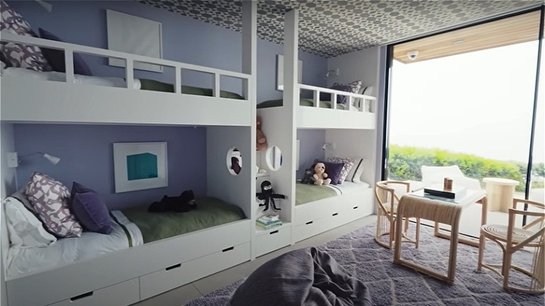
In comparison, when it comes to more personal areas, these spaces can have bright and colorful items. For example, her kid's bedroom displays a lot of purple shades, as per YouTube. Pompeo stated that when decorating this room, they started with the purple designed wallpaper on the ceiling. From there, they decided to paint the walls a light pale shade, add a white and purple designed rug, and hang bold-colored curtains. Over in the living room, there are hints of colors here and there, with teal-colored pillows and books on the table and bookshelf of a variety of colors. Most notably, perhaps, in between the bookshelves is a large art piece that features red and green tones.
In comparison to neutral tones, adding bright and bold colors to areas can be a bit more straightforward. For a living room, all you need to do is add a few pillows and possibly a throw blanket of color to the sofa. If you have a large table, consider adding a vase of brightly colored flowers. For kitchen areas, you can buy pots and pans of many colors these days. Even more so, you can hang them up and display them on a hook instead of storing them in a cabinet. Or, for more personal places such as a bedroom, you can go above and beyond as you please. Paint the walls an electric green, or add some funky wallpaper if you desire.

