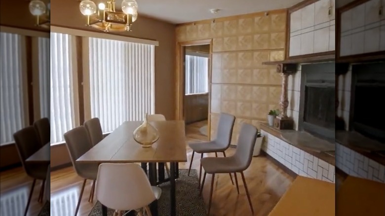
HGTV's Ugliest House In America Deems These Features Unacceptable In A Home
HGTV's "Ugliest House in America" is hosted by "Parks and Recreation" star, Retta, who travels across the country looking at strangely designed homes before voting on the most unattractive option. Interestingly enough, the residences are nominated by the owners themselves to be featured on the show, with the hope of winning and receiving a $150,000 renovation by interior designer Alison Victoria. While every home has its kinks, that doesn't stop homeowners from buying if they're reasonably priced.
If you regularly tune in, you know there have been multiple questionable design choices. For instance, in the episode titled "The Not-So-Great Lakes," Retta visits three homes in the Great Lakes region. One home, in particular, stood out because of its outdated hot tub that was situated at the end of a long hallway (via Realtor). Hot tubs are a luxury, but if placed at the end of a creepy hallway, they might not be as enjoyable as they should be.
Each home Retta visits has features no house should ever have. And it makes you think about the thought processes the previous owners or designers had when making these questionable decisions. Of course, you're bound to make renovation mistakes along the way. Check out these design elements you should definitely avoid adding to your home.
Ancient Greek God statues
Displaying statues inside or outside your house should be clearly thought out before making any rash decisions. While various styles can elevate the appearance and feel of a home, the wrong choice will make it look bizarre. During a special look into one of the episodes for "Ugliest Home in America," Retta visited a Minnesota home with a giant Poseidon statue in the middle of the driveway. According to Bring Me The News, homeowner Kourtney Bradford mentioned how she bought the house on a "low-ball offer," which the sellers accepted.
The home features underwater surroundings in different rooms that fit the ancient Greek God of the Sea theme. Some examples include under-the-sea décor, like an assortment of fish hung on the wall, blue-painted walls with wave detailing, and a cave-themed bathroom (via Twitter). Even though the previous owners carefully decorated each room to fit the motif, it doesn't mean these elements should have been incorporated in the first place.
The Poseidon statue could've easily been discarded or been smaller in size to avoid scaring any visitors or passersby. Alternatively, a Poseidon bust in the living room could have transformed the space and provided it with a more sophisticated look.
Linoleum from top to bottom
Deciding on the ideal type of flooring in your home can be difficult, especially when you have countless options, like hardwood, carpet, tile, and more. Of course, you should also consider the furniture you have or plan to buy for a particular room or space. Also, think about what color to paint the walls and how specific small décor will help create an overall cohesive look.
If you're thinking of sticking to one type of material for everything, you might need a few expert tips. According to Realtor, Retta visited a Los Angeles home that was completely outfitted with linoleum, from the flooring to the walls to the ceiling. It's possibly one of the weirdest designs the previous owners decided on.
One of the homeowners, Evan, said they would be able to mop the floors and ceilings since it's waterproof, per Realtor. Even though the walls, ceiling, and floor have different neutral finishes, everything still blends together. If there's one thing to avoid when renovating your home, it's using the same flooring material for your walls and ceiling.


