Home Features That Are Out Of Style, According To HGTV's Property Brothers
One of the risks when buying an older home is that the space can feel outdated or out of style. This might be due to the layout of the rooms or the quality of the furnishings, while other times it's because of smaller décor elements that are harder to pinpoint. According to Design Baddie, while some trends can last beyond the years they were originally popular, many tend to reach a peak before eventually declining and hibernating.
Because trends are cyclical and ever-changing, many experts advise choosing a timeless design. Drew and Jonathan Scott, hosts of HGTV's "Property Brothers: Forever Home" have plenty of experience when it comes to such trends. In an interview with Realtor. com, Jonathan shared that, "the important thing to remember is that trends change, styles change, but there are some elements that are just timeless. They just extend, and they live on, and they look beautiful."
In one recent episode of their show, titled "The Next Multigeneration," Drew and Jonathan tackle a home that is straight from the '80s. As they work to create an updated space that the homeowners can live in, they pinpoint some of the common features that typically make a home feel dated.
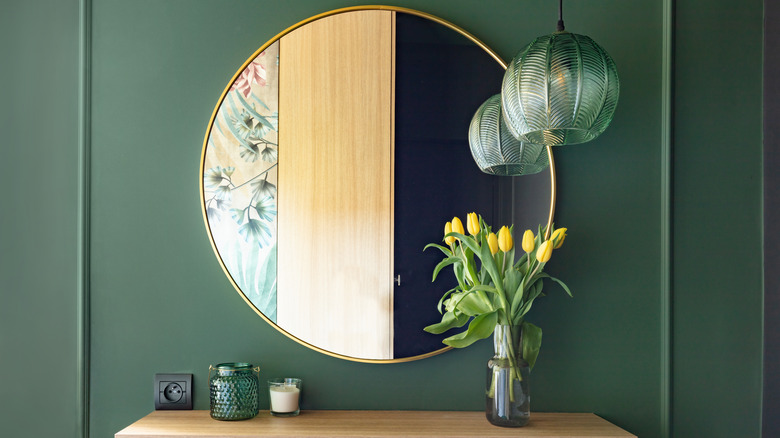
Mirrored walls
A staple of the '80s and '90s, mirrors brought in glamor and helped improve the appearance of a space, making it more inviting, notes Hommes. To that end, mirrored walls were often a staple of these older interiors because they added depth to a room by reflecting natural and artificial light. However, according to Jonathan Scott, "fully mirrored walls came and went," (per Realtor.com.)
While mirrored walls might make a niche comeback, they can make a space look like it hasn't been updated when they aren't done right. For a more timeless use of mirrors, the Scott brothers recommend using standard options on the wall instead. For a large area, you can group several mirrors together, or if you have less room, choose a large mirror and hang it at least 60 inches from the floor. Moreover, placing a mirror across from a window or light fixture can increase the amount of light reflected.
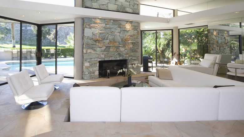
Sunken living rooms
A major trend of the '70s, sunken living rooms, featured a recessed floor that was lower than the rest of the home. According to Rocket Homes, this space was usually filled with sofas and chairs to create a conversation area in the middle of the room. Due to the popularity of open floor plans, a sunken living room created a defined area that was separate from the rest of the space.
Though they can add character when done right, sunken living rooms have their drawbacks, explains Drew Scott. "It was such a hot trend for quite a long time, and then people realized everyone falls on their face," he pointed out, per Realtor.com. Moreover, sunken living rooms can present issues with accessibility and are impractical for senior homeowners and those with mobility issues or injuries.
However, this doesn't mean you can't break up a large, open space. The Scott Brothers encourage creating zones depending on your needs, per Woman's Day. You can do this by arranging your furniture around a focal point such as a console table or fireplace, or you can use an area rug to tie furniture items together.


