How To Decorate Your House Like Only Murders In The Building
Everyone loves a good whodunit. What do you get when you team up a washed up Broadway producer, a former TV detective, and a young artist living in an unfinished apartment? The answer is a great show. Hulu's "Only Murders in the Building" is a beloved series that pairs together comedic masterminds Steve Martin and Martin Short with Disney alum Selena Gomez. It's fast-paced, it's witty, and it definitely keeps you guessing.
Yet, it's apparent that millions of people aren't just tuning in each week for the plot. There is something else drawing them in: the fantastic level of production design. In fact, when asked about the level of detail that went into creating the world of the Arconia, production designer Curt Beech told IndieWire, "Even the bad guy's apartment is inviting. When you walk into the foyer you don't know it's the home of a killer." Each room of the historic apartment building is nearly a character in and of itself. "The more important thing is to make spaces that are believable for the world that the writers have written," Beech told Daily Bruin. "That's all I care about. The spaces, while somewhat fantastic, do feel authentic for these characters." We've rounded up our favorite tips for those wanting to recreate the whimsical vibe of the show at home.
Choose a style that suits your personality
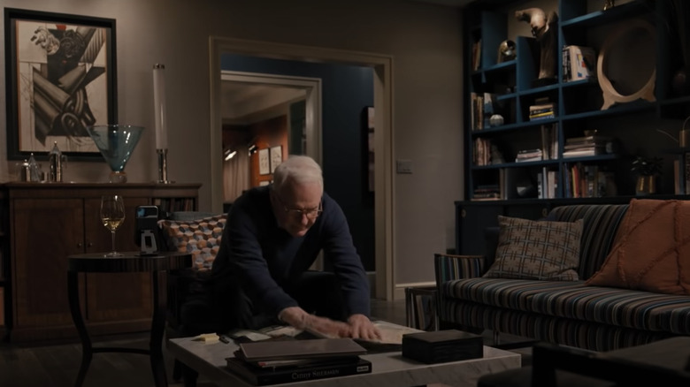
Production designers on "Only Murders in the Building" have done a great job of making characters' living spaces seem like an extension of their personality. Charles' apartment is a moody bachelor pad, which suits an older actor who is unlucky in love. Oliver's home is creative and upbeat, which is excellent for him because he's an eccentric producer. On the other hand, Mabel's space matches her personality perfectly: It's messy and unfinished. If you want a home that captures the vibe of "Only Murders in the Building," consider choosing furniture pieces and décor items that mimic the high points of your own personality.
According to Connecticut Home Interiors, the key to doing this is to match your moods to the rooms you experience them in. For example, in your office, you might want to feel alert and productive. To achieve this, you will want a desk that makes organization easy, as well as an ergonomic chair to reduce fatigue. In the same way, you might want to add a pinch of inspiration to your work space, so you can add some flair with curtains or art, just like Oliver would. You can bring this to other rooms, too. Bedrooms are likely to be soft, relaxing spaces. When you are choosing décor for these rooms, you don't want anything too wild that might keep you from sleeping.
Elevate your space with plenty of wall art
Charles-Haden Savage is a man of exquisite taste and he won't let us forget it. Just like Steven Martin in real life, his apartment is filled with art. According to ARTnews, the actor who brings the TV detective to life has a soft spot for paintings, just like his character. He is a known patron of contemporary Indigenous Australian art, and has an extensive personal collective that is shown both in galleries and simply enjoyed at home. On the show, Charles seems to prefer more moody, modern pieces. To copy this, you can choose the same style, or pick an art movement you like better and display it in similar ways.
Manhattan Arts International advises that you can really set the tone of a room through the artwork you choose to display. Painter Elliot Appel told the gallery, "My artwork adds elements of city life to any environment. The colors, street performers and architectural styles that I portray make any room come alive with the heartbeat of the city." Just like Charles, you can choose art to breathe life into a room. You can do this through contrasting colors, an interesting accent piece, or even a funky frame.
Don't be afraid to go retro
Charles' kitchen floor has tile straight out of the '70s — and it works. The character's vibe is very much that of someone who enjoys the highlights of bygone eras. After all, he is most known as playing Detective Brazzos on a show that, in canon, has been out of production for years. While trends tend to come and go, there are overarching themes of design that seem rather timeless. We continue to see them pop up when decorating, because, over the years, they have proven that they are not going anywhere.
According to Dengarden, when you want to incorporate retro elements into your home's décor, the best way to go about it is to start with the floor. A room's floor offers a great base (both figuratively and literally) for the overall tone of the room. Even if the rest of the décor doesn't quite look the part just yet, a fun floor can do a lot of work in pulling a theme together. Next, if you are on a budget and want your kitchen cabinets or dresser drawers to seem a little bit funkier, consider swapping out the knobs. While repainting is always going to go further for a new look, an easy fix while you're on the way is just updating the hardware instead.
Consider art deco light fixtures for a mysterious boost
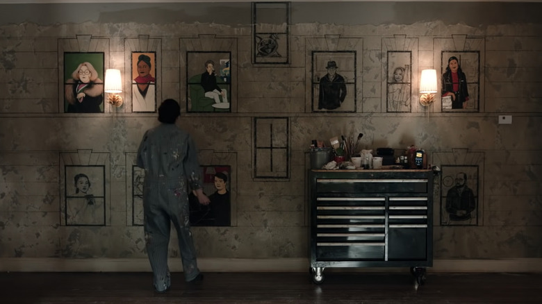
Mabel's unfinished apartment may belong to her aunt, but it still contains an interesting mix of styles. Her light fixtures, for example, appear to be art deco. According to Britannica, art deco is a style that first came into fashion during the '20s. You can easily recognize the style by its bold, brassy colors, geometric shapes, and rigid, streamlined structure. Art deco takes inspiration from the excitement of the Roaring '20s and usually also incorporates fancy materials, like marble and gold.
Because art deco style uses such bold shapes, Mabel really has the right idea by incorporating the style into her home with lighting. It's the perfect touch that elevates a space from boring to brilliant. If you do the same, your lights can do two jobs at the same time. They can provide light to a space, but also a touch of glamor as art deco has a reputation for opulence. You can choose silver, gold, or brass finishings for your light fixtures, as they tend to complement any paint color. In addition, the fun designs of art deco lights can be conversation starters at many cocktail hours to come.
Consider a monochromatic bathroom
Mabel's bathroom is all pink. In different scenes, you might notice that the tiles and even the shower curtain are the same bright hue. Choosing to go monochromatic is a bold choice, but one that's easy to follow if you want to recreate the look at home. According to Dolly, choosing to go monochrome is about so much more than sticking to a crisp, white palette. In fact, as the trend continues to grow in popularity, the term is applied more and more to bolder, more colorful looks.
When selecting your color for a monochromatic look, it's best to start with an anchor piece. You can base the rest of the room around this one thing. In Mabel's case, it's likely that the pink tiles inspired the rest of the pink decorations. If you were applying this inspiration to a different room in the house, you might have a pink chair, duvet cover, or even painting that you want everything to match. Once you have established your anchor piece, remember that it's not a good idea to have the rest of the room match the color exactly. Instead, it's better to create variety within the space and choose different shades of the same color to encourage visual interest.
Expose covered brick for a chic, effortless look
Mabel's apartment may be unfinished, but she just might be onto something. The exposed brick walls of the space are actually quite in style. According to the National Design Academy, there are plenty of perks to leaving brick exposed during your next remodel. The main benefit of the look is the character it adds to a room. It can bring depth and texture to space that might have felt a bit too cookie cutter. In addition, exposed brick easily complements other common home décor options, like glass elements and any metal finishings. Depending on what you have on hand, it means that you wouldn't have to do a lot of shopping to finish out the look when the renovations are complete.
Brick is also a pretty tough material, so you don't have to worry about wear and tear as much over the years. As with any remodeling project, you need to do a smaller test portion before moving forward. This way you can make sure the brick is the right color and texture for the look you want. Even better, check out inspection reports from when you purchased your home, or builder's reports from construction, to determine the location, size, and quality of the bricks under your plaster.
Go bold and and mix unexpected colors
Charles' kitchen cabinets are a stunning shade of turquoise, while the adjacent accent wall is bright tangerine. Some might say mixing such bold colors in your interior design could lead to a disaster. However, if you are sure to follow certain color principles, you can make it work every time. For example, be sure to "Opt for tones that are bold; not loud," as designer Sari Mina Ross told Mansion Global.
This means that you should lean into colors and combinations that are fun, daring, and exciting, rather than garish and tacky. The key to achieving this look is not doing "the entire room in the bold color, but opt to use it for accents through furniture or even a ceiling or trim," per Ross. We see this in the kitchen here, with the deep, dreamy turquoise allowing the zest of the orange to really pop. Designer Victoria Bell agrees, telling the outlet, "A great way to use a bold color without painting a whole room is to paint the doors and the trim. It brings the perfect amount of color without feeling overwhelming."
Embrace the unfinished
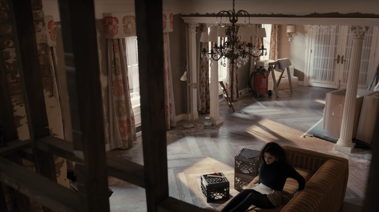
While Mabel works hard to sniff out the murderers living at the Arconia, the construction on her aunt's apartment doesn't seem to make too much progress. However, in the true spirit of capturing the "Only Murders in the Building" vibe, if your home is under construction, you can still make it chic. According to Blackline Renovations, the best way to live in a space under renovation is by planning ahead and sealing off rooms that need the most work. In the show, this doesn't happen, as Mabel makes use of every room in her apartment, as well as the secret passageways in and out of it.
What she does do, however, is add touches of personality even amid the chaos of construction (and a murder or two). You can see a nod to her hispanic heritage, as the drapes she uses draw on Mexican inspiration. Adding personality to your home like this, even if it is a mess under construction, is pretty simple. You just need to select an accent color to weave throughout each room. For Mabel, it's pink, as we see it pop up in multiple spots around her home. Next, incorporate patterns that appeal to you. We see this in Mabel's curtains, but you can do the same with coasters, duvet covers, and pillows.
Embrace the chicness of a maximalist home
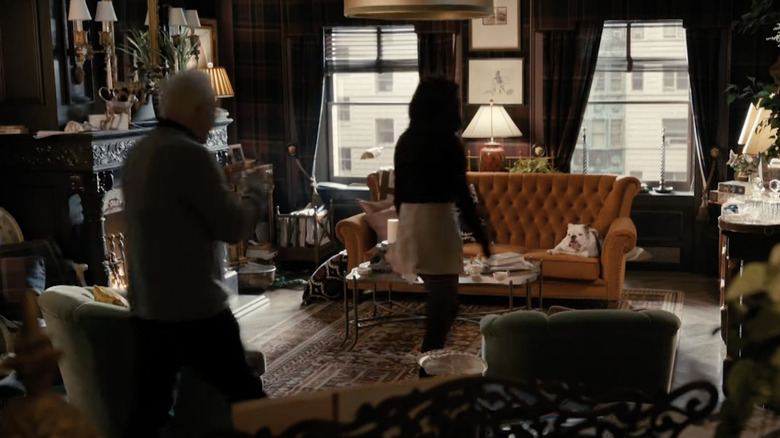
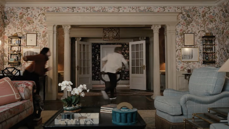
Go bigger, better, and bolder by filling your home to the brim just like Oliver. According to Vogue, the maximalist style often is misrepresented as clutter. While some maximalists might build a treasure trove of fun trinkets and statement pieces, in general, we should think of maximalism as the abundance of everything. It's an abundance of color, patterns, ideas, and different textures and tones. These things are all mixed together into a sort of organized chaos. As interior designer Kathryn M. Ireland told the magazine, "Be bold and decorate with conviction." In other words, go crazy.
If you are just starting off with the trend, a great idea is to stick with one color to begin. "Maximalist spaces can be successful when a cohesive look is created by tying many different patterns and textures together with a consistent color or color family," suggested Tina Schnabel, an interior designer.
Mix bold accent furniture with wooden neutrals
In true maximalist style, Oliver's living room is a study in both restraint and bursts of energy. In addition to his detailed color scheme, he anchors the bold visuals in his apartment with wooden neutrals in paneling and flooring. Interior designer Tina Schnabel told Vogue that "To ground the eye, consistent hard finishes like wood or marble coffee and side tables should provide relief to the room's bold patterns and colors. All in all, to be a maximalist, ensure as many spots in the room as possible aren't left naked." As Oliver is both a planner and a visionary, it makes sense that his home would follow the rules of the style to a T.
According to Simple Home Simple Life, many homeowners are tempted to paint their wooden trim to create a more cohesive look in the space. However, leaving the wood in its natural state can actually add more value to a room, as it offers more warmth and balance than other opinions. Do note, however, that different room colors tend to go better with different wooden hues. For example, lighter wood pairs well with bright hues and moody tones, while the likes of mahogany really only pairs with darker colors.
Invest in a good wallpaper
Fans have noticed that nearly every apartment on the show has a fun wall covering, so if you want to decorate your house like "Only Murders in the Building" a great place to start is by selecting a bold wallpaper. Designer Jennifer Palumbo told Forbes that "when working on architectural surfaces, we like to limit the number of finishes in a given space." Meaning that when you work with a striking pattern, be sure to stand back and let it shine. Don't crowd the rest of the room with too many other elements that could be visually distracting.
That is, of course, unless you are attempting to make a maximalist statement. As Sarah Wittenbraker told the magazine, "Sometimes a statement-making wallpaper just calls for more statements." The great thing about wallpaper is that it is not permanent. If you don't like your choice, it's easy to redo. In addition, with the rise of DIY, you can totally redo a room in your house with it over the course of one afternoon.
Use chairs to make a statement
Chairs aren't just a place to sit on the show — they are playful extensions of the characters personalities and fun, bold statement pieces. According to Joss & Main, shopping for the perfect accent chair can be quite the process, as there are a number of designs to choose from depending on your needs. Pause for a moment and consider what you, or your favorite resident of the Arconia, might typically need from a chair. For example, Charles would gravitate towards a club chair with its smooth, leather finish and low to the ground profile. While Oliver might select a chaise lounge or seashell chair to use for some of his staple histrionics.
That said, you don't have to select just one type of chair. Chairs of different shapes, textures, and sizes typically pair well together. In fact, "Only Murders in the Building" is proof that different types of furniture (and friends!) can often mix together to form a winning combination. Even so, when making a statement, don't forget to make it fun.
