The 13 All-Time Best Bathrooms Created On Fixer Upper
Fans of HGTV's iconic show "Fixer Upper" might have noticed that bathrooms aren't typically the stars of the home reveals. Many times newly renovated kitchens and stylish living rooms steal the spotlight. However, some of the bathrooms that have been redesigned are some of the most remarkable transformations on the show. Many times homeowners are faced with a bathroom that lacks function, style, and is drastically outdated. Then, in true Joanna fashion, she finds a way to utilize the often-small size of these spaces and turn them into stunning yet functional masterpieces.
These are the top bathrooms that the Gaines duo has put their signature touch on, working their wizardry to impressively revamp the space. Each features a one-of-a-kind design that was dreamt up with the homeowner in mind. From the just-right tile selection to expertly choosing fixtures, every bathroom project was executed perfectly. And, the result is these 13 stunning spaces that feature that magical Joanna Gaines touch.
S05E14 - All-American Farmhouse
What's a Joanna Gaines design without at least a hint of the modern farmhouse aesthetic? This episode follows the design expert as she renovates a barn for a wounded veteran with the help of the community. What could be more All-American than that?
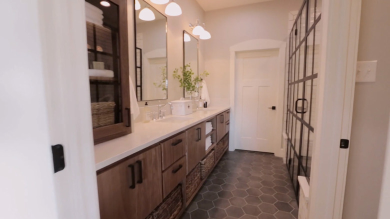
The home's palette was classic and emphasized wood and black metal accents, on a white or light and airy background. Simple geometry and subtle industrial elements update the farmhouse underpinnings, and it's all carried through from the garage door to the shower drain. The bathroom features stunning grey hexagon tile for a modern twist. The framed shower doors add character and a custom feel to the space. The vanity runs the entire length of the room, providing tons of valuable counter space and custom cabinetry. Then, Joanna adds tons of polished storage like baskets and bins to create a fully functional bathroom.
S05E08 - A Classic, Traditional Beauty
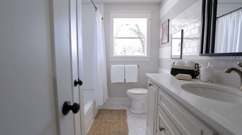
The children's bathroom in the Plain Jane House originally lacked style and function. With a narrow bathroom of a style immediately recognizable from small ranch houses, Gaines played to the narrow area's strengths by emphasizing the horizontal layout. She selected a crisp, neutral color palette that can evolve as kids age and styles change.
Sticking with this light and bright color scheme, Gaines gives the compact room an airy feel. She also created visual space by using oversized versions of traditional tiny hexagon floor tiles. The hexagon shape also gets picked up in the cabinet hardware. Framed retro prints of children playing are the perfect youthful touch in the space. There's even a very cool slide-out stool built into the vanity to help children reach the sink properly. Ultimately, this bathroom is about refining what you have to work with and creating a space that works for kids, guests, and parents all at once.
S05E06 - Flip House to Family Project
The thing about a comparatively small space that includes a bunch of predictable elements is that you can sometimes achieve a lot with relatively little. The Safe Gamble House, which ended up being designed for Joanna Gaines's sister and her family, has a lot of mid-century modern decor, notably in light fixtures, mirrors, and the accent wall in the master bedroom. Gaines moved away from that approach a little in the featured bathroom, which she punctuated with a fairly low-key design with a few dramatic elements.
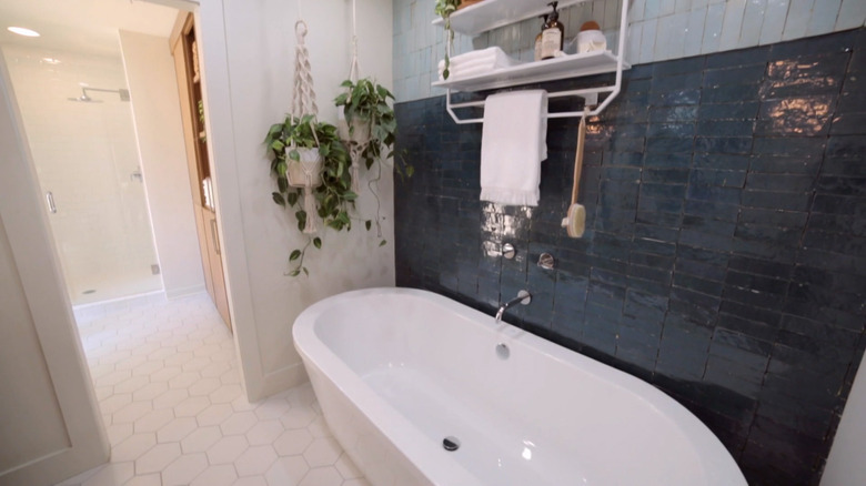
The palette of this bathroom is so light and low-contrast to give it a spacious vibe. From outside of the bathroom, you get the impression that's all there is to it, clean and white. But the entire room is elevated by the wall behind the gorgeous freestanding bathtub, which is tiled in two hues of a "kind of a dry-stacked, hand-made tile," in Gaines' words. The tile is not grouted, and the effect is striking.
S04E16 - The Flipper Upper
The so-called Giraffe House was a flip house the Gaineses took on during Season 4. Before the exterior renovations, the house was almost comically giraffe-like, spotted with dated stone. The couple painstakingly overhauled the home to make it a beautiful property, both inside and out.
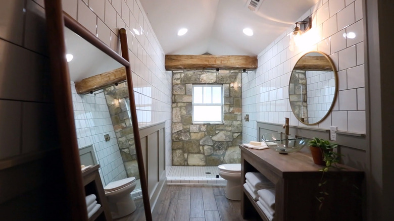
Joanna's pre-purchase plans for the bathrooms, like cosmetic fixes to the downstairs bath and a gentle overhaul of the master bath, were modified along the way. After some roofing and structural setbacks early on, Gaines decided to repurpose some of the exterior rock for use on the master bathroom's exterior wall. The other walls were done in square subway tile and wainscoting, a sleek look that played perfectly off the natural stone. Part of the ceiling was vaulted and a raw wood beam was installed, with a shower curtain track recessed within the beam. The effect is a refined, spacious, and functional master bath.
S02E11 - Country Life
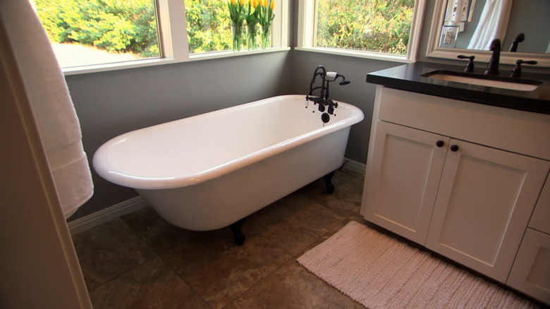
It should be an interior design rule of thumb, if you can accomplish something with windows, you should. The Overgrown Ranch's master suite was added to the rear of the home by the Gaines because the pre-renovation master bed and bathroom didn't seem to have much potential. The windows in the new bathroom look out onto the backyard, wrapping a corner of the addition. That corner and its windows defined the space's character and created a perfect nook for a freestanding tub, which had been gifted to one of the homeowners by her recently deceased brother.
Beyond that, the bath follows the usual Magnolia style, clean, simple, and elegant. A large mirror and black countertop sit atop a custom vanity painted Alabaster White, according to the Magnolia blog post about the home. The mirror makes the relatively small added-on space seem much larger, but ultimately it's the windows that made a difference. They do the magic work of integrating the outside with the inside of the home, and the surrounding landscape is what most drew the homeowners to the property.
S03E03 - Small Town Search for Space
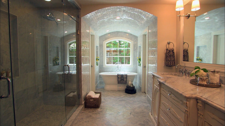
Joanna's description of this home's renovated bathroom as "a serene, spa-worthy space" is spot on. In this remodel, she combines elements that come together to create a luxurious yet functional vibe. These features include a barrel ceiling that creates a recess for the tub that ends with a similarly shaped window. This combination gives the feel of a gatehouse or barn stall that's been converted into a lavish retreat.
The other impressive element, at the opposite end from the tub window, is the bathroom's entrance. The bath appears to be set into the master bedroom and is accessed through what ends up feeling like a small entry hallway. You enter the bathroom through glass French doors, which create an instant impression of entering a spa-like place. Just inside is a white, antiqued flea market vanity topped with Carrara marble, and a large shower. The effect is an absolute getaway. You've retreated to a very nice bedroom, now step into the super-luxe spa-inspired bathroom.
S05E10 - Touchdown for a Family in Need
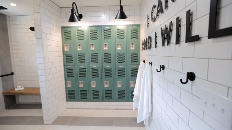
As often as not, the computer-generated walkthroughs that Joanna Gaines did with clients when pitching remodels ended up being somewhat different from the final product. However, the children's bathroom in the Copp House turned out nearly identical to the digital imagining. The space was created for two boys in wheelchairs, and Gaines devised a clean, fun, bright bathroom that says "locker room" with a clean and modern twist. The locker room concept was only enhanced by the participation of former NFL quarterback Tim Tebow.
In Joanna's Magnolia blog, she discusses the strategy for creating a handicap-accessible space throughout the home, including the boys' bathroom. The space's locker room theme is boosted by the openness of the rooms, and by a functional wall of storage lockers. Subway tiled walls create a bright, clean feel and the coordinating blue double vanity adds to the youthful vibe. The color scheme was carried over from the kids' bedroom, which in turn is carried throughout the house in various shades and hues. As a special touch, one of the family's favorite quotes is added to the wall for extra daily encouragement.
S03E10 - New Nest for a Growing Family
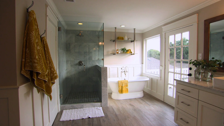
This bathroom is about good bones. The "before" state of the bathroom is a case study of how much you can waste good bones, while the "after" says a lot about what good bones can become in the right hands. This home was renovated for one of Gaines' photographers, Rachel Whyte, who also photographed the home for the Magnolia blog. But nothing in anyone's bag of photography tricks could have saved the bathroom from its dated elements, carpeting, heavy gold shower stall framing, and steps leading up to a built-in tub.
The renovated bathroom is aesthetically dominated by the tub area. The freestanding white tub alongside the large window and glass door make the corner of the room bright and sunny. The seamless glass shower walls further enhance the airy feel, and greenery and bright yellow linens add even more cheer to the space. Overall, it looks like a lovely place to run a bath and rest your own bones.
S03E12 - Creating Home Close to Campus
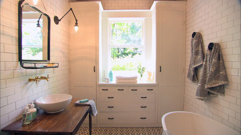
Some of the most miraculous renovations are sometimes the ones in which the least was done. That's true of the bathroom of the Beanstalk Bungalow, which had remarkably little done to it but was visibly transformed. A lot of this renovation was about digging down to find, and then restore, what was there to begin with.
The modifications to the bathroom were mainly cosmetic. Joanna added white subway tile from the floor to the ceiling of all four walls, then brought the brightness down to earth with an improvised vanity that looks like an antique biscuit table. This unique piece visually ties into the unfinished shiplap ceiling for a cohesive feel, and the black-and-white patterned floor tile plays perfectly against the dark light and cabinet fixtures. Plenty of functional yet polished storage can be found in the built-in cabinetry. Then, Joanna adds a splash of gold with an adorable faucet, giving the space a flawless touch of glam.
S03E17 - Home in the Heart of Waco
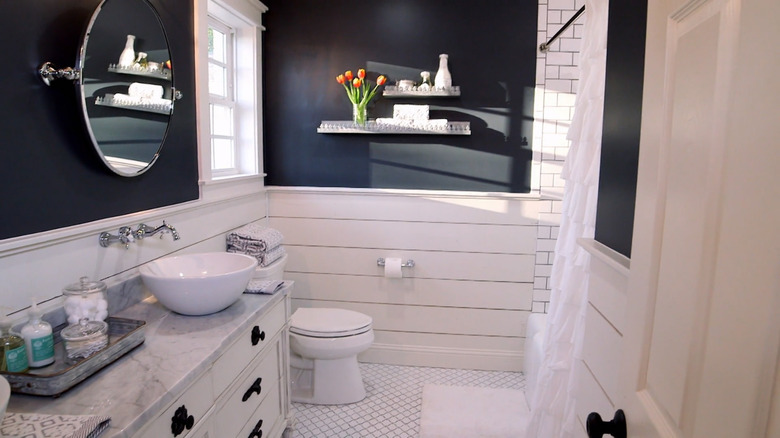
The color you choose can make or break a space. Consider the before and after differences in the Chicken House, which Joanna Gaines took from outdated to timeless. The original bathroom was a tacky throwback featuring pink tile, almond Venetian blinds, and basic white cabinets that look like they were plopped down straight from a Sears showroom. While the old cabinets were presumably meant to look built-in, the original stood a couple of inches from the wall and looked like freestanding furniture.
The elegant new cabinetry is built in but lifted off the floor on legs, and like everything else in the renovated room is classic and refined. The shiplap walls add character and the dark paint color infuses a touch of drama. Monochromatic floor and shower tiles give the space a cohesive feel that's polished and airy and the ruffled shower curtain injects a soft texture to the room.
S02E12 - Close to Water in Waco
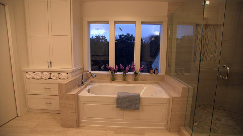
Renovated doesn't necessarily imply redesigned, which is immediately evident in the bathroom of the Faceless Bunker, a nickname for the home that perfectly encapsulated its odd lack of character. According to Joanna's Magnolia blog post about the renovation, the new homeowners weren't terribly fond of the recent remodel done by the previous owners. The design choices were stylistically unremarkable except when they were positively strange, such as the saloon doors separating the water closet from the rest of the bathroom.
The redesigned bathroom is much lighter and more luxurious. The entrance from the bedroom is a pair of one-panel French doors with large windows, welcoming the homeowners into the space. Warm tiles provide a spa-like feel and the large window-side soaking tub is an impressive centerpiece of the space. Details like integrated storage and a new double vanity also add polished function to the room.
S4E01 - The Dog-Loving Dream House
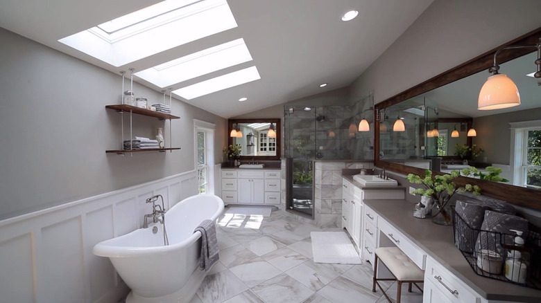
When Joanna Gaines' blog features four before photos of a bathroom, you have to assume she's making a point. This bathroom started out dark, dreary, and unwelcoming. Gaines is on point in this bath renovation, transforming a dim space that felt like a mountain cabin sauna into a light, spacious retreat.
A black drop-in tub with wide decking was replaced with a beautiful white freestanding tub. The oppressive wood planking covering every wall of the old room was torn out and replaced with simple wainscoting coated. The muted light gray and white color scheme gives the space a neutral and refined feel and takes advantage of the brightness from the skylights. The floors are large-format marble tile that creates a sleek foundation while the glass shower walls and darker tile add dimension. Wood accents, slightly amber pendant lights, and pops of greenery inject a warm and welcoming character to the room.
S1E06 - A Royal Reveal
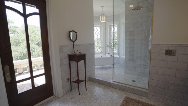
This bathroom was featured on the unique show, "Fixer Upper: The Castle." This isn't the couple's typical content, partly because it's the Gaines's own property, and partly because it's, you know, a castle. And this stately home's three-and-a-half baths turn out to be something special. Joanna describes the hall bath as one of her favorite rooms in the house. Fittingly for a castle, the room features classic and elegant elements, with exposed brass fixtures and high wainscoting in a mossy dark green. Complementary graphic statement tile covers the floor and elevates the space.
The Magnolia blog photos can't really do the room justice, so watch the episode to get a full sense of the room. What you see in the castle bathroom designs is a complex, multi-faceted personal style and the imagination to apply it appropriately in even the most dramatic setting. With every detail perfectly considered to create a stylish function, the updated space is remarkable.

