Design Mistakes Genevieve Gorder From Trading Spaces Says To Avoid
A home is a reflection of the personalities of its residents; from the overall style to the small details put on display, the choices individuals make help customize their homes. So it's no wonder that many of us put a lot of thought into how we design our spaces, especially as individual styles become specific.
Experts love to share their tips for what we can do to make our spaces look beautiful. Choosing large pieces of artwork to give them a professionally designed feel and creating a focal point in each room are popular suggestions, according to Pacaso. But what about the things we shouldn't do?
In a quest to elevate the interior of your own home, you may be inadvertently making a few mistakes that professionals would avoid. And it's not about hopping on a trend too late or loving something that's outdated. Genevieve Gorder from "Trading Spaces" sat down with House Beautiful to share the design mistakes that she often sees, regardless of how anyone decorates their home or what their personal style is.
Matching all of your décor
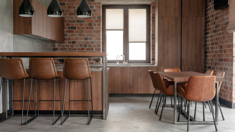
Many furniture designers and retailers offer collections that feature multiple pieces that match in silhouette, material, and decorative details. While it may seem obvious to buy each of these items to furnish a room, designers, including Genevieve Gorder, warn against this. "We don't want to date a carbon copy of ourselves ― we want a person who's complementary to what we give, just like everything in a room needs that other thing that helps it be better," Gorder tells House Beautiful. Having too many matching items can make a design look flat and uninteresting. Instead, you want to aim for pieces that are related yet different.
Of course, this doesn't mean that nothing in your home can match or come in a set. You might consider two of the same side chairs for a living room instead of matching a sofa and a loveseat, suggests Kathleen Jennison. When it comes to smaller details, like table lamps, consider different styles, shapes, and colors to create a visually interesting design. Another way to mix and match décor is to use both old and new pieces so you have a design with a story.
Picking the wrong size area rug
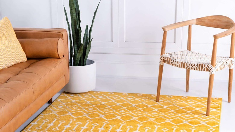
An area rug adds plenty of warmth and texture to a space. While some newbies agonize over the color and the pattern, designers believe that choosing the right size rug is a more important factor. "You know when getting an area rug, for example, often times it's much tinier than what it should be. They look like postage stamps, and that makes the room a lot smaller," Genevieve Gorder says, according to House Beautiful. An area rug acts as the foundation of a room and can help highlight the space. When a rug is too small, it can make the room feel constricted, yet a rug that's too large drowns out the space.
A good rule of thumb to follow is that bigger is better than smaller, says Rugs USA. For a living room, an area rug should be at least the length of the sofa, if not a little longer. You may also want to consider other furniture like side chairs, accent tables, and benches, and choose a rug size that will fit at least the front legs of each piece. Similar rules apply for a dining room and bedroom as well; the legs of your main pieces of furniture should be able to sit on the rug.
Not focusing on lighting
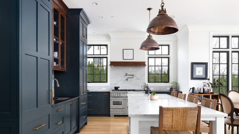
Lighting isn't only a functional detail; it helps create the mood of every room. Interior designers will tell you how important it is to consider how you light your space, not only what the fixture itself looks like. Illuminate a room in layers by adding ambient, task, and accent lighting in each room, says Ballard Designs. Ambient lighting refers to overhead lighting like a chandelier or recessed lighting. Task lighting is for detailed jobs like cooking or reading. Accent lighting highlights architecture or decorative details like a sconce over a bookshelf.
The color of the lighting also makes a difference. White light bulbs brighten the space, particularly for overhead lighting and some task lighting, but they can be harsh or too intense in the evenings. Warmer lights help create a cozy atmosphere and are best used for accent lighting and some task lighting. "Every light needs to be on a dimmer; it needs to be controllable with mood and time of day. It shouldn't just be what you bought in the box on a switch," Genevieve Gorder remarks to House Beautiful. Being able to lower the lighting without turning the light off completely will help you customize your home even further.
Forgoing color
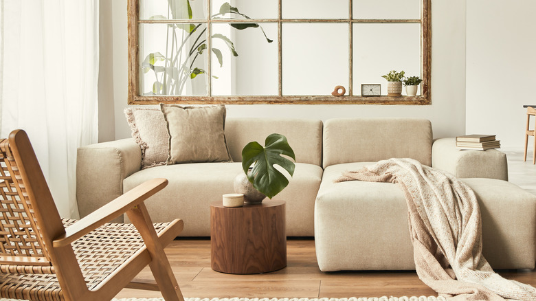
When it comes to designing a room, many naturally opt for a neutral color scheme, going so far as to choose a neutral shade of paint for the walls as well as the furniture. After all, neutrals pair easily with each other and other colors, so it makes sense to decorate with these shades as a base. The problem is that all-neutral interiors feel austere and sometimes lack personality. Using color wisely adds character to a space while the neutrals ground a room.
Don't fear adding color to your space. Per House Beautiful, Genevieve Gorder advises us to "build a family of colors to have a really happy, authentic space." There are no wrong or right colors to use in your space. Look for inspiration in nature, photographs, and other completed rooms to help find the hues you gravitate towards. Once you have an idea of the colors you like, choose five total to use throughout your home, suggests Remodelaholic. One of these can be the main color, while the others will work as accents. Try using variations of one color to add depth to your color palette.


