How To Decorate Your House Like Bridget Jones's Diary
If you were a woman and single when the movie Bridget Jones's Diary came out, it felt like someone finally understood you. Many of us already lived in places like an apartment or Bridget's flat. If you didn't (or don't), there's a good chance you wanted to. Because what was most appealing about Bridget was that she was every woman. Or at least, every awkward woman, making her all the more likable to her kindred spirits. Considering how many single ladies live, you may have wondered how to decorate your house like the one in Bridget Jones's Diary. And if we're embracing the truth here, some still live that way, and we're here for it.
Like Bridget, there was something laid back and completely comfortable about her flat. There was something so fundamentally, Bridget. At the story's core is the idea that we can and should embrace every aspect of ourselves, including where we call home because it is who we are.
As Amanda Nesbit told One King's Lane, when you embrace the things that personally matter to you instead of following a guidebook, "it gives a room more soul, more of a patina, and more of a homey look to bring in all the elements of old and new." And no matter how Bridget chooses to decorate, one thing will always remain true: We love her just the way she is.
Pile your pillows
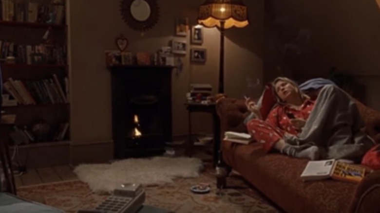
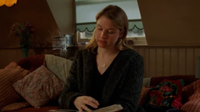
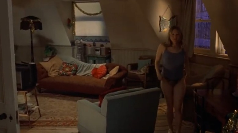
Besides being comfy, pillows on the couch can be a lovely design element. As Supreme Accents points out, throw pillows are a way to accessorize your furniture. Approach this the same way you would get dressed to go out. You might pair gold or silver jewelry with a little black dress. Think the same way about your couch. Pair bright, bold cushions with your neutral-colored furniture.
Don't be afraid to apply the reverse principle here. If your couches are bold colors, try pairing them with neutral-toned pillows. If you have lively shades like yellow, orange, or turquoise, consider pillows in gray, tan, or patterns in cream. Even the contrasting elements could be enough. Have an aqua couch? Try adding gray pillows with bright blue dots. Lime green sofa? Consider lime and cream-striped pillows.
Some other things to keep in mind are choosing different shapes, sizes, and textures for visual appeal (via Style by Emily Henderson). You should pick colors that complement one another but consider patterns in different sizes. If you use multiple colors, spread them out around the couch or other furniture to avoid too much of one color in the same area.
Select sage green walls
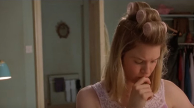
It's hard to know if Bridget knew in 2001 that the earthy sage green color in her bedroom would be all the rage more than twenty years later. It's not surprising, however, that it's so popular now. According to Hello Lovely, sage is a calming color, and who didn't want and need that through the last few pandemic years? When you're facing a seemingly unending lockdown, anything that puts you at ease is welcome.
Sage green walls can also help calm other, more intense vibes or colors in your rooms. In fact, it makes a perfect complement to bold accents like curtains or comforters. You can adjust your lighting accordingly if you feel things have gotten too bright in your room (via Arizona Tile).
Don't forget to add some complementary colors to your room in the form of curtains, bed linens, and maybe even more pillows. Choose white, charcoal, or purple if you favor cooler colors (via Craftbuds). If you prefer warmer tones, consider terracotta, gold, or brown. By combining and contrasting colors in your house, you can create a home that is, in equal parts, calming and inspiring. Experiment until you find a balance.
Low lighting and a warm atmosphere
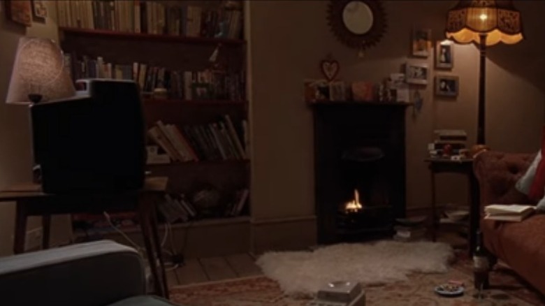
The brown walls in Bridget's living room create a warm environment, but so does the lighting. The lack thereof might be a better description. Dim lights and a fireplace in the living room create a warm and cozy atmosphere.
There are several things to consider if you're trying to recreate this look in your own home. First, Inviting Home explains that low lighting promotes relaxation and restfulness. But remember that lighting can be hard, and you want to go with soft options to achieve a restful atmosphere. The color of your lampshades can also make a difference in how your lighting appears. Like glasses, rose-tinted lampshades can make things easier on the eyes. Orange, amber, and yellow also create warmth.
A fireplace like Bridget's also contributes to this look. But they can be a lot of work and upkeep. One way around this is to choose a fireplace insert. These fit directly into your existing fireplace but are gas-operated (via Vertical Chimney). And unlike when they were first introduced, inserts are now safer and capable of heating your whole room.
Add avocado cabinets, bathtubs, and sinks
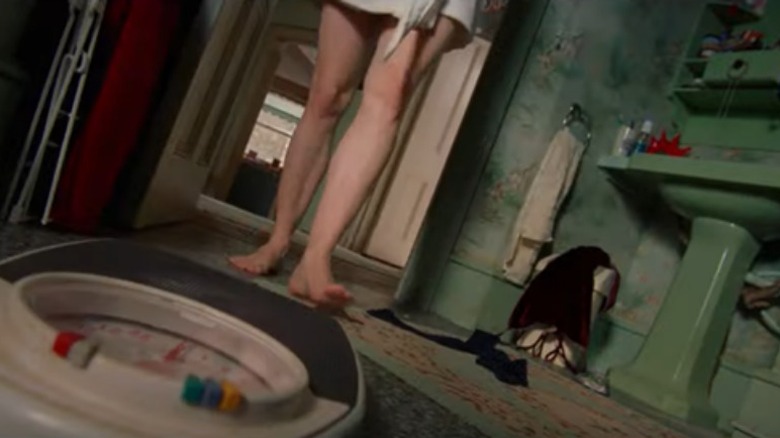
If you love green, there's no better style to emulate than Bridget's. And while green tubs and sinks once struck fear into the hearts of potential home sellers and buyers, the once defunct color is making a comeback, according to The Tub Pros. Natural colors have been all the rage since 2020. This includes the bathroom, where avocado, seafoam, and mint green were once considered hideously out of date.
These colors are now trending, especially in bathrooms, for the peaceful vibe and casual glamour they can provide (via 21 Oak). Mind the undertones in your shades of green to determine the room's mood. Earthy greens with yellow undertones evoke warmth and bring energy to the room, while those with cooler undertones create a calm, soothing, spa-like vibe.
If doing your cabinets, sinks, and tubs in green is too much for you, consider adding green accents. But if you are ready to try going all out and just want a way to glam up this style and make it a bit more modern, consider pairing a darker, green-colored rug or bath mat with neutral-toned bath towels and curtains.
Overflowing open shelves
If you follow home trends, you already know that open shelves are back in style. This minimalist look is becoming more popular as people look for ways to scale back. And according to Maple + Main, modern times and pandemic lockdowns have made people appreciate the things they have and want to use them instead of saving them for a special occasion.
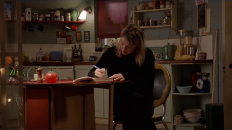
This can be a challenging look, and Bridget just manages to pull it off. You can easily overwhelm the space by overfilling your shelves. Things to consider include accessibility and space. Things you use often should be easy to get to, but don't overcrowd your shelves. Make a conscious effort to leave some blank space between items.
You may also want to steer clear of things that collect dust easily. One negative of not having doors on your cabinets is that your items are exposed to the elements. Another thing to remember when planning what to put on your shelves is color and texture (via Josie Michelle Davis). Don't aim for perfection, as it doesn't mesh well with an open-shelving style. Loosely plan your organization and keep similar colors together. Don't pair one bright color with all neutrals or vice versa.
Adorn walls with metallic frames
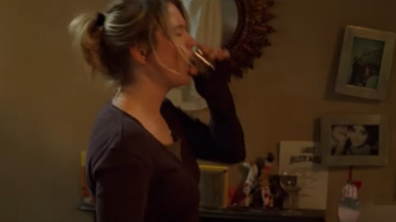
Besides the haphazard decorating style, another thing Bridget's wall decorations have in common is the frames. Her mirror is ringed in brass, while the frames beside them are a silver or nickel finish. This is a simple style to replicate in your home, even if you're on a budget.
There are some things to keep in mind if you are mixing metals. Invaluable explains that when you choose this route, you must select a primary color and an accent color. From there, your options are endless. There are many different types of metal and finishes. In Bridget's flat, it's satin or matte silver or nickel and embossed brass. But you can also find hammered or polished, brushed or antiqued finishes. And your color options include stainless steel, copper, cast iron, and aluminum.
The other good news is that you don't have to use just frames if you've decided on metal accent pieces. Mirrors in metal frames also work well, but so do some less traditional elements, like copper pots or silver accessories.
Balance bookshelves and brass lights
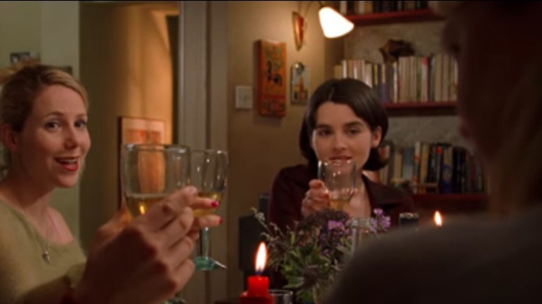
This pretty closely relates to the warm or ambient lighting category. You'll notice there are bookshelves all over Bridget's flat. What books she keeps on them depends on where she is in the process of her singlehood. There are books on attracting men at one point, while at others, they are about how much better it is living without them. But they are always full and adorned with knick-knacks.
In this case, however, it isn't just that the lighting is dim that creates the warm atmosphere. It's the fixtures themselves, which are made of brass. This warm metal is reflected in the soft light, creating a pleasant, welcoming atmosphere. One King's Lane suggests using less-traditional approaches when designing your bookcases, especially if you have a collection the size of Bridget's.
Consider stacking your books horizontally rather than vertically. You could also add art or décor pieces in front of, around, or between your books. Organize your existing books by color or select ones to create a color-specific theme. Sconces would also make a nice addition, preferably brass ones, if you are trying to recreate Bridget's look. Avoid the old-school polished brass and choose matte, satin, or natural finishes to create a modern, warm vibe in your home (via Lights Online).
Bathe in blue tile and floral paper
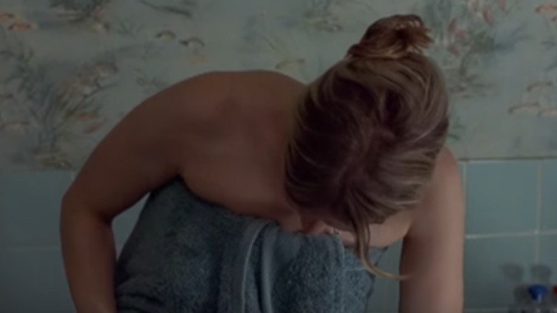
Not all of Bridget's bathroom is green. She also has blue tile and a water-themed blue floral wallpaper in her showers. Tile has always been popular in bathrooms, but wallpaper was out of style for a while. The good news is it's making a comeback.
According to The Tile Shop, blue is a wonderful option for any room in your home, but especially for bathrooms and kitchens. Blue is a calming color and evocative of water, making it ideally suited for the room where you shower and bathe. Light blue is your best choice to promote tranquility. But you should also consider using patterns and combining blue with other colors, like gray, cream, or white.
Floral and botanical wallpapers also contribute to the calming feeling of your bathroom, turning it into a makeshift spa. You can choose a maximal or minimal look to get your own version of Bridget's bathroom (via Lick).
Pair stained glass and retro artwork
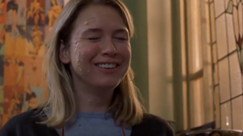
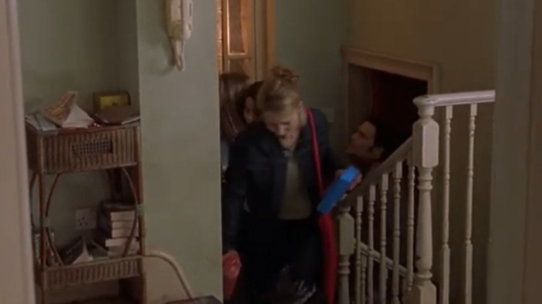
Maybe no part of Bridget's décor stands out like the stairs leading into her apartment from the door. There are so many style elements to consider here. The first is that gorgeous stained glass window that lets in tons of light and illuminates that collage of retro wall prints on the adjacent wall.
Cumberland Stained Glass recommends using white trim around your stained glass to make it stand out more. And while they suggest using minimalist design elements with stained glass, we think they would approve of Bridget's design choices. Her stained-glass window's location allows natural light to enter where it wouldn't otherwise. And some of the colors in the stained glass are mirrored in the retro art collage.
If you can't find the Andy Warhol-type pop art prints on the back wall in Bridget's stairwell, you can find wallpaper replicating this look (via Spoonflower). This also saves you the work of creating a collage of retro prints to cover your wall. Invest in a sheet of wallpaper with this print style, and put it up to create an accent wall.
Dazzle with string lights
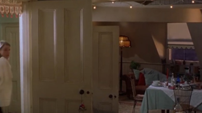
You can use these for a special occasion, as Bridget did for her birthday dinner, or as a design element in your home. Like other forms of lighting, this version can contribute to the atmosphere. And, as Christmas Designers points out, if you choose to use your Christmas string lights for this, you can feel like you're getting more value for your dollar by using them far beyond their traditional season.
One of the first things to consider when choosing this décor is how to hang your string lights. This depends on where you are hanging them (via eHow). The easiest way is with nails, but thumbtacks are sufficient for fairy lights. Command strips or other hooks will also work.
Consider brick clips or hot glue if you work with materials like brick or stone. If the lights are no longer needed, the latter can be peeled off in the future.
Pick polka dots
Another fun way to dress up your home is with polka dots. Bridget has incorporated this look into her kitchen with the wallpaper, but there are other ways to add it to your space. Visual Hunt lists curtains, wallpaper, decals, pillows, paint, and decals as ways to add polka dots. They also point out that polka dots are a perfect style element for minimalists. You can find them in large and small designs and just about every color.
This is good news because you can use polka dots with any interior decorating style. For instance, small polka dots in black and white work in a Scandinavian style, while large, bright dots create a more playful version.
Polka dots also "bring an element of movement and texture to a room," according to Angie Socias, founder of Coppel Design in Los Angeles (via Mansion Global). They can be playful or sophisticated, depending on the size and color of your polka dots and the background they appear on. Larger dots are more whimsical, while smaller ones are more refined.
Corner catch-alls in the entryway
There's no place where it's easier for things to get lost than right in the entryway. You need someplace to drop your keys and mail on the way in the door and a pair of shoes in case you have to run after your own personal Mr. Wonderful in the snow when he goes to buy you a new diary.
The New York Times suggests adding baskets and bins to collect hats, scarves, and other things that would otherwise mount up and clutter the area. Adding hooks and coatracks will also go a long way in keeping things in check in this area. Consider a bench if you have room or at least a stool. Both give you a place to sit to put on or take off your shoes, but the bench provides open space underneath to store your baskets. You could even invest in a version that opens up for additional storage. Shelves and bowls are other excellent catch-all options for this part of your home.
If you have the space, an alternative is to use a console table in this area (via The Aesthetic Organizer). You can slide a bench under this for pull-out seating or store baskets full of scarves, hats, mittens, and other items. You can also add hooks for your most common outerwear and a mirror to ensure you're picture-perfect on your way out the door.
Mix and match furniture colors and upholstery
Your furniture doesn't have to match to go together. You can combine different colors, styles, textures, and upholstery types. But there are some things to remember if you choose this route. Pretty Purple Door says to keep your furniture height and depth similar across all pieces of furniture. You need the people using them to feel as though they are on the same level, literally, if not metaphorically.
You should also look for additional similarities between your pieces. Consider shape, style, color, or type of upholstery.
One thing to avoid is mixing too many patterns, though you should consider using more than one (via Casa One). Also, keep the 80/20 rule in mind. Choose a star and a supporting cast with your furniture and design pieces. Whatever you choose as the starring style should make up 80 percent of the room's furniture and décor.
