The Best Color Palette For A Farmhouse Home Decor Style
The farmhouse home décor style has become increasingly popular in the last few years, especially since the birth of the Magnolia furniture line created by Joanna Gaines, explains Star Furniture. The style is defined by its simplistic and rustic design with nods to rural architecture. It also incorporates elements of modernism, which can give any space a comfy yet chic vibe. Two of the most prominent aspects of the farmhouse aesthetic are function and practicality primarily obtained through furniture choices. When deciding on furniture for your farmhouse look, search for items with clean lines made from natural materials.
According to Katilin Madden, farmhouse décor will be getting an upgrade in the new year; she says it's on the path to becoming less cozy and more sophisticated. Be prepared to steer clear of the clichéd pieces you'd find at your local farmers market, like antique milk jugs and signs that say, "Fresh cut flowers — 25 cents."
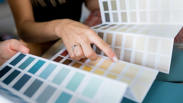
But before you even start thinking about accent pieces, you need to focus on a signature color palette. A color palette helps define one style from another, and choosing the right colors will help bring your design fantasy to life. You may already have some vague ideas of what a farmhouse décor style color palette entails, but we're here to offer you a guide on exactly which colors to choose.
Earthy neutrals
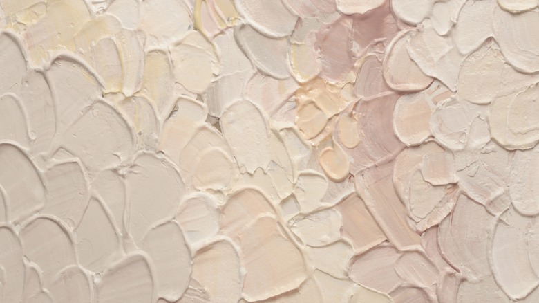
According to Vevano, for your wall colors, you want to keep it subtle with earthy neutrals and shades of beige. White is a farmhouse décor staple, and it makes a room look much bigger and brighter than it actually is, says All American Painting Plus. Unfortunately, white and other light hues (such as those beiges) show every smudge and scratch on the wall. If you're able to keep up with the maintenance it takes to keep your walls free of marks, light neutral colors are for you. To use black in the space, save it for the fixtures. Using it as your primary color completely defeats the purpose of the farmhouse vibe.
The goal here is to keep the walls looking clean, so that the focus stays on the furniture, fixtures, and other décor pieces. This style incorporates lots of wood and other natural materials, according to Home Made Lovely. Another way to make the room brighter is by opting for light-colored furniture. These will also create a nice contrast with darker pieces. Remember, the key to farmhouse style is keeping the vibe warm and cozy, so try to maintain that aesthetic with both paint and upholstery colors.
Muted accent colors
While earthy neutrals are the focal point of the color palette, the farmhouse style allows for plenty of more colorful hues, such as muted sage, aqua, or yellow, says Home Made Lovely. On the rare occasion, one might opt for a bolder red or teal, depending on personal preference. You can certainly still use colors without depleting the overall aesthetic, but you want to use them sparingly. Consistently incorporating bold, bright colors into your palette moves you into the territory of a contemporary style, as noted in San Francisco Design.
If you do want to include non-neutral shades in your space, adding houseplants is an easy way to do so. Houseplants are subtle and don't take away from the farmhouse vibe. If you aren't a fan of greenery, consider adding colorful picture frames, as long as they're muted. Once again, they'll be a subtle addition, but they bring just enough color for anyone who's craving it.


