5 Kitchen Trends You Should Ditch In Your Home
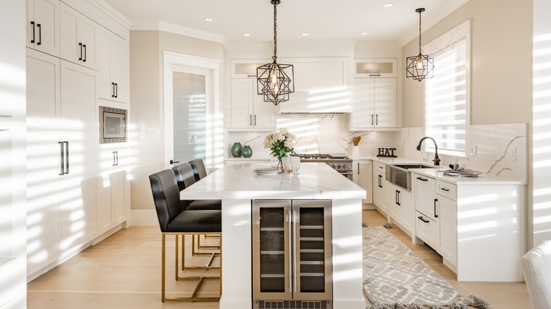
What's hot and cold in kitchen design? First of all, let's agree that taste is subjective and trends are fickle. For example, while many are screaming from the rooftops that white kitchens need to go, others assert that they will never go out of style. "Pristine all-white, sleek, super-modern kitchens are on their way out because they tend to feel cold," says designer Andrea Subotovsky (via Insider). Further, she noted that the difficulty of keeping an all-white kitchen spotless outweighs its appeal. On the contrary, Caroline on Design maintains that white kitchens are timeless and here to stay. Rather than white going out, it would be more accurate to say that color is in, especially green, according to the design director at kitchen company Tom Howley. "Green kitchens are having something of a moment right now. As a [color] we associate primarily with nature, this grounding shade has an incredible way of reconnecting us with our surroundings," he explained to Country Living.
While you may disagree, some experts say the following highlighted kitchen components are getting stale. Toss them, tweak them, or continue to enjoy them — and feel free to take it all with a grain of salt. But don't rip your white cabinets out just yet. MYMOVE contends some easy and affordable changes can update a room's impression, such as new lighting fixtures, hardware, seating, and appliances. And if that's not enough, you can always update the paint on your kitchen cabinets.
Chalkboard walls
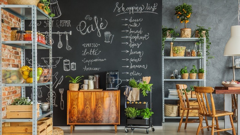
According to Curbed, chalkboard walls have a sentimental component, calling up school days. In the kitchen, they share space with the bistro/café scene, making us feel like budding restaurateurs or competent hosts. In summary, they offer an element of play. Yet, what follows playtime? The clean-up. Chalk is dusty and messy, and per one Curbed commenter, it runs in humid conditions like a kitchen environment. It might be time to switch to a shared app for the family shopping list.
Made popular in continuity with the rustic and industrial styles, which Livingetc says is played out, the chalkboard wall treatment is a little too unpolished for current tastes. Instead, the matte softness and imperfection of a chalk-washed wall have been transposed to the implementation of certain materials. Per Kitchn, black appliances and accents are trending as a warm and personalized alternative to conventional finishes. Additionally, soapstone patina, hand-glazed tile, and unlacquered brass are more permanent ways to show character. To recreate a similarly unique feeling as that of a chalkboard feature, home design expert Laurel Vernazza relayed to Kitchn that a kitchen gallery wall is a fun and budget-friendly way to be creative and tell your story.
Regarding any organization provided by a chalkboard wall, that's something we're still coveting. Country Living says that walk-in pantries and functional zones that accommodate specific tasks, such as meal prep and work-from-home counters, are at the top of the kitchen wish list.
Dark or earth-toned granite
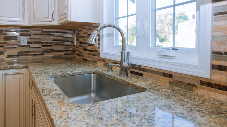
Granite is a favorite countertop material for its durability and range of options. Modernize, a home services site, explains that granite can be found in neutral tones as well as vivid colors like green, blue, and red. Furthermore, no two slabs are exactly alike. Yet, the natural material is porous and requires frequent sealing to maintain a sanitary and pristine surface. The stone also has an aesthetic challenge because it's associated with Tuscan-style kitchens, which trended in the early aughts. These rooms featured earth tones, amber lighting, rich wood cabinetry, and warm metals to create an elegant, old-world space. But, they've run their course, with many designers saying shiny earth-toned or speckled black granite is a giveaway that your kitchen is old enough to deserve a renovation. Decorator Linda Holt concurs, calling granite in these tones busy and bossy.
While the drama of granite countertops in unconventional colors is now a highlight of fashion-forward designs, most new kitchens are opting for white and shades of gray. Honed (matte) surfaces and materials that show age and patina, like marble and soapstone, are preferred. Finally, according to Holt, quartz is an engineered option enduringly popular and well-liked for its minimal, uniform appearance and easy maintenance.
If replacing countertops is not in the budget, there are less significant changes available to freshen the room. For example, you could repaint dark wood cabinets in a trending yet classic color, remove dated flourishes, and update lighting.
Shiplap and farmhouse decor from ceilings to floors
Farmhouse Living says that appreciation for farmhouse design is due in part to its function and flow. Originally, farmhouse kitchens needed to be practical while also being a welcome place to recuperate from arduous farm labor. They often incorporated building materials from the surrounding land, creating a humble and connected home. This true spirit of the style is the reason the blog feels it will always occupy a spot on the design map, and they assert that natural and rustic elements, like wooden beams or a stone fireplace surround, can be absorbed into many different trends.
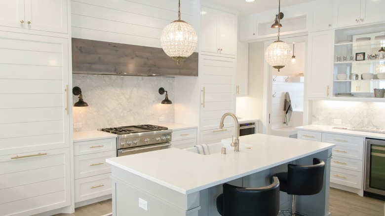
Yet, some farmhouse decor themes have become overused, including board and batten, wainscoting, and shiplap. When original, these features can be incredibly charming, however, it requires skill to successfully incorporate them into contemporary builds. That's not to say that shiplap can't complement a modern aesthetic — it's warm and textural while being minimal — but it must be deftly used or it can feel disingenuous. The Finished Space notes that when designers employ it in a kitchen, they'll frequently choose just one area, such as the range hood or island.
Farmhouse Living also points out that cluttered rooms filled with cute phrases and worn collectibles are out. Instead, they recommend a simple, unfussy kitchen with a focal point. Furthermore, they say just a little bit of color via lighting pendants, barstools, or an area rug can update a customarily neutral farmhouse palette.
Patterned tile backsplashes
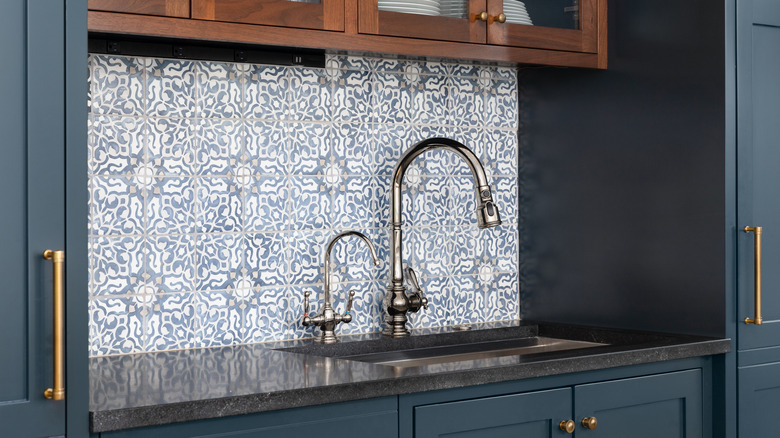
According to Denny + Gardner, a home remodeling firm, busily patterned backsplashes are a passing trend. Though an eye-catching feature, the bold prints and colors are too effective at time-stamping a kitchen remodel; plus, they note replacing a backsplash is a difficult and costly endeavor. Rather, a classic and subdued material offers more design flexibility and longevity. Interior designer Kirsten Blazek prefers to keep a kitchen timeless. "A kitchen renovation is a massive expense and I try to avoid anything that will look like it was 'on trend' in past years. I am currently staying away from any patterned backsplash tile and when choosing a kitchen cabinet color I like to pick something that isn't spot specific that it will date," she shared with Livingetc
If you're looking to produce impact by way of tile, Country Living declares feature flooring is in. The outlet notes that oversized flagstone tiles are a resilient, historic application growing in popularity for new kitchens. Alternately, for something with more verve, hard flooring buyer David Snazel says, "Vinyl flooring is a great and inexpensive way to add [color], pattern, and personality to a room without compromising on safety or quality. In recent years there have been many developments in design and styles that mean the effects vinyl can create, such as tile or wood, are incredibly realistic."
We might suggest introducing a hint of pattern that requires less commitment via artwork or printed plates displayed on the wall.
Open shelving
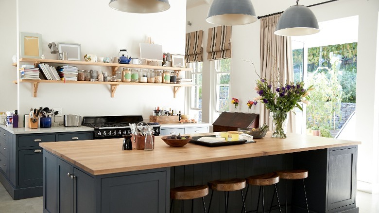
HGTV contends that open shelving is still a beloved feature of kitchen design. The removal of top cabinets opens the room, allowing it to feel more spacious, while shelves reclaim some of the forfeited storage. They're a good solution for awkward nooks that would otherwise languish as wasted space. Additionally, they're a low-cost substitute for cabinets and practical for entertainers, as items are visible and accessible to guests.
Yet, open shelves are not for everyone. Interior decorator Liz Toombs shared via Realtor, "Very few people are extremely tidy, and these shelves need an organized approach to stacking and storing dishes." It helps if you're the type who enjoys arranging a good shelfie. But if the point is lost on you, lose the open storage. Toombs continued, "The goal is to enhance the room's design, not detract from it, and kids' sippy cups, random teacups, and mismatched dishes will not look good on these shelves." Another downside is objects need to be dusted and de-greased frequently, particularly if located near the range.
In the meantime, as mentioned above, the pantry is making a comeback (via Country Living). This could help declutter open shelving or replace it entirely with something less revealing. To that end, the founder of Olive & Barr, Al Bruce, told the outlet, "Built-in larders have a show stopping quality in their own right." However, the kitchen design company always proposes open shelving within the pantry structure — closing the door on the whole mess.
