The 5 Worst Kitchen Trends Of All Time
From the scent of a home-cooked meal to the lively chatter at the island barstools, the kitchen is the heart of the home. Whether it be the Tuscan moodiness of the early 2000s or the lime green cabinet frenzy of the 1970s, it is a room that takes many shapes, sizes, and personas. Dining, socializing, decision-making, lesson-learning — this is often the place homeowners spend the most time outside of their bedrooms. Not to mention, it is considered the most valuable room in a home when a buyer is deciding where to purchase (according to Trulia).
But not all kitchens are created equal, and there are some truly abysmal trends you want to avoid when designing. Some of these are leftover atrocities from bygone eras, and others are mistakes less experienced remodelers make. These errors can be detrimental to the functionality and enjoyment of the space. So let's dive into the five worst kitchen trends of all time!
1. White grout and tile countertop
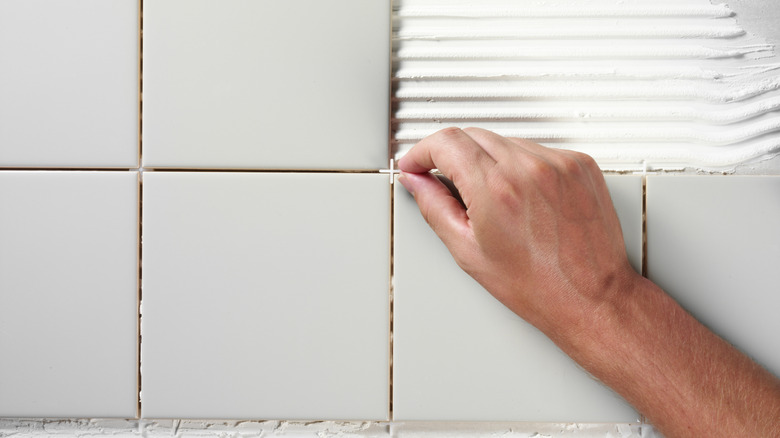
If your home was originally designed or remodeled in the 1980s, you are likely familiar with the infamous white grout and tile countertop. You are also probably familiar with why this style is one of the worst countertop ideas ever conceived, based on its aesthetics and high maintenance. Emerging after the reign of granite in the 1970s, grout and tile countertops quickly took off in the following decade due to their cheap installation.
However, there are two critical errors with this trend that make it so undesirable. Firstly, the grout is easily stained. Dirt, wear, and stains are always the most obvious on white surfaces, making the white grout and tile a poor option for a kitchen countertop. Any dirtiness shows immediately, which requires much more maintenance than other surfaces. Grout also contains and festers bacteria, so this is not conducive or sanitary for a space where cooking is regularly done (as noted by Newsroom). Lastly, modern countertops allow for cutting boards, pitchers, plates, trays, and any number of cooking supplies to be utilized on any part of the countertop. White grout tiles get in the way of this due to the ridges. This is also not a friendly finish for the avid home chef either.
2. Stop the soffit
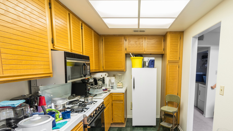
The kitchen soffit is a feature that has been out of style and construction for so long that you may be a little less familiar with what it even is. A kitchen soffit is a rectangular space above cabinets that sticks out. It is a space used to store details such as wires and pipes. At their worst, they can even protrude past the depth of your cabinets.
However, there are a couple of potential solutions for getting rid of soffits. Kitchn suggests lowering the ceiling to the height of the soffit. However, this is an expensive option that might make the room feel a bit confining. An ideal solution, structure permitting, would be to remove the soffit altogether and have the cabinets extend to the ceiling of the kitchen. This is the dream solution for a couple of reasons. Firstly, it eliminates the aesthetically displeasing soffit. Secondly, extending the cabinetry to the ceiling actually increases your viable storage and makes the room feel taller and more grand.
3. Small and minimal cabinetry
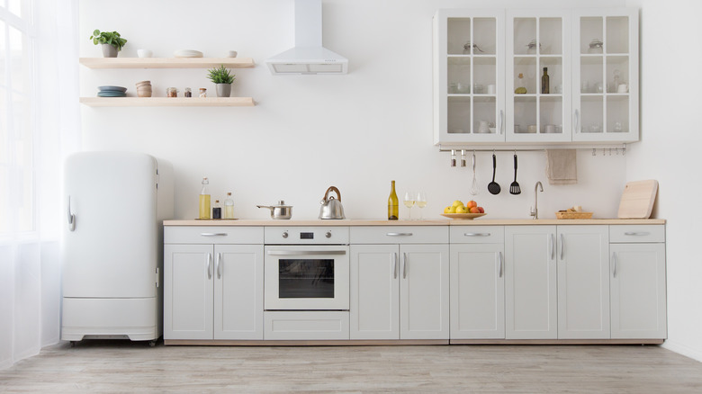
Home designers sometimes go with form over function. One of the worst mistakes these kinds of designers make is not allocating enough storage space, specifically in the kitchen. This can work for the Postmates-loving, frequent traveling types who want a showy and modern home. But for those who enjoy cooking, decorating, and organization, this can present a frustrating challenge.
If possible, replacing small cabinets entirely with something lower to the countertop that allows for a large repository is recommended. Some homeowners will express concerns about making their kitchen look small when replacing cabinets. But considering how critical storage is, painting these replacement cabinets a white or airy color is a great way to expand storage capacity and keep the room feeling large. If fully replacing cabinets is not feasible, another option is to install a hanging bar underneath the existing cabinets. This can be great for storing spices, utensils, and mugs, which can be helpful for opening up cabinet availability (as noted by Angi).
4. Stainless steel sink
Although stainless steel sinks have actually been around since the 1930s, these should be avoided when designing a kitchen (noted by Azom). From a style perspective, they are cheap and add a cafeteria-esque quality to any kitchen. So what are the best alternatives?
Materials such as marble, quartz, and porcelain are all durable materials that offer a much higher-end finish than a stainless steel sink (as noted by HGTV). While people often cannot pinpoint exactly what makes a space feel cheap, stainless steel sinks are one of those details that causes that exact reaction. Granite Imports also points out that it is very difficult to add a luxury aesthetic to an existing kitchen when dealing with a stainless steel sink. Aside from industrial-style kitchens, these sinks stick out like a sore thumb. Thus, it is best to avoid them altogether and opt for a more expensive material that fits the rest of the style.
5. Closed-off kitchens
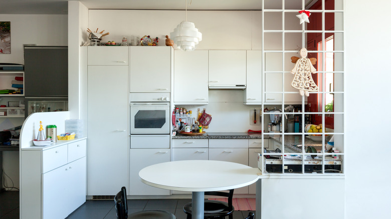
Closed-off kitchens are one of the worst kitchen trends to work around. Room separation belongs in the 20th century. As you have probably noticed, almost all new construction homes opt for an open-concept main floor. These days, the living room, dining room, and kitchen often bleed right into one another for that spacious, relaxed flow. Love Property notes that open-concept kitchens are one of the strongest trends in modern home design and that they are not going anywhere.
Having a closed-off kitchen is particularly undesirable in a confined or smaller residence. Insulated kitchens keep guests separated from one another, often result in a dark and uninviting kitchen aesthetic, and make homes feel generally smaller (as noted by House Logic). It can also create an overly serious room. Knocking out a wall or two can go a long way in making the home feel bigger, more connected, and have stronger resale value.
