5 Mistakes To Avoid When Decorating Your Kid's Room
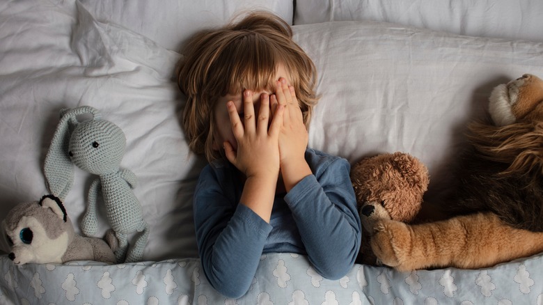
The way a bedroom feels directly impacts how a child sleeps and, ultimately, how they feel. This is why it's essential to be intentional when decorating your child's room. Interior designer Carolyn Feder recommends that a healthy bedroom is one where the child can sleep, play, enjoy, and learn (via Parents). Keeping things balanced and fun can be an intense process — from the mood you want to set to the theme you want to follow — so you need to keep some things in mind. First, some of the most important aspects of a kid's room are comfort and safety. The space should be set up so that they enjoy their time there and it feels like a haven.
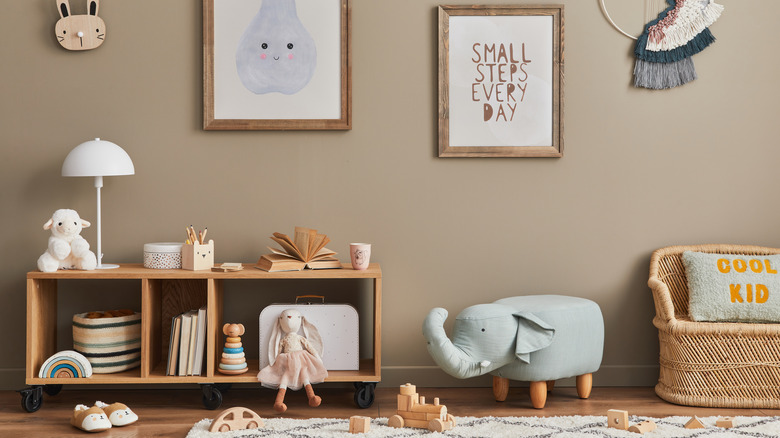
Second, change is the only constant when it comes to a child's bedroom, so be prepared for that when planning the décor. One tip from Desenio is to keep the walls neutral and bring the color and personality in with accessories instead. This way, you won't have to drastically alter the look of the room every time your kid's interests change. Keeping these principles in mind, here are five mistakes to avoid when decorating your kid's room to ensure it is a great fit for them.
1. Following a rigid theme
A rigid theme goes against some of the most important things that a child's bedroom needs. The room needs to be a place where they are safe and relaxed, so the priority should be how things feel and function instead of only how they look. This means soft textures, ambient lighting, and warm materials and colors, per Room to Grow.
If you incorporate a theme, it should be adaptable for the many changes to come, especially if you have a baby or a younger child. Their favorite color or activity might change, so the theme needs to be flexible enough to welcome new elements. Items like wall art and decorations should be easy to switch out, while shelves should be able to house a lot of different things over time, says Desenio. Furniture should also be sturdy and primed for anything that might come from playtime or just everyday use. This can look like non-slip tables and chairs that don't have sharp edges and can withstand falls.
2. Not maximizing the space
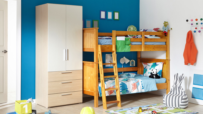
Kid's rooms need to include various elements as well as adequate space to move and play, which is why it's hard to design a small space. A tiny bedroom can quickly become overwhelming and uncomfortable for your child, so avoid the common decorating mistake of not maximizing the space you have. Especially in the case of shared bedrooms, the functionality should be a priority. Focus more on getting furniture pieces that have multiple functions instead of pieces that are more decorative, per Judith Taylor Designs. Combining bunk or loft beds with under-bed storage is a great way to save space.
Another way to do this is by utilizing vertical storage and hanging racks to make more use of the walls than the floor. Bright, light colors can also open up the room and make it feel more spacious. Lastly, keep things simple by opting for compact furniture pieces instead of bulky ones (via ExtraSpace Storage).
3. Clutter and chaos
For a room to feel cozy and comfortable, it shouldn't be busy with clutter that causes distraction, says Room to Grow. Of course, the room should be a safe space to play and do different activities, but there should be intentionality behind all the pieces and proper storage for everything. This is because constant clutter and chaos in the bedroom can cause overstimulation, which can negatively affect sleep, per Parents.
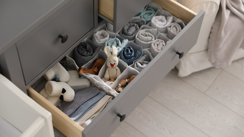
To avoid this, make sure there is a proper storage system for everything. Drawers and baskets to keep toys and accessories when they aren't needed can keep the room clutter-free and also make the space feel larger. One hack is to use tall shelves to keep certain toys out of your child's reach so they can't bring out everything at once (via ExtraSpace Storage). If it is a shared room, have designated storage bins, drawers, and shelves for each kid so that it's easier to arrange and keep track of.
4. Not having child-safe walls
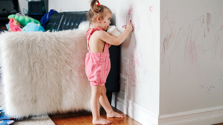
In line with functionality, a big mistake to avoid when decorating your kid's room is to forget that it is to be used. Your curious child that is constantly learning will want to draw on everything they can, and you should be prepared for that. Kids love to show their creativity on the huge, blank canvases they see around them, so their room should have walls that are easy to clean or acceptable to draw on.
Some ways to do this are by having a whiteboard or chalkboard wall, giving your child washable pens and paints, or coating the walls in washable paints. In addition to any impromptu art projects that might happen, these can preserve the walls from other types of messes and dirt (via Allure Painting Services). Another way to make the bedroom walls safe is to child-proof any electrical connections. Use outlet covers and wrap up any electrical cords, so they don't cause problems.
5. Making all the choices yourself
Decorating the room by yourself is a serious mistake to avoid when it comes to your kid's room because they should have input in the process. Ultimately, it is their room, so they should have a choice in how the room is decorated. Doing this will give them a sense of agency and ensure their personality shows in the space. When you make all the decisions, you run the risk of making the room too sophisticated, which can be boring for them. It could also be too simple or even feel childish, which won't be engaging enough.
Ask your child their opinion and what they would like from the beginning. Then, involve them in the whole process of choosing colors, furniture, and accessories. They will be using the room the most, so it needs to have items that they want and will enjoy using. Desenio suggests that the room should communicate who lives there. If it is shared, it should contain unique elements from the different children. Do they have anything they've made or colored? Or something they really love? Instead of generic posters, those items should grace the walls!
