How To Nail The Maximalist Aesthetic In Your Space, According To An Interior Designer
There are some people that absolutely adore a very neutral, minimalist aesthetic and embrace the simplicity it brings to their homes and lives. However, for others, that particular look can feel a bit cold or stark, and they may feel it doesn't allow them to express their personality in their space fully. They want burgundy and bold pink rather than beige, and they want fun prints rather than just cream-colored linen.
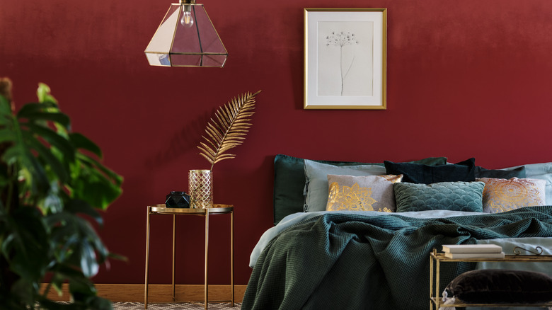
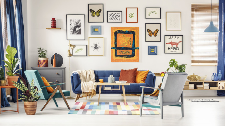
If you're the type who loves to see all kinds of colors, prints, and accessories in your space, you're in luck — as Vox reports, maximalism is officially trending. There are a few common ways to incorporate a maximalist aesthetic, as MyMove explains, from adding in bursts of color to incorporating bold art in the form of gallery walls to bringing in vintage or bohemian inspirations.
However, it can be challenging to figure out how exactly to tie all those eye-catching elements together — you still want your overall space to feel cohesive and to have a certain point of view, and simply adding every single item and color you can think of may not yield the aesthetic you're dreaming of.
That's where some tips and guidance from the experts can come in handy. In an exclusive interview with House Digest, Rachel Robarge, Head of Design at June Homes, shared her thoughts on how to incorporate maximalist decor in a chic way.
Love your collection
People are turning away from minimalism because when keeping things super neutral and simple, you don't always have the opportunity to showcase pieces that speak to you — that's where maximalism comes in.
"This might go without saying but is the most important. Maximalism is about self-expression! When you are purchasing a lot of different items to fill your space, if you really love your pieces, they will reflect who you are," says Rachel Robarge.
"Purchasing a bunch of art because that style is trending right now isn't going to feel authentic to your personal style," she adds.
Even if you see certain types of artwork in many maximalist spaces, if you don't love it, don't add it to your own space. Instead, get in touch with your inner artist and determine the types of things you're drawn to. Perhaps you love abstract art, or maybe you prefer landscapes. You might like muted colors in your art rather than super bold shades, preferring to incorporate saturated hues in your furniture rather than on your walls. By selecting pieces you truly love, you'll be well on your way to creating a space you likewise love, and that expresses your personality, and that's always the goal.
Add texture
Texture is absolutely crucial in interior design, and it's important not to get so distracted by colors and prints that you completely ignore texture in your maximalist space.
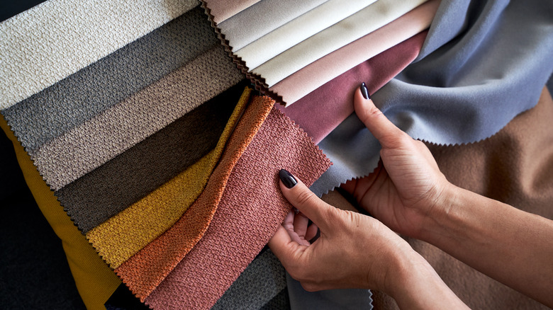
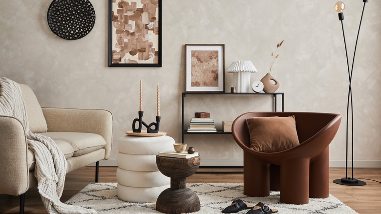
"Mixing together different textures goes a long way," explains Robarge. "Using the same type of fabric or stone throughout the space will leave it feeling flat and lack character. Different types of upholstery fabrics or different types of hard surfaces will add interest and layers to your design."
When you consider texture in a room, you might immediately think of the textiles present, such as curtains, throw pillows, or rugs — these are indeed prime areas to incorporate interesting textures, such as pairing a more rustic jute rug with plush velvet curtains.
However, as Robarge's comment illustrates, you also want to consider the larger items. Even something as simple as adding a concrete side table to contrast the wooden bookshelves in your space, or filling those bookshelves with feathered or glossy accessories, will add those bursts of texture to create a more complex and interesting space. Though you might naturally be drawn to particular textures — and should absolutely incorporate textures you love in your space — you want to be mindful about having some variety in textures to really bring your space to life.
Find a commonality
The problem with some maximalist spaces is that they can feel like walking into a packed thrift store — there are endless items and colors and prints that catch your eye, and it all becomes a bit too much. If seeing cluttered, chaotic maximalist spaces done wrong has caused you to avoid the maximalist aesthetic entirely, Robarge has a simple answer.
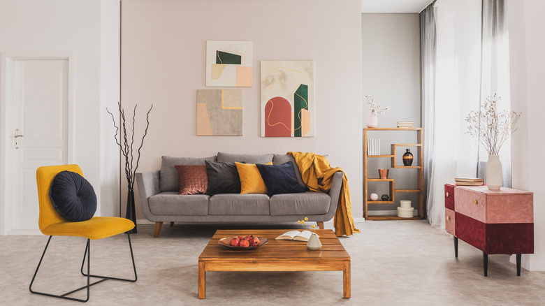
"Find a commonality, whether it is the subject of your art or creating a color scheme," advises Robarge. "When there is something that all of the pieces you are selecting have in common, there will be a sense of purpose and cohesiveness in your collection."
This could be something like a certain time period, such as picking art and colors and shapes from a specific era. Or, maybe you want to zero in on a country, sourcing pottery and artwork and textiles from artists in a particular region or that feature common aesthetic trademarks of that country.
"This is also helpful when you are trying to build your collection but don't know where to start," Robarge adds. Now, this isn't to say that you should have a restrictive set of rules and that you can never bring in anything that doesn't fit your unifying vision. However, having an idea about a common element will help you narrow down the pieces that would really work well in your space and will yield a room that seems chic rather than cluttered.
Don't forget the ceiling
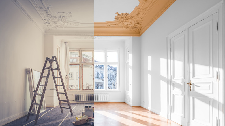
When you envision a maximalist space, chances are you might think of all the artwork hanging on the walls or even the sculptures and other decorative accessories positioned on the bookcases or other flat surfaces in the room. However, there's another key area of the room that you don't want to ignore — the ceiling.
"Our ceilings are a blank canvas just waiting to be decorated," explains Robarge. "Adding wallpaper or painting it a color that isn't just white will add more character and texture. There is so much you can do to your ceiling to change the overall feeling of the space."
Ceilings are also a great area to get bolder because they don't immediately catch your eye when walking into a room like the walls do. Perhaps you found a paint color or wallpaper print that you absolutely adore, but you think it'll be a bit overwhelming when splashed over every square inch of your walls. As Robarge advises, why not splash it on the ceiling instead, and select complementary tones for the walls? It's an unexpected area that so many overlook, and by paying a bit more attention to it, you'll create a truly one-of-a-kind maximalist space.
Use an item for a different purpose
When creating a maximalist space, you want to make sure you're selecting items that express your personality, as Robarge suggests. However, if you find something you adore but you're just not sure where or how you're going to use it, don't immediately discard the item — instead, take a moment to see if inspiration strikes. "Think out of the box with the purpose of your objects and furniture pieces. Get creative!" Robarge encourages.
"There are no rules to how something should be used," she adds. "Turning something upside down can open up many possibilities. A stack of books can be a side table, or a rug could be an interesting piece of art on your wall."
It's also helpful to bring an open mind while shopping for pieces for your space. Instead of thinking of certain needs you need to be filled, such as a side table or area rug, keep an eye out for pieces that you love and that have that sense of commonality that Robarge spoke about. You might overlook fantastic items if you're searching in a more single-minded way, seeking items that serve a particular function — with a more flexible approach, once you find something great, you can decide on which innovative way would be best to incorporate it.
