Designer Emily Henderson's Tips For Organizing Your Bookshelves
Bookshelves are one of the best ways to showcase your style while sharing who you are. First, there is the unit itself. Have you chosen something traditional, modern, oversized, or understated? Then, there are the books. A design-worthy feature with varied sizes and colors, look closer, and you'll learn more about the people who display them, about their interests and preoccupations. And last, for decorators, travelers, or sentimentalists, a bookcase is a place to highlight artful objects, photos, and souvenirs — few pieces of furniture accomplish so much.
As Emily Henderson describes them, bookshelves are a dream feature. They often inspire perfect imaginings of both décor and downtime: a cozy library, sophisticated living room, or quiet bedroom sitting area. In a nutshell, books invite slowness and the setting aside of multitasking to focus on one gratifying endeavor. And so the spaces dedicated to housing them benefit from their presence. Yet, the blog explains that empty bookshelves can also inspire dread. Like a home with no furniture, it's necessary to fill them. For something that feels pleasing and reflects your aesthetic, they can't be stuffed with titles or items without consideration of appearance. To that end, the designer has lent a handful of tips for effortless bookshelf styling — read on to find out what they are.
Vary the stacking method
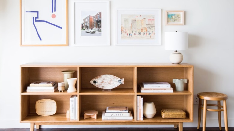
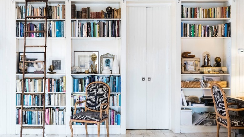
Emily Henderson suggests we start our bookshelf display with the books themselves. Gather your collection and begin stacking and piling. According to the blog, varying the orientation will add interest and allow space for the eye to rest and scatter in additional items. However, they note that for an authentic library mood, you'll want most of the spines to be oriented vertically and books to be the most significant objects. Large coffee table books piled horizontally will feel casual and spare. In contrast, smaller sizes placed side by side will appear more traditional, welcoming people to come near for a better look.
Interior designer Jenny Komenda recommends establishing the placement of the biggest and weightiest books first, creating an even visual and physical distribution. Remember to vary the method for aesthetics if the height of the shelves allows for vertical orientation. That being said, per Book Riot, excessively heavy or large books are best stored flat. Follow those with smaller volumes, again fashioning a balance with the overall arrangement. Emily Henderson notes that you'll want to portion color evenly throughout unless the goal is for shelves to look curated and intentionally categorized by color. If you have an overabundance of books, home décor retailer Nathan James endorses labeling your shelves and keeping frequently-read titles at eye level. And though it may be tempting, Book Riot cautions against jamming a unit too full to avoid damaging spines or dust jackets.
Add art and objects
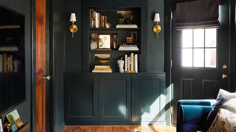
Emily Henderson describes the use of art in shelf styling as their most important tip. They say the framed pieces and decorative objects mixed among the books create arresting vignettes. Leaning art occupies empty space, and according to the blog, it pulls your eye to it, giving the shelves depth. Layering smaller items or volumes in front of framed works creates a collected feeling that offers intrigue and dimension. Additionally, colors in the art can be repeated or offset elsewhere. On the other hand, curved and rounded forms contrast straight-backed books wonderfully, while a patterned object adds life to a shelf full of solid spines. Picture a hand-painted bowl atop plain covers or an hourglass vase adjacent to a linear stack.
The blog recommends employing bookends to hold vertical groupings securely upright and as another means for introducing decoration, yet a good-looking heavy object makes a great stand-in. And they observe that plants, with their natural texture, are a nice counterpoint to the rigidity of books. No matter what your personal collection entails, Emily Henderson believes there are consistent guidelines for a fool-proof display. They suggest maintaining a cohesive color scheme across the arrangement and keeping some areas free to ensure the complete effect is not busy or overwhelming. Furthermore, like the books, the decorative elements should be balanced; pay attention to texture, shape, style, and print.


