Emily Henderson's Top Tips For Decorating An Open Floor Plan
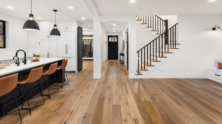
Some may assume that open floor plans are easier to decorate than those that are more closed off. Open concepts provide more space, therefore, shouldn't they be easier to design? However, many interior designers agree that the opposite is true and, often, open floor plans are actually more difficult to style.
There are a number of reasons why this is the case, including that it's easy to leave an open concepts with too much negative space, making the home feel empty. Also, these homes can appear as if they lack a sense of purpose or the correct flow. According to expert interior stylist Emily Henderson, open floor plans don't allow home or apartment owners to hide messy areas from guests. In an interview with Food 52 she says, "If you live in a studio apartment... and [you] do not usually make your bed, then maybe it is a good idea to create some separation between your dirty unmade bed and the living area your guests see."
Along with this advice, Henderson has three other tips for how to decorate an open floor plan. Let's take a look.
Consider your floor plan, but don't feel limited by it
Sometimes open floor plans have architectural separations between dedicated areas. For instance, maybe your home has columns, partial walls, or staircases. Emily Henderson says that these features "could be a good option for slightly separating [spaces]," per Food 52.
However, while they can be great indicators of where delineations should be made, they don't always need to be adhered to. Henderson says that many open concept homeowners desire a reading nook but don't feel like their space already has one. In these instances, she suggests creating one wherever it makes the most sense. In another example on her website Style By Emily Henderson, she helps another stylist design her open concept dining room by using the available walls to create a larger walkway and more seating. By doing this, they use the present architecture to their advantage. At the same time, they don't let the setup limit their design ideas.
Overall, Henderson says in her interview that the "divisions in your spaces should totally depend on how you live." Therefore, the choices you make on how to design and separate your home's rooms should only be determined by your desires and needs.
Use rugs to create zones
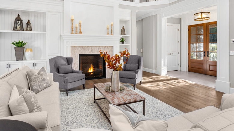
When designing rooms in an open concept, it's important to create separate zones, and an easy way to do this is by getting the most out of your area rugs. As Emily Henderson explains, "You can set up separate zones in minutes by anchoring areas with different rugs," per Kilz. The zones will feel like separate rooms because each space will have different flooring. "It makes total sense," she notes, "because when our brains see different flooring, they think, 'oh, different room.'" This matters for those with open concept layouts because the rugs help visitors make sense of all the spacious area within a large home.
On her website, Style By Emily Henderson, the designer says that the size of your rug is extremely important when using it to create zones. You don't want your rug to be too small, as it could make your space feel incomplete. Instead, she says it needs to be large enough to accommodate the front legs of the sofa as well as each of the chairs in any configuration. When in doubt, opt for a larger rug.
Pull furniture away from the walls
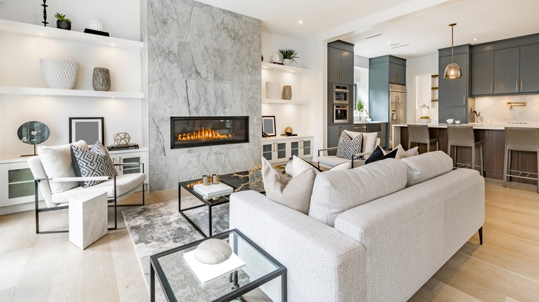
Another rule Emily Henderson says to always follow is to pull your furniture away from the walls. "If possible sofas should never be flush to a wall. Pull it out 3 to 5-inches and give it some breathing room," she writes on the Style By Emily Henderson blog. In an open floor plan, pushing all your furniture up against the walls creates too much negative space, which is what will make your room feel empty. Pulling it out from the wall will help create the zones in each room.
However, you may think that this rule shouldn't be followed in smaller homes; after all, wouldn't you want to create the most room possible in your space by pushing your couch up against the wall? On the contrary, Henderson says that pulling your sofa even just a few inches away from the wall will help everything feel less cramped together, even in a small area.
According to Food 52, Henderson suggests creating "a floating seating area in your space by pulling the sofa out from against the wall and placing two chairs opposite it." Doing this will designate a zone and make your living room feel more cozy and personal. Gift Elements adds that bringing furniture closer together creates a better flow in the room and more opportunities for conversation.


