5 Budget-Friendly Ways To Make Your Kitchen Look Expensive
Interior Design is always a three-way balancing act between form, function, and budget. Where price point is no obstacle, form and function follow naturally. When function matters above all else, you're going to end up sacrificing aesthetics unless you really start shelling out, and — sorry to break it to you — but cheap, pretty things rarely work that well after a few years of wear and tear. Kitchen design, however, is uniquely skewed. There's a certain bare minimum level of functionality that we will accept in rooms claiming to be a kitchen — as anyone who's had a realtor try to convince them that a bathroom sink, a kettle, and a mini fridge is all you need will understand.
This means most kitchens are made with the highest functionality factor for the lowest budget possible, and people who love to cook often look for budget-friendly ways to make their kitchen look like it's a space they have invested in. This effort is highly rewarded — according to Remodeling by JLC, a minor facelift of the kitchen is the most valuable home interior upgrade, with an expected return of 72% of the value of the renovation.
Upgrades to kitchen appliances can certainly boost all aspects of a kitchen, but for those working on a tight budget, there are a lot of smarter ways to invest your money and time. Here are some tips to fool folks into thinking you forked out big bucks for a cooler kitchen.
A facelift by any other name
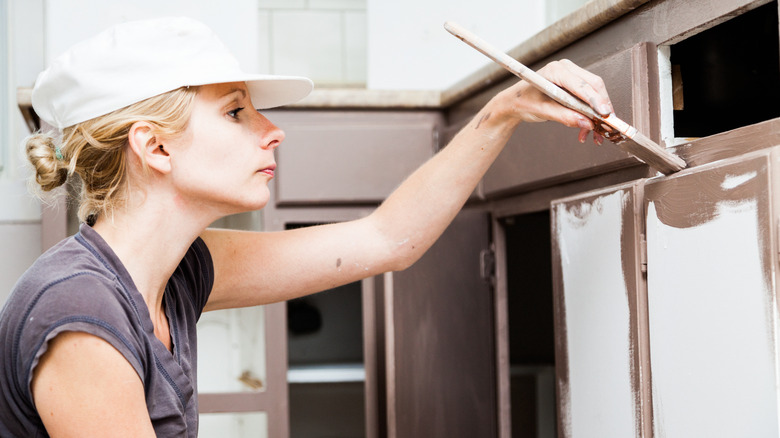
Superficiality has its uses. Focusing on the surface level is the biggest bang for your buck in terms of updating the overall look of your kitchen according to Decoist. The biggest visible surface area in the kitchen is usually the cabinetry, which is useful, as the doors, handles, and pulls of cabinets and drawers are also usually fairly cheap and easy to transform.
A cabinet facelift is a chance to make a significant update to the kitchen color scheme and make subtle design choices that lend a touch of class to the tired, the old, and the generic. Consider details such as molding, using contrasting accent colors for the handles and pulls, or even removing entire doors or window panes from cabinets to give an alternative layout to your kitchen storage, suggests Bunnings.
The other major surface to be facelifted is the countertop. According to Forbes Home, DIY stone effect paint kits can give the impression of a complete refit for a fraction of the cost of installing new granite countertops. This is only really an option if you're working with laminate countertops, but it is a simple (if time-consuming) DIY project that can totally transform your kitchen.
Let the light in
Good lighting can't save poor design — but bad lighting can ruin the ambiance and usefulness of a room. Just like anything in kitchen design, lighting design requires both form and function. Per Kelly Finley, CEO and creative director of interior design studio Joy Street Design "Lighting is jewelry – if you do it properly, it's what you see and notice when you walk into the room, so spend on it, make sure you have the budget for it." (via NKBA)
Understanding this principle allows designers to determine the subtle and inexpensive changes to the lighting that let them showcase certain features and minimize negative aspects. According to MyMove, the right shifts in lighting can transform a kitchen in an afternoon with only a few hundred dollars spent.
Adding light doesn't have to mean new electronics or knocking a hole in your house — consider how a change in curtain fabric will let more ambient light in during the day, or if an afternoon spent in the garden removing branches might give a few hours extra daylight to your space. The perfect kitchen lighting is in there somewhere, it's up to you to find which room configuration allows it to shine.
Find your kitchen's focal point
Not all kitchens are blessed with a kitchen island, a striking range, or a window with a stunning view. But because of the way our eyes and brains work, each kitchen will have some kind of a focal point. According to Dura Supreme Cabinetry, the focal point is simply the spot in the room where people's eyes naturally rest, and by upgrading this point you can achieve maximum impact for your money and time.
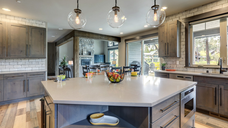
Upgrading a kitchen island is one of the simplest focal point upgrades you can make, and requires little specialist skill or investment. If your island is in decent shape, adding some molding and a new coat of paint can upgrade the look of your kitchen in one day for as little as $50 (via Today). Suppose you want a more thorough island renovation. In that case, it might take a day or two longer, but according to Amanda Seghetti still only requires basic DIY and can be a good test project before tackling the rest of the kitchen cabinets and countertops.
If your focal point isn't an island, consider how minor lighting upgrades, a change of color, and/or texture could rejuvenate the core aesthetic feature of your kitchen, and prepare to be amazed at how much impact minor tweaks can have.
Fabric adds texture
Most people use kitchens for cooking and eating, but not everyone does. The one activity common to every kitchen is cleaning. Even if you exclusively eat take-out on the sofa, crockery needs cleaning, the trash needs to be taken out, and spills need to be wiped. This means kitchens are dominated by shiny, wipe-clean surfaces. Fabric adds visible depth and texture to your kitchen, according to Kitchen Magic. Kitchens without the texture that fabric provides can feel unfinished — as if the builders finished their job, but the designer hasn't yet.
Using fabric in the kitchen has several other benefits. A hard, shiny kitchen can be a very noisy place, soft furnishings absorb vibrations and make the kitchen sound less industrial. Per Bilotta Kitchen & Home, many modern fabrics are easy to clean, so you can introduce luxurious and intentional textures to your kitchen design without giving yourself cleaning headaches.
Part of the reason that fabric makes your kitchen look more expensive is precisely the fact that it seems harder to clean. The idea is that the richer you are, the less likely it is that you're going to be doing your own cleaning, and the less you're going to base design choices around how easy or difficult something is to clean. If you judge it correctly, however, you can give this impression without actually adding to your cleaning load — add fabric to the least messy areas and watch the compliments roll in.
Save space and create space
One of the most expensive things to add to your kitchen is space. Even if you don't need to buy or build extra space, just expanding your kitchen area is a significant investment. The budget-friendly way to up how expensive and spacious your kitchen seems is to optimize storage to minimize clutter, and use optical effects to give the impression of extra space.
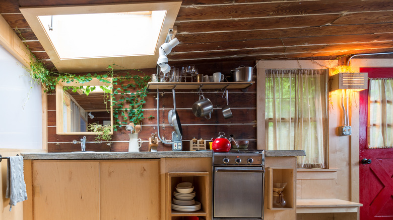
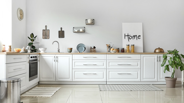
Minimizing clutter doesn't have to mean hiding everything behind cabinets, but it does mean keeping your countertops clear. Find ways to hang useful items from hooks or magnetic strips so they are easy to find and available when you need them, according to Arch Daily. Significant space savings can also be found by buying items that stack well and pack away cleanly into drawers or mobile units when needed.
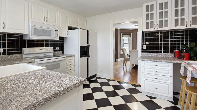
By keeping the countertops clear of clutter, kitchens seem more spacious. Another way to increase the sense of space in a kitchen is to use flooring tricks to give the impression of greater space. According to Flooring America, diagonal or checkerboard lines on the floor force people's eyes to the widest corners of the room, which makes the whole room seem bigger. Of course, relaying the entire floor of your kitchen isn't a budget proposition — however, if you can paint or otherwise adjust the pattern of your flooring without ripping the whole thing out, then you can significantly add to your kitchen's sense of spaciousness.
