Jenn Todryk Shares 3 Things That Instantly Make Your Home Seem Dated
HGTV's "No Demo Reno" host, Jenn Todryk, says she is all about making cosmetic changes to give a house a new style without having to tear down walls or build additions, saving time, money and the stress of living through a demolition. Additionally, while your taste and style may change over the years, we sometimes get used to the way things look in our homes and neglect making updates. After a while, our spaces may even start to look dated. That's where Todryk steps in — and she's not concerned with the latest social media trend, per Realtor, but with the way people are going to enjoy using their rooms.
In Season 2, episode 5 of "No Demo Reno," Todryk works with clients who have lived in their house for some time and just don't feel that the details reflect their style. The couple starts by pointing out the built-in shelving in the dining area that has plain white backing and glass shelves. They feel this is a dated look, and are also concerned about the glass with young kids running around. For very little money, Todryk lines the back of the built-in with shiplap, and replaces the glass shelves with warm, mid-toned wood shelves, giving the whole cabinet a fresh look.
Dark counters and brassy hardware
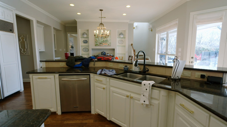
Jenn Todryk's clients in season 2, episode 5 of "No Demo Reno" have a huge kitchen with several features that make it look dated, from the black granite countertops to the brassy-yellow hardware and 12-inch ceramic tile placed on point for the backsplash, as noted by Realtor. They're also unhappy with the two levels of the massive, wraparound island and want Todryk to bring it down to one. A counter-height island would create room to spread out for daily activities and keep the sight lines open adding to a more contemporary feel, explains Eastwood Homes.
Todryk starts her kitchen updates by cutting down the bar-height counter on the island leaving an enormous eating area on one level. By removing the bar, Todryk also opens up the flow of the room. She also removes the black countertops and covers the island and all the counters with a creamy marble that works well with the white cabinets. The small work island in the center of the kitchen is covered with a dark quartzite for contrast. Todryk also decides to add wood shiplap as the backsplash, which cost a lot less than a tile backsplash would for such a large kitchen. Finally, Todryk swapped out the hardware for more neutral, brushed-brass handles.
Beige and boring bathroom
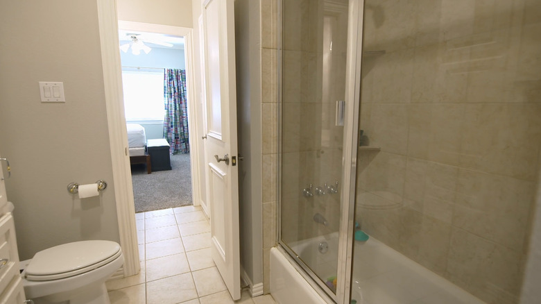
The client's boys shared a Jack-and-Jill bathroom that was entered from each of the two bedrooms. The original bathroom was all-beige with 12-inch ceramic tiles on the floor and only has a single sink vanity. The gold-trimmed sliding glass door encloses the tub, which is also lined with the beige tile, according to Realtor.
What a difference the update makes to the homeowners! Jenn Todryk gives this bathroom a complete overhaul by removing everything except the toilet. Instead of a tub, she used the space for a glassed-enclosed walk-in shower with double bands of horizontal tiles alternating in grey and white. The flooring in the shower and throughout the room was replaced with hexagonal black tiles. There's still only one sink, but with a much larger vanity that offers counter space on each side of it. The homeowners are convinced that the renovation will keep their kids from using their master bathroom anymore.
A dorm-like bedroom with textured walls
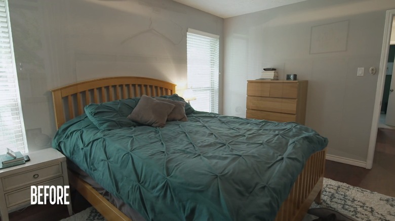
During the same episode of "No Demo Reno," Jenn Todryk updated a primary bedroom for a couple who felt like they were still living in a door room, but without the beer cans (via Realtor). Their space was a mash-up of furniture leftover from their college days, inherited from grandparents' homes, and scored at yard sales. Plus, they the rough stucco on the ceiling and the textured walls felt outdated; contemporary design emphasizes smooth walls and ceilings, according to Cooper Design Build, and that's what Todryk's plan included.
The clients also asked for board and batten for the walls but didn't have the budget for it. Instead, Todryk sanded down the rough walls and used wood trim and paint to create the look of board and batten for a budget-friendly price. The ceilings were also sanded down, and new furniture was added to pull together a beautiful bedroom which felt like a retreat rather than a dorm room.


