Dated Design Trends Good Bones' Mina Starsiak Hawk Is Over Seeing In Homes

As the host of HGTV's "Good Bones" for nearly 10 years, Mina Starsiak Hawk knows a thing or two about design trends. Fans will recognize her signature style as keeping the best bits of a property intact, and featuring bold new designs from local artists to give an individualized flair to each home she works with. Having renovated hundreds of properties, she has witnessed numerous trends come and go, giving her a keen eye for what's classic, what's not, and what's on the horizon.
Yet there are certain design trends that are either hot right now or have been in favor for nearly 50 years that she just can't wait to fall out of fashion. Some of them might even surprise you, as they were made popular by fellow HGTV stars. Yet Starsiak Hawk has never been one to mince her words, so even if everyone else is a fan, she isn't afraid to stand alone in what she likes and doesn't like. In her perfect world, here are the things everyone would stop doing in their homes.
Antebellum pillars are best left in the past
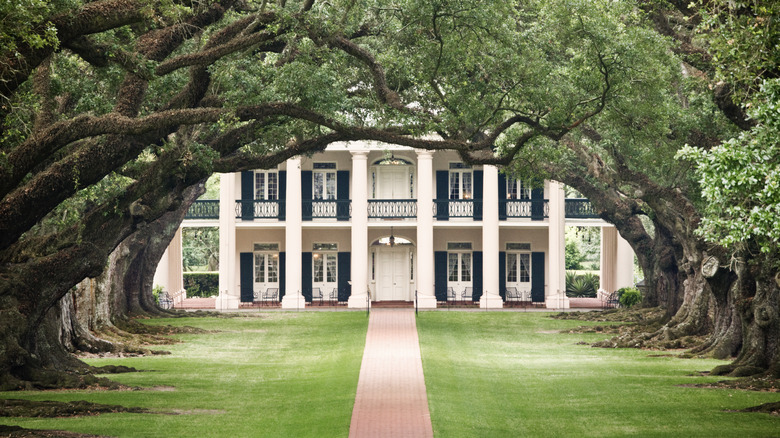
Antebellum design, or anything inspired by it, refers to a time in U.S. history before the Civil War, particularly in the South. Features like wrap-around porches or big white houses with large columns were popular during this time. However, Starsiak Hawk doesn't like these elements due to their association with the plantation economy and the horrors of slavery in America. "We can't get rid of all of them because they hold up the house," she said about a few attached to a client's house in the "Major Mansion Makeover" episode. "But we can bring them up to date."
She updates the design by getting rid of any non-essential pillars, which are not load-bearing and only there for looks. The ones that stayed were redesigned to look nothing like their Antebellum inspiration. The new pillars take a transitional-style rectangular form instead of traditional columns. If you're looking to update your own home, removing this dated design feature can go a long way towards distancing your property from such a dark moment in the country's history.
Tiled accent stripes are over
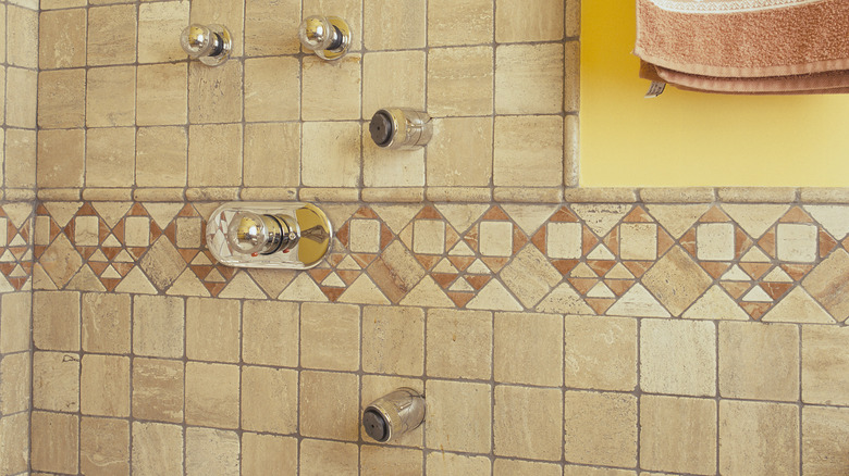
When asked about a home design trend that she is ready to put to bed, Starsiak Hawk couldn't answer fast enough. "Landing stripes or accent stripes in bathroom tile," she told the Indianapolis Home Show. This take might be seen as controversial, as stripes are consistently bobbing in and out of fashion. However, if she had her way, they would have stayed out of style forever.
The type of stripe she is referring to usually occurs about halfway up the shower wall. These stripes are a contrasting color to the rest of the tiling and are meant to add visual interest to a space. Yet Starsiak Hawk prefers you use the same tiling from floor to ceiling. It keeps things cleaner, chicer, and you don't risk having a bathroom that's constantly in and out of style, depending on how stripes are doing. Luckily, retiling is a relatively easy DIY that even beginners can complete in the course of a weekend. However, if you don't want to retile the entire shower to course-correct this design, you can remove just the contrasting stripe and replace it with matching slabs. To remove it without damaging the surrounding pieces, use a small rotating saw to grind the grout lines and then carefully chisel out the offending tiles.
Shiplap is past its prime
Anyone who watches a lot of HGTV will know that Joanna Gaines made shiplap famous on "Fixer Upper." The farmhouse-inspired boards were literally everywhere, and it seemed like home design as a whole could never get tired of them. Yet that was in the 2010s, and these days, Starsiak Hawk is more than ready to try something else. "I think everyone in the industry would say the ship has sailed a long time ago on shiplap. And we'd like to move on from that," she told LancasterOnline. It's an opinion she isn't shy about repeating, also telling the Philly Home and Garden Show, "I would be happy to never see shiplap again!"
So what are you supposed to use in your home instead of shiplap? Starsiak Hawk likes to add texture and color to a room by using wallpaper instead. However, that doesn't just mean plastering it to a wall. Much like how shiplap expanded to cover everything from walls to ceilings to cabinets, the HGTV star likes to think out of the box when papering. For instance, in a Season 4 episode of "Good Bones," she used white and gold floral wallpaper to spruce up a plain kitchen island.
Mid-century modern isn't her favorite
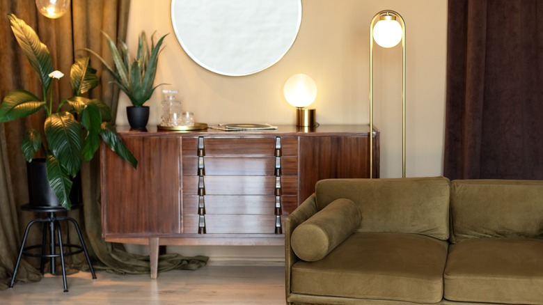
Mid-century modern came into fashion exactly when you think: the midpoint of the 20th century. It's a style characterized by simple shapes and smooth lines. Mid-century homes also typically have large, open areas with softer color schemes sprinkled with small, bright pops of color. Yet Starsiak Hawk isn't the movement's biggest fan. "My lake house is kind of mid-century modern, which isn't my style," she revealed to LancasterOnline. It might seem odd to buy a style of property you don't like, but the designer clearly liked the "bones" of the place. However, completely ignoring the design would seem out of place in such an architectural home, so she compromises by experimenting with the trend in temporary ways. "Like, I got this funky green silverware. It's very mid-century modern, but I can change it without incurring a huge cost if I decide I don't like it anymore."
Starsiak Hawk frequently encounters mid-century homes on "Good Bones," as many were built during the peak of the style from the 1940s to the 1970s. Over time, some of these homes lost their original features, giving her the flexibility to blend styles without being tied to strict mid-century aesthetics. If your space is mid-century and you don't like it either, think about incorporating small, modern touches to shake things up instead of doing a complete renovation. "[My lake house] has a lot of those characteristics: the shape of it, the stone fireplace, those kinds of things. I wanted to keep some of them," Starsiak Hawk told the outlet about her own home. "My Mina spin on anything is very approachable, comfortable, light, bright ... So I kept some of the things and then evened it out with more my style." She worked around the home's features but made it feel more contemporary with the furniture and decor pieces.
Gray is totally overdone
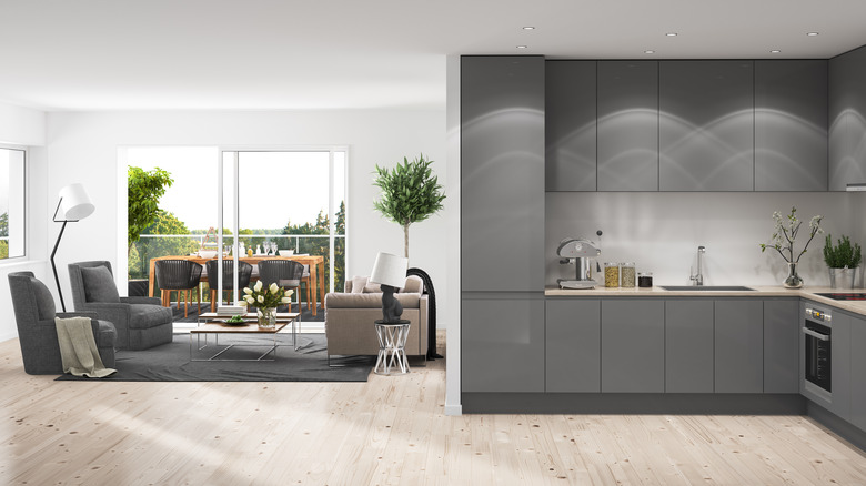
Home designers in the 2010s simply couldn't get enough gray in their homes. Everything seemed to come in a shade of it, from the paint on the walls to the couch cushions to even the wooden flooring. So much so that "Millennial Gray" became a design era all of its own. Yet Starsiak Hawk can't wait to see the end of these dated decorations. "I don't really follow trends. We try to stick with more timeless styles," she told The Minnesota Star Tribune. "But I do love that the warmer neutrals are coming back around versus the huge boom we saw in the cool, gray tones."
However, Starsiak Hawk's favorite cozy neutral might surprise you, as it is still gray-tinged. "A calming greige paint is going up all over the walls and ceiling for an extra cozy feel," she said in the "Twinning is Winning" episode of her show. Greige is the unofficial favorite of many in the design community, as it combines gray and beige for a warm, more inviting alternative to the moody starkness of traditional hues. Most mainstream paint stores like Sherwin-Williams have pre-mixed options in stock, but you can also always mix up your own to get the perfect shade.
Leaving the ceiling untouched and white
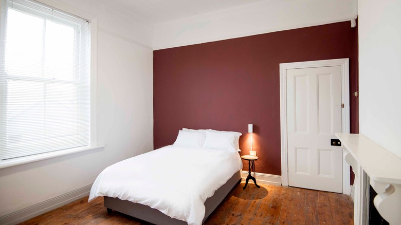
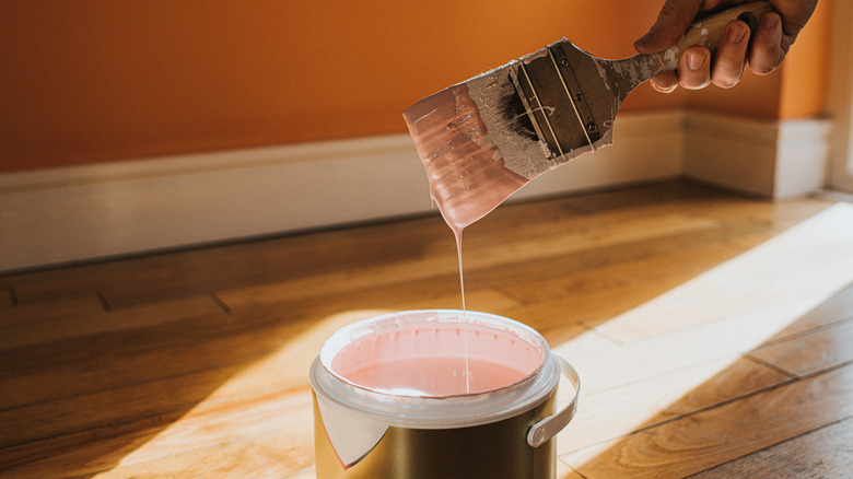
For Starsiak Hawk, there is a time and a place for color contrast. She enjoys bolder options at times, but wishes people would move on from using white as a safe contrast to louder wall choices. Instead, she prefers color stacking with different types of the same hue. "A lot of what you'll see in Season 8 is I got super obsessed with doing everything monochromatic," she explained to Realtor.com. "So the trim, the door, the walls, and the ceiling [are] all one color — they might be different sheens, but it really creates this [feeling] like the whole space is hugging you versus it wearing this awkward hat that's white because all ceilings are white and maybe your walls are burgundy."
If you'd like to recreate this look at home, knowing how to easily paint your ceiling is the first step. Just like walls, you need to make sure the surface is clean and free from cracks and holes before you get started. It's easy to spackle any imperfections before you get going. Next, when selecting your paint, choose one with a high viscosity (106 KU or higher) so that it will dry quickly and not drip down. Not doing this will leave you with awkward marks on your ceiling.
Childproofing doesn't have to be garish
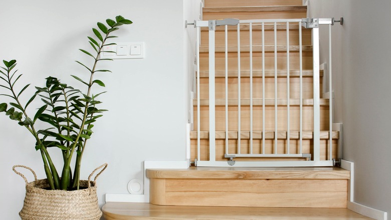
While childproofing your home definitely isn't a trend, letting the safety features cramp your style is a design choice. And, it's one better left in the past. When speaking of making sharp surfaces safer, Starsiak Hawk explained in a live chat with The Washington Post, "It's extremely hard to do this effectively and still make it look pretty. The best option I've found is a clear, rubber L channel that sticks to anything." The reason this works so well is because "you can still see it a bit because of the rubber's shine, but it's far less intrusive than the thick, colored, foam L channels you often see."
By doing things this way, couples can transition their homes into a space more suited for a family without sacrificing their overall sense of style. And it doesn't stop at sharp surfaces, either. "My gates are made of white metal, and I went more for function over form," she continued in the chat. "But if you want something less ugly, they make gates that essentially work like this: Imagine a roll of wrapping paper standing up that attaches to a wall, and you can pull it across an opening and hook it to the other wall." Yet, instead of a paper, it's actually a big roll of fabric that retracts, so you still have a barrier without relying on the large gate.
All-white kitchens shouldn't be too stark
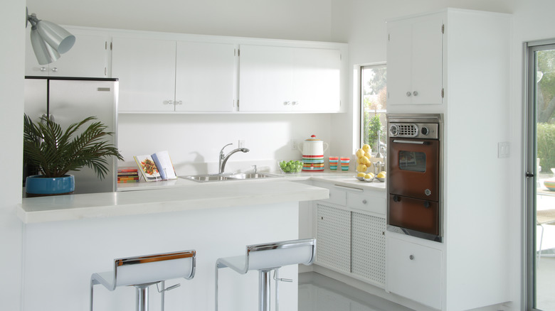
Starsiak Hawk loves an all-white kitchen. Fans of "Good Bones" will know that they pop up all the time on the show, and she constantly posts about them on her Instagram Reels, making fun of people who think the classic design style is too boring. However, even she admits that the trend can be overdone and out of style if you leave out a few key accents. "To add dimension to the all-white interiors, we brought in a lot of soft beiges, ivories, and light wood tones," she told viewers in the "Free House, Expensive Reno," episode. "And for a pop of organic color, we placed houseplants all around the space."
If your kitchen is stark white and looks too much like a hospital, you need a little help softening up. To do so, consider adding a few indoor plants for a quick and easy uplift. Kitchens do best with greenery options like herbs on the windowsill, although easy options like Snake Plants and Money Plants can also thrive in the space.
Certain paint sheens just aren't realistic for parents
While matte paint might be trendy, it's not the best choice for homes with children. Unlike adult-only households, families often deal with clean sticky fingerprints, spilled juice, or boogers on the walls. Because of this, Starsiak Hawk doesn't think it's a trend worth following. "My kids touch the walls all the time," she told Realtor.com. "Pick a paint sheen that's going to be scrubbable. Those things make it easier to refresh instead of having to replace."
Instead, go for a high-gloss or luster paint. This is because it's much easier to keep clean. All you will need is a damp cloth to make it look brand new again. To select the correct sheen, simply keep a lookout for the words on the label. Most cans will have a gloss classification near the color name. Specifically look for a semi-gloss or satin finish, with semi-gloss being the easier one to clean between the two.