Property Brothers: Drew Scott Shares The Key To Balancing Features In Your Home

Everyone loves a good feature in a house. Wainscotting adds texture to a boring room, stone on a fireplace makes a living room cozier, and a simple ceiling beam can elevate an entire room. These architectural flairs make a house feel more memorable. Without them, a space can feel like a developer rather than an architect created the design, building something of a McMansion. But while it's important to add thoughtful features, HGTV's Drew Scott points out that there can be too much of a good thing. While one of those accents can help make a house feel special, muddling them all together can make everything too busy.
"Trying to put in too many elements can actually distract you from a beautiful design," he said on his YouTube channel. He added later in the clip: "You just don't need to try so hard." He pointed out that cramming a space with too many focal points is the equivalent of wearing a tuxedo on a first date or a piano tie from the '90s. It shows that you're trying to do a lot to garner attention, but you don't actually need to put in that much effort. Here is a closer look at how Scott suggests to balance a house.
Why you shouldn't have too many features in a space
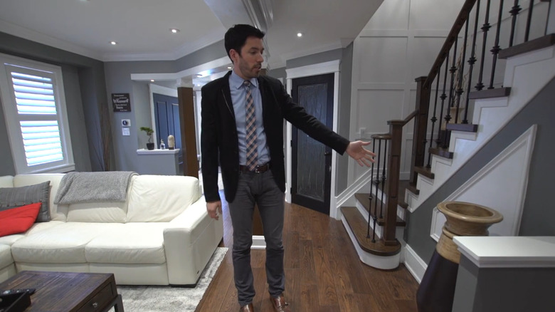
While you might like multiple different designs, it's best to narrow down your selection to one or two per room. "If you pack too many features into one space, it can be overbearing and overpowering," Scott warns. He used one client's house as an example. Upon entering their living room, you're faced with multiple features that seemingly war for your attention. "So you have some wainscotting here, you have the molding over here, you have a different detail shape over here," he said, pointing at a triangle-shaped wainscotting on the staircase. "Then you have the different colors on every other wall, including this extremely bold red wall that's a style that we used to do back in early 2000s." He pointed at a bright red accent wall (which isn't the best color choice) at the back of the living room, which was where the TV was hanging.
When making over the room, the main thing that he changed was painting the bright red wall the same gray as the rest of the space. Then, instead of ripping out the wainscotting and molding, he decided to let those two be the center features and instead changed the furniture to be less noticeable. He removed the TV and instead put a round dining table with white chairs there, and swapped out the eye-catching sectional couch for two white couches facing each other, which had a smaller footprint. This way, the wainscotting was the main standout in the room.