Stunning Paint Colors HGTV's Hilary Farr Loves Seeing In Homes

Few interior decorators are as renowned as HGTV's Hilary Farr for their love of neutral colors and timeless decor. As a celebrity designer and host of "Tough Love with Hilary Farr," she often shares her views on the best paint colors and palettes to achieve a classic and stylish home, which invariably includes hues of gray and taupe. Speaking to Streets of Toronto, Farr explains, "Earth tones are always popular and for a good reason." Farr also discusses her penchant for certain shades of blue, stating, "I like the deep, rich blues influenced by the colors of the exotic aesthetic of the Mediterranean and countries like Morocco."
Farr has a particular palette she loves to see in homes, which remains unaffected by ever-changing color trends. Referencing fashionable paint shades she goes on to say, "I am seeing the Pantone color 'Marsala' more than I want to. It's a trend which I don't plan to follow since I don't particularly love the color in a home. That's the thing to remember. You don't have to feel compelled to be 'on trend.' Keep an open mind!" Here we explore some of the most stunning interior paint colors Farr recommends and priceless decorating tips she swears by to help homeowners and DIY decorating enthusiasts achieve a designer-inspired finish.
Light blue walls are calming
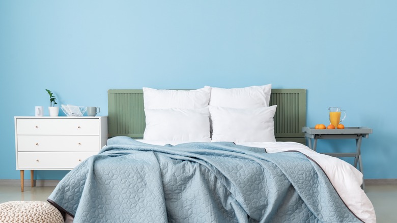
"I adore blue in a kitchen. It's very chic, it's very French. It is very calming. I just think it's forever and ever and ever. It's classic," says Farr in Season 2, Episode 8 of "Tough Love With Hilary Farr" (per HGTV UK). In fact, soft blue is a paint shade Farr loves to see in her client's rooms, and it's often a color she selects in her show. In Season 1, Episode 8 of "Tough Love With Hilary Farr" (per HGTV), she explains her decision to use the color in a bedroom: "This room is all about being calm. Note the walls. They're blue. And blue, with color therapy, is one of the best colors to have in a bedroom. It actually does soothe."
Blue, according to color theory, has the power to create a soothing and relaxing atmosphere. This is partially due to blue's association with the sky and the ocean, which can have a calming influence. 'Palladian Blue' by Benjamin Moore is a beautiful shade of blue paint that would work well in kitchens or bedrooms. It has a hint of gray to give it a modern vibe while making for a fresh and calming space. You can also incorporate light blue into your home decor without repainting. Consider opting for a soft blue backsplash tile or pale blue accessories such as this aqua sky stand mixer from Kitchenaid.
Earth tones are best for selling a property
When discussing the best ways to list a home for sale, Hilary recommends applying a fresh coat of paint to depersonalize the space and make it more welcoming. When discussing paint colors with Today she says, "You really should be looking for earth tones and neutrals, and that shows off everything else that you have. There is nobody that hates a beautiful warm gray."
If you're repainting your house in preparation for listing it, you want to appeal to a broad range of people. This means skipping the aisle of bold paint colors and opting for something neutral that isn't going to put anyone off your home as they step through the door. Earthy shades are inoffensive and allow people to imagine their own belongings and future life in your house. Consider 'Skimming Stone' by Farrow & Ball for a Farr-inspired look, and remember to hide your personal photos and memorabilia away in cabinets during showings. If you want to liven up a neutral color scheme to help your home stand out from the crowd you can add touches of color that create interest while reading as neutral. Earthy greens for soft furnishings and accessories can fulfill this purpose. As a color widely seen in nature, green comes across as neutral without being bland. Opt for cushions in shades of moss or sage, like these from Wayfair, to accent an earthy home.
Indigo is a timeless shade of blue that won't date a house
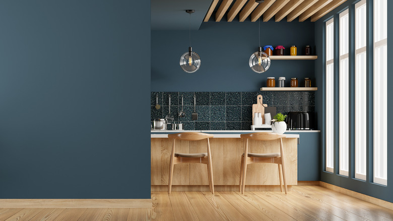
Farr openly admits that she doesn't have a favorite paint color, telling the Indianapolis Home Show: "I don't have a favorite – each space deserves colors and finishes that help make it unique. Perhaps I will paint the main living spaces light neutrals, or even white, and opt for a dramatic dark color as an accent, or for an intimate space such as a library." That being said, deep blue is a shade that Farr returns to time and time again. Indigo is one of her go-to blue paint colors because it is timeless and matches easily with other hues. She discusses indigo with The Today Show, explaining, "It's timeless, and as a result, it's an ongoing trend. It never gets old... It's just so rich and it reminds you of the ocean and water and all those things that you love during the summer. It's comforting and it works with every finish...Everything works with this color."
Follow in Farr's footsteps by incorporating indigo as a timeless kitchen paint color in your home. 'Indigo Batik' by Sherwin Williams is a deep and earthy shade of indigo that creates a restful and soothing atmosphere in any room, though it works particularly well in a kitchen with white countertops for a crisp and clean finish. If the idea of an entirely indigo room feels too intense, consider painting a feature wall in this classic shade, keeping the remaining walls neutral.
Farrow & Ball paint colors are a safe bet
In an interview with Showtime Magazine, Farr explains that her go-to paint colors often come from the Farrow & Ball range. She says, "Color depends on my mood and what the room demands. I like Farrow & Ball's 'Castle Grey', 'Borrowed Light', 'Purbeck Stone', 'Drawing Room Blue', 'Calamine', and 'Oval Room Blue'." As we've come to expect from Farr, all of these shades are earthy neutrals or blue hues, with the exception of one. 'Calamine' by Farrow & Ball is a sweet and subtle shade of pink that would be beautiful in a bedroom or children's nursery. Despite being a hue we wouldn't typically see in Farr's repertoire, this pink paint is in line with her love of muted, understated shades.
Interior decorators and designers universally adore paints by Farrow & Ball for their rich tones, earthy hues, and timeless shades. This company has been handcrafting paints for 75 years and offers a small selection of premium-quality shades, many of which are iconic paint colors that are classics for a reason. If you can't decide on a paint color, consider anything by Farrow & Ball to be a safe bet.
Neutral shades make a room feel bigger
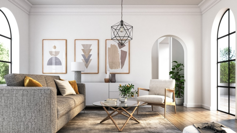
"I tend to use a neutral on the walls if I'm designing an entire house from scratch," Farr tells Homes & Gardens. Neutral colors on the walls make it easier to design a room because they serve as a blank canvas giving you more freedom to use bold prints or shades on furnishings and accessories. Additionally, neutral paint colors make your room look bigger, especially when the color is carried from the walls onto the ceilings. This is a trick Farr always uses when decorating a new space. She explains, "I like to have a very neutral wall, and then I always paint the ceiling the same color as the walls. I think everyone should. That's a really important part of making a room look great."
To visually expand your room using a paint color, follow Farr's advice and opt for a neutral, earthy tone. 'Manchester Tan' by Benjamin Moore is a warm neutral that will make any room feel welcoming and cozy, while 'Silverpointe' by Sherwin Williams is a cool gray paint that represents a modern take on a classic neutral. Painting the walls and ceilings the same color is a great design hack. Using the same paint across both surfaces means you won't have to worry about getting a neat line where the wall meets the ceilings, and the two surfaces can blend to create the sense of being enveloped by the space. This can also make the room feel larger or taller because the walls don't come to a harsh end.